As it gets closer to the end of our summer, and my last vacation time looms near I think about traveling. I've been asked more than a few times, how do I travel with my Copics? How do I pick the colors and how am I prepared?
Markers
I usually travel with a Copic 24 or 36pc. wallet filled with a range of colors, plus a thick and a thin inking pen, as well as a pencil and eraser. I choose 2 colors from each family- what colors I choose depends on my mood. I always have a blender or two (in case one goes dry and you don't carry a refill), at least 2 skin colors, a pale blue/blue green (for sky and water) and 3 or 4 grays for adding shadows to my other colors. At any time I usually have a wallet of markers and a sketchbook in my car ready for any spare coloring time.
You may wish to pick colors that coordinate with a specific colored paper or some other accessory that you know you'll use with those pictures later on. When I have ALL my markers in front of me I tend to pick the same colors all the time, so when I travel I purposefully bring different colors to avoid having all my work look the same.
Images
I travel with a binder filled with page protector sheets and at least 3 or 4 copies of each picture I may want to color stored in there. That way I have plenty of things to color depending on my mood. Keep a couple pieces of scratch paper for working on as well. When I travel I grab my binder, sketchbook, and my wallet- three things that easily fit in my luggage but give me hours of fun.
For illustrators, especially if you draw characters- it is good to color the same picture in 3 or 4 ways just to see how big a difference it makes when you change a few colors around, alter the skin tone, or change your shadow direction. Anytime I make a finished piece that I add to my art portfolio if you look behind it there are usually two or 3 other colored copies in there as well.
For papercrafters, by stocking up on pre-colored images when you get home to make cards you'll have lots to choose from, and while traveling the coloring part is easier to do than bringing all your ribbon, glues, cutters, punches, papers, etc. Keep a good assortment of simple images and detailed pictures that you know you'll need down the road (christmas, easter, etc.). I like to keep a variety, since my mood determines what I want to color. To remember what colors you used lightly write on the back of the pictures in pencil- then you'll have an easier time when you want to coordinate.
Flying
Many of my best pictures I've colored during long flights when I have lots of un-interrupted time. Especially detailed work- I've done some pretty tedious pictures that were so worth it once I was done, and I couldn't have had the time if I weren't on a flight.
I have to admit that when I fly, I LOVE to draw or color. It gets the attention of the people around me and is a great conversation piece. I love how kids get a smile when they look through my sketchbook, and adults think about ways they can be more creative. I've met the neatest people on the airplane simply because I didn't plug in my headset and watch the in-flight movie. This picture is one that I drew on a flight home from Chicago a few years ago.
When flying, my pens have never been confiscated. If you choose to bring the ABS kit with you, put it in your checked bags though (I've never tried to take it through the security point because I'd rather not risk losing it). If you color while on the flight, once you land take the caps off both sides to even out the internal air-pressure or you'll get blobbing.
When you color at your final destination, if it is a totally different climate or really hot and you last colored in a much different environment it's a good idea to pull the caps off both sides as well. Just recently I was doing a demo at our county fair. The room had no air conditioning and it was at least 90 degrees in there and very stuffy. I had two markers blob just because the last place they were used was in an air-conditioned office. Taking the caps off fixed the problem immediately, since that fixed the air pressure inside- remember, these markers are super air-tight.
I hope this has given you a few ideas about how to make your coloring more portable. Have a great time this holiday weekend and on your next vacation. See you tomorrow if you're coming to visit me in Portland, otherwise, I'll be back on Tuesday.
Friday, August 29, 2008
Thursday, August 28, 2008
Upcoming Classes
This fall is busy with demos, workshops, and other events. Here is a rundown of upcoming Copic events. If you are in the area for any of these we would love to meet you! I will be personally attending most of these, unless otherwise noted.
Sat. Aug. 30th, Portland OR
Collage on Alberta St. I will be hosting free demos from 11am to 1 pm. Stop by and visit!
Collage on Woodstock, free demo from 2 to 4 pm. Click on the link to upcoming classes for addresses to both these events.
September 27th & 28, Spokane WA
Spokane Art Supply is hosting their Great Arts Adventure & Rubber Stamp Show. click here for more details. Copic will be represented by some of our fabulous employees, so come and ask product questions and get a chance to play with Copic supplies.
Wed. October 1st, Charleston SC
Copic Certification for papercrafting, 9am to 4 pm. There is still plenty of room left at this event, so please contact me for an application. For those of you who are staying in the host hotel, that needs to be booked by Sept. 1 to receive our discount rate. Registration will open to everyone Monday Sept. 15th, so contact me to get on my waiting list if you do not fall under the early registration criteria.
October 3rd - 5th, Savannah GA
Savannah College of Art and Design is having a trade show down at their River Club. Please stop by- I'll be answering questions, demoing, and you can purchase Copic products as well. Check our upcoming class schedule for address and times.
October 9 or 10th, Kansas City MO
Copic Certification for Papercrafting, 9 am to 4 pm. There is still room, but these classes are filling FAST. Please contact me for applications. Registration for these classes won't open to the general public until Sept. 22nd, but you can still contact me to get on the waitinglist.
October 9th, Kansas City MO
Splitcoast Stampers Gathering, 6 pm to 8pm. This free event is open to any Splitcoast Stampers member, so click here to add your name to our RSVP list. We'll be having a party with Lori Craig and Sharon Harnist, please stop by!! We'll have a card swap and be donating cards to our troops overseas.
October 10 & 11th, Kansas City MO
For store owners only, we will be having demos and Q & A along with other papercrafting companies. If you are a store and would like more info please e-mail me.
Friday, November 7th Seattle WA
Copic Certification for papercrafting, 9 am to 4 pm. I am getting my mailing list together right now, so if you are interested please e-mail me. Applications will be going out in the next couple weeks, and registration will open Sept. 22nd
Sunday, Nov. 9th Demo
Check back for a list of free demos I will be hosting in the Seattle/Vancouver BC area
Monday, November 10th Vancouver BC
Copic Certification for papercrafting, 9 am to 4 pm. I am getting my mailing list together right now, so if you are interested please e-mail me. Applications will be going out in the next couple weeks, and registration will open Sept. 22nd
November 13 & 14th Eugene OR
University of Oregon Bookstore annual Tools of the Trade show. I will be offering free demos and answering questions, along with many other fine artists and Art Supply companies. Hours are from 10 am to 6pm (more details as we get closer to that event). Drop in and say Hi!! Doorprizes, giveaways, and lots of fun stuff all weekend.
Wednesday, August 27, 2008
Shadows part 3 - Shadows on Groups
This segment builds on the earlier posts about shadows, so please read parts 1 and 2 before getting into this posting. Also, bear with me as I slowly work my way through basic shadow concepts and into more complex ideas.
Note: I still have plenty of room in my upcoming certification classes for Kansas City and Charleston, and I am now building a mailing list for Seattle, Nov. 7th and Vancouver BC (a few days after Seattle, exact date TBA). E-mail me to get on my list!
Shadows on Groups
Last time we talked about shadows it was on a single apple sitting on a table. But how do the shadows change when we add other things around the apple? In this group I have an apple, pear and orange, with a little space between them so you can see how shadows work a little more.
1. Each object casts it's own shadow, same as it would by itself. The pear has a soft, pear-shaped shadow, the apple has an apple-shaped shadow, and the orange has a simple round shadow. the leaf on the pear is far above the table, so it casts a nice soft shadow.
2. Where two shadows overlap it gets a shade darker. So any spot where two shadows meed it will be darker. 3 shadows- even darker, etc. For my finished example I have softened all my shadow shapes together, but I need to remember to keep the shadows darker where tow meet.
3. The closer things are to each other, the less other light can bounce in and make it brighter. In this example the area between the fruit is going to be slightly darker simply because less light can bounce in and fill in the area between them. The top view shows the area that will get extra shadows and where the regular shadows fall.
For the final picture-All three of these fruit are fairly bright, but the apple will be darkest, so I added R89 to really darken it up. Notice the highlight on the orange. Unlike the apple, the orange peel is slightly textured, so to give it the textured feel I made the highlight dotted with my Opaque white. Image: Drawn with a 0.3 mm multiliner onto color laser copier paper.
Tuesday, August 26, 2008
Coloring Simple Bushes, Part 2
I got busy and never really got a chance to finish up yesterday's post, so here is a last, simple way to add texture into your flat bushes, or anything you want to not look flat and smooth.
Adding Texture to Marker Colored Areas
For this technique I'm using a bottle of our colorless blender solution. These come in big bottles, which is good because I have a tendency to suck through the blender solution quickly. Also, do this technique FIRST before adding your detail areas so you don't mess up anything you have in front of the textured bushes. Try this on a scratch area first before you color your finished area.
1. Roughly scribble in my base colors. You don't have to be too careful, you just need some kind of color on your paper. Let this dry before moving on so you get the most crisp effects (drying time varies by paper type).
2. Wrinkle up a paper towel. Make a little wad in your hand that has lots of nice small lumps and wrinkles- not a smooth folded paper towel.
3. Soak the wadded area with blender solution. Not too much, just enough to dampen.
4. Carefully dab onto your colored bushes. The longer you hold it in one spot, the stronger the contrast. You'll want to work fairly quickly so that the blender doesn't evaporate off the paper towel.
5. The more you dab, the more the the colors will mush together. This is a great way to hide or fix mistakes. This really lightens areas as well, so it helps if you made something too dark.
Anything with alcohol will react with the markers to some degree. Rubbing alcohol, will work, though it won't be as strong or predictable as Copic blender. Also try little dabs of hand sanitizer- the alcohol will react much slower and separate the dyes in strange ways, but you can watch it slowly react with your colored area and when it gets the look you want, carefully wipe it off.
This will work better on some papers than others. Soft papers will not give you crisp edges. Thick papers might take longer to react. If it doesn't seem like your effect is working, then try it on a different paper.
Here is my finished project. I used a 0.1mm multiliner to add bushes behind this sweet Wendy Papillion stamp by Stamping Bella. Then I colored them with G12 and G24 and let it dry. With a wadded paper towel soaked in blender I added texture. Look at how interesting the bushes are now. Then I finished coloring the picture Image: Wendy Papillon by Bella Stamps Paper: Neenah Classic Crest Ink: Memento Tuxedo Black Other: Multiliner 0.1mm, Paper towel, Copic blender solution.
Monday, August 25, 2008
Coloring simple bushes
Here is a very simple technique for rendering bushes, and can be applies to trees, or other plants. I use this technique more for bushes that are in the background, that you don't want to stand out or don't need much detail.
Coloring Simple Background Bushes
1. Start by picking 3 colors. One nice thing about greens is that on a plant you don't need to be as careful about following the Natural blending family, as long as you have a light, middle and dark that aren't too different.
Leaves in sunlight tend to look more yellow and bright so I usually pick a light YG in the 00's or 10's with a last digit of 0 - 3 for my highlight, and shadows tend to have more gray, so I go with a G or YG in the 60's-90's with a last digit of 7, 8 or 9
2. Think about the plants around your bush. If your bushes are exactly the same colors as your grass they may look a little strange, so I try to vary the two (I talked about coloring grass earlier). Have some bushes lighter and some bushes darker so people can tell they're not the same kind of plant.
3. Choose a highlight. Usually on top or slightly off to one side.
4. Begin Coloring
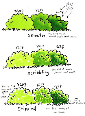
There are few main ways I do bushes, but the ways I'll cover today are Smooth, Scribbling, or Stippling. The main thing to keep in mind is that bushes are irregular. Individual leaves pick up the light from different directions, but if you try to carefully draw every single leaf on a bush you'll go insane. So my methods are for simple coloring that gives the illusion of complexity without the hard work.
Smooth
Color with your lightest color first. For smooth blends, layer your next color while the base is still wet, add your next darker color, color back over the edges with your light color, then add your darkest color, again going over the edges with your middle and light colors until the edges disappear. For crisp edges between color layers let each color dry completely and don't go back over the edges with a lighter color each time. Too bad this doesn't look very believable- it's just a smooth lump of green, not really a bush.
Scribble
Scribble the base color on, since the uneven coloring helps accent the roughness of leaves. Then layer on your midtone, again coloring unevenly, and last add your dark. How much or how little of each color is a matter of personal taste. I like this method because I can leave some spots of white- areas that act as natural highlights, and it's much quicker than smooth coloring.
Stippled
Dot on your lightest color, leaving lots of white, Add dots of your darker color, and finally finish up with your darkest color. If you are using a Ciao or Sketch marker this is the easiest technique, and you have two options. You can have either round dots by mushing your tip straight down, or you can have individual leaves by using the side of the brush marker.
Note: scribbled and stippled bushes will draw your eyes more than smooth bushes. Why? The crisper lines and bright white spots attract our attention more than a smoothly colored bush. So if you don't want the bushes to attract as much attention, leave less white areas and make sure the base color is more muted. Then the parts of your picture you care more about will stand out more. Remember also that our eyes are drawn to things with more contrast. If you don't want people to focus on your bushes then color them with less contrast.
Also, if you color something in front of these bushes that has super smooth, beautiful blends and then you have scribbled or stippled bushes in the background it will look strange. In this case you've lost your continuity. It's like the bushes were an afterthought.
Combo
Here I want the feel of individual leaves, but I want them to not stand out as much, so my first two color layers are smooth, then I dotted on the darkest green. Now you get the feel of individual leaves, but it has less sharp contrast than stippled by itself. This technique was very quick, it goes with more foreground elements than scribbled or stippled only, and is not as fake looking as smooth bushes.
Saturday, August 23, 2008
And the winner is....
Here is the winner for our blog candy, courtesy of Random.org
I love, love , love your markers! And also love the blog. I am still in the process of learning, but it has been so helpful. Keep up the great tutorials!
Cathy
And a special thanks to everyone for commenting. We really appreciate the comments and the chance to make better literature and website content. Have a great weekend!
Random Integer Generator
Here are your random numbers:
203
Timestamp: 2008-08-23 07:16:23 UTC
Way to go! there's something to be said for doing things at the last minute, so Cathy congrats on winning our blog candy. Her comment was:I love, love , love your markers! And also love the blog. I am still in the process of learning, but it has been so helpful. Keep up the great tutorials!
Cathy
And a special thanks to everyone for commenting. We really appreciate the comments and the chance to make better literature and website content. Have a great weekend!
Friday, August 22, 2008
Mermaid header, classes, etc.
I have a few things I want to cover today before the weekend. Monday I'll get back to posting more of the tutorials that you've come to expect. I was surprised that this wasn't auto posted, and then I noticed that I had it set for PM, not AM. Can you tell it's Friday?
New Blog Header
You may have noticed that I changed my header. I was kind of getting tired of the other one. After almost 3 months of blogging I felt it was time for a change. In a few weeks I'll get tired of this one, but for now you get a mermaid that I drew yesterday.
This was drawn with a 0.05 Gray Multiliner onto color laser copier paper and colored with BG10, BG13, BG18, BG72, BG75, G02, G21, YR00, YR65, Y11, C1, C3, C5, C7, E02, E04, V01, V04.
I made the watercolor/drip look to the background by soaking a small felt sponge in our blender solution and dabbed it on after the base colors had dried. This picture is rather large, so this is a good technique for making the streaks look less prominent. For this picture I did the background first because I knew that the dabbing technique would make a mess of any details I had colored on the mermaid's body. In real life, this is a much lighter picture. The turquoise doesn't match the green of my blog, but I didn't want to make the water too green, so I'll live with it.
Copic Prize drawing
At midnight tonite I will use the random number generator and come up with a winner for our Brochure drawing. Here is a photo of a happy person wearing this shirt at Anime Expo 2007 while watching our guest Japanese Artists.
Don't you want one of these cool shirts? You'll get other stuff too, but the shirt you can only win from us. Just leave a comment about our new brochure on the post last Thursday to get into the drawing. We really appreciate your comments- they help us help you better, so any complaints, anything you'd like to see more of, or just a good positive comment are all helpful.
Upcoming Copic Classes and demos
Art & Papercrafting
On Saturday Aug 30th I will be doing free demos at both Collage art store locations in Portland, OR. Come drop in and say hi! You can get more details by clicking on the events button on the sidebar.
Manga & Anime
If you want a chance to play with Copic products they will be at Anime Evolution this weekend in the Creation Station room. Labor Day weekend you can try coloring with our products at Kumoricon's fan art room.
Copic Certification- for teachers, store owners, or designers in papercrafting
I am accepting applications now for both Charleston SC, on October 1st. or Kansas City on the 9th or 10th. If you don't have an application yet, just e-mail me and I'll be happy to get one out to you.
SplitcoastStampers Gathering
The evening of Oct. 9th we will be having a FREE SCS gathering in the same hotel I'm doing certifications. You can get more details here. Just RSVP to SCS so we can get a headcount. I'll be there to answer questions and we'll have a card swap and you can donate cards to Service Members. It will be a blast!
Donate to a good Cause
I recently gained a new friend - the Pen Addict- and through his site I found a cause that we at Copic really relate to. How many of you have a desk full of perfectly good ballpoint pens that you never use? Now's your chance to donate those to people who can really use them.
Pens For Kids
African schoolchildren are desperate for pens to use in their schooling. You can help. Send your pens to the ambassadors at Pens For Kids. As you're getting your last-minute school supplies, think of how much an inexpensive package of ballpoint pens would help needy villagers gain an education. Money is also appreciated, since postage can be spendy. For more details visit their website.
Blog Award
My last point today, I promise. I hope that I've covered all the little things that pile up, since this is getting to be a long post. Remember to vote, and have a great weekend!
I got this award twice, from two wonderful stampers, so a big Thank you to Gina and Stamp Vamp who nominated me for this award. Now I get to pass on the favor to other blogs that I frequent.
The rules…
1. The winner can put the logo on their blog
2. Link the person you received your award from
3. Nominate at least 7 other blogs
4. Put links of those blogs on yours.
5. Leave a message on the blogs of those you’ve nominated.
So, to sum up a list of a few interesting blogs and bloggers (not all papercrafters), here goes:
1. Sharon Harnist, for excellent cards, clean explanations, and for putting up with my e-mails.
2. Lori Craig, because she's wonderful at helping me organize the KC get together.
3. Nina, Destempelolifant. from the Netherlands. I translate this one occasionally, but I like her look even if I can't read it.
4. The Pen Addict A new friend of mine. He likes pens, I like markers.
5. Patter, Triple the Scraps, she stamps and educates on childbirth- way to go!
6. Engrave, an Oregonian who does amazing engravings with lasers
7. Ria, she's another one from the Netherlands, follows my blog, and has a wonderful, whimsical coloring style.
New Blog Header
You may have noticed that I changed my header. I was kind of getting tired of the other one. After almost 3 months of blogging I felt it was time for a change. In a few weeks I'll get tired of this one, but for now you get a mermaid that I drew yesterday.
This was drawn with a 0.05 Gray Multiliner onto color laser copier paper and colored with BG10, BG13, BG18, BG72, BG75, G02, G21, YR00, YR65, Y11, C1, C3, C5, C7, E02, E04, V01, V04.
I made the watercolor/drip look to the background by soaking a small felt sponge in our blender solution and dabbed it on after the base colors had dried. This picture is rather large, so this is a good technique for making the streaks look less prominent. For this picture I did the background first because I knew that the dabbing technique would make a mess of any details I had colored on the mermaid's body. In real life, this is a much lighter picture. The turquoise doesn't match the green of my blog, but I didn't want to make the water too green, so I'll live with it.
Copic Prize drawing
At midnight tonite I will use the random number generator and come up with a winner for our Brochure drawing. Here is a photo of a happy person wearing this shirt at Anime Expo 2007 while watching our guest Japanese Artists.
Don't you want one of these cool shirts? You'll get other stuff too, but the shirt you can only win from us. Just leave a comment about our new brochure on the post last Thursday to get into the drawing. We really appreciate your comments- they help us help you better, so any complaints, anything you'd like to see more of, or just a good positive comment are all helpful.
Upcoming Copic Classes and demos
Art & Papercrafting
On Saturday Aug 30th I will be doing free demos at both Collage art store locations in Portland, OR. Come drop in and say hi! You can get more details by clicking on the events button on the sidebar.
Manga & Anime
If you want a chance to play with Copic products they will be at Anime Evolution this weekend in the Creation Station room. Labor Day weekend you can try coloring with our products at Kumoricon's fan art room.
Copic Certification- for teachers, store owners, or designers in papercrafting
I am accepting applications now for both Charleston SC, on October 1st. or Kansas City on the 9th or 10th. If you don't have an application yet, just e-mail me and I'll be happy to get one out to you.
SplitcoastStampers Gathering
The evening of Oct. 9th we will be having a FREE SCS gathering in the same hotel I'm doing certifications. You can get more details here. Just RSVP to SCS so we can get a headcount. I'll be there to answer questions and we'll have a card swap and you can donate cards to Service Members. It will be a blast!
Donate to a good Cause
I recently gained a new friend - the Pen Addict- and through his site I found a cause that we at Copic really relate to. How many of you have a desk full of perfectly good ballpoint pens that you never use? Now's your chance to donate those to people who can really use them.
Pens For Kids
African schoolchildren are desperate for pens to use in their schooling. You can help. Send your pens to the ambassadors at Pens For Kids. As you're getting your last-minute school supplies, think of how much an inexpensive package of ballpoint pens would help needy villagers gain an education. Money is also appreciated, since postage can be spendy. For more details visit their website.
Blog Award
My last point today, I promise. I hope that I've covered all the little things that pile up, since this is getting to be a long post. Remember to vote, and have a great weekend!
I got this award twice, from two wonderful stampers, so a big Thank you to Gina and Stamp Vamp who nominated me for this award. Now I get to pass on the favor to other blogs that I frequent.
The rules…
1. The winner can put the logo on their blog
2. Link the person you received your award from
3. Nominate at least 7 other blogs
4. Put links of those blogs on yours.
5. Leave a message on the blogs of those you’ve nominated.
So, to sum up a list of a few interesting blogs and bloggers (not all papercrafters), here goes:
1. Sharon Harnist, for excellent cards, clean explanations, and for putting up with my e-mails.
2. Lori Craig, because she's wonderful at helping me organize the KC get together.
3. Nina, Destempelolifant. from the Netherlands. I translate this one occasionally, but I like her look even if I can't read it.
4. The Pen Addict A new friend of mine. He likes pens, I like markers.
5. Patter, Triple the Scraps, she stamps and educates on childbirth- way to go!
6. Engrave, an Oregonian who does amazing engravings with lasers
7. Ria, she's another one from the Netherlands, follows my blog, and has a wonderful, whimsical coloring style.
Thursday, August 21, 2008
Shadows part 2 - Basic Shadow Guide
Tomorrow is your last day to leave a comment about our new brochure, so go back to last Thursday's post and tell us what you think! You'll win a t-shirt, plus some other fun Copic goodies, like a glitter pen, wide marker, and maybe something else...
Shadows Part 2, Basic Shadow Guide Today I want to continue a thought I started last week about shadows. Remember, these first few shadow posts will be fairly simple and get more complex as time goes by, so bear with me. Shadows follow some basic rules and I'm going to talk about those rules today.
Where are Shadows coming from?
For simplicity sake, we're going to have all our shadows come from the Sun. We know it is one light above us and shines down, leaving light and shadow in it's wake, but sometimes it can be pretty tricky looking at a flat picture and figuring out how to make it look dimensional using colors and shadows.
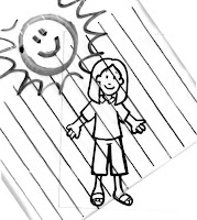
A simple technique that I use when teaching is to take a small piece of plastic (In this case I'm using a plastic sandwich bag ). This is going to be my "Sun" and it's rays of light. I draw parallel lines on the plastic with a dark marker close enough so that when I put it over my small images I can get a clear idea of where the sun's rays are striking the object.
I can choose a spot for the sun to shine from and by placing my rays of light over my image I can easily see where the light hits first (highlights) and where the light leaves the object or hits the ground (shadow areas). Since this is on plastic I can easily move it around and see where the most interesting shadows are, or where I would have the easiest time adding shadows.
To better understand shadows, keep these points in mind:
1. Shadows are not black. Shadows are a darker shade of the main color of the object/ground. Even when you are coloring something black, rarely do you color the shadows true black (to keep it simple I'm not getting into shadow colors beyond this in these first few posts- for now just stick to Cool Grays or the BV20's for your white ground shadows).
2. Shadows are darker and crisper closer to the object. This is because light bounces and reflects. When you are close to the object less light from around you is able to bounce in and make the shadow lighter, because the object blocks more of the reflecting light.
3. Shadows get lighter and softer around their edges as you get farther from the object. See point two. It gets lighter and softer because there is a lot more light reflecting around, confusing your edges.
4. Shadows mimic the shape of the object. We know an apple is round so it's shadow will be round, but since we're looking at it from the side that round shadow gets squished so it's an oval. From above it will look more true to life.
Think about standing in an empty parking lot as the sun is setting and your shadow stretches impossibly long behind you. Perspective and where the light is coming from make a difference into how the shadow is distorted, but usually it is an outline of the object.
5. Shadows from the Sun can't be wider than an object, just longer. See point 4. If you have a single light in your room and you look at the shadow your hand makes close to a table you will see how crisp the edges are and how dark the shadow is. Now, slowly lift up your arm closer to the light. Your shadow gets softer, lighter, and wider. For this to work from the Sun, you'd have to be pretty close to the sun. At that point I'm sure you'd burn up.
Now that we have the rules down, let's begin coloring. Choose an object to color that is round and one solid color for now (a ball, an egg, etc). You'll need 3 shades of a color for the object and a ground shadow color or two.
How do I choose a place for the sun to shine?
If you remember from my earlier posts on contrast, pictures are more interesting when they have more contrast. Wherever you choose to have the sun shine from, use this as a guide for your high-contrast artwork. To start, choose an easy angle, where the sun is pretty high in the sky.
Coloring Rounded shapes
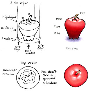
For this first example we're going to look at an apple with the sun shining straight from above. Your highlights are the first spot sun hits, or the very top of the apple. Your midtones are the middle colors, in this case the middle red of the apple. Your shadows are going to be the darkest areas.
Look at how we can tell that the top of the apple has ridges because of how the light hits those spots first. It then fades from there down to the deepest shadows at the base of the apple. The shadow on the ground is the same way. It is lightest on the edges where the Sun still can reach it, then fades into deeper shadow immediately under the apple. From above you can't see the shadow on the ground- the apple is blocking the shadow.
Pictures get more interesting when their light source is off to one side a little. This makes the shadows more exciting, but it can also get tricky to color.
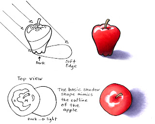
Take this second apple image. The shadow is now off to the side because the sun is shining off-center. See how the rays of light from the top edge of the apple have farther to go to reach the ground? This makes that far edge much softer and lighter than the shadow closer to the apple.
From above, the apple looks a lot more exciting. Now we can tell that it is an apple, not just a lumpy circle. The shadow shape looks more like an apple as seen from the side (see how it tapers). If the sun were even lower in the sky the shadows would get longer and the apple shape would get s t r e t c h e d.
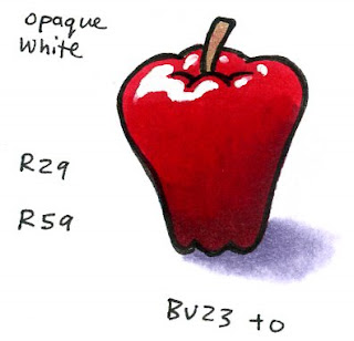
For both of these colored examples I used 3 colors on the apple, another color for the stem, and a ground color faded with the blender. I used the marker on paper blending technique. I used the sequence R22 -R29-R59 because it had much more contrast than if I just used R22 -R24-R29 (remember, more contrast is more interesting). Later I'll explain adding contrast and picking shadows that go across Natural blending groups.
For my final apple: the highlights were very tricky to leave white, so I cut out the lightest red, added Opaque white for crisp highlights, and softened the shadow sooner since it looks OK without being so long. Now my apple looks shiny, ripe, and cleanly lit with simple but interesting shadows.
Images: Drawn with a 0.5 multiliner onto color laser copier paper.
Wednesday, August 20, 2008
FAQ-How long can I re-work Copics?
Yesterday somebody brought up a good point. I mentioned that I can go back and re-work my drawing, making it darker, blending colors around etc. after I'm done. But how long can I do this?
Q. I was working on a picture last week and I want to come back and finish it. Is it too late to blend the colors I've already put down?
A. NO Problem! On almost any paper, on plastic, on fabric, on most things that I've experimented with you can come in at ANY TIME and keep blending, working colors together, and getting more effects. (note: Alcohol marker papers are less forgiving even when you're working right away, so don't expect too much out of them.)
Anything with alcohol will react with the markers no matter how long it's been.
I went looking for the oldest piece of Copic colored artwork I could find that I was willing to re-color. I found these parts of a cut-paper animation I did for a class back in 2001. Looking at them now I see how I want to change or blend the colors a bit more. I have no idea what paper I used or what my original colors were, I just know that I inked these with a multiliner onto some kind of cardstock (probably index cards from the animation studio). So 7 years this artwork has been sitting, untouched.
Smooth Blends on old artwork
For smooth blends, the trick to coming back and coloring an area that you were working on earlier is to re-wet it cleanly and evenly. Remember, any time you have a dry edge you will get a line or streak.
Here I want to change the colors of the rocks. I can make them lighter with the colorless blender or I can darken them up. The rocks are pretty light to start, so I'll mostly be darkening them up. These are smooth, underwater rocks so whatever I do, I don't want to add streaks back in.
I can tell these are warm gray, maybe with a hint of E31. I want the front rock's highlights lighter, the shadows darker, and the blends smoother. First, I feathered in E43 to darken my shadows. Next I'm going back with the blender from the middle of the rock and evenly pushing that color out to the edges by throughly soaking it. This is moving old and new particles of marker dye. In this case, I'm leaving ridges of color to define edges on the rock Now it's smooth and has more contrast.
Rocks: E43, 0, W5
Here is the final rock formation. look at how much more exciting it is because I added more contrast, and you can tell easier which rocks are in front and which ones are in back.
The biggest trick is to color in small circles, really soaking your paper, but follow the natural lumps of the shape. That way, if you do make streaky mistakes on a large area like this people won't notice as much (Actually, I didn't do anything different in my techniques for coloring these old rocks than I usually would when starting from scratch).
Touching Up Old Artwork
I'm sure each of you has looked at artwork from the first time you colored with copics and compared it to things you've colored more recently and wished you could go back and get rid of streaks, bad blends, etc.
You can't see it too well, but the original fish was not colored very evenly. This was before I had figured out how much to soak the paper, how to color in circles, and how to smoothly blend, so if you look close you can see streaks in the main body, and the back side of the paper is still mostly white. I want to get rid of those streaks and make the whole fish look more exciting.
Trouble is, I don't know what colors I used originally, and if I go back over the fish with my blender it will smooth those lines together, but it will also fade it to white. This is where I guess. The fish is a pale but bright pinkish/purple, maybe an RV11 layered with a V04 (I'm guessing). I'm going to find another pale purple, in this case I have V01 and I'm going to slowly and evenly go over the whole body of the fish. Look at how my colors smoothed together on a 7 year old drawing. This darkened it, softened all details, and got rid of the streaks. The backside also look much smoother now.
For the finished fish I added more shadows, highlights and details back in. I don't know if you can see or not, but I also had accidentally gone into the eye on the original work. A little blender cleaned that right up and I also added lighter scales with the blender.
Notice the hints of yellow in the original fins? I wanted the new fins to fade from the pink/purple to yellow. For the yellow to show up I need to push all that pink/purple dye out of the way. Here I used my blender to push away the darker color, then I added back the bright yellow. Now my fish is much more exciting and much better colored.
Fish: Y02, V01, V06, R85, 0
The final verdict is, old or new, you can always move the ink around that's on your paper. I treated the base color as if I'd colored it a few minutes earlier and it reacted exactly how I expected it would fresh, not seven years old. (to see a badly dubbed copy of the original animation I made from this artwork you can visit it here. Look close for the pink fish and the rocks).
Classes, etc.
For those of you who are trying to get into my Kansas City and Charleston classes I am now accepting applications. These classes are open until full, so first come, first serve on spaces. Also, If you haven't yet, post a comment on last Thursday's post for your chance to win. Thanks for your feedback!
Tuesday, August 19, 2008
Color Spotlight: Y17
I've been meaning to do another color spotlight for a while and only now am I getting around to it. Please note: When I mention a color combo whatever color I put first is the color I put down as my base color, then I blend in the second color. So Y17 + E25, the E255 was layered over the Y17. Also, these colors on the screen are NOT accurate and are for comparison only.
Y17, Golden Yellow
Story behind Y17: This was among the first colors Japan created over 20 years ago. This is a very bright Yellow, hovering on orange. Because the yellows are so bright, there is very little color difference in this blending family, especially as you get darker. Y17 has a touch more orange to it than Y18 or Y19 in my opinion. To get a good shadow for Y17 you would have to jump to another blending group within the Y's (Y28 or Y38) or into another color family- YR or E
Available in these styles: Copic, Sketch, Ciao, Wide
Natural Blend family:
Y11, Y13, Y15, Y17, Y18, Y19
Simple Blend: Highlight Y15 Midtone Y17 Shadow Y19
Similar colors, other families: B16, R17, V17, E17, BV17, G17, YR16
Marianne’s Unusual Combos: Y17 + E25, Y17+ YG25, YG21 + Y17
Advanced Color Rules for Y17*:
Complimentary: Y17/V09
Triad (simple 3 color combo): Y17, B05, RV29
Tetrad (simple 4 color combo): Y17, BG18, V09, YR09
Pentagram (simple 5 color combo):
Y17, G19, B79, RV29, YR09
High Contrast: Y17, YR16, B37, B06, R89, R29
Compound: Y17, E37, E59, V06, R39, V09
*Advanced color rules are generated by Adobe Illustrator CS3 based on the digital representation of the Copic Color Spectrum set into a special color wheel. I generate these as suggestions for color combos to try when you are looking for a nice change, or you have a paper that matches this particular color and you want help picking other unusual colors to go with it.
The project I made for Y17: Summer Sunflowers
I had been waiting to spotlight this color until my sunflowers were in bloom, because that is the flower that instantly comes to mind when I think of Golden Yellow. Here I'm showing the original photo I based my drawing from, and then my artistic interpretation of it with the color Y17.
The evening I took this photo the sun was just about to go down, and the next few photos got dark quickly, so I am showing my drawing with a darker sky than the photo. I also drew the outlines very loose, so my coloring style is loose as well. Notice how things close up have more vibrant colors, while things off in the distance have less contrast, less detail, and muted colors. I chose to make the foliage and blossoms brighter than real life. Looking at it now, I think it still needs deeper shadows for more contrast. Good thing I can always go back into my picture and blend more colors, even if it's been sitting for a week.
Drawn with a Multiliner 0.05 on Color Laser Copier paper
Colors used: Y11, Y13, Y17, YR16, YG00, YG41, YG67
G14, G17, G28, G85, BG10, B04, B24, E35, E57, E59, 0, W3, W5
Monday, August 18, 2008
Coloring on Plastic
For those of you who haven't commented yet on the new Brochure, don't forget to leave your thoughts on Thursday's post last week for your chance to win. Also, a reminder to people who are applying for the Kansas City or Charleston, SC Certification classes, your applications will be accepted starting on Wed. so get those ready to e-mail back to me. Don't have an application? e-mail me.
I was about to work on a project and I realized that you might like to see a simple altered art application for Copics. All Copic markers (not multiliners) are filled with permanent alcohol inks, and alcohol inks are great because they work on so many different surfaces.
Altering Clear Acrylic Sheets
Copic Markers and inks are permanent on plastic. This is great for those of you who want to do something on clear acrylic pieces. Ellen Hutson recently posted a technique for piercing plastic which reminded me that I had this project I've wanted to make for at least a month. Ellen didn't alter her album with Copic inks though, but she suggested using alcohol inks for a nice effect.
Just a few of the great things about working directly with Copic inks onto surfaces other than paper:
1. Non Toxic. I can spritz our blender solution onto my work and it's not harmful to my lungs
2. 322 colors. Not enough colors? you can mix your own as well.
3. Dropper built into each bottle. This makes it easy to drip inks in a controlled manner.
4. You can refill your marker with the same ink.
5. Works on many surfaces. I've altered wood, leather, metal, plastic, wigs, feathers, fabric, silk scarves, and oh so much more.
I picked up this fun clear letter album set from Clear Scraps. I want this simple album to be a sticker book for my son, so I'm not addding too many embellishments, just colors and distressing so he can fill it with stickers he gets this year in Kindergarten.
To make his name I colored only the backside of the plastic pieces. Although you can't see it, I roughed up the edges on each letter with sandpaper just before coloring it to give it a bit of texture up close. Then, I scribbled with markers or dripped inks directly onto the surface. I let it dry and put it all together. Very simple and fun.
The nice thing about working on plastic is that if you make a mistake, you can clean it completely with rubbing alcohol or hand sanitizer. In some spots where I got the ink too dark I dabbed or dripped blender solution on and gently removed color.
When you are coloring with the markers directly on the plastic the marker will streak, so work quickly and don't layer too much ink if you want it smooth.
Let your work dry completely. Although thin layers of ink are dry after a minute or so, dense areas need to dry longer. Watch out for really dense ink spots, they may get sticky and not dry completely on surfaces like this. If you get an area that is too dark you can dampen a paper towel with blender or alcohol and dab it off.
Dark colors will show up much better than light colors on glossy surfaces. This is especially true if you are coloring directly with the markers and not dripping inks on.
If you want really smooth, even coverage over plastics or odd surfaces you can always airbrush them. Sometime I'm planning on sharing more about this, for those directions you can go to our Library and download the Airbrushing brochure.
Another fun way of working with the inks is to drip on hand sanitizer. This has a slower drying time and you can smear the inks around like fingerpaints for some neat effects.
Here is my son's fun, finished album. It took me maybe 20 minutes to make and he'll have a great time putting stickers on it this year. (Sorry, I didn't write down what colors I used, since I scribbled and dripped a bunch from each color family).