Note: For those of you who find these first few shadow posts a little too basic, please bear with me. I have people of all age groups and skill levels who are following this blog and I have to make sure we are all starting from the same place.
 Why Shadows?
When we color there are many options available, from choosing mediums, colors, and choosing a coloring style. Many people who love the look of Copic markers like them because of their blending capabilities. You can get a smooth gradient from light to dark, and your shadows and shading look more natural because of it.
 When I speak of shadows, I am speaking of one of many techniques in coloring that make an object look like it has dimension. Shadows are a way of visually cluing our audience in that something is not flat on the surface of your paper, or that it has volume and weight.
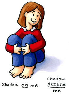
First, there are two places you can put a shadow, either ON an object or AROUND an object. While the two go together, I want to touch today on two basic styles of shadows AROUND an object.
Shadows Around an Object
I've noticed that people who draw/color tend to put colors around their objects in two basic ways and they call both ways a shadow. This is slightly misleading however, since shadow and shading are not the same thing:
1. Outlining Shadow
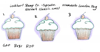
Going completely around the shape with a color. This makes the image pop from the paper, as if it is floating in space. Some styles include:
Simple Outline- One solid line of color all the way around an object (1)
Large Outline- Blocks of color around an object that are larger than one line, crisp edges (2)
Feathered Outline- Larger area of color that fades out (the Copic airbrush system is perfect for making this kind of shadow) (3)
 Graphic elements or stand-alone objects can use Outline shadows. Things that are not attached to the ground and would look strange with a ground shadow (a butterfly or a single unattached blossom) where you are trying to show to your viewer that your object is not on the flat paper, but above it, without physically cutting around your shape and gluing it so it sticks up.
I don't really consider any of these outlines a shadow in the traditional sense, since a shadow would imply 1. a single light source, darker on one side and lighter on the other and 2. how the object blocks light thereby casting a shadow. An outline IS a way of adding color around an image to make it pop up from the visual surface of your paper, however with these examples you are shading the paper, not adding shadows.
2. Ground shadow
Having a shadow that matches one edge of an object and shows where light is coming from. This gives the object a ground plane to rest on. Realistic coloring usually has Ground shadows- things that we feel have weight (a flower in a pot or me sitting on the ground). These can range form simple to complex, feathered or crisp edges, fading or solid, and so much more which we'll eventually get into.
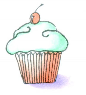
 Notice on this cupcake how I colored it with shadows that match the direction of the ground shadow- lighter on one side, darker on the other. The way I colored it makes us think it has dimension.
Note in this case the base of the cupcake is straight across and looks strange, whereas a real cupcake we would expect to curve towards us to have a shadow shaped like I colored it. On the examples for the outline shadows I don't have to worry about a light source, and the flat bottom on the cupcake doesn't stand out as much (with a flat bottom you can put this cupcake on a table, then you wouldn't see it's shadow).
I happened to color these examples with Copics, though the things we talk about can be applied to any medium. When you are coloring and adding shadows, before you choose a color you need to decide which type of shadow will suit your image best- this is important once we start looking at light sources and how shadows work with each other. Decide whether you'll want the image to "float" above the surface of the page or you want it to be part of the ground in the picture.

Great tutorial, thank you!!!
ReplyDeleteThank you for considering those of us who aren't as "advanced" as others when it comes to even the basics. =)
ReplyDeleteGreat post!
ANOTHER GREAT POST!
ReplyDeleteIs that really a sketch of YOU?? If so, you are cute, but have really big feet and are missing some fingers! HA HA HA!!!!!!!!!!!!
Thanks, Marianne!
Yeah, I have got to work on this. Got a problem with shadows :-(. Thanks so much.
ReplyDeleteI have had my copics long begore they became "hot stuff" in the card making world, and I must say that each day I use them more and more; mainly due to these tutorials that you are doing. I thank you for taking the time to do this, and making it so easy to learn.
ReplyDeleteThis is great. I just never know what shape to make the shadow and how big to make it.... But love the info you shared today!
ReplyDeleteThank you -- most helpful!!! I always do #1 - outline shadow - because it is the only thing I feel comfortable doing, and I do like the way it makes an image POP. Reading it here, tells me I'm doing something right -- LOL!!! And if I read your blog enough times over -- maybe I can progress a bit further -- LOL!!! Regardless of my level, I am really enjoying my Copics and having fun with them and, to me, that's what is important!!! The rest will come in time!!! I was in your class in Chicago and enjoyed meeting you!!! Thank you so much!!! I'll keep checking in!!!
ReplyDeleteBrochure colorful info and some commuter time in carpool: what a practiced experience. Thanks for hints and tips from brochure. Names of colors and their tag end numbers would be helpful within your online color chart. Some posts issue color number and others refer to your products by tag end color name so both next to the sample color would be helpful. Appreciate the user friendly brochure.
ReplyDeleteLove those color choices! providing endless shadow and rich shading. Brochure gives me reason to read often and practice while commuting.
ReplyDeleteAh, carpooling with Copics.
MT23stamper
I only recently found your blog. I have had such a hard coloring in stamped objects that I gave up. . . but now with your wonderful tutorials/instructions I can dust off my 'outline stamps'. Thank you so much for remembering those of us who don't have a natural talent, and have to 'work' at it and learn. You break it down into the basics. . . again, thank you.
ReplyDelete