 Once your Airbrush system is properly working we can now refine your airbrushing technique. Today I'll show some of the basic spray patterns and some tips for how you can get even spray patterns on your projects.
 Consistent Airbrush Spray Patterns
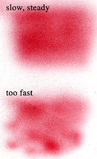
The first technique you want to master is a smooth, even background. If you look at these two spray patterns you'll see the top one is nice and even, while the bottom one is blotchy. If you want a nice even spray then you need to
 1. Work Slow from a middle distance. When you go slow it's easier to see where you're spraying. Also, working slow and steady is easier on the marker. You don't have to push the trigger all the way down to get a nice, smooth spray.
2. Sweeping hand motions side to side are easiest. Try not to go back and forth part-way across your area or in circles- this will make your surface blotchy. Up and down doesn't feel as natural for me, so it's harder to be consistent.
3. Start light. You can always go darker, but it's easier to be light than dark.
4. Make a test spray of each color before trying to make a smooth background. this helps you figure out if that color is spraying consistently or is too low on ink to spray well (see troubleshooting for more help). Remember also that most colors will look different when airbrushed than they do directly on the paper,
 As you practice, always work over scratch paper to protect your surface from overspray. Until you get the hang of exactly where your spray is going it's easy to accidentally spray your table, your nice project, or even your friend sitting next to you.
Distance and Pressure Differences
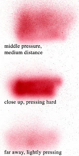
Once you master smooth, consistent strokes now you can try holding the marker different distances away from the paper and giving it different pressures (when I'm talking about pressure I am NOT talking about the settings on your compressor, rather I am talking about how hard or how soft you press on the trigger). You'll have to go back a couple posts to see the difference between the Sketch brush and these chisel spray patterns. Today I'm using the chisel nib from a Copic R59.
Most of the time I'm airbrushing subtle backgrounds. I tend to go for a far-away spray lightly pressing. Especially since I can always come back in and go darker later. It's easier to layer multiple colors when you are pressing lightly and are covering a larger area at a time.
Compare how dark the spray is when you are close and pushing hard to the other spray patterns. It almost looks like a totally different color because it is so intense. I try to avoid spraying this densely because there are so many dye particles sitting on top of the paper that your project will feel slightly sticky, especially on glossy surfaces. It's better to go lightly with a dark color than darkly with a light color.
 Feathered spray from dark to light
The last technique you should practice is feathering your spray. There are two methods of doing this that most people use.
1. Layer a bunch of light coats to make one side darker. I do this when I'm darkening the edges of an airbrushed area on a small piece of paper. I color the whole background evenly but lightly, then I add one or two more light layers over the edges making those darker. This is how I did the blue on the final project today.
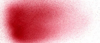
2. Apply more pressure at the beginning of a stroke and lift up at the end. Keep your arm in one place but tilt your hand so you are also lifting up at the end of the spray. This takes more practice, but it's how I achieved the nice spray pattern shown.
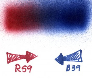
 If you want two colors to blend into each other the easiest way is to feather each color into the other color. If you look at my example, I started with the red and left the trailing edge light, then I came back in with the blue from the opposite direction and trailed it into the red.
My final project today is this lovely stamp by Gina K. I started by airbrushing the blue sky (BG01) and I feathered it in as I got closer to the leaves. Then I sprayed close up but lightly Y08, YR16 and E34 to get the soft colored areas without masking. Finally I added a few accent speckles with the brush end of an R89 Sketch marker. Again, no masking but the project looks very nice and interesting, though the colors are better in real life than my scanner shows them to be. One bonus of airbrushing over a stamped image is that the airbrushed ink is dry almost instantly so you can use almost any stamp ink and any paper and the markers won't ruin your lines.


Very good tips there Marianne! Thanks for showing all the different takes!
ReplyDeleteYou really should publish a book!! I'm not kidding. Your attention to every detail is much appreciated. This airbrush seminar is very lucid and very enabling. I was afraid to try it, but now I'm inspired to jump in. Thank you.
ReplyDelete