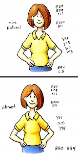
 Today I'm adding more to our ongoing discussion about the nature of shadows. To see all parts so far, just click on the "shadows" label at the end of this post. If you didn't read yesterday's post or follow the link to the Gamblin Oil Paints video I really strongly recommend you do so now. I know color theory seems like kind of a drag, but it will help your artwork look better.
Yesterday when I talked about the tone of shadows, I want you to know, there is no right or wrong answer- either shadow works. Art is a matter of personal taste, so if it looks right to you then it's right. If you want to make things that "look right" all the time then go into math :)
About Shadows...
True shadows are about two shades darker of the base color. They are not black- you can still see the color underneath.
However, true shadows also add a hint of gray. Color is how much light is reflected back to the eye, so if some of that light is blocked by a shadow then the color must not be as vibrant.
This expands upon the Natural blending families rule (more so in some color families than others) but it is not quite as straight forward as following a sequence of numbers to do your shadows. Now you're thinking, why did you go through all that effort to teach us to pick markers in groups when we are now going to break those rules??
Look at the series Y11, Y13, Y15, Y17, Y19. All of these are super vibrant yellows. Yes you could color a shirt that would look shaded with these yellows but the difference in a Natural Blending group is the density of dye. Y11 has fewer yellow particles than Y15, and Y15 has fewer than Y19. For most blending groups it's a matter of dye density when you go from digit to digit (this is why you can usually layer a color twice to get it one shade darker)
In real life though, if I were wearing a yellow shirt and you were adding shadows you would be adding gray and denser dye particles. So, you can add believable shadows in a few ways:
 1. Layer on a gray that would go with that color family. In this case Y11 could be shadowed with W's or T's, since all three families are warmish. Keep the last digits the same for light colors or 1-2 shades darker. Test layering the next yellow in the sequence only, layering a gray only, and then layering both for shadows. Which do you think looks better? Remember, it's YOUR artwork, so if you like the look then it works (there are no absolutes with art). By adding gray (W3) and some denser yellow particles from the same family (Y15) it looks more natural.
2. Add gray by moving deeper into the Copic color wheel (the deeper in, the more it gets gray). The next family in is the Y20's, a slightly more muted yellow family. Try layering Y23 or Y28 over your Y11. Now how does it look? For this I added the denser bright yellow (Y15), and then jumped to deep shadows from the next blending group (y28). See how much more vibrant the shadows are? This is because there are so many more yellow particles we add when going with this technique but our gray shift is subtle (from the 10's to the 20's).
My picture is still shadowed more than if I had stayed in the same blending group, but it looks more vibrant than just adding grays. Is is realistic? Not necessarily, since the shadows on a true pale yellow shirt wouldn't add this much orange, but it still looks good in my opinion. If you have enough colors try this on some of your own images. Stick to the same blending group for shadows on one, add shadows with grays to your second picture, then add shadows by jumping to the next blending group on yor third picture. (If you remember my earlier drawings of myself you'll see I look different. This is because I've had a haircut and I've been slowly loosing the baby fat I gained from my last pregnancy. I still haven't grown more fingers though :)
 Color Spotlight: Yellows
Yellow is an interesting color in the Copic color world. See on the color wheel how there are no Y90's? The last family is Y30's, and those start moving toward orange. That's because Yellows, as they get more gray quickly turn into brownish colors. Add a hint of red and you're really turning brown or orange. So Y20's are shadows of Y10's, but Y30's are more neutral but they are also the blending group that would pull you into the next color family- YR. When you get into the darker YR's you then get closer to red. (YR07 or 09 and R08 are really close colors). Then you could jump into my post with a color spotlight on YR's.
When I talk about Natural blending families and how they get darker as you go in, 80% of the time this is true (blues, BV's, G's, and BG's are pretty good about following the rules). Some color families don't play by the rules because this is a flat chart for a 3 dimensional concept as I mentioned yesterday and the color wheel pulls you into the next color group as you change blending groups (this is the case on the first families in red, oranges, and yellows- the color wheel pulls Y's into the YR's into the early R's. E's (earth colors) really don't follow the rules because it's easy to take any R, YR, or Y and turn it into browns).
 Shadowing with colors beyond the basics
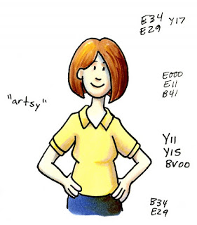
In talking about layering gray over a color to make the shadows more believable, you can add lots of colors to create your shadow that would add denser particles and gray. After watching the color video, what is something you could add to yellow that would cancel it out or make it gray? On a color wheel, that would be the color's opposite or purple.
 Many times in fine art you'll see pictures where the shadows have a life of their own, particularly in portraits. This is because the artist is shading their light yellow/peach skin colors with shadows of blue or purple to give the feel of gray without dulling down the vibrancy of their work by just adding neutral grays.
Also, remember that blues and purples are cool colors and shadows tend to be cooler areas on a picture. Here is the final illustration of me, where I used purple as my shadow color and blue to add some extra shadows on my skin. Note that I'm using very pale blues and purples. This allows the yellow to underlay the blue/purple tone and still be visible.
Image: Drawn with a 0.5mm Black Multiliner SP onto color laser copier paper.

Thank you for the shadowing tutorials. Color theory is complicated, and I always do best when I can see what you are talking about! These posts are always sooo helpful!
ReplyDeleteps - I didn't notice any baby fat when you were in Charleston.
I love your tutorials, too. I have been printing every one and studying. I bought a ton of copic markers, and am ready to go! Please host a workshop in Charlotte, NC sometime...I would LOVE to come! Your biggest fan...
ReplyDeleteMath, huh? Maybe that is why I said what I did yesterday......I am heavy on the math with a Math teacher dad! HA! I need to let go and try lots of different color combos! I liked learning about the opposite colors of the wheel being used as shadows....makes a lot of sense.
ReplyDeletei like how you can teach people! https://eliteessaywriters.com/review/speedypaper-com/
ReplyDelete