I think my head is finally getting back in the swing of things after the frantic days of CHA. Here is a quick, very simple tutorial. A couple months ago I showed how to color something to make it look like wood, here I am coloring on wood to make it look like wood. Since Copic markers are alcohol based, they work on many surfaces that water-based would not look as clean on.
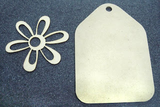
Wood tag project
Large wood tag by Kaiser crafts: E33 Wide, E55, E44. I started by coloring the background with my wide E33.
I was streaky because I wanted it to look like wood grain. Then I added some streaks of E55 and last, some darker tones with E44. I was careful to keep all my streaks in the same direction, but also uneven (Look at my post on coloring wood for a stepped-out diagram of how to color wooden-looking things).
Note that I used a little less of each darker tone, so that the overall effect is one of wood. You should test your browns since each blending family will feel a little different, but they don't always follow the rule of thumb about adding grays as you jump from one family to the next (like from the 40's to the 50's). In this case, the E44 has more gray than the E55, so it seems darker on the project. By adding E44 last it kept the edges on those thin streaks crisp. If I added the dark first it would soften my crisp lines when I added the lighter colors. I darkened the edge of the whole piece with the E44 so it matched the flower better.
Wood Flower by Kaiser crafts: B34, V06. Since this wasn't made of bits of ground-up wood like the tag it absorbed the color different. The marker dyes flowed more with the grain of the wood, while the other piece stayed fairly crisp and clean.
Chipboard Letter, K & Co: Colored with V06, RV29. This started out a light blue, so all I needed to do was add purple to get it to match the flower, then I had to tone the purple more pink with an RV29. I wiped off dense color with a wadded tissue soaked in blender.
Colors change on different Surfaces
People are always asking me to match Copic colors to specific things, papers, inks etc. I must say that this is very difficult, even under the best of circumstances. Anything you color on will pick up color in a unique way.
On this project, the little chipboard letter picked up color very differently than the Wood flower. I used the same purple on the letter that I did on the flower. Not the same looking though! I had to dab in a bit of RV29 to tone the purple so it was more pink/purple like the wood showed, since the glossy paper of the letter and the absorbent wood flower take in color in different ways.
Real wood versus fibers will also pick up the dyes differently. My purple is stronger on the flower than it would be on the other piece of wood. It really depends on what each item is made from.
When you make a personal color chart, use the paper YOU use most often. If you print it out on a different paper some colors may not look the same, especially on thicker cardstocks. Keep this in mind when matching colors across media as well. You won't get it exact without some trial and error.
My final background paper layer is some tracing vellum that I wrinkled up and colored with the bue and purple markers again to get a spotty, grunged-up look that is more see-through in real-life. The big green glass bead is one that I stole from a vase here in my office. I thought it nicely added to the piece. I haven't glued the whole thing in place yet, since I'm still debating wether to add more bling or not. One part of me says "leave good enough alone" the other half of me says "go for it! add more stuff!" we'll see which wins out. Have a great weekend!
Friday, January 30, 2009
Tuesday, January 27, 2009
CHA 2009
I'm still here, and I promised to post photos from CHA. In addition to photos, I have a rare treat- a short tutorial video taken in the Copic booth of me coloring a stamp by Our Craft Lounge on Monday by the great folks over at the Pink Donut. Go click on the video on their page and leave a comment or click through to You Tube. Meanwhile, here is a good picture of half the Copic Papercrafting Design team. From left: Sharon Harnist, Debbie Olson, Me, Sherrie Siemens, and Trudee Sauer.
Here is a great photo of Trudee in the booth happily coloring. Sherrie, Sally Lynn, and Trudee all have done a fabulous job coloring and chatting in the booth this year. Life is hard when you have to color all day! You can see in the background the big, colorful signs in our booth. Behind Trudee, on the right is our new glitter display. On the left is our graphic designer, Courtney, coloring and drawing at our doodle table.
Last, here is a quick photo of Cambria Turnbow and the great wall of stamps at Our Craft Lounge. It was a cute booth and totally full of fun, neat stuff. I need to get some sleep, so enjoy the photos and I'll try to take some more before I finish. Have a great week!
Sunday, January 25, 2009
Doodling with the Super Brush - Blob Fish
Time for another doodle! Although I'm busy here at CHA, and we had a wonderful first day and two great certification classes, I figured now is a good time to show another quick and easy doodle with the Super brush end of a Ciao or Sketch marker. This doodle is one of my favorites because it is so versatile and easy. If you liked the blob duck, then you'll love the blob fish.
Blob Fish
This is a super-easy doodle that I know anyone can make. Pick a good fishy color, here I'm using BG32, but it really doesn't matter. You'll also need a multiliner or some other outlining device. I'm using black because it has the best contrast, but you can also pick a colored multiliner that is darker than the marker color you use inside the fish. So if your fish is light blue, outline it with a Cobalt multiliner.
Rounded Fin Fish
1. Draw a blob/circle.
2. Touch the side of your super brush to the top and bottom of the fish to make fins.(Turn your paper, not your hands to get the right angle on your fins).
3. Add the tail in the same direction
4. Outline the body and fins.
5. Add final details, like eye, mouth, gills
See how easy that was! Here is another variation:
Pointy Fin Fish
All I changed was the direction I pointed my brush and the shape of the body blob. Now you can doodle up a whole ocean of cute fish.
Again, you will find it much easier to turn your paper than to turn your wrist to match the direction you want the fins.
Variations
The level of detail you add with the multiliner is entirely up to you. If you don't like the gills, then don't add them. You may prefer having a line drawn between the body and tail of the fish. These are your doodles.
Try using multiple colors, have the fins a different color than the body. Try adding lips or stripes or bubbles. Make a whole school of fish for a background, or a single fish for a pool party. The best thing about making the fish yourself is that they will coordinate perfectly with whatever else you color on that page.
These blob critters I have shown you are great projects that you can have a little one help you with. If you don't want kids using your markers, try this same thing with a set of watercolors. It's the outline that really makes the colored area pop off the page, so after they paint their blob go around the outlines with a nice pen (watercolors won't mess up a multiliner).
Here is my final little school of fish, ready to chomp the poor worm. It's super cute and super simple. I hope I've inspired you to doodle a little something for yourself.
Have a wonderful day and I'll try to post photos of CHA later. Some of you have stopped by and figured out what I was getting at in my obscure post about chocolate. Some of you have guessed, and for those of you who haven't wellllll....
We have new atyou Spica Glitter pen colors! There are 11 new colors and Chocolate happens to be one of them. I really will take some photos of the new colors sometime soon, promise! Otherwise, you'll have to stop by the booth to see the other new colors.
Wednesday, January 21, 2009
CHA 2009
Tomorrow I take off for sunny California and CHA. If you're coming, you can find us at the show in Booth 4147. Come and meet the fabulous Trudee Sauer and Sherrie Siemens demoing in our booth most days, then on Monday Sally Lynn MacDonald will be visiting us and on Wednesday you can meet Michelle White from Paper Tales down in sunny San Diego.
As a bit of a sneak peek I want to share a new release you'll be able to see in our booth. I'll give you some big hints, but let me just say that we are all eagerly awaiting some yummy things to try at CHA. I won't spill the beans entirely, but here is a quick card I made with our new goodies. If you can't guess then you'll just have to wait for me to tell you in a few days what is in store.
Here is my quick final project. I used a wide E33 marker to scribble the background paper then used an E31 to tone the white areas to a nice, soft brown. This took all of about 15 seconds to make! Then, I colored the plain white ribbon with E57. I love how easy it is to get my ribbon to perfectly match whatever I'm working on with just a quick swipe. The added stiffness from the dye makes my bows so crisp and clean as well.
I chose these colors to match my new secret. Then I drew the chocolates and sentiment with a 0.03 multiliner and colored them in with E33, E57 and B21, each color picked to match our new secret, which worked perfectly when added over the top. Last, I popped up the main artwork with dimensional tape. I hope you enjoy!
We'll be looking forward to seeing everyone at CHA, and for those of you who can't come, I'll really try to post some photos of the booth, so stay tuned.
For those of you who are waiting to get into the Certification classes being held in the next few months, please be patient. As we get details hammered out we will e-mail you the applications and class specs. Meanwhile, have a great week and be looking for some great papercrafting previews from Copic!
Tuesday, January 20, 2009
Oregon Asian Celebration 2009
Oregon Asian Celebration, Feb. 14 & 15 2009
I want to announce an event for those of you who are local. Each February in Eugene is the Oregon Asian Celebration (their website is not up yet, but look for it soon at www.asiancelebration.org/ ).
This year, the Asian Celebration theme is "Heart of Asia" and will be held the weekend of Feb. 14th and 15th at the Lane County Fairgrounds. Look for presentations from Asian Wedding dresses, martial arts, and wonderful food, dancing, and demonstrations of brush painting. There will events with Kumoricon, the Portland Anime festival, and we at Copic host a table in the Youth Room where kids can come in and color Manga illustrations with Copic markers. It is always a blast, so I strongly encourage you to go and experience the celebration if you haven't before. (Illustration I made for the 2006 Asian Celebration Poster, drawn with multiliners and colored with Copics).
For the last 4 years I have had the honor of illustrating their poster. Since you will be able to see the posters around town in the next few days, here is a sneak peak of my illustration for 2009 of two Koi fish.
My Illustration Process
Here is the first draft of the illustration, which, in this case, very closely resembles the final artwork. Usually my drawings go through many revisions, but this time I was able to get what I saw in my mind to match what my final artwork would be. This is what I submitted to the committee when they first presented the theme and asked me if I had any ideas to show the "Heart of Asia".
They liked my first idea, which is pretty rare with clients. So I try not to work too hard on the first draft, just enough to give them a good idea (particularly if they are not artists and can't visualize). Then, after I get approval I move on to cleaner drafts and final artwork.
Notice that my pencil lines are clean and smooth curves. If you find yourself drawing short, jagged lines as you work out a curve then try to break yourself of that habit NOW! Take your rough outline and trace clean smooth lines off it. When I teach comic drawing workshops this is a problem I see over and over again. As soon as students smooth out their lines the picture instantly looks more professional.
Whenever I have a realistic object I need to draw I do extensive research. Running internet image searches makes this part so much easier than it used to be, when I would spend hours in the Library pouring through reference books. I looked at both photos of real Koi fish and traditional illustrations to see how they were depicted. This gives me a good style to base my final illustrations on.
I started with a pencil drawing, outlined it with a multiliner, scanned in my artwork and fixed a few stray lines, printed it out on Color Laser Copier paper, and colored it in using Copic Markers. I scanned in my artwork and color corrected it (like usual, my most subtle colors didn't come through). Then I added the final color background with Photoshop and Illustrator.
This is my typical process when creating illustrations for clients. I have used it for years and it works well for me. Some people draw with their Wacom and print it to color, though I like the hand-eye control of working with my traditional pen, not the digital pen (I use the Wacom tablet or mouse for touch-ups). I hope this give you some ideas about how to professionally approach your own artwork for those of you who are new illustrators.
Just a quick note about upcoming certification classes. Registration is now open for New Orleans and Pensacola. Registration is closed for CHA and Topsfield, MA. Applications will be going out tomorrow for Buffalo, NY Mystic, CT and Toronto Ontario. Be looking for those in the afternoon. I hope to see you soon at one of these events!
Also, for you stampers, be looking for the ultimate paper comparison/giveaway in the next few days. We'll be testing all my favorite inks and papers, just in time for CHA. Then 5 lucky people will get a chance to try the exact same things and get an ultimate goodie package. I'll try to do a fine art paper comparison next month, so look for that as well. Have a great week!
Monday, January 19, 2009
Doodle background- doodling without a purpose
Once a week I'm going to try and remember to post a Draw-it-yourself technique. Today's technique is very simple, but makes a cool background when you're done. First, let's talk a bit about the purpose of doodles.
Admit it, you doodle. You are talking on the phone with a pen in your hand and you draw a dot. Then you do something around the dot. Before you know it, you have a squiggle, some lines, and a dot. Ta Da! You can doodle.
Doodling without a purpose
There are two kinds of doodling. What I just mentioned was Doodling Without a Purpose. It's Zen, it's Serendipity, it's Therapeutic, it's Subconscious. Whatever you want to say about it, it's random and you'll probably never do anything with it, it's just a way to keep your hand occupied while your mid is otherwise busy.
Here is an example from when I was in college. This is classic Marianne doodling. Very random patterns and small critters. This is the first time I've looked at it in 8 years. Note how I turned plain lines into shapes or added flowers to everything (I'm glad the professor didn't look over my shoulder or else he might have thought I wasn't paying attention).
A lot of people start with dots or swirls. I know my Mom would always draw a dot then elaborate from there. Sometimes it became a border, sometimes it just got to be a bigger dot, but if she was on the phone for any extended time there was bound to be a doodle. Sometimes it was one important word that she was talking about, and the word became a doodle.
Whenever you doodle like this, you tend to have one shape or object you always seem to come back to. Some people draw a shaded ball, some people always start with a square, some people always draw a little squggly S shape. Some people just draw a line and add things to it. You get the idea. Look back at YOUR notes from meetings, phone message pads, old homework. What are some of the shapes you always catch yourself doing?
Next time you doodle With A Purpose, start with one of your favorite doodle shapes and work from there. Doodling is supposed to be relaxing, not a time to stress over perfection. Though, I know that the more you go out of your way to doodle the "better" you'll get at it, and it will become a habit that is hard to break.
For today's doodle that I'm actually going to use, I started with basic dots in 3 light colors- YR02, V12, and YG03. Then I took an orange Spica pen and drew a circle around each dot. Then I took a melon-green Spica pen and drew circles around those circles. Where the two would touch I just combined them in larger and larger circles, each layer in a different color. Note that it's not perfect.
Finally, I have my own, custom sparkly background paper in pastel colors that looks cool but started as simple dots. Try different variations, but don't try too hard. If you make a mistake, so what? it's your doodle. You don't have to use it for a background, you could just be doing this for fun and relaxation. On that note, have a relaxed week - I'll try to post a few more things before I leave for CHA.
Friday, January 16, 2009
Copic Certification, Winter 2009, Topsfield
Just a quick note: Topsfield, Mass. class on March 1 is now full and closed. If you would like to attend a Certification class in this area please check our list for future events near you.
Video Tutorials
I apologize now for being such a bad blogger. We have been preparing for CHA, which is the Craft and Hobby Association trade show held next week in Anaheim, so for the next couple weeks I might be a little more infrequent in my blogging. I think there are a few spaces left in my Friday class on the 23rd, so contact us today if you want to come. Also, if anyone has tried to call in to Copic, we just got a new phone system that we are still trying to work all the kinks out of, so please be patient.
I know that many of you wish I would do video tutorials. Alas, my time is limited and if I did one tutorial then you'd expect it all the time, so for now you'll have to content yourself with some of these:
Online Videos
There are lots of good tutorials out there, and most can be found with a quick search on YouTube for the word "Copic". Here are some of my favorites. If you have uploaded some to your blog or have other favorites, please leave a link in the comments for today's post and a brief description of what is in the video.
First, for Stamping tutorials, check out our very own design team member, Sherrie Siemens. Just Monday Sherrie posted a great tutorial and her old tutorials are listed on the sidebar. Sherrie will be assisting me in my Toronto classes and you can see from the tutorials how through she is in her coloring. Thank you Sherrie!
Then, for Manga coloring, check out Amy Reeder Hadley's tutorial on how to color one of her characters from Fool's Gold, a series she draws for Tokyopop. She has a couple great videos on inking and coloring, so check those out. This second tutorial of hers explains the pre-process for coloring, and I love it!
For those of you who are studying Fashion Illustration, there is a series of videos uploaded from the DVD that accompanies book Fashion Illustration for Designers by Kathryn Hagen. Ms. Hagen is a fashion illustration instructor at Otis College. Each year, for about 5 years now, we at Copic have made custom Fashion Illustration sets for Otis college. The book is phenomenal! I could just eat it up, even for the non-fashion illustrators this has some great process tutorials.
DVD's now available
We have a great Product rendering DVD available now from Copic. This was created by a German Product Rendering professor and is dubbed in English or Japanese. They cover everthing from picking your tools to using Copics with chalk pastels and other mixed media. This shows effects you can get on traditional marker paper. You can get a taste of this video right on the Copic website. I could watch this for hours. I wil try to adapt some of the techniques from this video into other creative venues, so don't think that this is just for the dedicated professional designer.
For the very new beginner you can get the Copic DVD on Sketch Markers. This video shows basic coloring as well as some fun projects in papercrafting, manga and general marker care. Much of the time, the hands you see in the video are mine, so don't say that I've never done a video tutorial.
CHA Preview from the Copic Booth
Last, at CHA this year you can see a preview of 3 upcoming DVDs on Airbrushing with Copic. This is a NEW series we have been working on, which includes Papercrafting, Landscape Architecture, and Comic Illustration. Each DVD shows basic airbrushing and marker care, plus video of artists in their studios, working on a project. The featured artist for the papercrafting video is none other than Ellen Hutson! So stop by our booth (booth #4147) for a sneak preview. These videos will be available the second half of 2009. Once these are available I will be sure to post full reviews of them.
There are lots more exciting things coming from Copic, so I will try to let you know what's on the way in the next few months. There's something for everyone, from new stamping paper to new disposable fountain pens. Stay Tuned!
Tuesday, January 13, 2009
Coloring onto stamps, part 2 - Clean look
For those of you who are not afraid of drawing on your rubber with an alcohol marker, here is the second part of the post on coloring directly to your stamps. This quick technique is a little trickier than the last one, since you have to work quickly and not over-saturate your paper. This however, is the way that I have colored stamps for a while, and I've been happy with the results.
Today I'm using this cute AMuse Party Lanterns stamp. I'm working on a good cardstock that I know will hold my marker ink nice and crisply. The first technique it didn't matter as much, this technique works best on smooth, crisp paper. I colored directly onto the clean stamp with a G17, R59, B34, and YR16 (make sure the stamp is clean! otherwise the ink residue will stain your marker tip). Now, how do I get the image off the stamp without blurring it like we did with the flower?
This one's easy- for a small picture like this, take your colorless blender and pre-soak the area on the paper. Now stamp onto the damp paper. You may have to hold it for a moment, but it will give you acrisp impression. Stamp before the blender gets a chance to evaporate.
You can use the same spritzer that I showed before filled with blender, but I've found that it's easier to over-saturate the paper with the blender that way, though it's much better for soaking a large area, say for those larger Thomas Kinkade stamps. Or, you can also take a Wide colorless blender to soak the paper evenly.
Once I've stamped this I cannot color it in with markers though- it just won't work, since those lines will want to blend with my colored area. You could color over this with colored pencils or something though. Embosing won't work, because you'd be sticking embossing powder over the whole damp area, not just the lines.
Friday, January 9, 2009
Certification Class updates
It's time to go over upcoming classes. Today I am sending out applications for Sally Lynn's East Coast classes, early next week I'll be sending out the applications for Florida, New Orleans, and my Rochester, Toronto, and other East Coast Classes. For any of the Northeast classes, you are all on the same mailing list, so please be patient and just wait for the second info letter and application if you do not see your preferred location listed.
Anaheim Certification, CHA, Jan 23 or 24th. Taught by Marianne. I still have a few spaces, open to general public!. Call now to register, speak to Kris 866-662-6742.
Feb 20th New Orleans, LA (This is the weekend of Mardi Gras so you can come and party!)
Feb 23rd Pensacola, FL graciously hosted by Flourishes. Both classes taught by Marianne. This will be a whole weekend of classes and a big event so come to either the New Orleans class or the Pensacola class and participate in the fun with Flourishes. (Flourishes event info available from Flourishes). Registration opens Late Next Week
Feb 22nd, Long Branch, NJ taught by Sally Lynn
March 1st, Topsfield MA, Hosted by Absolutely Everything, taught by Sally Lynn.
March 15th, Camp Hill, PA taught by Sally Lynn. These classes are each in conjunction with larger weekends of crafting, so contact Sally Lynn for more details. E-mail with appliaction is going out today, Call now to register.
March 19th New London CT (formerly Westport, CT) Taught by Marianne, co-taught by Sally Lynn, project-based class in the evening to follow.
March 23 Rochester, NY Taught by Marianne
March 24 Toronto, Ont. Taught by Marianne, Co-taught by Sherrie Siemens. Open to any store, teacher, or design team member Registration opens Late next week
March 25th Toronto, Ont. Taught by Sherrie, assisted by Marianne. Open only to Open Page Wholesale accounts. Contact Open Page to register.
Sherrie will also be available to teach workshops or make-n-takes on this trip in the Toronto area, so if your store is interested, please contact her for arranging your store's event.
Upcoming in April, May, June:
April - Salt Lake City, UT date TBA Taught by Marianne. join the mailing list!
April 19th Kingsport TN Taught by Sally Lynn join the mailing list!
April 26th Chino, CA Taught by Sally Lynn join the mailing list!
May - Possible Louisville, KY, taught by Marianne join the mailing list!
June 28th Durham, NC Taught by Sally Lynn join the mailing list!
Even if you don't see a city near you, please use our sign in form on my sidebar to get added to the mailing list and tell me where you are interested in attending.
On another note...Those of you who are lovin' your Copics for coloring in Amuse stamps, go check out the new A Muse chat room. Lots of great stuff over there...I think I'll head over there right now myself. Have a great weekend!
Thursday, January 8, 2009
Coloring onto stamps, part 1 - Watercolor look
I know many stampers out there wonder if they can color directly onto their stamps with Copic Markers. Can you do it? will it work? will it ruin your stamp? My answer is, YES you can color directly onto your stamp, and here's how.
Coloring onto stamps with Copics, Fake Watercolor Look-
First of all, I want you to know that years ago, when we first heard that stampers were using Copic markers this is what we thought they were doing with them- coloring onto their stamps and stamping things. NOT stamping things then coloring them in. So I would color onto my stamps and then stamp with them to get some neat colored images. Then someone told me that this was bad for my stamps, so I stopped admitting that I did this, then someone else said it was OK on your stamps, so then everything was OK.
One of the challenges of working with Copics directly onto rubber is that the alcohol in the ink evaporates too quickly to color then stamp with. That ink is not going to be affected by water like traditional stamp inks would be, so if you breathe, or "huff" on it to re-wet the ink, it just won't work. So how do we get the ink damp to stamp?
You'll see in my photo I have a Mist-It by Inspired Crafts. I have mine filled with Copic Colorless blender solution, NOT water. I simply color onto the stamp with whatever colors I want to use (in this case I used R59, R29, and YG99). I gently misted the stamp and then stamped my image. Now it looks like I watercolored the picture, but it's all Copics.
Note: Rubbing alcohol will work for this technique, however on some colors it alters the dye and changes the fianl color, so test it first.
This is a serendipity kind of effect, since too much mist and the image gets all blobby, too little mist and the paper doesn't pick up the ink evenly. I had to stamp about 5 or 6 times to get this one to look the way I wanted it to. Also, this works best on solid-area stamps, like the Flourishes Spring Ephemerals stamp that you see here.
Will it ruin my stamp?
This is where people start debating. Alcohol can be harsh on rubber- it dries it out and makes it brittle. My answer is that if you clean your stamp after each use it won't be a problem. Solvent based inks like StazOn or using your stamps with bleach are just as bad for them. That being said, many people won't use their stamps with solvents or with Bleach since those can be hard on your stamps. Gina K. posted this technique shortly after taking the Copic Certification class, where we covered this technique, so read this tutorial and it's comments on SplitcoastStampers if you want more details. Like I mentioned, I have some stamps that are 4 or 5 years old that I had been doing this to, and they are fine. To clean them, just mist them again to get the final residue off, then use a regular stamp cleaner with a stamp conditioner in it if you are concerned.
Here is the final card I made with this technique. The darker green paper was actually more of an olive colored paper by Prism and I colored over both it and the plain ribbon with the darker green, G28. Then I added dabs and drips of colorless blender over the colored areas to really weather it out. The textured brown paper is also from Prism, I lightly colored it with E31 to bring out the texture then "watercolored" E37 onto it for the darker blotches.
Wednesday, January 7, 2009
Doodling with the Super Brush - Blob Ducks
It's time for me to post another Draw It Yourself. This one is super easy, I promise. Before you try this technique I suggest you read this old post on doodling to get your technique down, then try this easy duckling.
Blob Ducks
You'll need two Sketch or Ciao markers (it can be done with Copics, it's just easier with the super-brush). Get a nice vibrant yellow and a nice orange, and a multiliner (either black or sepia, gray, or orange would also look nice).
1. With the yellow marker, draw a dot by pressing the brush straight down.
2. Add a larger half-circle below the circle and slightly off to one side.
3. With the orange marker, lay it on it's side to draw a beak and feet.
4. With your multiliner, outline the orange beak and feet first, then draw a line around the yellow area.
5. Draw a dot for the eye and a curved line for the wing.
Presto! You have a very cute little duck.
Here is my final scene, with hearts drawn by blobbing two drop-shapes from the super brush and tracing around them. I used Y15, YR04 for the ducks and R83 for the hearts. Perfect for a quick baby card or an Easter scene. I hope you try this super-easy technique for yourself. Think about what other shapes you can doodle in this manner. Try adding wings sticking out or drawing smiles on the beaks. The creativity is limitless. People will think you are so talented that you can draw such cute little ducks, but you'll know the secret of how simple these really are to make.
For another example, here is a quick background paper I made with this technique but this time I used an orange multiliner SP to draw the outlines. I like how much softer it is than the black outline, especially for background paper. I'm going to use this for something I'm doing in my duck-themed bathroom. Cute, quick, and I know the colors will match perfectly.
Think of using elements like this for repeating patterns. Try using softer colors for backgrounds as well, or mix and match dark and light ducks. If these ducks are too vibrant, then use the colors that are 2 digits lower, or Y13 and YR02. It will give you much lighter ducks in the same color family.
Have a great day doodling!
Tuesday, January 6, 2009
Glossy Carstock, Part 4 - Blending like watercolors
Brushing Ink on Glossy Paper with a Blender
This is a technique that I like because it looks just like watercolors, but it's on glossy paper and dries very quickly. You can use this technique on regular paper as well. This is a quick project, but it gives a nice look.
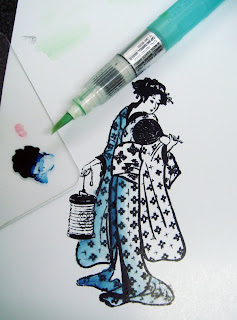
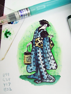
How it works is that I stamped this beautiful Kodomo image, Fanning Lady, with Memento Tuxedo Black ink onto glossy cardstock and let it sit and dry for a while (make sure it's dry! heat-set it if you need to). Then, with a dark blue marker (B99) I dabbed a spot of color onto a piece of acrylic. This is my palette. I took a watercolor brush that you can fill with liquid and I filled it with Copic Colorless blender. Now I've got a super juicy watercolor brush that works with Copics.
Remember back to my earlier posts on blending with glossy paper, once you put a color down, you can't really lighten it up when you are working with Copics. You also couldn't get one dark blue marker to look so light. With this technique you can apply lots of levels of thin color and build up a darker shade with natural blends and it won't give you streaks and ugly dye edges like you would see when using the marker directly on the paper.
Watercoloring with Copics has made me better with regular watercolors. When I turn in artwork to galleries I usually wtercolor it. I was never good at watercolors untill I started coloring with Copics.
Why would I use a brush filled with blender, isn't a Sketch or Ciao colorless blender good enough? The blender markers aren't juicy enough for applying ink in this manner. They dry too quickly for it to really look like watercolors. With this blender-filled brush however, I can squeeze out extra blender as I need it to get the smoothest, juiciest flow of ink. On glossy paper it doesn't take much since it will start to blob and spread, but it's a look you can't get on glossy paper with watercolors alone. This is also a great way to color vellum smoothly. This technique works best with dark colors.
Here is my final image. It looks like I used a lot more colors than I actually did because of the nature of laying down lots of thin ink layers. I used B99, E02, G28, Y17, and YG09. I hope you get a chance to try this technique, not just on glossy paper. This would work well on SU! paper as well as watercolor paper or any papers that Copic markers may not regularly work on.