 Lighting on Cylinders
This is pretty basic. On the side closest to the light source leave it white, then have it fade out from there, getting darker on the far side. I picked 3 colors in a sequence to give me my light, middle, and dark values- V01, V04, and V06.
 When you are coloring a cylinder you need to keep all your marker strokes flowing up and down along the straight edge of the cylinder, particularly on shiny shapes. A reflective cylinder distorts light tall along it's height so if you have lots of little strokes running the opposite direction it will look a little odd (it can be done but for simplicity sake it will look better if you keep your streaks in one direction).
Shiny objects will have a crisper, stronger contrast between light and dark, as will smaller or more directional light sources. You can also see that I broke up the strong black outline with some Opaque white to really pick out the reflective highlights.
Soft or diffused lighting will give you a much gentler gradient from light to dark. Note how you really lose all deep shadows when you have soft light from the front (more on this in a moment). Another common way that we see cylinders is with a highlight on the backside as well. This is a reflection of ambient light, or light all around us. Sometimes I leave a back reflection, other times I don't. It's a matter of personal taste in the exercise today.
The basic cylinder shape is carried over into many everyday objects, from poles to cups, bottles to human limbs. Once you master adding shadows to a sphere and a cylinder (and a cube which we haven't discussed yet) you can color just about anything and you'll know how to adapt your lighting accordingly.
 Simple shape diagram for lighting
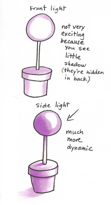
Let's apply this cylinder to a final image today to see how dynamic lighting works on a finished object. This lighting diagram helps you understand the basic shapes involved when coloring this topiary. I draw little diagrams all the time to help me figure out how to do my lighting- I break a complex object down into it's simple shapes so I can understand it better.
Many people start coloring with just general shadows- darker on the edges, light in the middle. This is correct if the light is coming from directly in front. Notice that it's not very exciting. There isn't much contrast between highlights and shadows and you wouldn't see a ground shadow because it is hidden behind the plant.
If we turn the scene so that the light is coming from one side it suddenly gets a lot more exciting. We see dark shadows and highlights. Although this is harder to color it makes the final artwork much more dynamic and alive. I also added a hint of a ground shadow. This gives our plant something to rest on or a good foundation so it's not floating in space.
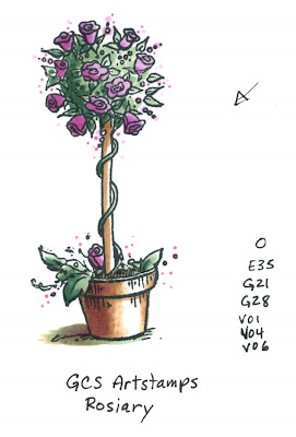
 Using the lighting diagram above I colored my final image. I figured that since I just got back from a fabulous trip to Canada I should use a fabulous Canadian stamp. This is the stamp "Rosiary" by GCS Artstamps, stamped with Memento Tuxedo Black ink.
Notice how the greens and purples on the top sphere of plant are dark on the far side and you can really tell that it is a ball of plant life. If I had colored this with shadows from the front it might be harder to tell it's a sphere since the shadows wouldn't clue me in as much.
The flowerpot is getting a nice soft light but you can easily tell which direction the light is coming from. We really get a sense of volume and depth just by having our shadows from one direction. I hope this helps you break a rut of coloring things all in the same way, have a great weekend!

Marianne,
ReplyDeleteWelcome back! I really dig drawing and coloring flower pots. I cut out the one you colored for me at CHA and put it in my example book. :o) I also really like to draw and color vases. This was very helpful! Thanks!
Take care and STAY POSITIVE!
Thanks so much for the lessons you post! I never really thought about shadows before, but now I'm going to try not coloring everything the same. ;-)
ReplyDeleteThanks so much for the tutorial Marianne! I really love learning about light sources and the shadows as it is helpful with my coloring now. I have a ways to go but I am seeing some improvement LOL. BTW- I enjoyed the copic class in Toronto. It was great to see some of your talent in person. Hope you are recouping from the whirlwind trip.
ReplyDeleteI absolutely love your tutorials. They are so informative and you explain everything so well.
ReplyDeleteWow...how interesting! I am a true beginner with the fundamentals of coloring and after reading each one of your tutorials, I'm really starting to put it all together. Thank you so much for taking the time to help us along.
ReplyDeleteGreat post! Any shadowing tips are more than welcome!I am the one who asked about the snowmen in Toronto
ReplyDeleteI would be struggling and not getting the best out of my Copics without your tutorials. I can't thank you enough.
ReplyDeleteViv xx
For months I have been following your blog and marveling at your ability to make coloring with Copics easy to understand and follow.
ReplyDeleteThank you.
These are great pointers. Thanks for sharing them, they will be so helpful to me.
ReplyDeleteKelly