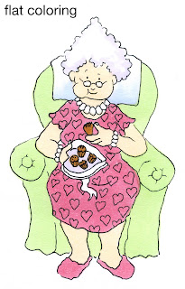
 Flat Coloring
The first thing that people notice about images colored with Copic markers is how smooth everything looks. By coloring in small circles and evenly soaking your paper you can finally get a flat area to look perfectly flat.
This also gets boring real quick because we know that the world is not flat. This Granny image is from the new release over at Our Craft Lounge. She looks pretty lifeless with plain, flat coloring. I used R83, YR000, YG11, E35, B41, and BV31. I like Granny because she is a character who is very much alive and has personality - NOT destined to be flat her whole life (especially with all those chocolates she's eating).

 Shaded Coloring
When we want things to look more alive we add shadows. If you look at the whole list of shadow posts you can see all my directions over the last year or so about adding shadows. I have tried to simplify shadows as much as possible, so don't get overwhelmed if you think you can't do it, just scroll to the beginning and start there.
If you look at this simple diagram you can see the difference between something flat and something with volume and substance.
 When Shading, the first step is to pick our light source. In this case, it is coming from the upper left corner. I leave my green cylinder (YG11) white on the side closest to the light and faded in BG93 to create the shading. Because this object is rounded my shading from light to dark is smooth.
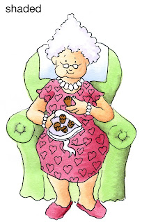
Here is Granny with simple shading added. She looks much more alive than she did at first. I added R85 & R89 to the R83, E11 to her skin, and BG93 to the chair. I smoothed darker colors in by layering light-dark-light, so an area like her skin would have been colored YR000 + E11 + YRooo. So far, all of these are smooth blends from light to dark.
I think she's still missing something, though.
Cast Shadows
If you look back at the shading diagram you'll see the volume of the cylinder has left a shadow on the ground, or a Cast Shadow.
On a cast shadow you see the edges are crisp, with no soft shading. This is because the light is blocked in a straight line by the hard edges of the object. This adds to the illusion of volume and we can really feel that our object has substance. However, this is a simple object.
 The world is made up of much more complex shapes and objects than the cylinder. If we add a top to our shape then the shadow changes as well.
Look at the first "lamp" in my diagram. The shadow it leaves on the ground mimics the shape that we know the object would have in real life. So we have the cast shadow of the whole image.
But look at where the "shade" overlaps the base. There needs to be a shadow here as well because the top is blocking light on the ground AND on the base.
 The shadow the top casts will have hard edge because it is blocking the light in a straight line. By adding the darker shadow on the green area we can really get feel for the dimension this "lamp" has.
Let's look at Granny again.
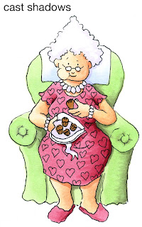
Her dress hangs over her legs, so let's cast a Crisp shadow on her legs. Her head sticks out over her neck, so she gets a shadow there, too. Don't forget the chair, as Granny is blocking the light that is hitting the chair, so those will be crisp shadows as well. Her hair casts a shadow, as does her box of chocolates.
By deepening the shadows and making some crisp while leaving the basic shading smooth you can really get a sense of granny's volume. Look at how much more dynamic her legs are in particular (you never thought of granny's legs as being dynamic, did you?)
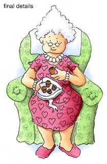
 Here is my final Granny. I used a gray multiliner 0.05mm to add scribble flowers to the upholstery and I added a hint of B41 to the ground and behind the chair just to give her a bit more life. I hope this helps you in your coloring. Have a great week, and enjoy eating your own sweets. Don't forget to check out the other fun stamp sets in the new release from Our Craft Lounge!

Great tutorial as always Marianne. I have to thank you so much for all your posts; I have read each and every one because I am a fairly new owner of Copics and you are my go-to instructor to learn all the tricks and tips.
ReplyDeleteAlthough I am just kicking myself for not discovering them sooner; it looks like I missed my chance at a class since one was held here in Winnipeg last June (darnit!)
Anyway, I just wanted to express my sincere thanks for all your clear instructions... they have sure helped me a lot!
This is such a clear explanation. I can finally explain it so much more clearly now when I teach copic colouring.
ReplyDeleteThanks so much Marianne, I practically stalk your blog waiting for your posts, and I've learned so much from your blog.
I love the granny image - she's so cute!
Thanks for the great tutorial. I'm still learning how to use my Copics.
ReplyDeleteThank you for such a fantastic tutorial. It all makes sense, but I'm still learning. Thanks again. xo Jackie
ReplyDeleteThis tutorial is so helpful...i have a question...why isn't there shading on the right side of grannie's chair the same as the lamp? Given I have never put shading on the ground I paid super-duper attention and am wondering, does it apply in all cases? It seems the light source would follow that??? Thankz very much. Samara
ReplyDeleteSamara,
ReplyDeleteIn real life the chair would cast a strong shadow just like the "lamp" however, it would detract from the image in this case, as that would be one big shadow and it would throw off the balance of the picture. When you are doing stand-alone art like this to be added to a card it would look funny. So it is artistic choice to have her chair not cast a ground shadow.
If she were part of a complete setting, as in a full living room then I would add a shadow on the ground. Not a strong shadow, but a definite darkening on the right side.
Do you see the difference? I avoided the "Real " shadow by just adding a little blue hint behind her chair but her chair isn't sitting on the ground, it's floating in midair.
Does that make sense or did I confuse you more? While I'm teaching realistic coloring principles you still can choose which parts to follow or not.
marianne
wow! What a great tutorial! I love grammy and she always makes me smile!
ReplyDeleteExcellent. These type of posts are very helpful! Thanks much.
ReplyDeleteSuper tutorial Marianne!
ReplyDeleteI used your tips today and I was really happy, especially with the cast shadow.
I have arrived at your blog via Mary Englebreit's blog about copic markers. I am very interested in these for myself and as a gift for my tween and teen daughters. Any suggestions you have on "kits" that I can purchase for this? Maybe a "blog" on that? Thank you!
ReplyDeleteThere are so many kits by so many companies that you really have to go looking for yourself. Figure out what you'll be coloring the most (people, flowers,etc) and scout around for sets geared for that artwork.
ReplyDeleteMarianne
thanks, Marianne! I really have appreciated your shadowing tutorial series! And your explanation today made a ton of sense, and made me feel like some of my coloring choices are really ok! LOL!!
ReplyDeleteHave a wonderful and happy Thanksgiving!! :)
kimberly
Quite informative and interestinmg tutorial.
ReplyDeleteThanks.
Regards,
image coloring
Fabulous and Informative, Marianne--you're the best!
ReplyDeleteBrilliantly explained, Marianne! I knew my shadows were missing something, and I'm now going to have to shoo 11yo dd away from my desk so I can play with my own copics!
ReplyDeleteyour blogs have such an amazing thoughts and this blog is very interesting. i like this post! Thank's for this.
ReplyDeleteSignature:
Visit to play games friv than play games2girls and play game kids games online ! have fun!
What’s up to all, it’s genuinely a fastidious for me to visit this
ReplyDeletewebsite, it consists of priceless Information. 메이저사이트