Monday, August 30, 2010
Feather Blending, again
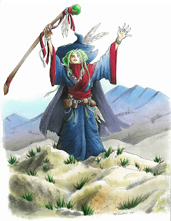
I had a great time at the Manga demo in Portland this weekend, and I had a chance to color this wizard picture I had drawn years ago. It's always fun to re-visit old images and color them with fresh eyes. I like this version a lot better than the version I colored oh so long ago.
Just to give you an idea of scale, these large manga pieces that I occasionally show are full-page sized, they are not small pictures, and are made for my example book. If you ever meet me at a show, bug me to let you look through my example books- it's fun to see bigger work sometimes, and see how I use techniques on a large scale.
You'll note in this picture how I show distance by making things in the back blueish. I know I've explained the blue-things-far-away before, but it never hurts to talk about how to make it look correct in a finished piece.
Feather Blending - Purple Mountain Majesties
I wanted to use this piece as an example of good feather blending. I've talked about feather blending a few times before (1, 2) but it never hurts to review.
Many of the Intermediate Applications I received I have had to turn down because they did not show proper feather blending. To me, this means I must not be explaining it well enough. This is a tricky concept, so it's getting an advanced label. What really makes it tricky is the amount of practice you need in order to find good color combos and time it takes to figure out the proper technique.
If you look at the mountains in the background, you'll see that they blend from blue, to purple, to warm gray. Blue and Warm Gray are opposites, in that Warm Gray is brownish toned and Blues and Blue violets are far away from them on the color wheel.
I started the mountains by coloring with B41. I stroke from the top of each peak, down to the base, flowing in the direction of the mountain. I am lifting up at the end of each stroke so that I have less ink at the base and more at the peak. As you can see from the third peak, I apply lots of very light layers to achieve the look I'm going for. I did criss-cross my strokes slightly for a proper feather, but I am consistent with the base feathered and the top of the peak dark.
Next, I feathered in W3 from the bottom in exactly the same technique, this time, making the base dark and the feathering go back up into the mountain. I added lots of very light layers to achieve the proper blend. I think on the actual picture I used W2, not W3, but you get the idea.
You can see on the third peak how the layers blending more and more, and you notice the streaks less and less. Sometimes I'll come back with the blue and add another light layer after I added the second color, just to get it a little smoother.
Last, you'll notice on my final mountains that it has the pretty purple fade. After I was done feathering the blue and the gray I added a faint layer of BV31. How much is a matter of personal taste.
You can see from these mountains that the more you layer the pale purple over the whole area, the more it shows through. The third mountain is colored as if it is in front, but it looks like it has more shadow than the others, so it could have been colored as if it were in back simply by adding more BV31. The purple is strongest in the middle because there is the least amount of dye on that spot on the page. This gives the purple a place to fill in, if that makes any sense.
On the final mountains in the main picture I added a faint streak of BV23/BV25 to darken the shadows on the left side of each peak. This makes it look a little less flat, but not so much that it detracts from the main image.
I used too many random colors to list, but I did use one other technique, which you might not have noticed. On the rocks in the foreground I dampened my nasty rag and blotted off some browns and grays that were already on there. This added the hint of texture you see on the front rocks.
I hope this has inspired you to practice the feather blending again. This is tricky, but when done right, it looks really good. Have a great week!
Friday, August 27, 2010
Events & Updates
Sunday from 2-5pm I'll be at Kinokuniya Beaverton, located inside of Uwajimaya's Japanese grocery store (10500 SW Beavertn Hillsdle Hwy, Beaverton, OR) .
I'll be doing Copic demos, coloring Manga, and generally having a great time, so stop in and say hi! Meanwhile, Nancy wanted me to remind people that there are lots of Certification classes coming up, so get your registrations in right away...
Chicago, Oct. 22nd, Taught by Marianne Walker, Project by Sherrie Siemens and Debbie Olson
(the next session will be before Winter CHA, then regularly thereafter)
I am still reviewing Intermediate Applications, for the class in Chicago in October, so please submit them this weekend. Qualified attendees will be notified early next week.
It is important to read the application carefully and show your best coloring skills- I am picky about the coloring that I will accept into the class. I do not see the names on the coloring pages, only the coloring ability demonstrated, so give me your best representation if you want to be accepted.
If you need an application for either Intermediate or Standard certifications, you can download one here.
North American Standard Certifications this Fall
Please note that when you download an application to attend a certification class there is also an information file to download as well. This has the specific location, times, and other important details. Here are all the classes that are currently available to apply for:
Albuquerque, NM Aug. 29th Taught by Jennie Black Open to Public
Branson, MO Sept. 3, Taught by Lori Craig Open to Public
Pittsburgh, PA Sept. 6th, taught by Colleen Schaan Open to Public
Oakland, CA Sept 11th, taught by Jennie Black Open to Public
Minneapolis MN Sept 16 (before Scrapfest) Taught by Debbie Olson and Lori Craig Open to Public
Salt Lake City, UT Sept 25th Taught by Jennie Black Open to Public
Calgary, Canada, Sept 26th Taught by Sherrie Siemens Open to Stores & Designers
Buena Park CA, Oct. 2nd, Taught by Jennie Black Open to Stores & Designers
Jacksonville FL, Oct 8th taught by Colleen Schaan Open to Stores & Designers
Chicago, IL, Oct. 21 Taught by Lori Craig Open to Stores & Designers
Applications have not gone out yet for the following locations:
Richmond VA, Nov. 8 Taught by Colleen Schaan
Halifax Nova Scotia, Nov. 11th Taught by Sherrie Siemens
I'll be doing Copic demos, coloring Manga, and generally having a great time, so stop in and say hi! Meanwhile, Nancy wanted me to remind people that there are lots of Certification classes coming up, so get your registrations in right away...
Intermediate Certification
Chicago, Oct. 22nd, Taught by Marianne Walker, Project by Sherrie Siemens and Debbie Olson
(the next session will be before Winter CHA, then regularly thereafter)
I am still reviewing Intermediate Applications, for the class in Chicago in October, so please submit them this weekend. Qualified attendees will be notified early next week.
It is important to read the application carefully and show your best coloring skills- I am picky about the coloring that I will accept into the class. I do not see the names on the coloring pages, only the coloring ability demonstrated, so give me your best representation if you want to be accepted.
If you need an application for either Intermediate or Standard certifications, you can download one here.
North American Standard Certifications this Fall
Please note that when you download an application to attend a certification class there is also an information file to download as well. This has the specific location, times, and other important details. Here are all the classes that are currently available to apply for:
Albuquerque, NM Aug. 29th Taught by Jennie Black Open to Public
Branson, MO Sept. 3, Taught by Lori Craig Open to Public
Pittsburgh, PA Sept. 6th, taught by Colleen Schaan Open to Public
Oakland, CA Sept 11th, taught by Jennie Black Open to Public
Minneapolis MN Sept 16 (before Scrapfest) Taught by Debbie Olson and Lori Craig Open to Public
Salt Lake City, UT Sept 25th Taught by Jennie Black Open to Public
Calgary, Canada, Sept 26th Taught by Sherrie Siemens Open to Stores & Designers
Buena Park CA, Oct. 2nd, Taught by Jennie Black Open to Stores & Designers
Jacksonville FL, Oct 8th taught by Colleen Schaan Open to Stores & Designers
Chicago, IL, Oct. 21 Taught by Lori Craig Open to Stores & Designers
Applications have not gone out yet for the following locations:
Richmond VA, Nov. 8 Taught by Colleen Schaan
Halifax Nova Scotia, Nov. 11th Taught by Sherrie Siemens
Wednesday, August 25, 2010
Links and upcoming events
I wanted to share a couple quick links with you today. First of all, for those of you in the UK you will be happy to note that there is a Certification coming to your area in a few months:
UK Copic Certification
With Wendy Kadzidlo (UK Copic Certified Regional Instructor)
Sunday 21st November 2010
Elcot park Hotel, Nr Newbury, Berkshire.
Click here for more information.
Copic Blog
For those of you who are looking for some inspiration in a different direction, have you checked out the official North American Copic blog recently? Here you'll find neat artists featured that use Copic products, interviews, and other great Copic things, so check it out!
Tuesday, August 24, 2010
Intermediate Applications
Applications for the Chicago Intermediate class have now been sent out. Please fill those out and get them back to us right away, as the class will be filled within a few days. Remember, we will NOT accept applications unless BOTH pages are completed and returned.
You can download an application here.
Thursday, August 19, 2010
Demos in 'Frisco
It is gorgeous right now here in San Francisco! Yesterday I had a fabulous demo at Flax Art down on Market Street. This afternoon I'll be at the Grand Opening of the new Blick Art Materials store, so stop by and visit if you're in the neighborhood.
Here is the picture that I had a chance to color yesterday afternoon. I drew the black line work while at Anime Expo in July, and I've been waiting for a chance to color it in. I love doing demos! It gives me a chance to color and chat with so many neat people. Stop by today to see what new artwork I'll be coloring. Have a great week, and I hope you find some inspiration from my work.
Paper: Color laser copier paper, Some of the colors used: Skin: YG11, YG06, G85, E70, Skirt/Shirt: G85, G99, BG99, Y28, E59, Hair: Y21, Y28, E09,
Monday, August 16, 2010
Upcoming Events
This has been a very busy Summer, and there's a lot more happening this Fall. If you're looking for opportunities to see Copics in action come visit me at one of my upcoming demos:
Wed. Aug. 18th, Flax Art Materials, San Francisco, CA demo from 2 to 5pm
Thurs. Aug. 19th Blick Art Materials Grand Opening, San Francisco downtown from 1 to 4 pm.
Fri. Aug 20th Lane County Fair, Eugene OR Youth Art/Manga drawing from Noon to 8pm.
Sun. Aug. 29th Portland, OR Kinokuniya Beaverton 2-5pm Manga demo
Friday Sept. 10th, Eugene, OR, Eugene Mayor's Teen Art Show Opening Reception, Maude Kerns Art Center, 6-8pm
Fri-Sat Oct. 1-2, Savannah GA, Savannah College of Art & Design, Art Materials Trade Show
I'll be setting up more demos as the season progresses, so keep watching. I hope to see you soon!
Friday, August 13, 2010
Certification Update
Upcoming Certifications
you'll notice a new logo for the certification classes. I needed a good way for people to see the difference between the Beginner and Intermediate classes, so now, look for the colored logo. Yellow for Beginner, Purple for Intermediate.
North American Beginner Certifications this Fall
Please note that when you download an application to attend a certification class there is also an information file to download as well. This has the specific location, times, and other important details. Here are all the classes that are currently available to apply for:
Atlanta, GA Aug. 23 Taught by Colleen Schaan Open to Public
Green Bay, WI Aug. 21 Taught by Debbie Olson Open to Public
Albuquerque, NM Aug. 29th Taught by Jennie Black Open to Public
Branson, MO Sept. 3, Taught by Lori Craig Open to Public
Pittsburgh, PA Sept. 6th, taught by Colleen Schaan Open to Public
Oakland, CA Sept 11th, taught by Jennie Black Open to Public
New Orleans, LA Sept. 15th taught by Jenn Balcer CANCELED
Minneapolis MN Sept 16 (before Scrapfest) Taught by Debbie Olson and Lori Craig Open to Public
Salt Lake City, UT Sept 25th Taught by Jennie Black Open to Stores & Designers
Calgary, Canada, Sept 26th Taught by Sherrie Siemens Open to Stores & Designers
Buena Park CA, Oct. 2nd, Taught by Jennie Black Open to Stores & Designers
Jacksonville FL, Oct 8th taught by Colleen Schaan Open to Stores & Designers
Applications have not gone out yet for the following locations:
Chicago, IL, Oct. 21 Taught by Lori Craig
Richmond VA, Nov. 8 Taught by Colleen Schaan
If you need an application for any of these locations you can download one here. Send in completed applications right away, even if you are not qualified, as the waiting lists fill on a first-come, first-serve basis.
If you have any questions please contact our Certification Coordinator Nancy, nancy@copicmarker.com (Here is a photo of Nancy doing a make 'n take at the Splitcoaststampers booth at the CHA Summer Supershow.)
European Certification
Friday, 10th September 2010 Hagen, Germany on (one day before the Stempelmekka Fair). This class will be held in German. Taught by Diny Sprakel (she's a fabulous instructor, and you'll be sure to have a great experience!). For more information on European classes please contact Britta, at b.rumpf-burblies@holtz-gmbh.de
Australian Certification
August 30, Melbourne, VIC Taught by Mandi Lee Klinger - FULL
October 25, Brisbane, QLD Taught by Kathy Jones
for more information please contact copicmarker.com.au
Intermediate Certification Details
Intermediate Certification
Chicago, Oct. 22nd, Taught by Marianne Walker, Project by Sherrie Siemens and Debbie Olson
(the next session will be before Winter CHA, then regularly thereafter)
The application for the intermediate class will be available in about a week. Below are the technical details of the class for those of you who are interested in attending. I will have more information about specific topics as time progresses:
• Class size is limited, so apply early.
• Class runs from 9am to 4pm with a 1 hr. lunch break, then 6 to 8pm for the project. You MUST be available to attend the whole day or you will not be listed as having completed the training. People who cannot attend the evening event will not be accepted into the class.
• Fee: $199, due within 3 days of accepted application. NO EXCEPTIONS! Demand is very high for this first session and you will be bumped if you do not pay within the 3 days. Same cancellation policy as with regular certification (see the details section where regular applications are posted).
Important Note: You must have completed your regular certification prior to submitting the application for the Intermediate class. There are no exceptions.
Application Process:
• As soon as you get the application fill it out COMPLETELY and submit it.
• No applications are accepted early.
• You cannot save a space for a friend- they must be accepted on the same basis as everyone else.
• This application is harder to fill out than a standard application, so fill it out and return it right away.
• To apply you must prove a mastery of basic topics covered in a regular certification, as the instructors will NOT be reviewing any topics covered in a regular class.
• Coloring will be required in the application.
• The application will be a downloadable PDF. This will need to be electronically returned to us as a jpeg. The best method is to print it out, complete the application and follow the directions, then scan it or take a clean, easy to see photo of the relevant sections for us to review. We MUST decline applications that are not returned properly, since demand is so high for this session.
• DO NOT SEND ANY ADDITIONAL CARD EXAMPLES! This will not change your chances of getting into the class. The examples you provide in the application will be exactly the same as everyone else, and they prove to us that you have practiced coloring and are ready for the next level.
• Applications will be reviewed as soon as we get them, and you will be notified upon acceptance.
Don't feel bad if you are not accepted. Space is very limited, especially since this is the first class. We are keeping applications neutral and will not accept people simply because they are a "craft-lebrity" or "a big name in crafting". We need to assure that everyone attending the class is dedicated to coloring already and driven to learning techniques that will take their work to a new level. The instructor has a lot to cover in a short time, and people who aren't confident in their techniques could slow down the whole class.
There will be more Intermediate Classes as time passes, so if you don't get in the first time, don't give up! Practice all of the blending techniques, practice smooth coloring,...just practice, practice, practice! Many of the topics covered in the class I have talked about over the years here on my blog. The difference is having the instructor right there to help you through your tough situation. Ideally, everyone would have a chance to get the one-on-one attention that will be provided in the class, but it is very hard at first.
More information will be on the Copic website once the applications go out, so please do not e-mail nancy with questions yet!
Thursday, August 5, 2010
New Products CHA Summer 2010, part 4
Color Swatch Book
One last neat thing that we introduced at CHA this Summer is the new Copic Color Swatch Book. This handy, travel-sized organizer is perfect for keeping your colors organized and having a reference book that is customized by you!
The Color Swatch Book is printed on very nice bright white cardstock, ideal for giving you accurate color readings. The back cover unfolds and tucks between pages to protect while filling in swatches. The book measures approx. 7" x 3.5" (about the size of a checkbook) and has 18 pages with color groups and directions.
Each page is organized so you can see Natural Blending groups and see where you might be missing colors in your personal spectrum. As you can see from this photo of the BG page, I can quickly see which colors I want in the BG family that will blend with the BG09 I already have. For space purposes, some blending groups are listed on the same line, (See the BG30's and the BG40's), but wherever possible each group is given it's own space.
Best of all, the cover is left uncolored (see the book in the photo behind the colored version)- you get to color it how you want! I drew the cover art based on illustrations from the Art Noveau movement 100 years ago. I really love the flowing lines and repeated floral patterns from the 1910's and 20's.
Drawing Process
I drew the art lightly first with a pencil then traced it on my light table with a .25mm Multiliner SP. I went back with a thicker pen to darken in the larger dark areas. Then I scanned it into the computer and cleaned up some of the lines. Last, I took my artwork into Adobe Illustrator and converted it into vectors to give it the smooth thick/thin line quality that you see here.
Coloring Process
I really had fun coloring the final cover of my swatch book! Best of all, each person can I started with my lightest colors, in this case, the green. I used YG41 and faded each stem so it would be easy to blend into the next color. Next I added BV00 and feathered it into the green of the stems. I also tapered the BV00 into the top of each "blossom", leaving the tips white. Then I feathered E04 back into the BV. After I had the blossoms finished I darkened the green stems with G85. Anywhere the stems look like they go behind each other I was sure to make it a little darker. this gives the curling lines more individual strength.
Next I darkened the leaves. I wanted them to have the same general tone of the stems, but still be distinct. To do this I could either make them lighter or darker than the stems, so I opted to make them darker. I Began with a base of YG41, darkened with the G85, then added a touch of B39 to really deepen the green without turning it grey, since there really wasn't a darker green that I wanted to use that would not turn it gray, and G29 would leave a different feel to the tone. As it is, the hint of deep blue really gives dimension, in my opinion.
Last, I added a touch of dimension to each blossom with a dot of BV04 blended with the BV00. I colored teh marker with C1, BV23, and C5. By throwing the BV23 in instead of the C3 it also adds a bit of color depth to an otherwise stale gray. I added crisp shadows under each leaf that covers the marker with the C5. I colored the logo with the YG41 lightly faded into the BV00. The tips of the marker are colored with BV00, BV04, and a hint of E04 to pull in the pink from the blossoms. The fine white lines on the shiny marker body were made with Opaque white that I carefully applied after I was completely done coloring.
I hope this gives you some inspiration for coloring your own beautiful swatch book cover. Once you color yours send me a link! I'd love to see what you make.
These new swatch books are now shipping, so ask your local Copic retailer if you would like to get one for yourself. The Blending Card will be arriving in stores in a couple weeks.