Coloring Around Tiny Details

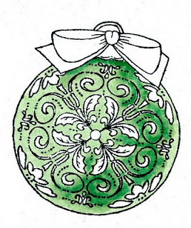
 First, you want to start with the main color that you are working around the details. In this case, it was the light green. I stamped my image with Memento and made sure it had dried really well before coloring, since tiny details would show bleeding more than usual.
Carefully color with the base color, G12. I used the very tip of the brush and had no problem working around even the smallest of shapes. At this point, if I had made mistakes I could still clean out the white areas with my colorless blender, but I don't really need to on this image. When cleaning up you need to have a lot of patience. dab a tiny amount of blender on, let it dry, dab another tiny amount and so on. You can't scrub in the blender like usual to clean up areas.
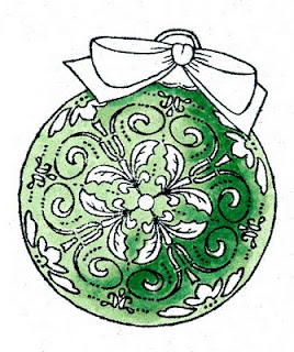
 Next, I lightly scribbled in the dark green, G17. I scribbled because I had to be careful to not oversoak the areas I want to blend, as it could easily bleed into the surrounding details.
Now I can ever so carefully go back with the G12 and lightly blend the darker green out. I want the areas where the darker green fades into the lighter green to be as smooth as possible to keep the dimensional illusion to the ornament. It's OK if I lose the darkest areas of the darker green.
 Once the blending is dry I went back with the dark green and touched in my deepest contrast again. The base colors need to be dry in order to keep the edges crisp. Now you can really see the dimension on the ornament. I like the high contrast between the G12 and the G17- this is what makes the ornament look so round.
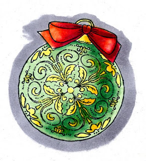
Finally, I colored the yellow details- lighter on the light side, and Y17 in the shadows. I was not as worried about precision, since the yellow would not show up if I accidentally colored over the green areas.
 The paper I was coordinating with was very orange-red, so I used YR09 and RV29 for my base red tones on the bow. Then I darkened it with R59. This helped pull the reds together. Again, I was careful to keep all my highlights and shadows consistent with the main ornament so the whole image looked better. Then I colored a middle gray around the outside of the ornament, since I knew I would be cutting it out and I wanted some contrast between the ornament and the background paper, but I didn't want to cut two pieces of paper.
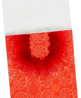
 One detail that you might not notice right away on the final bookmark is that on the base papers, I wanted to coordinate the colors a little better, so where the light gray paper met the red I blended in a very light layer of C1 and C2. Then, under the area where the ornament is sitting I added some of the reds, again, feathering them out until it created a darker halo around my ornament that smoothly blended out to the reds of the paper. I also did this along the bottom edge of the red paper. Thanks for stopping by, have a great weekend, and I'll see some of you in a few days in Chicago!!

Thank you so much for sharing how you made the ornament so dimensional. I need to practice that:)
ReplyDeleteVery beautiful you have the patience of Job. I try hard with images like this and always blunder your images are always perfect.
ReplyDeleteBig hugs,
Jeanine
I just wanted to mention how much I appreciate what you do for us stampers.
ReplyDeleteI'm still learning how to use my wonderful Copic Sketch markers.
You're the best!
thanks again,
Debbie
See you in Chicago!! I'm getting soooo excited.
ReplyDeleteCheryl
Great tutorial and photos Marianne! Thank you!
ReplyDeleteTake care and STAY POSITIVE!!
Thank you for the tutorial(s)...they really are a big help in learning to use the Copics...an addiction I might add!!!!!
ReplyDeleteHave a friend who said 'I don't care what you say, I'm not spending money for THOSE'...saying this over and over. Well, you guessed it, she tried them and is singing the praises of how much she LOVES her Copics! I LOL every time I hear her say it!!!!
Jan Castle
Fantastic tutorial Marianne!!!!
ReplyDeleteanother wonderful tutorial ... Thanks. Loved the Intermediate class, by the way!
ReplyDeleteThis turned out so beautiful!
ReplyDelete