 Screen Tones and Colored Images
Coloring screen tones can be kind of tricky. The problem is, that screen tones are non-porous, and if you try to color over them with Copic markers, it will not work very well. Here are two options to allow you to color your work.
 1. Color before you apply tone
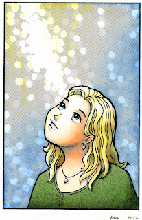
Color your image with markers before you apply any tone. As you can see from the first image, the girl doesn't look too bad, but I want more texture to her shirt, and I want the sky to have that same pattern from yesterday. I colored it, planning where tones would be, and having my textures mimic the tones I will be applying (dots in the sky pattern).
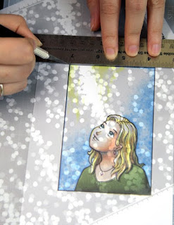
Once ALL my coloring is done, then I can apply tones like I did on yesterday's post. Be sure to burnish your tones well, or else the colors will not appear as nicely through the tone areas.
 Cutting note: If you are going to be cutting along straight lines, cut against a metal ruler or metal-edged wooden ruler. Your craft knife may get caught on the edge of a wooden or plastic ruler and nick or damage the edge. When cutting with a metal ruler, be careful to keep the sharp edge of your blade from scraping against the metal. This might damage the blade. Try not to push too hard on the ruler when cutting, as it may stick the tone down where you don't want it to go.
Soft Paper warning: If you have a very soft or fibrous paper, when you try to pull up the extra tone it may pull up some of your surrounding colored areas. This might be more pronounced if you are coloring with colored pencils and especially chalks. This is not as big a problem with marker, which permeates the paper better.
 2. Apply tones to black & white image, then photocopy & color the copy
I always prefer coloring a photocopy, otherwise there is no way to undo a mistake if there is a problem with the coloring.
You may have to adjust your photocopier contrast to get the best printout when you copy your line work. Make sure the contrast is high, so you don't lose any line darkness on areas where you may not have burnished the tones enough. If it copies too dark, then lower your contrast or increase your brightness.
If you are going to be shrinking your final piece: whenever possible, color the full scale version, then shrink later. This helps you have the most detail and it is much easier to accurately color tiny areas if they are slightly larger.
Final images: Drawn with .3mm Multiliner, Sky: B32, 0, Y01, YR30, Hair: Y02, Y21, E43, B32, Eyes: BG13, B05, C1, C3, Shirt: YG63, G99, Skin: E000, E11, BV00, V12, Y02, B32. Screen Tones: Y-1589, and Y-1204

WOW! Sure wish I could see this technique done in person! The look is stunning!
ReplyDeleteJan
Stunning. I love how she turned out. Feel the same way Jan does. I kinda think I understand.
ReplyDeleteHugs
I wish you would sell the digital image of the girl. I love her!
ReplyDeleteWow, I love how it looks!!
ReplyDeleteYou really had a beautiful and useful blog! I was looking for this info while ago.
Thanks for sharing!
Leena
This is a wonderful technique. TFS.
ReplyDelete