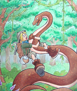
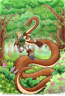
 Here is an old, kinda washed out photo of the original. The colors were pretty soft, the trees were washed out, and the whole thing was a bit flat (the photo also makes it look worse, but it was pretty bad). I had been experimenting with the markers at the time, learning how to use them better, so this was not a fabulous coloring sample, but I did like the drawing itself.
I realized when I was flipping through my portfolio that I had actually never finished coloring the image, but it looked "good enough" so I'd ignored it all these years.
Well, I pulled it out. This was a line drawing that I had photocopied onto color laser copier paper. I had colored it and stuck it away. Now, 11 years later, I pulled it out to tighten up a lot of things.
One of the most amazing traits of Copic markers is that on uncoated paper you have an infinite working time. Meaning, just because I colored something 11 years ago doesn't mean that it's done. I can pull it out and re-work the colors at any time. Once the ink is wetted with another marker again, I can mix and blend.
 So, I throughly worked over this piece. Biggest priority was fixing the lack of contrast in the trees. Years ago I had dabbed on hand-sanitizer to affect the texture in the trees. Trouble is, hand sanitizer really fades out colors. It looks cool, but I learned through trial and error over the years since 2005 that I should have started darker on the base color first. I also crated more depth on the bushes and shrubs. Now you can clearly see which trees are in front, which bushes are in the foreground, and how dimensional the fern-things are.
Next, I made him look less flat. Again, deepening the shadows on my character makes him pop and look much more dynamic. (by the way, Tad is his name, as in "A Tad Bit of an Adventure", the comic series I was working up at the time). I added better skin tones, shadows on the snake, and generally punched up the contrast on the character.
Last, I spent a lot of time on the snake. In the first sample, you can see I had a few, irregular scales dotted in with a variety of colors. This time, I increased the contrast in the shadows and more clearly defined the scales on the belly with the colorless blender. Once all the contrast was done, then I went, scale-by-scale with the colorless blender and added more regularity to the scales.
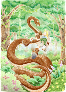
 To create dots, I simply touch the tip of the colorless blender to a colored area and it pushes the color out the backside of the paper. To show you what I mean, here is a scan of the backside of this picture. Because this is on such thin paper, you can clearly see the contrast and effects of the blender on a colored area.
What is really amazing is that except for the shadows, the brown ink on the snake is the same ink I put down 11 years ago. So, all the ink pushed out the back of the paper came from a marker more than a decade ago, and I was still able to move it around. Love that about my Copic Markers!
Have a great week, and I hope to see you at some upcoming event!

Wow! Such a contrast from one drawing to revision. Thanks for sharing. Love to read your posts. And your work is awesome.
ReplyDeleteStunning Marianne! You are such a talented artist. By the way if you knew anyone else Jewish Flourishes has a Hanukkah set coming out this month or next. It's a beginning.
ReplyDeleteJan Marie
STUNNING difference...love the work you do! Miss seeing you at Main Street, but can't be helped right now.
ReplyDeletePaper Hugs,
Jan
Wow! It looks amazing. Thank you for the tips.
ReplyDeleteYou and your work are AMAZING! Thanks for sharing.
ReplyDeleteVicky Briggs
Looks great! Thanks for sharing Tad with us.
ReplyDeleteGreat post & useful. Thanks
ReplyDeleteJual Kelinci
Kelinci
Perkelincian
Jual Kelinci
Holland Lop
ReplyDeleteThanks for sharing, nice post! Post really provice useful information!
Giaonhan247 chuyên dịch vụ vận chuyển hàng đi mỹ cũng như dịch vụ ship hàng mỹ từ dịch vụ nhận mua hộ hàng mỹ từ trang ebay vn cùng với dịch vụ mua hàng amazon về VN uy tín, giá rẻ.
Best Drawing and sketches, gives better vision for drawings.
ReplyDeleteBest Neurologists specialists in JP NAGAR Banglore, contact us best-neurologist-in-jp-nagar-bangalore CLICK HERE for best services
Thank you for sharing very useful & informative article.
ReplyDeleteFor sofa repair service contact thesofastore they gives
Best Sofa Repair Services in Austin Town,Bangalore
Nice post. It is really interesting. Thanks for sharing the post!
ReplyDeleteCopic ciao markers
copic refills canada
Good post,Thanks for sharing this.
ReplyDeletelook here
Sofa Refurbishing in Hulimavu
Very good article,Thank you
ReplyDeleteFor Astrological service contact Shri Durga astro center,They gives
Best Astrologer in Yadgir
Great post.
ReplyDeleteVisit Best Astrologer in Davangere.
Thanks a lot for providing such an important and knowledgeable post.
ReplyDeleteFor Best Astrologer in RT Nagar. Contact us.
Repainting old art can breathe new life into classic pieces, giving them a fresh, modern feel while retaining their original charm. It's amazing how a slight change in color can change the entire mood of an artwork. If you're looking for something transformative for your business, check out Hyper Speed Pages - best b2b landing pages — they make great B2B landing pages that can really boost your online presence!
ReplyDeleteThis comment has been removed by the author.
ReplyDeleteThis kind of lasting impact and precision mirrors the enduring quality and creativity that xposure media group brings to every project. Just as the ink has stood the test of time, Xposure Media Group delivers timeless, impactful results that leave a lasting impression.
ReplyDeleteAmazing art. you re such an amazing artist Marianne! digital marketing agency in chennai
ReplyDeleteتُعد الجودة والسلامة من أبرز مواصفات خزانات الفيبرجلاس في الدمامخزانات فيبر جلاس في الدمام. تُصنع من مواد خام معتمدة من قبل هيئة المواصفات والمقاييس السعودية (SASO)، مما يضمن سلامتها لتخزين مياه الشرب. الأسطح الداخلية للخزانات ناعمة وتمنع نمو الطحالب والبكتيريا، مما يضمن بقاء المياه نظيفة وصحية. كما تقدم معظم المصانع السعودية ضمانات طويلة الأمد على منتجاتها، والتي قد تصل إلى 25 عامًا، مما يعكس الثقة في جودة المنتج ومتانته. هذه الضمانات تغطي عيوب التصنيع وتوفر للمستهلك راحة البال
ReplyDelete
ReplyDeleteCredit repair actually works, I didn’t know until I tried, I worked with a company my friend’s daughter referred to me and the result was surprisingly great, when I saw results I was like hmm this is quite interesting lol, they raised my credit score and cleaned up my credit report, they were very patient and walked me through the process one step before another, I enjoyed and didn’t regret working with them, for anyone else who might need their help reach out to them with the information below
Mycreditsaint@gmail.com or 8582471758
DO YOU REQUIRE TECHNICAL SKILLS TO SOLVE YOUR HACKING RELATED PROBLEMS?
ReplyDelete●Hacking of all social media accounts
●Spying on cheating partner
●Retrieving of lost Cryptocurrency
●Data alteration
●Finding of lost phone
●Clearing/paying off of mortgage/loan
●Increasing of credit score
●Bitcoin mining
●Tracking of location
●Hacking of cell phone/other devices
●Block out or track down hackers
Secure yourself now!!!
Contact: ETHICALHACKERS009@GMAIL.COM OR WHATSAPP+14106350697
They are the best at what they do they helped me out and i am here to testify contact them and come back testifying
door production not only protect products from physical damage but also shield them from environmental factors such as dust, humidity, and UV exposure. In warehouses and distribution centers where goods may sit for extended periods, this protective layer helps maintain product integrity and cleanliness. Sensitive items like food products, pharmaceuticals, and electronics benefit greatly from controlled wrapping that limits contamination and exposure. By maintaining a stable and sealed environment around packaged goods, wrapping machines help extend shelf life, preserve quality, and ensure products remain presentable and market-ready until they reach the end consumer.
ReplyDeleteتمثل سلامة الوقود عاملاً حاسماً في اختيار المولدات. الديزل وقود أقل تطايراً واشتعالاً مقارنة بالبنزين، مما يقلل بشكل كبير من مخاطر حدوث انفجارات أو حرائق أثناء التخزين أو التزويد بالوقود. هذه الميزة تجعل مولدات الديزل هي الخيار القانوني والتقني مولدات كهرباء للمصانع في المباني السكنية المزدحمة، المواقع الإنشائية، والمستودعات، حيث يمكن تخزين كميات كبيرة من الوقود بأمان تام لفترات طويلة دون خوف من تبخرها أو تدهور جودتها.
ReplyDelete