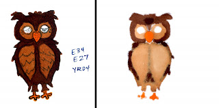
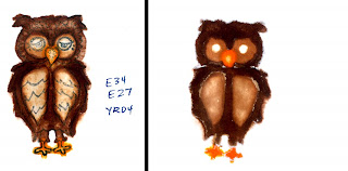
 Whenever I talk about smooth coloring, I mention turning your paper over to look at the backside which will show you how well you've been coloring. A well blended artwork will look just as smooth on the back as it does on the front. So why not show the back instead of the front?
I had art students who used to do this all the time because it looks so cool. It gives you blended, almost watercolor look by coloring the backside, StampinKub showed this technique earlier this year on his blog.
This works better on thinner or softer paper for soft lines. If you want crisp edges on the back then use paper that gives you crisp lines on the front. PTI Stamper's paper is very thick, so it won't work as well, neither will SU! paper because it's coated. Thin paper will take less ink to soak through. I'm going to show this on cardstock just because it is a bit more challenging, and I haven't tried it in a while.
For best results try this with images that aren't too detailed, or the lines are thinner. The stamp I'm using today has fairly thick lines, so I'm go
 ing to stamp, then stamp again so my ink isn't so dense. I'm coloring in the lighter version because even though I know my ink shouldn't bleed with my markers I don't need to risk it with this picture.
Thoroughly soak your colors. Work your marker in circles to evenly saturate the paper. Frequently flip the paper over to see if it's even. The nice thing about this technique is that no one will see if you went outside the lines.
I am leaving the eyes alone- those are so detailed that I'll add them on the back last. On the backside you can really see the areas that are colored darkly and which ones are light. The main body of the owl I had first colored E34, and see how that light color stands out more from this side than the dark color I added later.
 Your coloring will leave white areas on the back where your stamped lines are if you don't color darkly over the lines (Like under his beak). We want to subtly define those lines without drawing anything.
This is where I can add a different look. On the front side, go back over each area with your colorless blender, pushing the colors out to the edge. The blender is pushing the dye from the markers not only to the edge but out the back as well so all my colors get darker. For crisper edges do this after the whole image has dried. For softer edges do it while it's still wet. Also, you will get best results if your blender pen is super juicy
You may like the look of the owl before I blended it, I think it looks cool either way, but hte choice is up to you. Last, add the little dots for eyes.
 When would I use this technique?
This is a good way to salvage a picture that you think the coloring looks bad on. Sometimes the backside looks better, so don't throw it away just because it isn't perfect. Another thing you could use this for is on a symmetrical image I could stap back over the back and it would really give a loose, floating look to the artwork.
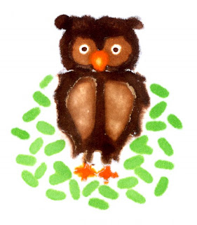
 I like how this effect gives us soft edges with no defined lines. The shapes are simplified- almost as if a child painted it. I could see this owl on a card for a little kid.
I think that the next time I try this, I'll stick to thinner paper OR I'll use an image where the details don't matter as much (like a soft flower). As it is, it looks better with the leaves I added (G14 on the front side) and the little dot eyes (E27 from the backside). The idea behind this post though is to look at both sides of your artwork and don't discard it just because it's not perfect. If you are coloring a flower, what if you do the petals from the backside this way, then color the leaves in front the regulr way? Experiment!
Image: What a Hoot by Inque Boutique Ink: Memento Tuxedo Black Paper: Neenah Classic Crest Solar White Cardstock
 Certification in October
Certification classes in Kansas City and Charleston SC are now both open to everyone. I have limited spaces available, so please let me know THIS WEEK if you would like to attend. I will be leaving next week for those classes and will have a harder time fitting you in. For simplicity, you can call our toll free number 866-662-6742 and Kris will get your registration over the phone.

I love the idea of this! :)*
ReplyDeleteFUN IDEA! I love checking out the back when I am done, but never thought of showing it off!
ReplyDeleteOH, and checking the back also helps you see if certain colors are drying out, too!
This was an interesting tutorial. Thanks!
ReplyDelete