 Planning Shadows in a Complex Composition
At first glance we see a simple image, two lilac blooms among the leaves. We can color it very simply, with purple for the blooms and green for the leaves. Overall it would probably look fine, though it would be very flat. So we start looking at how to add shadows, then we see that this lilac bush is very complex and we get overwhelmed. How can we add shadows and not panic?
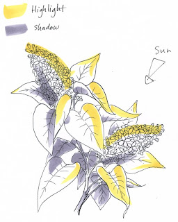
 The first step when attacking something like this is to do a quick value study. I keep it to 3 values for simplicity sake: Highlight (yellow), midtone (nothing), and Shadow (gray). I choose my light source and I look at each element individually. On a rough copy of my artwork I plan where my lighting will be. Once I have a light source I go element by element. Things closest to the light will get highlights. Far sides will get shadows. The underside of leaves will be shadows, the tops will be highlighted. Then I can use this lighting reference as a map for coloring.
I could have chosen my light to come from the top left. Picture how the shadows would change: the tip of the top bloom would be very bright and the bottom bloom would have been shaded by the leaves. That would look cool, too.
But how/why did I chose where to put my light today? I strategically choose so that my viewer will be pulled into the image how I want them to...
 Strategic Coloring
This means I am in control of the picture and I am choosing how to color it for a reason, not just picking colors and lighting at random. For a strategically colored composition I am choosing my lighting so the strongest contrast will fall on the most important elements of the image: the two large blooms. I want the sunlight to come from the side where both blooms will get the strongest sunlight and more of the less important elements (the background leaves) will be in shadow. If my light were coming from the top left then only the top blossom would be important and the other would be shadowed. It would look good, but not what I feel like today.
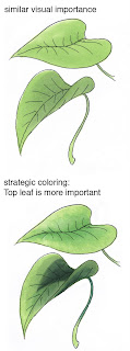
 Leaves are green and can be either warm or cool. Yesterday I showed how the top leaf was warmer and brighter, while the bottom leaf was cooler and shaded. It's easy to tell that the top leaf is more important. If I had colored them both exactly the same then they would have had the same visual importance. This is not being in control of the artwork, this is just coloring in something.
If you remember back to some earlier discussions on shadows (part 6, 8) then you'll know that cool colors recede and warm colors are close. I want the most important things to feel close and I want my shadowed leaves on the far side of the branch to feel far away. Yesterday we knew that both leaves were on the same visual plane, meaning that they were equal distance from our eyes, except that one was above the other spatially. This is why both got the same YG undertone.
The final step of deepening shadows increases the visual importance when things are on the same visual plane. Huh? Read it a couple times. When you strategically darken the shadows on two things that are both the same distance from your eyes then you are using the shadows to tell your viewer what is important.
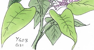
In this lilac branch we have leaves that are far away and the underside. I don't want those to feel like they are on the same spatial plane, so unlike the leaves yesterday I DON'T color them with a base of bright YG, I color them only with G21.
 Already you can see from the base tone only that the leaves in front are more visually important and the branch and background are far away and not dominant. I haven't even added shadows yet.
This is where my smaller leaf color studies yesterday are important. I know that I'll be coloring each leaf using the YG03 family and G21/G28. Becasue the G21 and G28 are going to be used on both leaves in front and leaves in back then it's OK if I don't use the YG03 both in front and back, since the other colors will tie in the background leaves.
I know that I will want the blossoms to be most important, so the leaves around the blossoms should be the most interesting and the leaves away from the blossoms should fall away into the shadows. I will plan accordingly and have my brightest areas pull your eyes back into the blossoms, while background colors will have less contrast and have less YG03, more of the G28.
From my final image you can tell that the entire branch is well lit and on the sunny side of the bush. It's very balanced compositionally, and your eye flows through the whole.
If I were to have colored it so only the top bloom was well-lit then the movement and balance (M, B from DUMB-V) would be that all attention flowed to the tip of the top bloom. This would be totally appropriate if I had a focal something there, say a butterfly perched on the top bloom. I'd want the butterfly to be most important, so I'd have all colors pull your eye towards the butterfly. If I were to use the final lilac with other exterior elements in a layout then maybe I would want only one bloom important so it would pull your eye into that object.
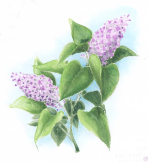
 I'll save the rest so I don't overwhelm you today. As a teaser of the final image I'll show you the backside, which looks more like watercolor and is just as beautiful as the front.
I drew my lilac with a 0.1 mm Copic multiliner onto Color laser copier paper and photocopied it before coloring it. Because the paper is so thin it takes very little ink to evenly soak the paper and the backside looks very rich and vibrant. You can easily see the final lighting and tell which leaves are close and important and which ones are in the back and complimenting the foreground elements.

WOW! You are so complete and in-depth with your composition! Thank you so much!
ReplyDeleteAnyone who ever said Copics were just another marker has never read your blog!
I'm learning a whole lot from your very detailed posts. Thank you for taking the time to share your skills and insights!
ReplyDeleteWow.....I think I learn as much from seeing the back side as the front. Wonderful!
ReplyDeletethank you SO much for explaining all fo this to us! I GET IT!!! :-)
ReplyDeleteAmazing, just amazing. I wait for the next installment avidly!
ReplyDeleteThank you once again for sharing your expertise. It's invaluable to a beginner like me that wants the best out of her Copics.
Viv xx
Thank you, thank you!
ReplyDeleteohmigoodness! That is the BACK of your work! Superb! When I used to do embroidery that was always a measure of how careful and experienced a needleworker was--if the back was as neat as the front.
ReplyDeleteI love the study in shadows--it really makes me think. As an ex-web designer I think two-dimensionally and all light mentally comes from the top-left of the screen. So it is always "odd" to me to think of an image with such depth that is shadowed so intricately and differently. Thanks for helping me see things in a different way and teaching us so much about art and light.
I love how how you explain every little detail of the process - Thanks so much.
ReplyDeleteI soooo look forward to meeting you at the Toronto class!!
Awesome! the post. I read your post very carefully and it is very helpful tutorial. Even I think that I learn as much from seeing the back side as the front. Thanks a lot for your posting.
ReplyDeleteVanessa
my site