Wednesday, July 16, 2008

Drawing Grass

Thanks to all the super-awesome, super-talented, super-fun people who came to the class yesterday.It's great to meet people face to face that you've met online before, but there's nothing like real life. Now when I pop into one of Gina K's forums I really know Gina K :). The whole rest of this week will fly by, I guess I'm ready.OK, so this is what I was going to post yesterday, before I got sidetracked. However, I saw some really nice swatch books in the class yesterday, and anyone who takes my class should be prepared with a swatch book or place to put the examples and dabblings that they make.

Grass
The super brush end of a Sketch or Ciao marker is very flexible, and really feels like a brush. With a little flick you can get a perfect tuft of grass. Flick a few times to build your tuft. Practice a bit, since this is a basic brush technique, yet it takes a light hand. Make your motions very quick and light.

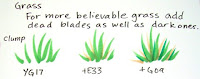
It's fine to practice large and small, until your hand can comfortably make these little grassy chunks. Keep your wrist very loose when doing this. Practice making some large clumps and some small tussocks.The trick to making believable grass is to make it irregular. Some blades are short, some are tall, and the colors range from light to dark. Add a few dead blades - see how much more dynamic it looks.
I'm sure that any outdoor picture you work on would benefit from a few tufts of grass and you can always dab in a few rocks for a simple accent as well. Or, use the blender pen and dot in some rocks over a simple light brown groundcover.

For a nice smooth lawn, practice making blades that are all the same length and in a nice row, since a well-manicured lawn is very clean and even. This makes a wonderful ground cover that doesn't detract from the main image. If you want a solid green area under your blades of grass then color the big green area first, then, while it's still wet on your paper, add the individual flecks of grass. That way you won't get the annoying darker spots under your blades like you see on my first lawn example. Add your darker color after you do the light color.

Sky and Grass
When you are adding grass to a picture that you also want sky in, do the sky first, since your grass will overlap the edge of the sky. Sky is usually blue, and grass is usually green, and green is made from blue so if your green overlaps the sky it won't look so bad.
Trying to carefully color sky between tiny blades of grass so you don't bleed the blades out is much harder. Trust me. Just do your sky first and add your grass later. On this picture I got tired of making softly blended skies, so I colored the blue then dabbed on the blender to get the mottled look. See how I made my first layer of grass? Now I add my darker blades over the top of this to get the overall lawn look.

Image: Gardenia Greenthumb by Stamping Bella, Ink: Memento Tuxedo Black Paper: Neenah Classic Crest

Tuesday, July 15, 2008

Keeping an Example Book


I had a wonderful trip yesterday, and a fabulous group showed up at Artist & Display to learn about the markers. What a great mix of users, from manga to papercrafting. Note: I do have couple spots left in my Chicago 16th class left, but you have to call and register today (toll free: 866-66-COPIC) For today, this wasn't what I was going to post today, but since I forgot to take the photos I needed, then this is what you get (Actually, this is even the second option, since I was about to hit publish and I noticed a comment that was too important to not answer).

Keeping a Swatch Book
My second post on this site was a suggestion to keep a color swatch book. I can't stress this enough! You will get different results on your paper, with your stamp inks, and with your own color combos so try them today. I hope also that you are starting to keep a personal test of the techniques I share each day. This is a very important part of learning about Copic markers.

If you don't try these neat techniques on your own paper and keep track of what worked for you then you're not really learning from these tips.

So what do my swatch books look like? I have a couple of small Artist Portfolio books. I can insert/remove pages easily, and my pages are protected from all the people who want to thumb through my artwork or stamped examples.

These don't have to be finished cards, but can be the scratch examples that you experimented with, or, if you get it to work once instantly make a second copy and add it to your book. Notice how I also jot down notes. This helps me remember what I was thinking when I made these pages.

If you haven't started one of these yet, I strongly suggest you begin. This saves so much time in the future. It will become your instant inspiration and color choosing book.

Monday, July 14, 2008

Alcohol Marker Papers

Tonite I'm in Milwaukee doing a free event, tomorrow I'm doing Copic Certification, then Chicago and CHA starting Wednesday. Whoo Hoo! This is a busy, crafty week. I may be a little short on posts this week since I'm so busy, but bear with me.

We've talked about the best matte cardstock and heavy papers for using with Copics, but what about all the other papers out there? Aren't there special marker papers made just for using with markers? Yes. There are many types, but these react very differently than the steps I stated earlier for testing good papers. These are probably not the best for papercrafters, but are good for professional designers, architects, car designers, etc.

Marker Papers are usually thin, very smooth, coated papers that have little or no bleed through when used with alcohol markers. What this means is that ink is floating on the surface, unlike matte cardstock where we want the ink to soak the whole paper and we use slow, even, saturating techniques. Marker papers use a lot less ink, and a few quick, smooth strokes will evenly color an area. If you start heavily layering colors onto marker paper it really has no-where to go, so it streaks and pools. It really looks bad, so with marker paper, less is more. It's kinda hard to see in the photo, but the colors show up different as well.

When working on a coated Marker Paper remember that your ink lines need to dry very throughly BEFORE you color over them. Since marker papers are coated the ink has less to soak into and will get picked up and smeared around much easier. See the bottom small green circle- it smeared. I also tried to fix the mistakes where it was colored out of the line and it just doesn't work as well.

The special effects I have shown with the colorless blender do NOT work the same on coated marker papers, in fact, many of them don't work at all, so be aware. See how subtle the bricks are on the marker paper compared to the other cardstock. The colors in the top circle don't want to blend as well either.

Marker papers also tend to be thin- thin enough to trace through, yet they prevent bleeding onto the page beneath. Designers love these papers because they can trace their artwork and still do a rendering while referring to their original sketch.

Some common types of coated marker papers are the Copic Alcohol Marker Pad, which was designed by the Germans for professional design, Bienfang Graphics 360, Pro Art Marker Paper (most fine-art paper companies make their own version of Marker Paper), and the Copic PM Pad which has a slightly rougher surface so you can use chalk pastels with your completed marker rendering (Pastel/Marker Pad). Here is a list of some of the different marker papers available.

Notes:
• Copic Sketchbooks are a cardstock, not a coated marker paper, therefore they will bleed.

• Manga Illustration Paper comes in two types, Natural White, which is a matte cardstock and Pure White, which is a bleedproof marker paper. Don't confuse the two!

Image: Hole punch I drew a few years ago on PM paper. Notice how streaky the shadow is- I couldn't blend it out like I usually do on cardstock or non-coated papers.

Friday, July 11, 2008

F01 Drawing Pen

If you look at my sidebar, you'll see a new link to the Copic Events Calendar. Every now and then go look through what events and shows we have coming up. Every few months I teach comic drawing, architecture rendering, or stamp coloring here in Eugene where Copic is based. I'll try to keep it updated with all my little public appearances, so check back there regularly.

Today I wanted to feature a product that is probably one of our least understood Copic offerings, the F01 Drawing pen.
The F01 Drawing pen is a 0.1 mm disposable Fountain Pen that works beautifully for drawing images with a variable line width. It has a metal fountain pen tip that delivers true dipping-pen style artwork. This is great for the traditional illustrator who likes using old-fashion
ed ink pens, but wants portability and no mess. This is getting tagged as advanced because this pen is tricky to use, and not for everyone.

The F01 pen works best on very smooth, thick paper, with good tight fibers. You don't want to use this on thin, soft papers like regular copier paper or newsprint, since the metal nib will scratch the paper and get clogged with paper-fibers.

Hold the pen at a 45º angle to your paper, with the metal part on top, the black reinforcing part underneath and pull it towards you. If you want a thick line, push harder, if you want a thin line lift up a bit. If you try drawing sideways it won't work as well, nor will it work if it's held upside down.

Japan suggests that you don't drop or shake this pen, since it has a unique system for getting the ink to flow smoothly.

With a little practice this pen will give you wonderful results. I love working in my sketchbook with this pen, since I don't have to re-draw a line or switch pens to get it thick or thin. Also a beautiful pen for hand journalling, you'll really feel like you are working with old-school art supplies. This pen is tricky to learn so most people either love it or hate it. Have a wonderful weekend!

Thursday, July 10, 2008

Feather Blending

This week our internet at work is in transition, so some of my e-mails have been not working or going out as promptly as usual. Be patient! If you don't think I got your e-mail at all, you can call if it is something that can't wait (like details about Copic Certification that I e-mailed last week but many people missed). Use our toll free number 866-66-COPIC (866-662-6742)

For those of you in the Milwaukee area who can't make it to the Certification Class, but still want a chance to visit and get help with your work, be it Manga, coloring stamps, or rendering techniques I will be doing a FREE evening event at Artist & Display. I'll have markers to play with and will be happy to answer any questions. Monday, July 14th, 5-6 pm (unless my flight is late!). The address is 9015 West Burleigh, Milwaukee WI. You can visit their website for directions.

Here is another quick technique post. This is one of the basic ways of blending two colors. Unlike the Marker on Paper blending, this is a good technique when you're trying to blend very different colors. This also works best with the Super Brush nib from a Sketch or Ciao, though it can work with a Copic marker, it's just a little harder to get the perfect feathering.

Feather Blending Colors Together
1. Start with two lighter colors (colors that end in a 4 or less). Pick two colors that are fairly different. In this case I'm working with B23 and R83, since they won't blend using the technique from a couple days ago, and I don't want them to fade to white, so I won't be using a blender. Note that whatever colors you choose will get darker, so start light.

2. Work in a long, thin area. The trick is to work this while the marker is still wet, and we'll be layering ink in one direction, NOT coloring in smooth circles like we have in the past. The back of your paper will only soak through on the darker edge at first, but when you're done, it will be even on the back most of the way through.

3. Apply the first/lighter color about 3/4 of the way through the area (it may be hard to figure out which one is lighter). Lift up at the end of each stroke so you have denser color at the start and less color at the end of each stroke. This takes a bit of practice if you're not used to the softness of the Super Brush. the same principle applies when using a Copic marker, except you won't have the distinct brush-streak. Work in the same direction, but layer enough so you loose the streaks at the base and see them in the middle.

4. Come in from the opposite direction with your second color. Use the same techniques as step 3. Work while it's still wet. This will still look streaky, but have patience. Also, look at how light the marker is in this step, then compare it to the colors in the next step.

5. Repeat. Go back with the first color, then back with the second, then back with the first... you get the idea. Every now and then let the paper dry so you can see the true effect. Also, if the paper gets too saturated you'll see some splotchiness, so if you see ink glistening on the surface, let your paper dry a bit (not all the way, just enough so you're not going outside your lines- do you see the weird lighter area on either end- I should have let it dry more between layers). See how much darker this swatch is, yet there we have a smooth transition from blue to pink.

If you have done this correctly you should loose most of the individual streaks, unless you look close. On smaller areas you won't have to repeat as often to get the smooth look.

Image: Eloise Greengrass by Bella Stamps, Paper: Neenah Classic Crest Ink: Memento Tuxedo Black

Wednesday, July 9, 2008

Doodling with the Super Brush

It's summer time, it's hot, and I'm busy. I'm sure that none of you have those problems :) July is one of our busiest months each year, and this year is no exception. Time seems to be zipping past, and I still have so much to do...

For the next two weeks I'll probably have pretty short posts, since CHA will be taking a lot of time. However, short but sweet is sometimes the best. This is a simple technique that works with the Sketch or Ciao Super Brush Nib.

Perfect Drops
With the side of the brush, gently touch your tip to the paper. That's it. That's my tip.

What? That's all? You're probably thinking that was a lame tip. You need to think outside the box and I'll show what you can do with that tip.

Look at the shape created by the side of the tip. It is a perfect drop. If you push gently it will be fatter, if you are quick it will be thin. If you're not careful it will be a blob. Practice till you get the "perfect" drop shape.

Put two drops next to each other and you have a quick heart. I know Sharon Harnist has shown this technique a few times on her blog- if you dig back to February she used it on her calendar.

Draw a dot and put drops around it, you have a perfect flower.
Add drops with the point out and you have a star.
Dots and drops can build up to a lot of things.
I make perfect dots by touching the brush tip straight down and pushing. It won't destroy your tip if you do it gently. The super brush is very flexible and will bounce right back. I've never ruined a tip using this technique, and some of my markers are really old, but they still give me lovely drops and dots.

Think borders, accents, simple alterations to existing patterned paper, the potential is limitless, though this is a very simple technique. This is fun to do on 3-D items as well, like boxes, paper bags, fabric, purses, leather. Are you getting ideas yet?

Note: When building up shapes with the drip-points in different directions, turn the paper not your hand.

That technique is all good and well, but to really have fun, you need to take it a step more. Remember, you can't ruin a marker when you touch tip-to-tip, so now try the same thing only this time, why don't you touch a second color to the tip of your marker?

Now you can make two-tone drops. Oooooooo! Did I finally give you an idea that you hadn't seen before? perfectly blended little drops for any project.

Two tone flowers, butterflies, stars, hearts, drops, borders, patterns, can you think of more ideas? This little two tone flower's stem and leaf were made with a melon Spica glitter pen (enlarge it to see the sparkle).

The lines on the butterfly were drawn with a multiliner. See how simple that was, and your little butterfly looks so cute! This is a perfect springtime embellishment to your papercrafting. What if you do a pile of leaves with your fall stamping? Just make a drop on it's side and add a stem with a pen. If you make the shape first, then outline it with a pen people will think you made the outline first, then colored it in, but you'll know it was hand-drawn.

Have fun playing!

Image:
Artwork drawn with Multiliner and photocopied onto Neenah Classic Crest paper. Notice how I used dots instead of a soft shadow? This would be perfect if he were going with a patterned polka-dot paper or if you just want to try something simple that looks different. The blades of grass were made by gently flicking the brush as if it really were a paintbrush.

Tuesday, July 8, 2008

Fixing Stamp Lines

Yesterday afternoon my internet at work went out and I didn't get through all my e-mails, so if you asked me a question, please have patience! Meanwhile, a quick post about stamping.

Something happened to me a day or so ago that I'm sure has never happened to you, so I figured I'd share my experience :)

I had the perfect scrap of paper, the perfect size stamp, and I knew what colors I was going to use. I ink it up, and stamp. Oh bother, I missed a spot while inking. Now I have to go use a full sheet of paper to get a clean impression. What a waste.

Actually, this didn't happen.

I had the perfect stamp, I had the perfect size of paper, I knew what colors, I inked up and I missed a spot. No problem. I reached for my black Copic multiliner in a size that matched my stamp line and I fixed my image. No paper wasted and my line won't bleed when I color over it.

Copic Multiliners are pigment based, archival, acid free, and come in two body styles- disposable in 9 different sizes / 5 colors or refillable Multiliner SP's in 10 different sizes and 12 colors in two sizes.

These pens are perfect, since I know that if I have a line I missed and I draw it back in with my multiliner it won't bleed when I color over it on matte cardstock. The different point sizes are perfect, since each stamp has a different line width. note: On glossy or coated papers let it dry well so it doesn't bleed when you color over it. These are waterproof, so if you're going to watercolor a picture these will work great. I strongly suggest that if you work with stamps, get these pens for fixing mistakes. Keep a few line widths in your supplies, right next to your favorite stamp pads.

I personally love the Multiliner SP pens for all my illustrations as well, since they will last me forever. If I ever break a tip, I just swap it out, if I run out of ink, I get a new cartridge. They are a fine quality inking pen that I truly love. (On a side note, these are also the very pens that Karen Lockhart uses for drawing her stamps).

You may not consider yourself an artist, but they're also great for adding a bit of grass or a ground line to your work that looks like it came with the picture. Add swirls, patterns, dots, and if you match the line width of your stamp, no one will know that it didn't come on that image originally! This is a great way to personalize your coloring. Match a pattern on your image to your paper. Use a super-fine line pen to add really tiny details. Experiment! Try the colored multiliners to draw details in that won't get blended out when you color over them.

Stamp images: Pears by Lockhart Stamps, Tire Swing by AMuse, ink: Memento Tuxedo Black Paper: Neenah cardstock