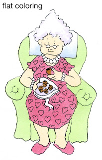
 Flat Coloring
The first thing that people notice about images colored with Copic markers is how smooth everything looks. By coloring in small circles and evenly soaking your paper you can finally get a flat area to look perfectly flat.
This also gets boring real quick because we know that the world is not flat. This Granny image is from the new release over at Our Craft Lounge. She looks pretty lifeless with plain, flat coloring. I used R83, YR000, YG11, E35, B41, and BV31. I like Granny because she is a character who is very much alive and has personality - NOT destined to be flat her whole life (especially with all those chocolates she's eating).
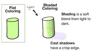
 Shaded Coloring
When we want things to look more alive we add shadows. If you look at the whole list of shadow posts you can see all my directions over the last year or so about adding shadows. I have tried to simplify shadows as much as possible, so don't get overwhelmed if you think you can't do it, just scroll to the beginning and start there.
If you look at this simple diagram you can see the difference between something flat and something with volume and substance.
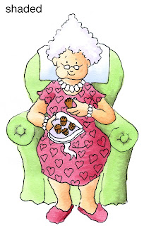 When Shading, the first step is to pick our light source. In this case, it is coming from the upper left corner. I leave my green cylinder (YG11) white on the side closest to the light and faded in BG93 to create the shading. Because this object is rounded my shading from light to dark is smooth.
Here is Granny with simple shading added. She looks much more alive than she did at first. I added R85 & R89 to the R83, E11 to her skin, and BG93 to the chair. I smoothed darker colors in by layering light-dark-light, so an area like her skin would have been colored YR000 + E11 + YRooo. So far, all of these are smooth blends from light to dark.
I think she's still missing something, though.
Cast Shadows
If you look back at the shading diagram you'll see the volume of the cylinder has left a shadow on the ground, or a Cast Shadow.
On a cast shadow you see the edges are crisp, with no soft shading. This is because the light is blocked in a straight line by the hard edges of the object. This adds to the illusion of volume and we can really feel that our object has substance. However, this is a simple object.
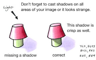 The world is made up of much more complex shapes and objects than the cylinder. If we add a top to our shape then the shadow changes as well.
Look at the first "lamp" in my diagram. The shadow it leaves on the ground mimics the shape that we know the object would have in real life. So we have the cast shadow of the whole image.
But look at where the "shade" overlaps the base. There needs to be a shadow here as well because the top is blocking light on the ground AND on the base.
 The shadow the top casts will have hard edge because it is blocking the light in a straight line. By adding the darker shadow on the green area we can really get feel for the dimension this "lamp" has.
Let's look at Granny again.
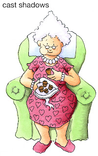
Her dress hangs over her legs, so let's cast a Crisp shadow on her legs. Her head sticks out over her neck, so she gets a shadow there, too. Don't forget the chair, as Granny is blocking the light that is hitting the chair, so those will be crisp shadows as well. Her hair casts a shadow, as does her box of chocolates.
By deepening the shadows and making some crisp while leaving the basic shading smooth you can really get a sense of granny's volume. Look at how much more dynamic her legs are in particular (you never thought of granny's legs as being dynamic, did you?)
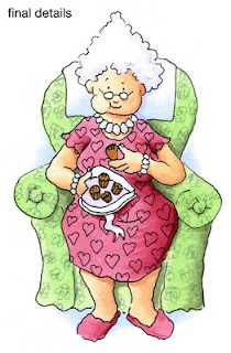 Here is my final Granny. I used a gray multiliner 0.05mm to add scribble flowers to the upholstery and I added a hint of B41 to the ground and behind the chair just to give her a bit more life. I hope this helps you in your coloring. Have a great week, and enjoy eating your own sweets. Don't forget to check out the other fun stamp sets in the new release from Our Craft Lounge!


