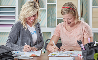
Paper crafting workshops
I can't believe that this year is almost over! I was going over my lists and I realized that a new year means new workshops are listed on the Copic website. Lots of dates and locations are now listed.
New for 2016:
Coloring Flowers: Beyond the Book- This workshop includes some great images from the coloring flowers book, but also includes some new images. This class is taught on the same day, in the evening on any day that we are also offering a Standard Certification class.
Continuing from last year:
Standard Copic Certification: The ultimate class for paper crafters who want to know all the fundamentals of using Copic Markers. Learn how to test papers, inks, airbrush, and choose colors. Learn multiple blending techniques and experiment with a little mixed media.
Intermediate Certification: This class is perfect for people who have taken the Standard Certification class and now want to learn how to color more like an artist. Learn how to apply shadows and choose colors beyond the basics. Discuss composition ideas and how to color tricky situations and more complex images.
Whimsical Faces & Hair: Learn tips and tricks for coloring a variety of fun faces and hairstyles. Try many different color combinations and get ideas for adapting into your own stamp projects.
Vintage Values & Monotones: Have you ever wanted to color beautiful sepia images or in a limited color palette? This class is a great way to experiment with a variety of colors and techniques for beautiful images.
Dress for Success: Coloring Clothing & Accessories: From wrinkles to textures and patterns, this class will help you color many different fabrics and fabric styles. Leather, plaid, metal, and so much more!
Lots of exciting opportunities in 2016 to learn how to use Copic Markers. For more info about any class I've mentioned please visit the Copic workshop page on the website.
Tuesday, December 22, 2015
Friday, December 11, 2015
Coloring a stylized poinsettia
Crisp layered colors
As I promised a few days ago, here is the colored step-by-step tutorial that I worked up for the free poinsettia download. I hope you enjoy coloring it your own way!
I printed my image on a piece of our Art pack paper. I always make laser prints or photocopies. (I know some of you ask about ink-jet printers, but sadly I don't have much experience with those, as I always work with toner).
I started with a light, even base coat of my lightest colors. I used R21 for the red and YG11 for the green leaves. I colored in circles, evenly soaking the paper so that my base color was nice and smooth. Then, I let this dry completely before I added my darker colors. This helps keep the color edges crisp.
Next I colored the green leaves. I wanted to work in a graphic style, not a realistic style. This is what I had in mind when I drew this whimsical, stylized poinsettia illustration.
I used YG13 and YG17 to create the gradient on each leaf. I left the outer edge on each leaf light. I first feathered on YG13, then feathered a layer of YG17. The, I carefully blended the YG17 with a layer of YG13 and faded that out into the leaves with YG11.
If the base coat of ink isn't totally dry, then this technique doesn't work very well because the darker colors will bleed out and not be crisp enough. For darkest green areas, I added G28.
Same for the red. The base coat needs to be totally dry. Then, the red petals are much smaller and reds tend to bleed more, so I used a slightly different color order. I layered my dark R29 on each petal, then went back and blended out with R24 and R21. The center of each flower has a layer of R89.
This also prevents a build-up of too many layers of dark red. (On some papers that buildup turns into a sticky residue where the paper can't absorb any more.)
You can see the difference between the left flower, which has been blended, and the right flower which only has R29 and no blending yet.
I colored the flowerpot with Y00, Y13, Y21, and Y28. I layered and blended each of those colors. Then, I wanted to add some extra punches of contrast to the leaves and blossoms.
On the leaves, I added some very light streaks of R22 over the dark green area. I also added some light highlights of Y13 to the edges of the leaves. (See the close-up). It's hard to see that those are red streaks, unless you look really close.
Then, in the dark red I wanted to add hints of contrast as well, so I added tiny streaks of BG09. I know it seems strange, but the dark blue-green helps the reds pop-out more. Why did I use BG09? I really don't know. That was the marker my eye saw first in my stack of markers and I said to myself "Well, that color will work". Really, I could have used any dark blue or green or even purple to add pops of shadow color.
I finished the whole picture by adding a soft blue background. I used B00 and feathered it out towards the white of the paper. Usually I would come back with the colorless blender and blend it to make it fade, but the finished edges were so soft it worked fine without the need to blend. I colored right over all the black flourishes.
Then, I took the YG13 and colored in the flourishes. Since blue is found in green, there wasn't a problem of having a light blue base to the green areas. I added tiny bits of contrast to the larger flourishes with little dots of G28.
I hope you enjoyed this different, stylized look to my coloring. Now I have a pretty Christmas poinsettia to use for gifts.
Have a great weekend!
Wednesday, December 9, 2015
Free Poinsettia Line Art download
I can't believe it's December already! This year has really flown by. Anyways, this week I am working on a fun tutorial and I figured that I would share the line-art with you ahead of time, so you can experiment on your own, before you see how I color it.
This is my early Christmas gift to you. You are welcome to click and download and share this line art coloring page. I encourage you to color it, then display your finished creation around your house.
May you find some peaceful time during this hectic season to just sit down and color. Have a great week!
Labels:
beginner,
blank artwork,
downloadable line art,
just chatting
Subscribe to:
Posts (Atom)