Tuesday, February 28, 2012

Spring Pink Flamingo

Happy Springtime!
The other day my husband was joking about putting out a pink flamingo among our bulbs that are starting to sprout. While I didn't want one in my yard, it got me to thinking about drawing one, so today I am giving you your very own free digi pink flamingo, and some tips about coloring it.

Please enjoy this image for your own personal use, and not for publication. You are welcome to upload finished images to the Copic Facebook page :)

Green and Blue
This image has a beautiful row of tulips, and a lot of blue sky visible between the flowers. However, many of you who know me know that I am impatient and always looking for a faster/easier way of coloring. I wanted the sky to fade behind the flowers, but I didn't want to take the time to be picky about coloring the sky perfectly.

Many of you, in coloring this image, might start by coloring the leaves with YG05, as shown in A. However, that would be tedious once I went in and tried to blend out my pale blue sky.

So, I started by coloring the sky, as shown in figure B. I colored with my BG10 and blended it all pretty with my colorless blender, without worrying about the leaves, since there is blue in green. The BG10 is so pale I knew that it wouldn't really affect the bright green that will go over it. See how much quicker coloring is, once I didn't worry about the leaves? I tried to keep the bulb tops white, as those will be pink and the BG10 would not make the pink look as pretty.

Next, I colored my basic flat colors. I started with RV52 for my base pinks, YG05 for the leaves, N7 for the black beak, and E13 with E44 spotted on for the ground.

Then, I went back and added my first level of blending. What a difference it makes! I added RV55 to all the light pink areas. Then, I added YG63 to the vibrant green.

For my final layer of contrast, I added RV66 to the pinks, and a hint of Opaque white to the highlights on the plastic flamingo. I darkened the contrast on the leaves with G46. I also dotted in a few more spots of color into the ground with YG61 and some more E44.

Overall, a very simple image, and coloring was really quick (scanning and writing the tutorial took a lot longer than coloring the image!) I hope you have as fun and easy a time coloring it as I did.

On Thursday I have a great announcement, so stay tuned!

Wednesday, February 22, 2012

Certification updates

Certification Updates

Wow! Just about all of our classes are full or almost full. We still have a couple spots left this weekend for our Miami class, and two new classes opened today, but otherwise, our classes are SOLD OUT!

Remember: I will be teaching the Phoenix Intermediate class coming up next month, and Sherrie will be teaching the Columbus OH classes.

Each time a class opens, we send out an e-mail to that region. If you have not been getting the new class e-mails, please register with Nancy, nancy@copicmarker.com

Feb. 25 Miami, FL taught by Lori Craig Open to Public

March 2, Edmonton, Alberta, taught by Sherrie Siemens FULL
March 8, St. Louis taught by Lori Craig FULL
March 9, Columbus, OH taught by Sherrie Siemens FULL
March 10, York, PA taught by Marianne Walker FULL
March 23, Phoenix, AZ taught by Lori Craig FULL

April 13th, Seattle, WA taught by Lori Craig filling fast!!
April 19th, Milwaukee, WI taught by Debbie Olson filling fast!!

Applications have not gone out yet for:

May, TBA
, Toronto, ON taught by Sherrie Siemens
May 18th, Dallas, TX taught by Lori Craig

North American Intermediate Certification Classes
Take your coloring to a new level with these exciting Intermediate Certification classes. You can now take these classes back-to-back with the standard classes. To apply to any of these classes, please visit our website and you will find an overview of the program.

Feb. 18th Richmond, VA taught by Debbie Olson FULL

March 3, Edmonton, Alberta, taught by Sherrie Siemens FULL
March 9, St. Louis, MO taught by Debbie Olson FULL
March 10, Columbus, OH taught by Sherrie Siemens only 2 spots left!
March 24, Phoenix, AZ taught by Marianne Walker FULL

April 14th, Seattle, WA taught by Sherrie Siemens filling fast!!
April 20th, Milwaukee, WI taught by Debbie Olson filling fast!!

May, TBA, Toronto, ON taught by Sherrie Siemens

Thursday, February 16, 2012

Screen Tones, Part 2

Today I wanted to finish up the tutorial on using screen tones. Yesterday we talked about using screen tones with a black & white illustration, today I wanted to discuss colored artwork.

Screen Tones and Colored Images
Coloring screen tones can be kind of tricky. The problem is, that screen tones are non-porous, and if you try to color over them with Copic markers, it will not work very well. Here are two options to allow you to color your work.

1. Color before you apply tone

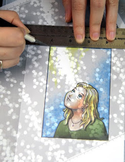
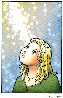
Color your image with markers before you apply any tone. As you can see from the first image, the girl doesn't look too bad, but I want more texture to her shirt, and I want the sky to have that same pattern from yesterday. I colored it, planning where tones would be, and having my textures mimic the tones I will be applying (dots in the sky pattern).

Once ALL my coloring is done, then I can apply tones like I did on yesterday's post. Be sure to burnish your tones well, or else the colors will not appear as nicely through the tone areas.

Cutting note: If you are going to be cutting along straight lines, cut against a metal ruler or metal-edged wooden ruler. Your craft knife may get caught on the edge of a wooden or plastic ruler and nick or damage the edge. When cutting with a metal ruler, be careful to keep the sharp edge of your blade from scraping against the metal. This might damage the blade. Try not to push too hard on the ruler when cutting, as it may stick the tone down where you don't want it to go.

Soft Paper warning: If you have a very soft or fibrous paper, when you try to pull up the extra tone it may pull up some of your surrounding colored areas. This might be more pronounced if you are coloring with colored pencils and especially chalks. This is not as big a problem with marker, which permeates the paper better.

2. Apply tones to black & white image, then photocopy & color the copy

I always prefer coloring a photocopy, otherwise there is no way to undo a mistake if there is a problem with the coloring.

You may have to adjust your photocopier contrast to get the best printout when you copy your line work. Make sure the contrast is high, so you don't lose any line darkness on areas where you may not have burnished the tones enough. If it copies too dark, then lower your contrast or increase your brightness.

If you are going to be shrinking your final piece: whenever possible, color the full scale version, then shrink later. This helps you have the most detail and it is much easier to accurately color tiny areas if they are slightly larger.

Final images: Drawn with .3mm Multiliner, Sky: B32, 0, Y01, YR30, Hair: Y02, Y21, E43, B32, Eyes: BG13, B05, C1, C3, Shirt: YG63, G99, Skin: E000, E11, BV00, V12, Y02, B32. Screen Tones: Y-1589, and Y-1204

Wednesday, February 15, 2012

Screen Tones

This week I wanted to share a tutorial about a product many of you may have not heard of, yet we carry it here at Copic on our web store.

Screen Tones
Screen tones are a specially printed transparent sticker that is commonly used for adding patterns and shading to comics. If you have ever had to do a lot of cross-hatching, tones can save you a lot of tedious drawing. Screen tones are more popular in Japan, where a lot of comics are still drawn by hand, however, they are growing in popularity here in the U.S.

Although they are usually used for comics, screen tones are great for mixed-media, crafts, and many other applications. We carry about 40 different tones in our store. From clouds and trees, to gray and stripes. As each one is transparent, you can layer, mix, and match to get the effect you need.

Tools
Screen tones require a few basic tools to get best results.

1. Good cutting mat. I use a clear one so I can use it through my light table for detailed work, though any "self-healing" mat is good to work on.

2. Sharp craft knife. I use an exacto knife, and I keep plenty of sharp blades so I never worry about ripping my tones when cutting, and I don't have to push very hard to get a good cut.

3. Artwork. I photocopy my work, and add tones to the copy, just in case I make a mistake. You will get best results if your work is printed on medium to thick paper (because you are cutting into it and don't want to damage it).

4. Burnishing tool. I use a bone knife, but there are special burnishing tools you can purchase at art-stores.

Using Screen Tones on
a Black & Whi
te Image
These basic steps will help you add tones to a black and white image. See tomorrow's post for directions on working with colored images. there are lots of ways to use screen tones, but this is the technique I happen to use.

1. Peel the screen from the protective backing sheet. Position artwork under the pattern area you want.

Note: if you are afraid of damaging your artwork, you can place your art under both the screen and backing layer, as they are still fairly transparent. Be aware that your screen may shift when cutting, so tack it in place with a removable tape.

2. Make your rough cut around basic area, and peel back tone layer. Save unused tone on the sheet of backing paper.

• Cut lightly so you don't damage your artwork!
• Try not to press the tone down in areas where you will be making additional cuts and removing pieces.
• When peeling, be careful to not fold or stick unused tone to itself.
• Keep even the tiniest scraps, as they are useful in all sorts of situations.

3. Cut detailed areas and peel off excess tone. Carefully burnish tone (firmly press tone into illustration) to make sure it is firmly applied.

• Burnish evenly from the detailed areas out towards the edges. This helps avoid wrinkles.
• To protect the screen tone while burnishing, you can place a piece of clean scratch paper between the tone and the burnishing tool.
• Be sure that edges are very cleanly rubbed down.
• If ink lines appear slightly gray under the tone, continue to burnish until the lines look black.

4. Add other tones, using steps above.

• Be careful that you don't accidentally pull up your first layer of tones when removing excess tone from the second layers.
• Again, when you are done, be sure to burnish completely.
• When layering multiple tones in one spot, be extra careful when cutting so you don't damage lower tone layers.
• You can make an area darker by layering a second layer of the same tone, simply off-set or turn the next layer slightly until it covers more white.

5. To add highlights to a toned area, carefully scrape away printed tone (not the sticker backing). See photo.

• Tone can also be carefully removed with a sand eraser, available at art stores.
• Use the side of the blade to avoid scraping through the sticker layer.

Once you are done, if you need to touch up any areas with an inking pen, be aware that the screen is non-porous, so any ink lines drawn over tone will need to be allowed to dry for a long time or else they may easily smear.

As you can see from the finished piece, screen tones help make the artwork look a lot more textural and interesting, without having to go through the computer. Best of all, if you are going to be photocopying your artwork, screentones photocopy well, and shrink or enlarge nicely.

My New Book!

Copic Coloring Guide, Level 2: Nature
After months of work, and then months of waiting, it is finally here! Colleen Schaan and I have just released our second book in the Copic Coloring Guide series. You can pick up your very own copy direct from Annie's Attic, or from your local retailer.

The Copic Coloring Guide, Level 2 teaches you how to color things in nature, from rocks and plants, to water and sky. Best of all, each image we step out in a tutorial is included on a CD that comes with the book, so you can print the image and practice along. Colleen and I worked hard to make sure directions are clear and simple. I carefully drew each tutorial image to teach the coloring concepts as concisely as possible. This book is a perfect companion for the bestselling first book, and will look great in your growing Copic library.

I will have more fun details about the book in a few weeks, and each of the contributing designers will be sharing some neat things from the book. Meanwhile, go ahead a pick up a copy or ask your local store when they will be getting it in stock. Enjoy coloring!

Monday, February 13, 2012

Certification 2012 Updates

Before I post my weekly tutorial, I need to update the Papercrafting Certification classes, as there have been a few minor changes, and new classes have opened, and many classes have filled.

A few small changes: I will be teaching the Phoenix Intermediate class coming up next month, and Sherrie will be teaching the Columbus OH classes.

Each time a class opens, we send out an e-mail to that region. If you have not been getting the new class e-mails, please register with Nancy, nancy@copicmarker.com


Feb. 17th Richmond, VA taught by Debbie Olson FULL
Feb. 25 Miami, FL taught by Lori Craig Open to Public

March 2, Edmonton, Alberta, taught by Sherrie Siemens almost full!!
March 8, St. Louis taught by Lori Craig almost full!!
March 9, Columbus, OH taught by Sherrie Siemens almost full!!
March 10, York, PA taught by Marianne Walker FULL
March 23, Phoenix, AZ taught by Lori Craig almost full!!

More locations are getting finalized. Here are a couple future classes that will be available soon. Applications have not gone out yet for:

April 19th, Milwaukee, WI taught by Debbie Olson applications go out next week

May, TBA
, Toronto, ON taught by Sherrie Siemens
May 18th, Dallas, TX taught by Lori Craig

North American Intermediate Certification Classes
Take your coloring to a new level with these exciting Intermediate Certification classes. You can now take these classes back-to-back with the standard classes. To apply to any of these classes, please visit our website and you will find an overview of the program.

Feb. 18th Richmond, VA taught by Debbie Olson FULL

March 3, Edmonton, Alberta, taught by Sherrie Siemens Open to Public
March 9, St. Louis, MO taught by Debbie Olson FULL
March 10, Columbus, OH taught by Sherrie Siemens Open to Public
March 24, Phoenix, AZ taught by Marianne Walker Open to Public

May, TBA, Toronto, ON taught by Sherrie Siemens

Thursday, February 9, 2012

Artwork for Oregon Asian Celebration

As promised, here is a brief post about my process for working on the artwork for the Oregon Asian Celebration.

This year's dragon went back and forth many times before we decided on a final version. Once a final was chosen, then I could start coloring. For more information about the Oregon Asian Celebration, please visit their website.

Coloring The Year of the Dragon
I actually colored the image parts separately, then combined them on the computer. I didn't write down all the colors I used, so I am going from memory on my colors.

I started by coloring the head. As I had not exactly decided how I was going to position the head, I did not draw in his eyes until after I had attached the head to the final artwork.

I worked in tones of YG11, YR12, YR15, YR04, and YR21, with shadows of YR18 and YR27. The blue/gray is B52 and BG72 with hints of C3 and BV31. The scanner did not pick up all the subtleties. However, I like how rich and vibrant the golds and yellows came out. In testing colors I liked the combination of the vibrant orange with the lime-green color on his fringe.


Next, I colored the globe. This was much easier. I love how the colors came out in this image. I worked heavily with the BG70's family and the green areas were colored with G20, YG11, and BG72.

I really like how the globe came out by itself. I can think of lots of nice uses for this portion of the illustration.

Last, I worked on the main dragon image. You can see from this version how strange it looks without a head or the globe finished. I used the same colors from the dragon's head, then I used B52, YG11, BG72, and many of teh B90's markers for the waves. Again, I accented with BV31 for the grayer areas.

After all the base coloring was done, I carefully drew in the scales with the brush tip of my YR12 and YR14 markers. Then, I held it at arms length and decided which areas needed darkening. I went back with my deep oranges and hints of gray to add shadows.

The final image was tweaked slightly in photoshop for the poster, as the waves scanned in too gray. Otherwise, the poster is fairly accurate to the original scan.

I will be demoing part of the time at the Youth Art Room at the Oregon Asian Celebration. If I am not at our table, then many other fabulous people from Copic will be demoing. I hope to see you there next week!

Thursday, February 2, 2012

Upcoming Local Events

I've been pretty busy since coming home from CHA, but I wanted to post a quick update for some great local events.

This Saturday, Feb. 11th, from 2 to 4 I will be in Eugene at the U of O Bookstore hosting a free workshop on marker rendering. Seating can be limited, so be sure to arrive on time.

Feb. 18-19th, come celebrate the Year of the Dragon! Oregon Asian Celebration, Lane County Fairgrounds. Copic/Imagination International will be sponsoring coloring tables in the Youth Art room. You can find out more from the Asian Celebration Website or from their Facebook page.

Once again, I designed the artwork for this year's Asian Celebration poster. The image was colored entirely with Copics. Later this week I will try to post more information about my design process for that image.

I hope to see you at one of these events!