Monday, June 30, 2008

Picking Between Markers part 3 - Sketch

I know I promised last week that I would share the differences between the marker types and why you would want one over the other. Sorry about getting sidetracked on colorless blenders, but there is just so much you can do with a blender pen, in fact you can take a blender pen and...wait...no... I'm talking about Sketch Markers today, NOT blender pens :)


Sketch Markers
Copic released Sketch markers over 15 years ago and with that move they revolutionized fine art markers. The original Copic Marker feels like a nice, solid, firm traditional marker. The Sketch marker came with one end that feels like a brush - A really juicy, flexible brush that never frays and lasts a long time. Finally, here was a marker that didn't feel like a marker, but it would put the high quality Copic inks onto paper in a smooth, paint-like way.

This is what makes the Sketch marker the most popular of all Copic marker types. That's why Japan makes 322 colors of Sketch, and they may even make more (I have some colors I would love to see that Japan doesn't make yet).

The other end has a Medium Broad nib, which is a firm chisel tip that is perfect for airbrushing or for coloring large areas. This tip is only slightly smaller than the broad nib nib on a Copic marker.

The Sketch marker gives two different patterns when airbrushed. The chisel end gives a fine, smooth spray, the brush end gives a larger speckled pattern. So if you enjoy airbrushing you may prefer this marker over the Copic, even though you'll have to refill this one sooner.

If you don't like the chisel nib, then you can swap it out with a Medium Round Nib. This firm round point is great for writing. It's a little larger than the fine point on a Copic, but it is great for people who are used to working with a firm ended marker and want something they can write with that is better than the chisel nib. Note that if you remove the chisel then the airbrushing doesn't work the same (more on this when we cover airbrushing). This tip works on either side of a Sketch or Ciao marker.

Most of the time I choose Sketch markers because I love how smooth the Super Brush allows me to color. Also, there are so many more colors than any other marker out there that it's hard to beat the selection offered by Sketch. I like how it takes me a while to run one dry, since I tend to be lazy about refilling. If I had only one style to pick, I'd go with Sketch for my everyday coloring needs.

The rest of this week I'll be sharing things that relate to comics as well as stamping, in honor of Anime Expo, so stay tuned for a guide to skin colors and more. Enjoy coloring!


Stamp Image: Pumpkins in Wheelbarrow by Lockhart Stamp Co, Paper: Neenah Classic Crest Ink: Memento Tuxedo Black Markers: YG17, YR02, YR04, E35, E37, W3, W5, BG10, Colorless Blender

Friday, June 27, 2008

Frequently asked questions

Before I cover Sketch markers, I want to address a few things that people always ask me, and no matter how many times I answer, someone else will ask me the same thing. Hopefully this will help you with all your questions you've been dying to have answered, or just wondered about.

So here we go:
Q. How do I pronounce Copic? Ciao? Spica?
A.
Copic- long o, Coh-pick Ciao - chow, like the Italian greeting Spica- speek-ah is the Japanese pronunciation and how we say it, but it could be called spike-ah, which is the way Americans pronounce the star of the Virgo constellation it's named after.

Q. Which way should I store my Copic markers? Horizontal or Vertical?
A. However they look best on your desk :) Japan sells them stored either way, so it doesn't really matter.

Q. Will the marker dry out if I don't use it after a while?
A. No. We guarantee a 3-year shelf-life. These are very airtight and will last for years, even if you never use them.

Q. Are Copic Markers lightfast?
A. No. They are a dye. they will fade in harsh light unless they are protected from direct light.

Q. What happens if I leave my marker in the hot sun or a freezing car?
A. Nothing. They are air tight, alcohol. It will take a lot for them to freeze or boil due to extreme temps.

Q. I was coloring away and suddenly my marker blobbed. I've had the marker for a while, what happened?
A. The air pressure inside the marker is messed up. Remember, these are very airtight markers. A pressure change from weather, elevation, or my frequent problem is from coloring while flying with the markers. Just pull the cap off both ends and let it sit for a moment. This evens out the air pressure and you should be OK after that.

Q. Are Copic Markers acid-free?
A. Depending on the surface, they dry acid-free. The alcohol carrier solvent is slightly off-neutral pH, but once that evaporates they are neutral. Some papers retain the alcohol more than others though.

Q. One side of my marker seems to be dry. Do I need to refill both sides?
A. No. Both nibs share the same ink reservoir. If one side is dry, chances are the other side is almost dry too. Just refill from the chisel end and you'll be fine.

I hope you find these little tidbits useful. If you have questions, please ask- send me e-mails at office1@copicmarker.com Have a great weekend!

Thursday, June 26, 2008

White & Transparent Things

Every now and then I get a question that I think everyone would benefit from the answer. Here's one I got recently. Just so everyone knows, I was NOT planning on posting anything else about the Colorless blender today, I really was going to move on to talking about the differences between markers, but this question just fit in too perfectly with this week's earlier posts.

Q. I have several of the sketch copic markers but I need one that will show white on white cardstock or a color that will look white or 2 colors that will make a wedding dress or image like that look white. Can you help me??? I just don't know which one to buy. Any help I would so love to have that you could give me thanks so much and thanks for such great markers !!!! I love them

A. "White? just don't color it. Your paper is already white" (This was the first response our Operations Manager had)

MEN ... jeepers ... he just doesn't get it :)

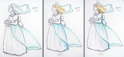
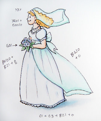
I didn't have a wedding dress stamp, so I drew an example to show you what I mean. First, you need to figure out the feel of the card. What papers are you going to accent with? what do you want it to feel like?

1. What tone of white?
Cool, crisp, clean white tends to have a hint of blue, hence adding blueing to a load of white laundry. It makes it look cleaner. So use a super-pale blue or blue violet. bright-B000, muted-BV20, or B40. I'm using a B21 on the final picture since a B000 is a little bright.

Natural white, like a white wool is actually warmer. If I were working with an antique palette, I'd choose a really pale E40 or W0/W1

Sunny bright things would have a trace of yellow. Y000

Cool, neutral blue could use a pale gray. C0/C1 or N0/N1

Watery looking things would get a hint of green, so BG10, BG000

Rosy, blushy glow, R000 or RV000

Or, basically any color that ends in a 0 can be used to achieve some kind of pale tone, so test yours to see what colors work for you and with your other accents. IMO, Blue or blue gray with a hint of violet will still be your best choice for a clean white dress.

2. How do I color it?
Ah, now this is the part that makes it look white. Don't color in the whole picture with whatever pale color you chose, since it will not be white anymore. Color only the shadows and edges. Pick a spot for your sun to be shining (I'll explain this better someday), and add your shadows heavier opposite that spot. For these examples, I am having the sun shining from the front, so she'll be slightly more shadowed on the back.

Color only the edges and use the blender to fade to white. It's that easy (it's sounds easy, right?) The complicated part gets an advanced tag-

Transparent-
Same thing, color only the edges and fade to white. The tricky part is showing things that are under the transparent layer. Her dress and hair are partially covered by a veil. What do we do now?

In this picture the lines suggest what to do:
1. Color the transparent layer with a faint edge of the tone you want. Fade this into white with the colorless blender. I chose BG10 because it has a different feel than the under layer so you can keep the parts distinct in the tutorial. Normally I would choose a blue that would match the dress better.

2. Things under the transparent layer appear one or two shades LIGHTER than they would otherwise. So, whatever color you color the hair or dress, make it even lighter under the veil or train.

3. Don't color all the way to the edge on the under layer- leave some white between it and the over-layer. This really adds to the transparent look. See how I didn't draw the line all the way to the edge? This gives you a visual clue about how see-through it is. I am only going to color where the line is.

4. The transparent layer under the transparent layer will also be colored a shade lighter. Huh? Read it again, slower and it will make sense. Where you see the back of the veil make it lighter than the front edge.

5. The last thing is to add your ground shadows. Areas under the dress are completely shadowed, but she is walking across a white background, so choose a shadow color that ends in 1 or 2. The shadow under her flowing train will be one shade lighter than under her dress because more light is getting through. fade these out with the blender to show how diaphanous the edges are.

Bonus: For some extra bling color edges with the clear Spica Glitter pen. It doesn't show up on camera, but that just adds the final subtle, glimmery touch.

I know it's tricky, but it looks cool when it's done. Again, I chose very different feeling transparent colors so you could get a better idea of how the dress looks underneath. Keep in mind that these colors are super-hard to pick up either from my camera or from the scanner, so don't trust the screen colors entirely, they are just to give you an idea. Sadly, a lot of the subtle colors are washed out. Paper: Neenah Classic Crest Ink: Photocopy

Wednesday, June 25, 2008

The Colorless Blender makes jeans

I really have a lot about the colorless blender that I just need to get off my chest before I can move on. Any time I think I've said enough, more comes to mind. I will do other things besides ramble about the colorless blender, really I will.

Using the colorless blender to blend colors
I guess I should explain how the colorless blender blends colors, since it is called a colorless blender. Remember though, the colorless blender is best at lightening, pushing, and fading to white. So, if you want to actually blend two colors together, know that the blender marker will also lighten, push, and fade those colors together.

Usually when I am blending two colors together I just blend those two colors (this is a subject I could cover for a whole month sometime later!). Only when I want my colors to also get lighter do I use the colorless blender. This technique will work best with colors that are in the same Natural Blending family and only 3 or 4 digits off each other.

A common time to lighten and blend colors is when you want to make something look old, faded, or weathered. In this case, let's make some stonewashed jeans.

1. Color your image about 2 shades darker than you want it to end up. This does not need to be the prettiest coloring, just get the colors on paper and have your shadows in the general area you want them to end up.

2. Color with the blender from the lightest faded area, out. Do this while your base color is still a little wet so your edges are soft. Yesterday's example we had hard crisp edges because we let our color dry. Stonewashed jeans however are much more subtle. If you had crisp edges on your faded area it would look more like you dripped bleach on your pants (that could work as well). You don't need to be perfect when adding blender, it's the irregularities that make it interesting. The third swatch is with the blender dabbed on to give irregular patches. (Dabbed- I dabbed the marker in the same spot a few times to make sure it left lots of juice behind)

3. Repeat as desired. The first fade might be all you need. If your pants are really dark to begin with you may want to do this a couple times. I did one base layer then came back while it was still wet and pushed a little more color out.

You don't always have to use the blender to fade out a color. There are whole piles of other pale Copic colors that you can use over the top of darker colors to get neat blended effects.

Remember how we layered grays to tone down a vibrant color? If you don't want your jeans too pale, use B32 instead. Compare the two swatches- the B32 is more soft, and I dabbed it on for texture. This will stonewash them in a more subtle manner.


Want to shade them? I added C3 to really gray them down. The last swatch shows how you can blob on totally opposite colors, like Y02 for a stunning pattern (I think I had a swimsuit that looked like this once). See how the yellow pushes out the blue? This is because I made each spot really juicy. If you just draw a little yellow spot it won't be as strong. Really soak that light color in to push out darker colors.

Here is a finished example using the blender techniques we've covered in the last few days. This Bella stamp was colored with only 5 colors plus the blender. Not bad for the range of shading you see. I used the stonewashed technique from today on her jeans, and I used yesterday's technique of coloring the edges only on just about everything else. I picked a hair color from the same color family as her skin, that way they have good tone together. The green is kinda dark, since I knew I'd want some nice rich dark areas, but see how I used the blender to make it lighter on most everything else. You also can't see where I fixed a slight mistake with the blender.

Hooray for blender markers!

Stamp: Good-Luck-a-Bella by Bella Stamps Paper: Neenah Classic Crest Ink: Memento Tuxedo Black

Tuesday, June 24, 2008

More about the colorless blender

I am still sloughing through past e-mails, so have patience if I am a couple days behind. Also don't worry, I will post sometime this week the features that make a Sketch or Ciao marker different from the Copic original.

Meanwhile, I still have a bit to say about Colorless blenders.
So far, we've figured out that the colorless blender marker does a few things, but it still might not work the way we anticipate. That's because it's called a colorless blender, we expect blending, but it really does the following best:

1. It lightens colors
2. It pushes colors
3. It fades to white
4. Great for special effects
5. It blends colors (note that I list this last- in my opinion this is a side-effect of what the blender does best- lightens, pushes, and fades to white)

We've made bricks and we've fixed mistakes, but there is so much more it can do. I'm not even going to touch on all the blender can do right now, but I will show some more ways of using what we already know about the blender to color images better.

Fade to white by pushing colors
This example is almost exactly the opposite of what we did yesterday. Instead of pushing color from the outside into the stamped area, we're pushing color from the middle of an area out to the edges. Same rules apply as yesterday though.

1. Start with an area that you've only colored the edges. In this case I'm using BG93 that I haven't colored very smoothly. Make sure you have good scratch paper under your work for this technique.

2. Color from the lightest spot, out towards the edges. Don't stop in the middle or it will give you ugly lines/streaks. In this case I'm using a lot of blender, so it's really juicy and is shoving that color around very strongly.

3. Color almost to the edge, but not over. Remember, you color is getting pushed in front of your blender, so if you color up to the line it will go over. Also note how dark the color is around the edge. This is at least 1 or 2 shades darker than my original color, so try this technique with lighter colors until you get an idea of how it will react. If you need it lighter then let it dry and repeat (just like erasing). Keep a swatch in your swatch book to remember what you did.

If you want a nice subtle shadow that fades out from your image like you'll frequently see on Debbie, Trudee, or Michelle's blogs, then try the same thing, only use a lot less blender and a much lighter touch. Debbie mixed her own B0000 marker a while ago (note that it has 4 zeros, making it super-light) because she is always fading out from pale blue to the color of her paper.

Here are some examples I shared on Splitcoaststampers a while back. This is a page from my swatch book. Note that the pink frosting on the cupcakes fades to white and the ground shadow fades from color to white as well.

Color Note: I chose these shadow colors to show that not all shadows have to be gray. These are supposed to give you the idea of light bouncing off the cupcake cup and reflecting a bit of color on the white background.

Monday, June 23, 2008

Fixing Mistakes with the Colorless blender


I have been swamped since I got back from Seattle, so I'm sorry if it's taking me longer to answer e-mails than usual. We are also packing for a large show down in LA that will be happening July 3-6, Anime Expo, so I'm going to also be a bit preoccupied getting ready for that show for the next week, then it's packing for CHA and the Certification Classes in Milwaukee and Chicago. Summer is just sooo busy! Hopefully we'll see some of you this summer at one of our events.

Today I wanted to share a quick technique that goes right along with the bricks from Friday. This is a very simple but important trick to keep up your sleeve when you're coloring with Copic markers.

One of the qualities of the Colorless blender is that it pushes color- think of pushing your hand through sand and the sand piles up in front of your hand. That's why the bricks worked- it pushed the darker color out from the middle of each brick and made a thick ring around your shape.

So how can we use this to our benefit? I could push color around to fix mistakes. This poor snail was not colored very carefully. I used YG41, BV31, and YR31 and as you can see, the BV and the YR went out of the lines. No worries, this is where my colorless blender comes in to fix my sloppy work.

To fix coloring mistakes:
1. Color from the outside and "push" your color back into the stamped image. Don't color over the stamped line, color up to the stamped line. The dye is building up in front of your blender and creating a small ridge of color. The trick is to hide this ridge under the stamped line. See how the BV31 fixed right up on the first push? we got lucky with that color. The YR31 still has a ways to go, soooo...

2. Let it dry and repeat. This step might need to be repeated a few times, but you have to let it dry completely before trying it again, or else the marker will move too much and make a mess of the colored area. When you're doing this trick be sure to keep absorbent scratch paper under your work to catch any stray ink you push around.

Also, some colors will be easier to erase than others. After 3 or 4 repeats the YR31 still has a faint trace left, but no where near as bad as before. I can hide this with my ground shadow very easily now, before it would have looked really bad. If you do get a faint ridge inside the stamped line, just color back over the whole area with that same color. This will hide those small mistakes.

Stamp:
Slippery Snail by Stampabilities, Paper: Neenah Classic Crest Ink: Memento Ink, London Fog

Friday, June 20, 2008

Simple Bricks

I'll talk more about the differences between markers next week, when I'm back from Seattle, meanwhile, it's been a few days since I showed a cool technique, so here's a fun one.

For those of you who haven't taken a class from me, this is one of my favorite, simple techniques, and is great for making a quick patterned background for a small area.

First, start with a streaky colored area. In this case, since I'm going with bricks, I am choosing some orange/browns and layering them sort of randomly, but still all streaks are in the same direction. Why did I streak with a few colors? It adds a pleasing, uneven but similar color to your overall brick pattern.

Next, using the chisel end of a colorless blender in any marker style, touch the angled side down and hold it there for a few seconds. The browns will get pushed out in the same shape as the marker tip. If you hold the tip too long in one place the spot will get round and fuzzy, so practice to get the ideal "brick". Good paper will help keep these edges crisp as well. Be sure to lay your bricks in the direction of the streaks, so you'll get more of a consistent color to your bricks.

Remember, in good brick-mason style to stagger your rows of bricks. Also, the colorless blender will make lighter colored bricks. If you want darker bricks, then try a color that is similar to the colors you first streaked with, but still a few numbers lighter on the last digit. This assures that you're pushing out the color already on your paper. If you use a dark color it just covers up your pretty undercolor. See how the E31 leaves more muted bricks than the blender? Either one looks good though. Make an occasional brick darker for even more artistic effect.

This technique can get tedious over large areas, but it is great when used for a limited background, or if you want to make a brick path, house, or other element of a larger picture. Debbie Olson sort of used this technique to add bricks to a Thomas Kincade stamp by Cornish Heritage Farms once (sorry, it was a while ago or else I could give you a link).

The background for this butterfly stamp was colored in the same manner, except I used an assortment of streaky pinks/light purples to make my base coat (R22, RV11, V12, V01 and maybe a few others). Then I used the blender pen in a random pattern to give a confetti look to the streaks. Experiment with different color combos, and holding the chisel tip at different angles to get different patterns. Want a woven sweater? Use the point of the chisel for an even finer effect and layer it in the same way.

Image: Butterfly stamp by Karen Lockhart Ink: Memento Tuxedo Black Paper: Neenah Classic Crest Cardstock Markers for butterfly: V15, R39, BG72

Thursday, June 19, 2008

What will ruin a marker tip?


Since I'm out of town I figured we'll cover some basics that I was going to explain later, but now's as good a time as any. Someone recently commented that they want the things that are bad for your marker to be bolder so they are easier to avoid. Here's a list of things I would try to avoid coloring over:

1. White Out- No way should you color over white-out. Besides looking bad on paper it leaves a white spot on the marker tip. the photo shows how coloring over white out shows up worse than ever, and it can leave gunk on your marker tip.

2. Unfired Clay- this will discolor the tip because bits of clay are clogging the fibers. Also avoid plaster. Clay coated papers also should be tested, some will work and some won't.
What is OK: Ceramic paint-it-yourself ornaments are great. Sculpey, after it's baked looks real neat. Glazed Ceramics are Ok too, though those are pretty slick surfaces.

3. Acrylic paints- You can get away with some quick work but if you try to color over most acrylics they will clog your marker tips/discolor your tips.

4. Chalks/Oil Pastels- Nope. Do these after you color with marker, not before.

5. Untested stamping inks- These will stain you tips and it may come back off when you least expect it. See the post on Testing stamping inks for more info on how to throughly test an ink.

6. Solvents or oils: These are just a bad idea to color over. They are fine to use over the top of your marker drawing though, and won't hurt it unless they contain Alcohol, Ethanol, or some other similar chemical.

Rule of thumb- If it is something that when it gets wet it smears and is opaque, STAY AWAY or test it first.


Things that won't hurt your marker, just make the tip look UGLY:
1. Pencil- I once had a colorless blender that I didn't change the tip on for almost 4 years. The tip was grey and people thought I was coloring with a light gray marker. The tip was fine, and the blender ink was clear, but it had become gray from all my years of going over pencil lines. If you go over a thick pencil line quickly scribble onto some scratch paper to get it off your tip. Same with Colored Pencils. They won't hurt your marker, just make the tips ugly (see photo)

2. Watercolors- These are so thin that you usually won't have a problem, but they might discolor the tip. If you want to use watercolors, use them AFTER you use markers.

Rule of thumb: In Japan Copic markers are commonly used with watercolors, pastels, colored pencil, acrylics. However, they use them AFTER the marker work has been done. Also, any other inks that are not allowed to dry enough that usually work with Copics will discolor the tips. Your pale colors will show damage the most.

It's easy to switch out a tip if you have ruined it beyond help. Get a pair of tweezers (Copic tweezers have little gripping teeth that make removal easier) and pull the tip straight out. Then, insert the new tip by pushing it straight in where the old tip was. Let the marker sit for a few minutes so the ink flows evenly.

This is not a complete list, but I am hoping that if any of you have run into other marker no-no's you can share these with us.

Wednesday, June 18, 2008

Picking Between Markers, part 2 - Copic

Oh I'm going to have so much fun papercrafting today! Usually I come up to Seattle each spring for the SakuraCon Anime Convention and teach Copic workshops, but this year I was too busy so everyone else went instead. I love Seattle and I really missed all my Anime friends, but I'm getting to play with stampers, so it all works out.

The first marker type I'd like to explain is the original Copic Marker.

For those of you who want a firm, fine point while coloring, the ability to airbrush, or don't want to refill right away then the Original Copic Marker is for you.

Original Copic Markers were the first style created by Japan over 25 years ago. They are most popular for Architects, product designers, calligraphers, Quilters, and for papercrafting. These durable markers have not changed since they first came out many years ago. Some artists have kept the same marker for over 20 years!

These markers feature a square body design, come in 216 colors, and have the option of 9 different tips. If you don't like the standard fine or broad tips then swap them out for calligraphy tips, a brush tip, super fine tip, round nib, or any of the other custom nibs.

What does all this mean? The original Copic Marker is the most customizable. You can get an empty marker and mix your own inks to get exactly the color you want, as well as the tips you need.

I use these when I have a larger area that I want to color smoothly, and I also need to fill in fine details. One feature people like is that when you take a cap off it can stick on the other side, (you can't do this with a sketch, but you can with a Ciao) and the color number is printed on the cap (not Ciao). The Fine nib is also much easier to write with than the Super Brush tip found on Sketch or Ciao markers. So if you think you'll be doing a lot of journaling with the markers instead of inking pens, then the original Copic marker is for you.

Image credits- Stamp: Party Lanterns by AMuse Ink : Memento Tuxedo Black Paper: Neenah Classic Crest Markers : B41, Y11, G12, V12, BV31

Tuesday, June 17, 2008

Picking Between Marker Types - part 1

Well, I'm off to Seattle this afternoon. I have my posts for the next few days set up for automatic, so hopefully they'll show up when they're supposed to. Just don't feel bad if I don't comment back as quickly as usual, 'cause I'm in Seattle coloring my fingers off!! Alright!!

Copic Markers come in 4 different body styles. Most people work with the main three, Copic, Sketch, or Ciao. Wide markers are fun for backgrounds and special effects (like last Thursday's post). If you don't already know, each marker style has very different qualities, though they all share some common traits.

Just to confuse you, Copic is the brand name (pronounced with a long o, like Oh! Pick more colors!). Copic is also a style of marker (the square-shaped marker). When I'm talking about any of our marker types I'll try to say Copic Markers, but when I'm comparing the individual styles I usually say Sketch, Copic, Ciao or Wide.

You may have noticed that I haven't yet compared the 3 main Copic Marker types yet, nor do I usually tell you which type I use. Mostly, this is because the color is more important to me than the marker style. Second, I have a mix of all marker types on my desk so I use a mix of body styles when I color. It's annoying enough listing which colors I used, let alone which style I chose. Unless the body style is important to the specific technique I'm sharing then I don't usually pay attention to anything but the color.

You, on the other hand, probably care a lot more than I do what makes each marker different. Let me state this first:

All Copic Markers have the same ink. A B32 in Copic is the same color as a B32 in Sketch or Wide. These are computer-mixed inks. They have not changed in 20 some years, and they never will change. If you have a marker that's 15 yrs. old and you go to refill it, it will be the exact same color.

• All Copic Marker ink is alcohol based dye. It is low-odor and it doesn't cause paper to "pill" when you layer it many times in the same spot. This dye is permanent on many surfaces making it a great choice for mixed-media. Also, we say alcohol, but it really is ethanol, hence the low-odor.

All Copic Markers are refillable with replaceable tips. Any marker you buy, with a little care, will last you forever so pick the type that is right for You. Before you pick a marker you need to figure out what qualities are most important. A list of questions to ask yourself to get you started thinking toward the marker type that is best for you:

What is important to me when I color?
1. Do I color a lot or a little? If you only color every now and then and you just want a high quality marker for those rare occasions, think Ciao. If you will be coloring all the time, pick Copic or Sketch (these will last longer before needing to be refilled).

2. Do I have to have every color exactly perfect, or is close good enough? If you need EXACT colors think Sketch, since it has the most colors, 322. Copic has 216, but both Copic and Sketch have empty markers so you could always fill your own colors and make custom as well. If you're not too picky, go with Ciao, since they have only 144 colors and no empties.

3. Do I like a firm tip to color with or do I want the really flexible brush? The Copic comes standard with a nice firm, fine point for coloring. This is great for details, but you would have to buy an optional brush for the other side if you also like the brush, then the airbrushing capability would get messed up. Copic markers are versatile and have a total of 9 different tips so you could turn these into a calligraphy marker, a super-fine pointed marker, or give it a nice round end. If you know you like the flexible brush (which takes some getting used to) then go for the Sketch or Ciao. They do have one optional Med. Round nib, but it's not as fine as the Copic nibs. This question is really hard to answer unless you get a chance to play with each style before you buy.

4. Do I think I will ever airbrush? No, you may want Ciao. Yes, go for Sketch or Copic.

5. How much airbrushing will I do? If you don't think you'll be doing anything but airbrushing you may want Copics, since they hold the most ink to start with. If you want two different airbrush effects from one marker then go for Sketch, though it will have to be refilled sooner than the Copic.

6. Do I care about needing to refill right away? If you don't mind refilling sooner, then go for Ciao. If refilling sounds like a pain and you want to go longer before buying your inks, think Sketch or Copic (Copic holds even more ink than Sketch to begin with).

7. How much am I willing to spend on a marker? Ciao generally run $2 less per marker than the other styles, but they'll need to be refilled sooner and you can't airbrush. Sketch and Copic are a little more expensive up front. Refill inks sell for about $6.95 US, but one refill will fill a Sketch or Copic marker about 10 times, and a Ciao marker about 15 times. Work out the math and you'll see that refills are really inexpensive over the long run.

Over the next 2 weeks I will highlight each marker type individually, so compare carefully before you make a commitment (I have met people who bought one of each body style in the same color because they used them for different things). Meanwhile, I'm heading up to the fun city of Seattle- I can't wait to meet the great stampers up there!

Monday, June 16, 2008

Stamping Paper and Ink Results

We had 324 people submit replies to the question What paper/ink? by the time that I tallied all the stats. I want to thank all of you for your helpful comments. Below are the results, type by type:

Paper - 292 Votes for what works
Papertrey Ink Stamper’s Select: 97 33.2%
Georgia Pacific Cardstock: 72 24.7%
Stampin Up! Whisper White: 36 12.3%
Neenah Classic Crest Solar White: 30 10.3%
Curious Cryogen White: 10 3.4%
Close to My Heart white Daisy: 6 2%
Poison Ivy: 5 1.7%
Bazzil White: 4 1.4 %
Canson Fan Boy, Staples Coverstock, Wasau White: 3 (less than 1% each)
California Paper Goods, Watercolor, Xerox Cardstock, MatteKote: 2 (less than 1% each)
Aquabee Manga Pad, AMuse, Making Memories, Paper Accents Pearlized, Xpedx, PaperRocks 110 #, Paper Cuts, Solarcrest White, Professional Cartooning Pad, Mango, Hobby Lobby Paper Studio, Strathmore Smooth Bristol, WinWorld, Ampad, Hammermill Color Copy Cover, Copic Sketchbook: 1 (less than 1% each)

Papertrey Ink Stamper's Select: This was by far the most popular paper for working with Copics. This is a very high quality, heavy cardstock with good blendability.
Georgia Pacific Cardstock: This inexpensive cardstock is easy to find, with decent blending qualities.
SU! Whisper White: Many of you voted for this paper, although it is not a matte cardstock. It is coated, and some of the comments noted that it is good for single-layer coloring, but not as good for blending.
Neenah Classic Crest Solar White: This cardstock is not as easy to find, but it is a good, high quality cardstock. I use this kind the most, because we also use it for printing on in the office.


Inks - 235 votes for what works
Brilliance: 72 30.6 %
Ranger Adirondack: 49 20.8%
Palette Noir: 46 19.6%
Memento: 24 10.2%
StazOn: 16 6.8%
Versafine: 13 5.5 %
Ranger Distress Ink: 4 1.7 %
Ancient Page: 3 1.3 %
Palette Ink by Stewart Superior: 2 (less than 1%)
Cougar Opaque, Archival Ink/Michael’s, SU! Classic Black, SU! Chocolate Chip, Close to My Heart, Versamark (embossed): 1 (less than 1%)

Brilliance: Almost everyone who suggested this ink said to heat-set it
Ranger Adirondack: This ink was intended not to smear with alcohol inks
Palette Noir: Heat-set it
Memento: Those of you who have tried this new ink love it, since you don't have to heat-set it
StazOn: Many of you who have tried this ink admit that you are beginners, or haven't experimented much, you also suggest heat-setting
Versafine: Heat-set


What doesn’t work, or found something better:
Paper
Stampin Up! Whisper White: 7
Georgia Pacific: 2
Bazzil, SU! Confetti White, Curious Cryogen White, Close To My Heart, Christine’s CC Designs White:1
Inks
StazOn: 4
Stampin Up! Dye Ink: 2
Brilliance, Adirondack, Memento, Encore:1

If you ever get a new type of ink or cardstock remember to try the steps I outlined to find out if these will work for you. Note that some inks work better on some cardstocks than others, so test BOTH the paper and the ink.

Certification- Tomorrow I'll be leaving for Seattle. These classes will be a blast! I am so looking forward to meeting all of you fun stampers and hopefully I'll be able to share some useful things with you. I will try to keep updates on future Certification Classes posted regularly, so keep watching. I found a forum on SCS started by people attending my classes- everyone is so excited!


Saturday, June 14, 2008

And the winner is....

We had 321 people submit replies to the question What paper/ink?. Congratulations to
Suzie Q for winning the blog candy! Your comment number was generated by

Random Integer Generator

Here are your random numbers:

111 

Timestamp: 2008-06-14 07:06:58 UTC

(12:06 AM pacific Time)

Your comment was:
Blogger SusieQ said...

Love your blog! Through trial and error (and error, and error, and error), I've found that Neenah & PTI work the best for me in terms of paper - there is minimal feathering, and good blendability. For ink, I've had the best results with Brillance pigment ink, Palette hybrid ink, and Memento ink.

June 10, 2008 1:55 PM

Suzie, if you could please e-mail me your address I can send you out your fun prize! I want to again thank everyone for helping. Monday I'll post the rest of the paper/ink results.

Friday, June 13, 2008

Drawing a picture to color- Low Tide on the Oregon Coast


OK, enough of you wanted to know how I drew the picture in this morning's post. Here is my typical process whenever I draw anything.

Smooth, tight paper. I used color laser copier paper and started with a rough pencil sketch.

Pencil. I draw very lightly with a blunt pencil so it erases cleaner. Erase with a soft eraser, holding the paper on one edge and carefully erasing in smooth even strokes (no scrubbing back and forth). This keeps the paper and ink lines from getting ripped.

Ink. I ink over my pencil lines with a Copic Multiliner 0.1 mm. For thicker lines I will grab a slightly larger pen, or just go over the line twice.

Photocopy before I color. In this case I scanned it into my computer, because I didn't know what size I'd like to color it. Sometimes I touch it up in Photoshop if I need to fix stray lines or pencil that wasn't erased. Then I printed it at a couple sizes and chose one I liked.

Choose Colors. In this case my color palette was chosen by the color rules for E33. Otherwise I would choose colors that matched real sand/nature better (E42, W3, etc.). Many times I go digging on the internet to look at a photo and see what colors will be in real life. For the plaid on yesterday's card I watched the video of the Monty Python skit and worked from there.

If you want to try coloring this picture, go for it, just note where you got the picture from. Send me a link of your colored copy.

Color Spotlight: E33

Today is the last day to add a comment to Tuesday's post. Tonight at midnight I'll tally up the winner and post next week what the favorite paper/ink combos are.

Finally, I'm starting my Color Spotlight feature. Every week or so I'll showcase a different color and give ideas of color combos that will work with it. Please note: When I mention a color combo whatever color I put first is the color I put down as my base color, then I blend in the second color. So E33 + G85, the G85 was layered over the E33.


E33, Sand
Story behind E33: This was among the first colors Japan created over 20 years ago. This is a good, multipurpose middle/light warm brown, and one of our best-selling browns (that's not a skin color).
Available in these styles: Copic, Sketch, Ciao, Wide
Natural Blend family:
E30, E31, E33, E34, E35, E37, E39
Simple Blend:
Highlight E31 Midtone E33 Shadow E35
Similar colors, other families:
B34, BG32, RV32, Y32, R32, W3
Marianne’s Unusual Combos:
E33 + G85, E33+ V06, y23 + E33

Advanced Color Rules for E33*:
Complimentary: E33/B02
Triad (simple 3 color combo): E33, G24, V15
Tetrad (simple 4 color combo): E33, YG03, B02, FRV1
Pentagram (simple 5 color combo):
E33
, FY1, G03, V17, RV17
High Contrast: E33, E39, E77, G29, BG18
Compound: E33, E29, BV04, FV2, B79

*Advanced color rules are generated by Adobe Illustrator CS3 based on the digital representation of the Copic Color Spectrum set into a special color wheel. I generate these as suggestions for color combos to try when you are looking for a nice change, or you have a paper that matches this particular color and you want help picking other unusual colors to go with it.


The project I made for E33: Low Tide on the Oregon Coast
Sometimes I get tired of coloring other people's beautiful stamps, so here's a pic I drew to feature E33. I have always loved the coast, and it's hard for me to forget my Marine Biology teacher when I think of sand, so we get a vibrant low-tide drawing today. To show you how you can incorporate the swatches for E33, I tried to use mostly colors or color families found in the above rules, plus a couple extra that it's hard to live without, like the colorless blender and B000 :). These colors make the picture a bit brighter than a real beach scene, but that's OK. BTW, I compared the color E33 to sand from my son's sandbox. A more accurate sand color would be E43 with a little W3 layered over it to tone it down.


Water: B000, B02, BG10, BG13, BG18
Sand: E31, E33, E35, E37, C7 Sky: BG10
Rocks: E31, C3, C5 Mountains: E31, C3, BG18
Sea Stars & Urchins: RV17, V15, V17, YR61, YR65, E33
Seaweed: G24, G29 Mussels: C3, C5, C7
Anemones: YG03, YR61, V15
I used the colorless blender on almost everything