For those of you who are papercrafters there is a new blog which hosts a coloring challenge every 2 weeks Copic Creations Challenge Blog
This was started by the following lovely ladies. Go check it out!
They have some neat prizes as well as links to other tutorials online for coloring each challenge topic. The challenge this time is coloring faces and skin tones. Go look around and see what kinds of neat cards people are coloring these days.

Thursday, April 2, 2009

Wednesday, April 1, 2009
A little Art Journaling
 I have been working on my art journaling recently and I wanted to post a piece I made this week. This is most of a 12 x 12 scrapbook page, which didn't quite fit on my scanner, but taking a photo would have lost the details.
I wanted to make something that would use up a lot of the random scraps that I have been collecting and what better way than showing it off with some creative Journaling and doodling. Years ago, when we first brought Copics in Tracy Moore found our products and loved them. I strongly suggest you go check out Tracy's work and get some great inspirations
 Altered-Art Journaling With Copic
Journaling is a great way to explore altering objects and playing with your products in ways you wouldn't usually explore if you were giving it away or had a sweet little card to make for someone. It's a very relaxing, freeform means of expression that I challenge each of you to try sometime. It's low-key and exploratory. I was just reading a report by a leading Japanese researcher who was explaining that art exercises more of your brain waves than other, passive activities and helps keep you alert as you age. I think sometimes I just need to be more alert in the afternoon, let alone old age. Having a journal/doodle page is a great way to do this.
 I won't list everything that I used, but I used a smattering of almost all Copic products to get my final results-
Backgrounds- Made with Wide markers and dripped inks, added blobs of hand-sanitizer for color variation.
Journaling- Copic Multiliners in sizes 0.05mm - 0.5mm, Atyou Spica Glitter Pens, Colored Multiliner SP, Drawing Pen F01, fine point on Copic original
Altered materials- Die-cut metal with inks dabbed on, plastic with color airbrushed on or directly colored. Tissue paper colored and doodled on with Sketch or Multiliners, Rhinestones colored with inks, Ribbon colored with inks, chipboard letter airbrushed.
Stamps- I colored directly onto my stamps and then stamped quickly for immediate results, rather than dampening the paper. The red fish/blob was made from a stamp colored with a wide red marker then I spritzed on colorless blender to re-wet it.

 Mixed Media
A quick reminder about working with altered surfaces. When working with mixed media, like paints or colored pencils, do all your marker first then add your extras later. This protects your marker tips from picking up the solvents or particles of your media and ruining your marker tips. Or, add color with the airbrush. Since the tip does not touch the surface then it won't get damaged. Test any guache, gel mediums, or spray on solvents to make sure they won't cause your marker to bleed. Anything with Alcohol will react and cause the marker to run.
Coloring Onto Silk with Spica pens
I added dark purple blobs onto the pink silk flower with my Spica Glitter pen (the flower was white when I first got it but a little marker took care of that). The ink will run with the flow of the fabric- it spreads very fast. However, the glitter doesn't spread as much and it pools right at the point where you touch the fabric. Knowing this, use a very light touch and move the pen quickly so that the glitter spreads around but the
Lightfastness
Copic Marker inks are a dye, so if you are going to be exposing your work to harsh light you'll want to protect it from UV rays. The Multiliners and Spica pens are archival, acid free, and lightfast pigments. These will do fine when exposed to strong lights.
I hope this gives you a little jolt of something out of the ordinary to spark your creativity today. Have a great week!

Tuesday, March 31, 2009
Shading on a Narrow flower
A long, narrow flower blossom is basically a cylinder, so let's adapt the shading that we discussed in the last post to shading a flower.

 Lighting on a Narrow Blossom
I was Googling something and I came across a delicate little purple flower. In looking at it I saw that each blossom was long and narrow, much like the cylinders we were discussing earlier. So I decided to draw the bloom and we'll color it using what we learned before.
First, as with any of our artwork, we need to pick a light source. Once again, I drew a diagram of two blossoms to better understand my shadows.
 Each bloom got a basic shadow on the far side from my light source. Then, where the top blossom shades the bottom flower there is an extra shadow. Next, we look at the inside of each bloom. Note that the cylinder is hollow. On the bottom bloom we know that it will be in deep shadow because all light is blocked and it is such a tiny area that no ambient light can work it's way in either. The top blossom is a little trickier. We need to imagine where the top petal shades inside, but the bottom petals still gather sunlight at full force.
When we apply this to our artwork you can see that the first layer of coloring defines basic shapes- Sky, stem, and flowers. There is no contrast yet and so there is nothing very interesting about this picture.
 This cluster of blossoms gets a lot more complicated than my simple diagram above. Now I need to look at each blossom individually to find the shadows. A good place to start is with things we know will be deep shadows- flowers on the far side of the bloom, and then each cylinder individually.
As you can see from the second layer of shadows in BV13 I was able to define each bloom, but when put together they fit as a whole cluster. This is a lot more exciting than the flat colored area of the first layer. Note that I add my darker color in feathering strokes that follow the direction on each petal. If I were to go the opposite direction it wouldn't look right. The petals also have natural ridges in them that flow along their length, so if I have streaks I want them to accent natural elements.
 It still doesn't look quite right because we haven't gone in with our final layer of shadows.
For my last layer of color I added V17. Again, I streaked it in same direction as the middle purple. I used much less V17 than I did BV13, but look at how much more exciting the flower is. Look at how deep the purple is in the center bloom. It is dark because we know that the flowe is a long tube and deep inside the tube light will be blocked, so this area gets my darkest purple. The yellow center sticks out into sunlight, so it stays bright. If it were deep inside then I would color it a shadowed yellow.
I could stop at this point and my bloom would look great. However, I'm a bit of a perfectionist. I want my colors to blend smoothly into each other, and I still have some shadows to touch up. My last step is to smooth and darken one last time. Following the direction on each petal I went in with BV000 and blended the light, middle, and dark together in a more natural way.
 Blending without the Blender
On my final image I did not use any colorless blender. Why? Because my pale purple is already the shade I want my highlights. Since the whole flower is purple I can go back over any areas that need smoothing over with the BV000. This acts like my blender- it smooths all the purples together. However, it does not lighten up any areas so I am not fading my rich purples out to white. Use the blender only when you need to fade to white or a color is too dark.
 After I smoothed all my colors together I went back with my middle purple, BV13, and I added some directional streaks back into each bloom. I also added a bit more V17 to deepen the darkest shadows one more time. Now my final cluster is richly colored and looks more alive.
I drew these little blue wildflowers with a 0.1mm multiliner onto color laser copier paper. I looked at about 10 different photos online to really get a feel for the look of these flowers before I tried to draw them. This way I'm not copying a specific photo, rather, I am creating a composition using elements I saw in many photos.

 Lighting on a Narrow Blossom
I was Googling something and I came across a delicate little purple flower. In looking at it I saw that each blossom was long and narrow, much like the cylinders we were discussing earlier. So I decided to draw the bloom and we'll color it using what we learned before.
First, as with any of our artwork, we need to pick a light source. Once again, I drew a diagram of two blossoms to better understand my shadows.
 Each bloom got a basic shadow on the far side from my light source. Then, where the top blossom shades the bottom flower there is an extra shadow. Next, we look at the inside of each bloom. Note that the cylinder is hollow. On the bottom bloom we know that it will be in deep shadow because all light is blocked and it is such a tiny area that no ambient light can work it's way in either. The top blossom is a little trickier. We need to imagine where the top petal shades inside, but the bottom petals still gather sunlight at full force.
When we apply this to our artwork you can see that the first layer of coloring defines basic shapes- Sky, stem, and flowers. There is no contrast yet and so there is nothing very interesting about this picture.
 This cluster of blossoms gets a lot more complicated than my simple diagram above. Now I need to look at each blossom individually to find the shadows. A good place to start is with things we know will be deep shadows- flowers on the far side of the bloom, and then each cylinder individually.
As you can see from the second layer of shadows in BV13 I was able to define each bloom, but when put together they fit as a whole cluster. This is a lot more exciting than the flat colored area of the first layer. Note that I add my darker color in feathering strokes that follow the direction on each petal. If I were to go the opposite direction it wouldn't look right. The petals also have natural ridges in them that flow along their length, so if I have streaks I want them to accent natural elements.
 It still doesn't look quite right because we haven't gone in with our final layer of shadows.
For my last layer of color I added V17. Again, I streaked it in same direction as the middle purple. I used much less V17 than I did BV13, but look at how much more exciting the flower is. Look at how deep the purple is in the center bloom. It is dark because we know that the flowe is a long tube and deep inside the tube light will be blocked, so this area gets my darkest purple. The yellow center sticks out into sunlight, so it stays bright. If it were deep inside then I would color it a shadowed yellow.
I could stop at this point and my bloom would look great. However, I'm a bit of a perfectionist. I want my colors to blend smoothly into each other, and I still have some shadows to touch up. My last step is to smooth and darken one last time. Following the direction on each petal I went in with BV000 and blended the light, middle, and dark together in a more natural way.
 Blending without the Blender
On my final image I did not use any colorless blender. Why? Because my pale purple is already the shade I want my highlights. Since the whole flower is purple I can go back over any areas that need smoothing over with the BV000. This acts like my blender- it smooths all the purples together. However, it does not lighten up any areas so I am not fading my rich purples out to white. Use the blender only when you need to fade to white or a color is too dark.
 After I smoothed all my colors together I went back with my middle purple, BV13, and I added some directional streaks back into each bloom. I also added a bit more V17 to deepen the darkest shadows one more time. Now my final cluster is richly colored and looks more alive.
I drew these little blue wildflowers with a 0.1mm multiliner onto color laser copier paper. I looked at about 10 different photos online to really get a feel for the look of these flowers before I tried to draw them. This way I'm not copying a specific photo, rather, I am creating a composition using elements I saw in many photos.
Monday, March 30, 2009
Certification update
Kingsport, TN class on April 19th is full. However, there are still lots of spaces in the other classes. Also, the Chino, CA class on April 26th will open to the public on Friday.
Saturday, March 28, 2009
Shadows part 10 - Shading a cylinder
I was coloring something earlier and I got to thinking that in all the shadow posts I've done, I haven't spoken about cylinders. This is important once I get into coloring hair and other complex objects. You should review lighting on spheres before you learn about cylinders.
 Lighting on Cylinders
This is pretty basic. On the side closest to the light source leave it white, then have it fade out from there, getting darker on the far side. I picked 3 colors in a sequence to give me my light, middle, and dark values- V01, V04, and V06.
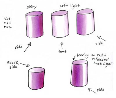 When you are coloring a cylinder you need to keep all your marker strokes flowing up and down along the straight edge of the cylinder, particularly on shiny shapes. A reflective cylinder distorts light tall along it's height so if you have lots of little strokes running the opposite direction it will look a little odd (it can be done but for simplicity sake it will look better if you keep your streaks in one direction).
Shiny objects will have a crisper, stronger contrast between light and dark, as will smaller or more directional light sources. You can also see that I broke up the strong black outline with some Opaque white to really pick out the reflective highlights.
Soft or diffused lighting will give you a much gentler gradient from light to dark. Note how you really lose all deep shadows when you have soft light from the front (more on this in a moment). Another common way that we see cylinders is with a highlight on the backside as well. This is a reflection of ambient light, or light all around us. Sometimes I leave a back reflection, other times I don't. It's a matter of personal taste in the exercise today.
The basic cylinder shape is carried over into many everyday objects, from poles to cups, bottles to human limbs. Once you master adding shadows to a sphere and a cylinder (and a cube which we haven't discussed yet) you can color just about anything and you'll know how to adapt your lighting accordingly.
 Simple shape diagram for lighting
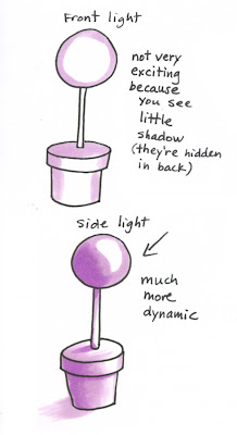
Let's apply this cylinder to a final image today to see how dynamic lighting works on a finished object. This lighting diagram helps you understand the basic shapes involved when coloring this topiary. I draw little diagrams all the time to help me figure out how to do my lighting- I break a complex object down into it's simple shapes so I can understand it better.
Many people start coloring with just general shadows- darker on the edges, light in the middle. This is correct if the light is coming from directly in front. Notice that it's not very exciting. There isn't much contrast between highlights and shadows and you wouldn't see a ground shadow because it is hidden behind the plant.
If we turn the scene so that the light is coming from one side it suddenly gets a lot more exciting. We see dark shadows and highlights. Although this is harder to color it makes the final artwork much more dynamic and alive. I also added a hint of a ground shadow. This gives our plant something to rest on or a good foundation so it's not floating in space.
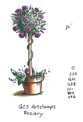 Using the lighting diagram above I colored my final image. I figured that since I just got back from a fabulous trip to Canada I should use a fabulous Canadian stamp. This is the stamp "Rosiary" by GCS Artstamps, stamped with Memento Tuxedo Black ink.
Notice how the greens and purples on the top sphere of plant are dark on the far side and you can really tell that it is a ball of plant life. If I had colored this with shadows from the front it might be harder to tell it's a sphere since the shadows wouldn't clue me in as much.
The flowerpot is getting a nice soft light but you can easily tell which direction the light is coming from. We really get a sense of volume and depth just by having our shadows from one direction. I hope this helps you break a rut of coloring things all in the same way, have a great weekend!
 Lighting on Cylinders
This is pretty basic. On the side closest to the light source leave it white, then have it fade out from there, getting darker on the far side. I picked 3 colors in a sequence to give me my light, middle, and dark values- V01, V04, and V06.
 When you are coloring a cylinder you need to keep all your marker strokes flowing up and down along the straight edge of the cylinder, particularly on shiny shapes. A reflective cylinder distorts light tall along it's height so if you have lots of little strokes running the opposite direction it will look a little odd (it can be done but for simplicity sake it will look better if you keep your streaks in one direction).
Shiny objects will have a crisper, stronger contrast between light and dark, as will smaller or more directional light sources. You can also see that I broke up the strong black outline with some Opaque white to really pick out the reflective highlights.
Soft or diffused lighting will give you a much gentler gradient from light to dark. Note how you really lose all deep shadows when you have soft light from the front (more on this in a moment). Another common way that we see cylinders is with a highlight on the backside as well. This is a reflection of ambient light, or light all around us. Sometimes I leave a back reflection, other times I don't. It's a matter of personal taste in the exercise today.
The basic cylinder shape is carried over into many everyday objects, from poles to cups, bottles to human limbs. Once you master adding shadows to a sphere and a cylinder (and a cube which we haven't discussed yet) you can color just about anything and you'll know how to adapt your lighting accordingly.
 Simple shape diagram for lighting
Let's apply this cylinder to a final image today to see how dynamic lighting works on a finished object. This lighting diagram helps you understand the basic shapes involved when coloring this topiary. I draw little diagrams all the time to help me figure out how to do my lighting- I break a complex object down into it's simple shapes so I can understand it better.
Many people start coloring with just general shadows- darker on the edges, light in the middle. This is correct if the light is coming from directly in front. Notice that it's not very exciting. There isn't much contrast between highlights and shadows and you wouldn't see a ground shadow because it is hidden behind the plant.
If we turn the scene so that the light is coming from one side it suddenly gets a lot more exciting. We see dark shadows and highlights. Although this is harder to color it makes the final artwork much more dynamic and alive. I also added a hint of a ground shadow. This gives our plant something to rest on or a good foundation so it's not floating in space.
 Using the lighting diagram above I colored my final image. I figured that since I just got back from a fabulous trip to Canada I should use a fabulous Canadian stamp. This is the stamp "Rosiary" by GCS Artstamps, stamped with Memento Tuxedo Black ink.
Notice how the greens and purples on the top sphere of plant are dark on the far side and you can really tell that it is a ball of plant life. If I had colored this with shadows from the front it might be harder to tell it's a sphere since the shadows wouldn't clue me in as much.
The flowerpot is getting a nice soft light but you can easily tell which direction the light is coming from. We really get a sense of volume and depth just by having our shadows from one direction. I hope this helps you break a rut of coloring things all in the same way, have a great weekend!
Thursday, March 26, 2009
Back from A Long trip
I apologize for being missing for so long. I'm still not entirely sure I'm really here again. We taught 4 certification classes this week and my mind is still in a blur. Thank you to all the fabulous crafters we met this week.
I need to update the upcoming Certification classes. Each class is $120 and runs from 9am to 4pm. No supplies needed, since you will walk away with a whole pile of neat stuff and ideas. Check dates and locations below for upcoming events-
• Now open to the public •
e-mail me for applications office1@copicmarker.com
Savage, MD April 5th Taught by Sally Lynn
Kingsport, TN April 19th Taught by Sally Lynn
San Francisco, CA April 22nd Taught by Marianne
• Upcoming, contact me for applications •
Chino, CA April 26th Taught by Sally Lynn
Rockland, MA May 17th Taught by Sally Lynn
Smithville, OH May 31st Taught by Sally Lynn
Winnipeg, Manitoba, CA June 6th Taught by Sherrie Siemens
• Applications going out soon, sign up on the sidebar to get on mailing lists •
Belmont, NH June 14th
Durham, NC June 28th
Orlando, FL July, day before CHA
Portland, OR (May or early June, date TBA) sign up for mailing list
Texas- Dates TBA (Late Summer or Fall) sign up for mailing list
Calgary & Edmonton, Alberta (July, dates TBA) sign up for mailing list
• Canceled •
May 3rd, Rotterdam, NY
I know that there are may places across this world that people would like to see a Certification. While we cannot fit every location in 2009, we are looking at 2010. We try to keep our locations about 2-3hrs apart, so if you live within 2 or 3 hrs. drive of an upcoming city then that might be the closest it will come to you for quite a while. Just know that we feel your pain and want to come visit all of you!
I need to update the upcoming Certification classes. Each class is $120 and runs from 9am to 4pm. No supplies needed, since you will walk away with a whole pile of neat stuff and ideas. Check dates and locations below for upcoming events-
• Now open to the public •
e-mail me for applications office1@copicmarker.com
Savage, MD April 5th Taught by Sally Lynn
Kingsport, TN April 19th Taught by Sally Lynn
San Francisco, CA April 22nd Taught by Marianne
• Upcoming, contact me for applications •
Chino, CA April 26th Taught by Sally Lynn
Rockland, MA May 17th Taught by Sally Lynn
Smithville, OH May 31st Taught by Sally Lynn
Winnipeg, Manitoba, CA June 6th Taught by Sherrie Siemens
• Applications going out soon, sign up on the sidebar to get on mailing lists •
Belmont, NH June 14th
Durham, NC June 28th
Orlando, FL July, day before CHA
Portland, OR (May or early June, date TBA) sign up for mailing list
Texas- Dates TBA (Late Summer or Fall) sign up for mailing list
Calgary & Edmonton, Alberta (July, dates TBA) sign up for mailing list
• Canceled •
May 3rd, Rotterdam, NY
I know that there are may places across this world that people would like to see a Certification. While we cannot fit every location in 2009, we are looking at 2010. We try to keep our locations about 2-3hrs apart, so if you live within 2 or 3 hrs. drive of an upcoming city then that might be the closest it will come to you for quite a while. Just know that we feel your pain and want to come visit all of you!
Tuesday, March 17, 2009
Making drops of dew
What a rainy week we've had so far! However, this part of Oregon is considered a temperate rainforest, so we're bound to have our share of rain. In thinking about rain and St. Patrick's Day, I figured now is a good time to bring up wet things. Wet, like a morning rain shower leaving tiny drops on a field of shamrocks.
 Adding Dew Drops
You can add drops of rain and dew to any colored area, and I'll step you through that today. What you want to do is color your picture entirely with Copics then with a few little extras we can add drops of water. This is perfect for pictures of spring flowers or on leaves, rocks, or whatever else is out there getting wet.
 I started with a rough drawing of clover I made with a 0.05mm Multiliner. I photocopied my line work onto color laser copier paper because I know that I get the crispest special effects on this paper, even crisper than on Neenah. For this technique you will get the best results on paper that has crisp colored edges like the PTI, Neenah, Borden & Riley Marker paper, and such. Georgia Pacific is too soft. onto added two of the same base greens that we were working with last week: G21 and YG03. Background got G21 and the middle layer of clover got YG03. The top layer of shamrocks I want much brighter so I colored them in with YG01.
I darkened the shaded areas with G24 and I darkened the bright yellow green with YG06, a darker bright yellow green. (Be aware that the colors on the screen are highly inaccurate).
I added the deepest shadows with G07 lightly feathered into each leaf, stroking from the middle out. The little jagged edges of the feathering I kept so the whole picture looked more leaf-like.
 Next, let the whole thing dry really well. This helps make the special effects crisp. Then I add "drops" first with my colorless blender. I pick spots that I want drops and I just touch the blender there until the color moves out of the way.
To get a stronger "drop" I let it dry then do it again in the same spot. This pushes more color out of the way.
Then, at the top of the drop, I add a glint of white with the Opaque white. Don't go crazy adding drops everywhere, just a few strategically placed ones. I got crazy on the shamrocks on the picture because I wanted a really wet field. A few large drops are probably enough. Drops tend to pool along the edges or ridges on a leaf, so most of my drops are on the outer edges. On small drops I did not add glints of white with the Opaque white, rather, I used a white prismacolor pencil. This gives more subtle highlights. For the darkest underside on some of teh drops I added a tiny line/shadow with a 0.1 mm Olive Multiliner.
I f you look at each of the top leaves you will also see lighter "squiggles". This mimics the pattern found on clover and it is just a quick scribble from the white colored pencil. I wish this camera would have picked up the color better, since in real life this picture is much more vibrant and bright.
May the luck of the Irish be with you this day!
 On an unrelated note I just wanted to mention that the Savage, MD Copic Certification class on April 5th taught by Sally Lynn MacDonald is now open to the public (if you visit her blog you'll see a list of upcoming Copic classes). I have a few spaces left in my Monday class in Buffalo, NY as well. If you need to apply for either of these clases please send an e-mail to Kris at orders@copicmarker.com Also, if you are interested in Canadian classes there will be many coming up in June and July, so sign up on our mailing list using the form on my sidebar or the form on the Copic website.
I will be out of town until Thursday the 26th, so I won't be responding to e-mails as quickly as usual. Also, my blog posts will be a bit more sporadic, but know that I still care about you.
 Adding Dew Drops
You can add drops of rain and dew to any colored area, and I'll step you through that today. What you want to do is color your picture entirely with Copics then with a few little extras we can add drops of water. This is perfect for pictures of spring flowers or on leaves, rocks, or whatever else is out there getting wet.
 I started with a rough drawing of clover I made with a 0.05mm Multiliner. I photocopied my line work onto color laser copier paper because I know that I get the crispest special effects on this paper, even crisper than on Neenah. For this technique you will get the best results on paper that has crisp colored edges like the PTI, Neenah, Borden & Riley Marker paper, and such. Georgia Pacific is too soft. onto added two of the same base greens that we were working with last week: G21 and YG03. Background got G21 and the middle layer of clover got YG03. The top layer of shamrocks I want much brighter so I colored them in with YG01.
I darkened the shaded areas with G24 and I darkened the bright yellow green with YG06, a darker bright yellow green. (Be aware that the colors on the screen are highly inaccurate).
I added the deepest shadows with G07 lightly feathered into each leaf, stroking from the middle out. The little jagged edges of the feathering I kept so the whole picture looked more leaf-like.
 Next, let the whole thing dry really well. This helps make the special effects crisp. Then I add "drops" first with my colorless blender. I pick spots that I want drops and I just touch the blender there until the color moves out of the way.
To get a stronger "drop" I let it dry then do it again in the same spot. This pushes more color out of the way.
Then, at the top of the drop, I add a glint of white with the Opaque white. Don't go crazy adding drops everywhere, just a few strategically placed ones. I got crazy on the shamrocks on the picture because I wanted a really wet field. A few large drops are probably enough. Drops tend to pool along the edges or ridges on a leaf, so most of my drops are on the outer edges. On small drops I did not add glints of white with the Opaque white, rather, I used a white prismacolor pencil. This gives more subtle highlights. For the darkest underside on some of teh drops I added a tiny line/shadow with a 0.1 mm Olive Multiliner.
I
 f you look at each of the top leaves you will also see lighter "squiggles". This mimics the pattern found on clover and it is just a quick scribble from the white colored pencil. I wish this camera would have picked up the color better, since in real life this picture is much more vibrant and bright.
May the luck of the Irish be with you this day!
 On an unrelated note I just wanted to mention that the Savage, MD Copic Certification class on April 5th taught by Sally Lynn MacDonald is now open to the public (if you visit her blog you'll see a list of upcoming Copic classes). I have a few spaces left in my Monday class in Buffalo, NY as well. If you need to apply for either of these clases please send an e-mail to Kris at orders@copicmarker.com Also, if you are interested in Canadian classes there will be many coming up in June and July, so sign up on our mailing list using the form on my sidebar or the form on the Copic website.
I will be out of town until Thursday the 26th, so I won't be responding to e-mails as quickly as usual. Also, my blog posts will be a bit more sporadic, but know that I still care about you.
Subscribe to:
Posts (Atom)