 Coloring Bodies of Water
Before we proceed I suggest that you read this entire post from last year about doing reflections. I have modified the wording slightly in today's post, but read the whole thing to see it's final application.
I have included a reference photo from a recent trip to the lake. This was taken on a slightly cloudy day, on a very still lake. Look at each of the points in the photo that I describe below.
 A couple of basic rules about water reflections-
(I'm simplifying so you can color it easier):
1. Still water gives crisp reflections, moving water will be broken. The more your water is moving, the more the reflection will be broken, so it's a matter of taste as to how much accuracy your reflection has. It looks more accurate to have still water near the object and gradually make water far away more broken as the light from farther away gets more distorted.
2. Reflections are about the same size as the original object. Reflections are just a trick of light on a body of water, and from a distance the main body of a reflected object looks about the same size. There may be a few stray bits of color reflected in ripples farther out, but for the most part, keep the reflections reasonable. If there is a distortion it will usually be towards the viewer.
Don't go overboard with the reflections! Remember which part of your artwork is most important - is it the objects above water or the reflections. You'll need to make artistic choices to make the important things stand out more.
3. Water is one or two shades darker/grayer than whatever it's reflecting. This is your clue that it's a reflection. Since the sky is usually blue, your reflection water usually has a slight bluish tint to it, which is where we get the idea that water should be blue. Water is not really blue, water is clear. We just draw it blue for simplicity sake.
The mood of the water also is determined by the color of the sky. On a dark, overcast day then you'll get dark water with little light reflected. On a bright, sunny day you'll have bright water with more light reflected off the surface. In my photo you can see that it's a middle day, so the water is kinda dark, but not too bad.
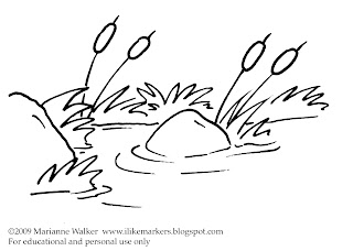 Blank picture to color
I have had a few of you request that when I do a quick drawing that isn't from a stamp then I should include a blank picture to print out and color.
Here is a copy of the line drawing I am coloring today. You may print it for your own tutorial purposes. You can color with Copics over some inkjet printouts, so test before you print to know if your particular ink will bleed or not. Otherwise, you can print it on a laser printer or photocopy it and you'll have no problems coloring.
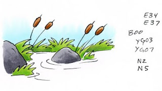 Water In A Pond
I'm starting today with anything above water already colored. That way we can focus on just the water. You'll see that my sky is a nice light B00 and my grass is a simple YG03 and YG07 combo. The rocks are a neutral gray and the cat-tails are a simple brown. This is a nice, easy scene to color - until you start coloring the water.
Let's take it in easy steps so you don't feel overwhelmed.
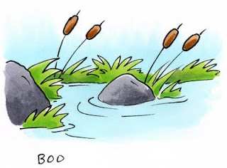 If we start by coloring the water the same color as the sky you can quickly see how flat and fake our scene looks. However, we must remember that the water will be the same tone as the sky - just slightly darker and grayer.
By adding a base tone of our sky color it will give the final picture hints of our underlying blue sky and pull the two elements together more. So go ahead, color your water with the same color as the sky (Other colors I like for blue skies include B0000 or B000, B32, BG10, BG0000)
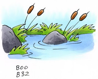 Next, we need to darken the water and tone it down a bit.
 If I add a color that is in the same blending group as the sky then our water will be too vibrant. Remember, water is more gray than sky. In this case I will need to use a blue that is grayer by about 2 or 3 families, so I reach for something in the B30's. The lightest shade is B32, the last digit - 2 - tells me that it will be 2 shades darker than our original color which ends in 0.
I shadow the edges of the pond with the B32 and I leave the middle area still light, as this would have the most direct reflection of the sky. Already this is a big improvement over the flat blue we first had.
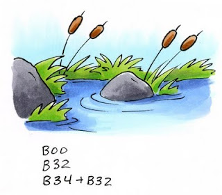 Time to add contrast. Remember, contrast makes things more interesting so we should always look for ways to improve our work. To give the water contrast and shadows I reach for a color that is 2 shades deeper than B32, which would be B34.
I darkened things near the shore, and the shadow side of each object near the water. I'm not adding too much, just enough to make it look interesting. Then I take the B32 and smoothly blend the dark blue into the middle color (You can leave yours kind of streaky as long as your streaks are in the same direction as the ripples). I also added a hint of shadow to the ripples to add variation as well.
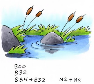 Now we can add the reflections of objects. This is a matter of personal taste. You might like the water just as it is.
I start with the largest objects. In this case it's the rocks. I take the same two grays I used on the rocks and I am lightly scribbling in the direction of the ripples. Note how it's not smooth and perfect and you can still see blue under the gray. This is OK. This is what increases the illusion of water. You can see that where I have a ripple I left the darker blue alone. This also heightens the idea of water.
The rock closest to us is much bigger and closer, therefore it's reflection is much crisper and deeper. The ripples don't affect it as much when it's that close.
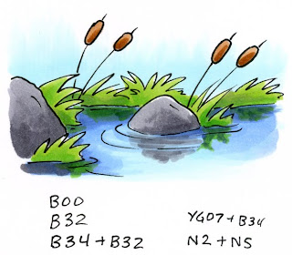 Now I can add the shadow of the grass. I use the darker of my two grass colors and lightly add the illusion of grass. to darken it up I added hints of the B34. This helps give the water a deeper, brighter blue-green feel, and it tones down the vibrant YG. Now our little pond looks almost done.
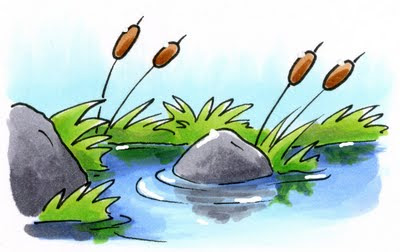
For the final step today I need to add white back in. To do this I took some opaque white and a very fine paintbrush (or toothpick) and I painted back in a few small highlights. I added some glints of light to the ripples in the water and I gave a dab of highlight to each of the objects in the picture as well. Now we can really feel how bright and crisp our day is with the sun shining on our serene little pond.
If you try coloring today's tutorial please send us a link of your example. I would love to see your colored picture! Have fun coloring.

17 comments:
wonderful tutorial, thank you. just starting with copics, trying to decide which to get: have the zeros (01-04) in most...when do I branch out into higher numbers and when ordering online, how do I decide which ones? Or can I get away with just the zeros? Thanks!
Totally wonderful
Thank you so much, Marianne for the in depth explanation of how to color water and the shadows. This was very helpful and easy to follow. You're terrific!!!!
Great tutorial! Thanks, I needed this one.
Although I don't always leave a comment I truly appreciate your teaching tutorials! Thank you!
I just don't know what I'd do without you!
Marianne,
Reading this tutorial on water made me think about clouds and sky. That would be a really good series to teach us about. From a perfect blue sky to a sky with fluffy clouds to a sky with clouds - blue, purple, yellow. There so many colors in the sky. :o) Please consider. Thank you.
Take care and STAY POSITIVE!
Great post about reflections and shadowing, M (something I haven't even thought about attempting!). And that cutie-patootie in the foreground of the photo is adorable! Where'd she get all that blonde hair?!!
Oh you know, I dye it blonde because I think my daughter would look good blonde (OK, not really- can you imagine trying to get a 2 yr old to hold still while you dye their hair??)
enjoy coloring!
This is the best tutorial on Copics I have seen ( and some I have paid for!).
I will certainly bookmark your site for future reference.
Thank you for the time and effort you have taken on this.
Great tips, Marianne, thanks!
Oh, and my daughter wants to dye hers pink!
Oh WOW, what a cool tutorial! Thanks so much! Just was introduced to your site and SO glad that I was! ((Giggling about the blonde hair comments, hee!))
Wow have I ever missed you....!!
Have only tried copics once but have watched my friend use them and she performs wonders with them.
I can only hope that I can get as good as she is with them. The one time I used them I absolutley loved them.
Water is not really blue, water is clear. We just draw it blue for simplicity sake.
before marriage
his was taken on a slightly cloudy day, on a very still lake.
breast pagets disease
Thanks for the great color combo ideas for water. I probably would have used these colors anyways as I have them, but it's neat to see how other people manipulate copics!! Nicely done!
Post a Comment