Coloring Cubes Part 2
 Crisp vs. Diffused Light
One thing I want to point out is that I don't usually color my shadows as crisply as we are in these posts because I prefer to have softer edges, or diffused lighting, on shadows. Anywhere you have sharp contrast your eye immediately goes there. When I am coloring an object I don't want people to focus on the shadows, rather, I want them to just think about the shape of things.
Choosing where to place your shadows is an artistic choice. Just because something does cast a shadow does not mean that you HAVE to make it realistic, or strong. Way back when I first started teaching about shadows on this blog I purposefully worked with diffused lighting. This means all my shadows have soft edges. However, when you start working on more realistic compositions, such as these lilacs 1, 2 from a while ago you can see that it is important to have variety in your shadows to make the image more believable.
 Casting Shadows on Round Objects
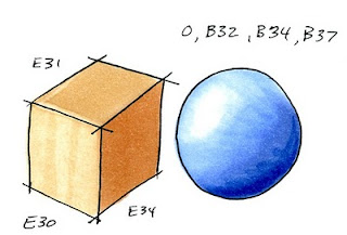
Thus far we have discussed coloring a few shapes of objects- cylinders, spheres, cubes, and we have talked about casting shadows that match the shape of each object. A while ago I discussed how shadows overlap, but now that we have talked more about cast shadows I wanted to cover it some more.
In this example we have a sphere sitting right next to our cube from yesterday. When we have a strong cast shadow from the cube we know that it has to interact with this sphere. However, a sphere is trickier to place a shadow on than the flat ground.
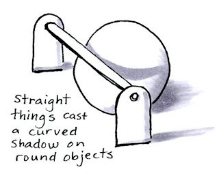 Shadows that are cast onto a rounded shape will wrap around the shape. If you look at this simple drawing you can see that a straight line will cast a curved shadow on our sphere.
Here is also an example of artistic choice in my shadows. I purposefully made the ground shadows in this image diffused because I don't want you thinking about the ground shadows, I just wanted you to see the concept of the rounded shadow on the sphere.
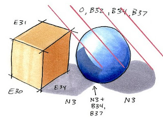 Let's apply this concept to the cube and sphere. This is where it gets tricky and we have to guess a little.
I started by drawing the shadow under the sphere, as this was much easier to tell where it was going. Next, I place the shadow under the cube, Except for the sphere.
I found the spot on my sphere where the light gets blocked at the same angle as the shadow cast from the sphere (red lines). You can easily see in this diagram where the light is hitting first. I chose to have the point of the cube in from the edge of the sphere a little bit. Then I guessed how the edge of the shadow would curve around from there. This can be tricky unless you have an example to look at. For our purposes guessing is good enough.
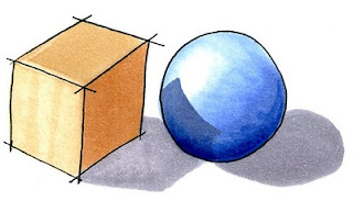 You can see, once I erase all my notes, how the final pair look with crisp shadows. It may not be exact, but it is good enough for our purposes. Now let's adapt this shadow to our final image.
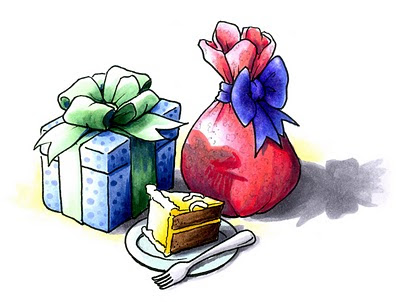
The present I showed yesterday was adapted from a larger composition of gifts. Each object in the composition casts it's own unique shadows. You can see from this progression how I started with the simple shadows then gradually added more until they look more believable. Click on the image to enlarge.

Final Image: Drawn with a 0.25 mm Multiliner SP onto color laser copier paper. B32, B34, B37, B79, YG41, G21, G28, Y11, Y18, E34, E39, RV21, R22, RV29, N1, N, N5, BG10, 0. Details on the red gift were drawn with a 0.1 mm gray multiliner.

8 comments:
Thanks - an excellent tutorial as usual!
Judy Jackson
Super tutorial! Thank you so much.
What a Magnificient Tutorial, Marianne! You always do such a wonderful job explaining and those little jots of marker all around to show the numbers. A belated happy birthday - You are appreciated by Many. hugs ~Jeni
Thanks so much for a wonderful tutorial. So very helpful and much needed, I just want my colored images to look nice.
Thank you for the great tutorial on coloring in my stamped images!
Super tutorial! Thank you so much.
work at home in india
Wow--fabulous, Marianne!
I have never seen anything as good as your tutorials - have you made a book - I would love to buy it then
Post a Comment