 I wanted to do a quick tutorial on the Anime girl I posted a couple days ago. It's the little details that make the whole look so nice, and the details are easier than you think! Don't get overwhelmed, just try one or two of these simple ideas in your next project, and I bet you'll like the results.
 Easy, Elegant Details
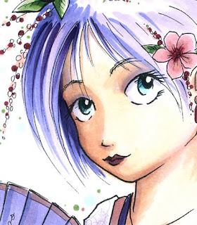
Face: The face is made of a good range of skin tones, for strong contrast. The detail here that I want you to notice, especially above the eyes, is that I used the same pale BV from the hair for the BV in her skin shadows. This makes her facial tones match better.
I also kept some shadows crisp, while I blended out the smooth areas as much as possible. I made sure that I shaded under the strands of hair in her bangs as well. Notice that I added a very faint gray/purple shadow on the edges of her eyeball. this gives it a little dimension, yet makes the white area still stand out.
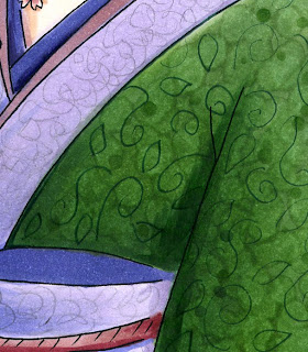
 Clothing: (Jing, this one's for you). Jing saw this picture in my portfolio at CHA and was impressed with the clothing. I explained how to do it and she was surprised at how simple the technique was. So I promised I would share it someday on my blog.
The rich green in her kimono is a couple shades of green, smoothly blended together. Then, while the background was still wet, I dabbed in some colorless blender. I also added a few dots of the darkest green to finish the texture. This created the subtle variation you see. Once it was dry, I took an olive 0.05 Multiliner and doddled in the darker swirls and leaves. The final effect, when viewed from a distance, looks like a very elegant pattern.
The purple fabric was much simpler. I blended the purple together, then to finish it off, I scribbled with a regular pencil the pale gray pattern. That's it. Because the pencil was so light, it kept the tones of the purple underneath and looks very nice.
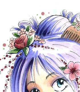
 Hair: I did not blend the hair at all. Rather, I colored it in simple streaks- I left the highlights white, then added BV00, BV04, and BV08. That's it. From a distance it looks much more complex. I just made sure that the streaks overlapped in a way that you can still see the individual strands from each layer. I made sure to darken the shadow side more than the highlight side, and deepen the area behind her head the most.
Even the flowers and blossoms are colored very simply. However, the detail in the drawing itself makes it look much more complex. I repeated the pattern of the blossoms in the sky around her head simply by dotting with the same light green and light pink. I dunno why, but for the last couple years I have enjoyed doing this, and I like the look it produces. Call it a personal quirk.
 Also, I was presented to the Stylish Blogger Award by Robin. Thank you Robin!! I am happy to inspire you.
I don't really do the questions about myself, since those of you who are my friends on Facebook see enough of my personal life. I also must confess that I don't have time to follow blogs much. I've found that I have time to either be a media producer or media consumer, but not both.
However, I regularly go to the Copic Blog because there is such a variety of artists featured on there that I am always able to find inspiration...check it out!

10 comments:
Marianne, thank you for sharing in such detail!! I love the way you created the fabric. It adds a great deal of depth and interest to your piece - one of the key things I learned from you when creating a piece of art!
Take care and STAY POSITIVE!
ohhhh this is amazing tutorial.
Thanks for the tutorial! I love it.
Is the line art available to practice coloring?
Thank you,
Lynn
I really wish I could just sit with you and talk more about it - but it was nice to learn and thanks for posting it. I gots loads of practice papers done but doesnt look good at the moment-one day ... steady hands (smile!).
Oh just to have a pinch of your talent!!!
Fantastic tutorial. Thank you for sharing your precious talent!
Marianne - I tried to order your book from my favorite on-line store and they were already out! I've learned alot from your tutorials. You are amazing!
I think this is a fabulous book for people like me who have no idea of shading!! Awesome tutorial!
Lori :-)
Thanks for sharing this truly inspirational tutorial. I can't wait to practice some images of my own
happy crafting
julie
Post a Comment