
 Textured Sweater
I hope everyone had a good weekend. I wanted to share part 2 and 3 of the sweater cat post from last Friday. If you haven't downloaded it and colored it yet, please do, and practice along!
This next step is all about technique. Many of the techniques I use depend on how I am holding my marker.

I started with the same base color of G12 that I worked with on Friday's examples. For coloring large areas like the base green, I work with the brush end of the marker, coloring using the side of the brush.
Next, I add details in the shadows, using my slightly darker green, YG17. For these details, I hold the marker straight up and down, using only the finest tip of the nib. When you push straight down, you will get dots of varying sizes (see diagram). Don't worry about damaging the nib, it will bounce right back to shape.
Use the very tip of the marker and scribble in the texture, leaving plenty of areas that are not blended. Go ahead and add some dots of color as well.
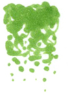 As you can see from this close up, my scribbling is very irregular, but, it goes from darker and dense, to light and sparse. This is the technique you need to practice: Scribbling in shadows that appear to get lighter and darker, simply by how much ink you add.
Notice that on the lighter end, instead of scribbles I move more to individual dots. This color is layered over a lighter color on the cat's sweater, so those dots floating in open space won't look as strange.

If you want softer color variation, work while the base color is wet and the two colors will soften together a bit more. If you want stronger contrast, work while the base color is dry. On the ribbed edges of the sweater, I did not scribble, rather, I colored in the direction of the ribbing.
Next, I add a darker layer of green scribbles/dots. NO BLENDING! Resist the urge to go back and blend the colors together.

Look closely at my pattern diagram in the corner. I am adding so little dark that I never really scribble, I simply dot it in, over the top of the middle green, again, getting lighter as you work into the highlights on the sweater.
At this point, you can make a decision- too much or too little texture? If you feel that the texture is too harsh, then you can add more texture to blend.

To soften edges without blending, take your lightest color, in this case G12, and heavily dot it over the entire sweater. Do NOT color in circles and blend, as this would destroy all your careful texture. All we want to do is soften edges. By dotting on the lightest color, it softens a little bit, without washing out the full texture.
Look closely at this final sweater sample. Compare the before and after. You need to make sure that the dots are really juicy for it to move colors around.
 This is also a time when you can add a subtle tone of another color. For instance, you are trying to match a particular green paper with your coloring. However, the sweater needs to be a hint more gray or yellow green. At this point, dot in some of whatever color it needs, be it a pale gray or a more yellow.
  Here is the final sweater, colored with texture, instead of using the colorless blender to add texture. Later I'll show you a method for coloring the fur with texture as well.
6 comments:
Thanks for sharing this easy shading technique.
thank you so much for sharing this. it really helps me a lot!
I am off to print and try this- I am going to try it on different cardstocks too, to see the difference. Thanks for sharing this- much appreciated!
Very helpful Marianne!...as usual :o) Thank you!
Take care and STAY POSITIVE!
Great stuff Marianne!! I just taught a class last night regarding texture (with blending solution) and Pointalism. I should have read your blog yesterday to spread these tips. Thank you!!!
great techniques and thanks for the blank image to practice on
Post a Comment