 Shadows Part 2, Basic Shadow Guide Today I want to continue a thought I started last week about shadows. Remember, these first few shadow posts will be fairly simple and get more complex as time goes by, so bear with me. Shadows follow some basic rules and I'm going to talk about those rules today.
 Where are Shadows coming from?
For simplicity sake, we're going to have all our shadows come from the Sun. We know it is one light above us and shines down, leaving light and shadow in it's wake, but sometimes it can be pretty tricky looking at a flat picture and figuring out how to make it look dimensional using colors and shadows.
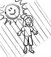
 A simple technique that I use when teaching is to take a small piece of plastic (In this case I'm using a plastic sandwich bag ). This is going to be my "Sun" and it's rays of light. I draw parallel lines on the plastic with a dark marker close enough so that when I put it over my small images I can get a clear idea of where the sun's rays are striking the object.
I can choose a spot for the sun to shine from and by placing my rays of light over my image I can easily see where the light hits first (highlights) and where the light leaves the object or hits the ground (shadow areas). Since this is on plastic I can easily move it around and see where the most interesting shadows are, or where I would have the easiest time adding shadows.
To better understand shadows, keep these points in mind:
1. Shadows are not black. Shadows are a darker shade of the main color of the object/ground. Even when you are coloring something black, rarely do you color the shadows true black (to keep it simple I'm not getting into shadow colors beyond this in these first few posts- for now just stick to Cool Grays or the BV20's for your white ground shadows).
2. Shadows are darker and crisper closer to the object. This is because light bounces and reflects. When you are close to the object less light from around you is able to bounce in and make the shadow lighter, because the object blocks more of the reflecting light.
3. Shadows get lighter and softer around their edges as you get farther from the object. See point two. It gets lighter and softer because there is a lot more light reflecting around, confusing your edges.
4. Shadows mimic the shape of the object. We know an apple is round so it's shadow will be round, but since we're looking at it from the side that round shadow gets squished so it's an oval. From above it will look more true to life.
Think about standing in an empty parking lot as the sun is setting and your shadow stretches impossibly long behind you. Perspective and where the light is coming from make a difference into how the shadow is distorted, but usually it is an outline of the object.
5. Shadows from the Sun can't be wider than an object, just longer. See point 4. If you have a single light in your room and you look at the shadow your hand makes close to a table you will see how crisp the edges are and how dark the shadow is. Now, slowly lift up your arm closer to the light. Your shadow gets softer, lighter, and wider. For this to work from the Sun, you'd have to be pretty close to the sun. At that point I'm sure you'd burn up.
Now that we have the rules down, let's begin coloring. Choose an object to color that is round and one solid color for now (a ball, an egg, etc). You'll need 3 shades of a color for the object and a ground shadow color or two.
 How do I choose a place for the sun to shine?
If you remember from my earlier posts on contrast, pictures are more interesting when they have more contrast. Wherever you choose to have the sun shine from, use this as a guide for your high-contrast artwork. To start, choose an easy angle, where the sun is pretty high in the sky.
Coloring Rounded shapes
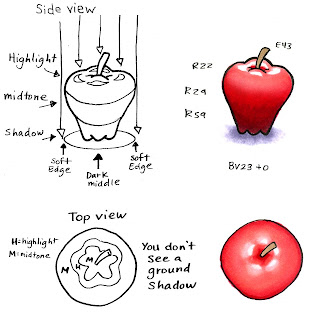
For this first example we're going to look at an apple with the sun shining straight from above. Your highlights are the first spot sun hits, or the very top of the apple. Your midtones are the middle colors, in this case the middle red of the apple. Your shadows are going to be the darkest areas.
Look at how we can tell that the top of the apple has ridges because of how the light hits those spots first. It then fades from there down to the deepest shadows at the base of the apple. The shadow on the ground is the same way. It is lightest on the edges where the Sun still can reach it, then fades into deeper shadow immediately under the apple. From above you can't see the shadow on the ground- the apple is blocking the shadow.
Pictures get more interesting when their light source is off to one side a little. This makes the shadows more exciting, but it can also get tricky to color.
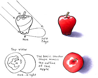
 Take this second apple image. The shadow is now off to the side because the sun is shining off-center. See how the rays of light from the top edge of the apple have farther to go to reach the ground? This makes that far edge much softer and lighter than the shadow closer to the apple.
From above, the apple looks a lot more exciting. Now we can tell that it is an apple, not just a lumpy circle. The shadow shape looks more like an apple as seen from the side (see how it tapers). If the sun were even lower in the sky the shadows would get longer and the apple shape would get s t r e t c h e d.
For both of these colored examples I used 3 colors on the apple, another color for the stem, and a ground color faded with the blender. I used the marker on paper blending technique. I used the sequence R22 -R29-R59 because it had much more contrast than if I just used R22 -R24-R29 (remember, more contrast is more interesting). Later I'll explain adding contrast and picking shadows that go across Natural blending groups.
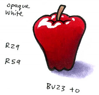
 For my final apple: the highlights were very tricky to leave white, so I cut out the lightest red, added Opaque white for crisp highlights, and softened the shadow sooner since it looks OK without being so long. Now my apple looks shiny, ripe, and cleanly lit with simple but interesting shadows.
Images: Drawn with a 0.5 multiliner onto color laser copier paper.

16 comments:
This is an EXCELLENT POST! I always knew how to shade, but the idea of the lines showing where to stop the shadow, is a light-bulb moment for me! Why didn't I think of that? HA HA!
Thank you, you're brilliant!
thanks for all of the education you share on your blog Marianne!
This is soooo what I need. Thanks so much for doing this. I'm anxiously awaiting my first order for Copics and I really want to learn shading and highlighting without having to copy a model.
This is such a great and helpful post. I've read a number of articles and lessons on shadows, and they've been useful. But this one I comprehended a little more clearly thanks to your illustrations. Definitely one to come back to for reference in the future.
Wow, great idea with the plastic bag, thanks so much!
I know it's basic, but this is a great post! What a great reminder! They don't teach engineers about shadowing in Drafting class! We're all about crisp, precise lines! I love this!
This is a wonderful post on shadowing! Thanks for making it so easy to understand!!
I cannot thank you enough for your blog!!I've given you an award. You can get it at my blog...www.stamphappens.com. Thanks for the inspiration!
This post is perfect for me! I love your step-by-step each day because I don't get overwhelmed with too much at once. Can't wait to try out your tips. Thank you!
Shading, shadowing, blending = great tutorial. Great brochure! Step-by-step tutorial leaves big impression, small tactical burden and huge need for more plastic sandwich bags recycled from lunchboxes. Shazam.
I love it that you so much I had so many questions reagarding shadows
I just love everything I'm learning here! Thanks!
:J
Thank you for this awesome post. I could never quite get the "shadow concept"..no idea why not, but the plastic idea really worked for me!
I'm practicing my shadows. Thanks for this post! Really helpful. I *tried* to follow your instructions on these shoes: http://www.flickr.com/photos/mixing-katie/2992918743/
This post is so incredibly helpful. Your illustrations make it crystal clear.
GREAT lesson from the best! Thanks, Marianne!!
Post a Comment