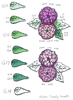
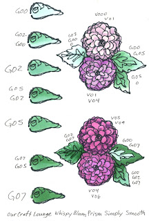
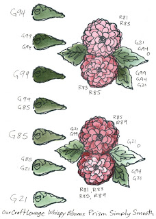
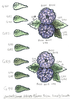
 I've been working hard this weekend on many projects. One ongoing project that each of you should work on is your Color Swatch Book. As I was gathering my supplies for my next round of Certification classes on the East Coast I realized that my swatch book didn't have many green examples, nor did I have examples of some different types of paper. So I added some pages and I figured you would like to see them this week
By the way, Mystic, CT • Buffalo, NY • Toronto, Ont are all open to the public. If you wish to register send me an e-mail for the application. And, you can now follow me on twitter.
 Swatch Book Color Ranges
With hundreds of colors available you really have a lot of swatches to try to find combinations that work for you (click here for a downloadable color wheel and blank chart). Swatch books will reflect the personality of the owner. You'll probably make more pages in your favorite colors and the more you work with your favorite colors the more you'll find combinations using your favorite colors. If you find yourself always reaching for the same 15 colors out of your collection of 50 then you should branch out. Throw in a color you don't use very often to mix it up a bit. Sometimes the results will startle you.
 Look through your swatch book every now ant then and see where the color combos are lacking. My color book had mostly blues and browns, because people asked a lot of questions about blues and browns. Also, there are LOTS of shades of blues and browns and it's hard to remember what I've tried.
Here is a partially done example page. If you look at the blossoms (I think they're hydrangeas but I can't remember which flower I was drawing at the time) you'll see that I'm also looking at the V000, V01, V04, V05, V06, V09 Natural Blending Family. Each blossom is very different, yet they're all within the same color group. This is why you need swatches.
If I remember from math correctly, for 322 colors, if you are just blending 2 different colors each time then you'll have a possible 103,362 options. (formula: n(n-1). ) If you throw in a 3 color blend, then you have over 33 million combinations! (formula: n(n-1(n-2)). ) That's not factoring in different ink types, paper types, and all the other little things that go into your artwork. So don't feel like you have to write down every color/ink/paper combo out there, just the ones that you find useful.

 Greens
I needed to document the basic green family, so I started from the beginning, with G00. I know that Copic makes a G000, but it's too light for my scanner to pick up, so if you love that color don't feel that I'm leaving you out. Since I am trying to see color combos in Natural Blending groups for this page of greens I prepared it with blank spaces for color swatches on the side, then on the main image I mix up the colors on the side to see different combos and to get a feel for contrast.
Greens are actually pretty easy to find great looking combos. I hesitate to say that any two greens will look good together, but it's a safer bet that they will than guessing that any two pinks will work well with each other.
Since green is made of Yellow and Blue, you can add either of these and also find good green color combos. You can warm up your basic greens with Y, or YG. You can cool down your greens with BG or B. If you want to mute out your greens (turn them brown or gray) then throw in the opposite color, red.
 You can see from one of the leaves on my example page I shadowed G85 with V99. Although those colors are totally different, I had used the purple in the blossom and I know that v99 is dark and that cool shadows have purple in them, so I knew that I could add a cool, deep shadow to my green leaf and it would work.
Also compare the greens from the G00 and G12 pages to the greens on the other two pages. Look at how much more vibrant colors from the 00's and 10's are. If youa re coloring leaves in the springtime then they will be more vibrant and warmer, like the 00's and 10's. If you are coloring something from the deep forest, an older plant, or something from late summer then you might want to reach for more muted greens like the G40, G80's or G90's.
When you jump from a base color of G02 to shadows of G99 you will start to see where some greens just don't quite work together. Why? Because G02 is a WARM, bright green. It has a lot more yellow in it. G99 is a COOL, dark green. When you add a warm and a cool it turns to gray/brown. the vibrancy of the G02 would get lost in the dull, muted G99. However, I might be able to get away with shadowing the G02 with a YG, or maybe adding a bit of warm gray, or... I think I have to test more colors first!
 Contrast
I know I've discussed it before, but to make an image more eye-catching you need to add contrast. Look at each flower on this page. Which blossoms grab your attention first? Which seem more alive? You'll note that the blossoms which stand out and look most real are the ones with the largest color range.
 Any element on these pages that has a color jump of more than 5 digits on the last number grabs your attention more than color combos that are only 2 or 3 digits off. Yet my darkest colors are not overwhelming the picture, rather, they are only for accenting the shadows. Do you see how all the little suggestions I've been giving you are starting to fit together?
The flower with V000, V04, V09 has wonderful richness to it. The blossom with BV00, BV04, and BV09 also really pops off the page. If you look back to my post a couple weeks ago on the basic Rules of Good Design you will see that this contrast is part of M,B and V from DUMB-V. Because of the high contrast this is a more dominant image and a good way of coloring if the flower is your most important element in the picture. Your eyes move to the high contrast areas first. By having a larger range of colors you add varienty to an otherwise flat image.
You really need to experiment on your own, and keep updating your swatch book regularly. I'll try to show you more examples as I work through my book, but remember, colors will look different on a computer than they will in real life. Paper: Prism Simply Smooth, Image: Whispy Blooms from Our Craft Lounge. Ink: Memento Tuxedo Black

4 comments:
Great post, Marianne! I only have 4 YG/G color combos that I use consistently. This gives me food for thought. Thanks!!
Wow! You're the best. I will sure add this post to my copic book.
I love that color chart! A great way to help me figure out which colors I need to buy next!
I realize this is a rather old post, but I wanted to see if the line-art for these swatch pages might be available so I could practice on them and add them to my swatch book. Thanks!
Post a Comment