Friday, August 28, 2009

Friday Links & Class Updates

It's been a while since I updated upcoming classes and certifications. As I get updates I try to regularly post those, so keep checking back for more details. Today you can also find a couple of great art links to keep you inspired over the weekend.

Upcoming Papercrafting Certification Classes
There are two ways to get an application for any of the upcoming classes. For any class that has already had the application already sent out you need to e-mail me at marianne@copicmarker.com and I will gladly send you one. For any class that has not had applications sent out please add yourself to the mailing list using the green sign-in box on the right. Be sure to mark which location for certification you are interested in, or you will not get an application on that mailing.

September

17th Minneapolis, MN (from 1pm to 7:30pm, buffet dinner included, $130) taught by Marianne Open to the public, register NOW! This class is filling fast.

October
4th Decatur, GA taught by Sally Lynn Open to Stores & Designers
24th Coos Bay, OR taught by Marianne Open to Stores & Designers
25th Evansville, IN taught by Sally Lynn Open to Stores & Designers
28th Grand Rapids, MI taught by Marianne Open to Stores & Designers

Applications have NOT gone out for the following locations:

November
22nd Columbia, SC taught by Sally Lynn

December
13th San Antonio, TX taught by Sally Lynn

January 2010
10th Miami/South Florida taught by Sally Lynn (TBA)
23rd Anaheim, CA taught By Marianne

Upcoming Events
This fall there are lost of special appearances I will be making all across the United States. Come visit me and learn some neat hands-on techniques at one of these fine venues.

September 18-19 Mall of America, Scrapfest 2009. Minneapolis, MN. Join me, Debbie Olson, Cambria Turnbow, and many others as we demo and host make-n-takes.

October 1-3 Savannah College of Art & Design Tools of the Trade Show. This is a fabulous event with many fine-art vendors showing the best and newest in fine-art supplies.

October 23 Memories of Time, Stamping Workshop, Coos Bay, OR.

November 14, Jordan Schnitzer Museum of Art, Eugene, OR. This drop-in event will be in conjunction with the upcoming Comic Book/Superheroes gallery show.

November 19 & 20th, University of Oregon Tools of the Trade show. Come to the annual art-supply trade show hosted inside the U of O Bookstore. There will be lots of professional artists from all around showing their techniques - from watercolor to colored pencil. There's always lots to see at these shows.

Friday Art links
I'm sorry it's been a few weeks since I posted some fun friday art links. Here are some that I found this week. I hope you find them inspiring.

Copic Community
First of all, I want to remind you about Copic Community. This is a place where YOU can post any work you've made with Copics. Visit CopicCommunity.com to see what I'm talking about.

Drawing heads
Have you ever wanted to draw realistic heads? This link has a fabulous tutorial that steps you through the rights and wrongs of drawing heads. www.anticz.com

Digital Photography Tips
I know that many of you have your own blogs and you take your own digital photos to upload. Dig through this site for some ideas on how to get more from your camera and consistently take better shots. I strongly suggest you read through it! The best blogs out there stand out because their photos are clean and well-planned. www.digital-photography-school.com

Monday, August 24, 2009

Feather blending, revisited

I know that sometime last year I discussed feather blending, but as this is the trickiest blending technique using the markers I want to cover it again and show you step-by-step how to make more dynamic color blends.

Blending opposite colors
Feather blending is the technique we use when we want to blend colors that are very different, say a pink and a green.

If we were to layer those colors on top of each other they would turn into a muddy mess of color, however, we want them to look like they smoothly blend into each other. You can review my older post here.

This is advanced because this is the trickiest technique. I'm also adding another layer of color so my blend is going to end up more dynamic than it would if I just used 2 colors. If you can't figure this out just by reading the blog don't feel bad. This is a very tricky technique to understand unless you see it done. Even then it is hard to duplicate and takes a steady, light hand.


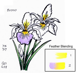
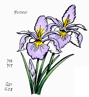
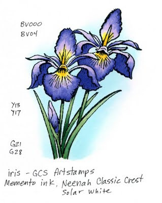
Today I'm working with this Iris image by GCS Artstamps. Irises are hard because they fade from a deep, rich blue-violet purple to a bright yellow center. I start by laying down my yellow centers. I put a base of Y13 and feather it out into each petal. Then I darkened the middle with a hint of Y17 on each flower.


If you look at the inset diagram above you can see how I am going to layer on the BV000. I feather the yellow one way, VERY LIGHTLY, then I feather in from the opposite direction the light purple. When I'm done I will get a natural looking blend from yellow into BV.


If you still see streaks on either layer then review the steps in my earlier post. You should also color in many very light layers until you've built up the smooth area you need. This is very tricky, and it works best with the side of the brush nib. Practice flicking the brush to get the proper technique.

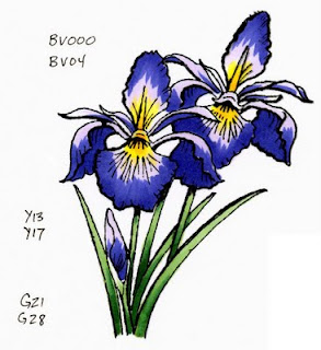
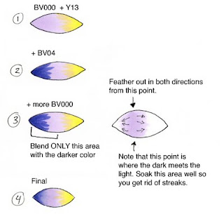
Next, I feather in my dark BV04 to each petal, following the same direction as the BV000. I am going about half-way into each lighter area. I am leaving plenty of the light purple before it touches the yellow, likewise, I am giving myself plenty of the dark area to blend back in.

Note: If it seems like your marker layers are starting to bleed outside your lines then STOP! It is very easy to oversoak the paper when using this technique. Let your paper dry out a bit before adding more of the light color, then it won't bleed so much.


At this point I want you to look at the diagram below. Note the 3rd step where I am adding in the BV000 to blend the light and dark together. Right where the dark meets the light I am putting the heaviest flow of ink. Then I lift up and feather out in both directions from there. This pushes the darker color back into itself (note also that I am not going all the way back to the far edge of dark, but almost that far).


When you look at my final Iris image you can see how the color fades smoothly from the rich, vibrant yellow to the much darker blue-violet. I could go in even more and darken the underside of each petal with an even darker purple, but I think I'll leave it for now.

Image stamped with Memento ink onto Neenah Classic-Crest solar white cardstock and touched up with a 0.1 mm multiliner SP.

Sunday, August 16, 2009

Southern California

I'm here in sunny Southern California. Friday we had some fabulous store visits with Scrapbook Heaven- and Collective Journey. We made some very cute cards in our make-n-takes and workshops. I know you're excited to come to visit Copic and Our Craft Lounge today at these other great stores:

Yellowbird Scrapbooking-10-12pm El Cajon,
Scrapbook Your Life-1-3pm San Diego,
Cool Scrapbook Stuff- 4-7pm Poway,

Meanwhile, I'm getting ready for Monday's certification class in Carlsbad. This class is totally full. I know a lot of people down here would like to attend another Certification, but my next class in this area won't be until January when we host a class the day before CHA.

If you are trying to get into my class at Scrapfest next month in Minneapolis be aware that space is filling VERY fast for that class, so get your applications in quickly, even if you are going to be on the waiting list. Don't feel bad if you can't make it to a certification... you can always take a class from an instructor near you who is certified, as there are many excellent instructors out there who are teaching some great classes (I bumped into a few great teachers already on this trip, and I know I'll see even more today and monday). Support your local stores! Take workshops and classes.

For today, I hope to see you at one of the many stores we're visiting. Have a great weekend and keep coloring!

Thursday, August 13, 2009

Contrast Contrast Contrast

People frequently show me their coloring and they ask me if they are doing it correctly. Almost always their coloring is great. It looks smooth, their blends are nice, and their colors match each other well. So why do they feel that there is a problem? Because their artwork doesn't jump off the page - it just looks flat and sits there.

Contrast
I know I mention it often, but the biggest reason the art doesn't look complete is because there isn't enough color range to make it exciting. To achieve the look of 3-D you need to have darker darks and lighter lights. Don't forget that Copics come in all 334 colors for a reason (I know the new pale colors are exciting, but don't forget about dark colors too!).

Look at the top example of this cute little turtle. I followed all the rules. I colored in color families that are all bright and vibrant. I picked colors in two color sequences that follow the Natural Blending groups. All my colors are just a few digits off from each other (except yellows because those are so vibrant you can get away with larger jumps). He's cute, you can see some shading, but he's kind of flat looking and plain.

Now compare him to the bottom example. All I did was take each color group from the first and add one shade another 3 or 4 digits darker (the yellow was shadowed with a grayer yellow, Y26). Just that one simple change in each color group makes the turtle appear more alive and rounded.

You might be one of the people who needs this. Look at your work. Hold it at arm's length and squint at it. Does it all blur together, or can you see shapes and forms because of the shadows? If your colors seem flat then add more shadows (go dig through my older posts to find out where to put those shadows). It may take a bit of effort to get out of your comfort zone to add the deeper colors. If you find yourself only using colors that end in a 5 or lower then I strongly urge you to add a bit of darkness in.

Try today's example for yourself. Color a picture in only 2 colors, then color the same picture and add in a darker value to each color family. I think you'll quickly see the change it makes.

Here is my final, easy card I made with this image. It's for my son's summer play-group teacher, his play group ends this week and he really likes his teacher. I stamped Kona with Memento ink onto Gina K. Pure Luxury cardstock, used Prima crystals, paper by Reminisce, and wrote the sentiment with my 0.3 mm Multiliner. Have a great week, and I hope to see you in Southern California this weekend!

Wednesday, August 12, 2009

Wednesday updates

I'm busy getting ready for my trip to Southern California this week, but I wanted to send some updates out about my upcoming workshops.

Certification Classes
3 new locations have been coordinated for this October. Please sign up on the sidebar of this blog to get the applications for these locations:
4th Decatur, GA taught by Sally Lynn
24th Coos Bay, OR taught by Marianne
28th Grand Rapids, MI taught by Marianne

August
15th Vancouver, BC taught by Sherrie FULL
16th Eau Claire, WI taught by Sally Lynn FULL
17th Carlsbad/Oceanside CA, taught by Marianne OPEN (e-mail orders@copicmarker.com for an application)
22nd Calgary, AB taught by Sherrie FULL
29th Edmonton, AB taught by Sherrie. OPEN

September
17th Minneapolis, MN (from 1pm to 7:30pm, buffet dinner included, $130) taught by Marianne Open

The following classes are upcoming. Applications have NOT gone out yet, so sign up on the sidebar of my blog through Vertical Response to get on the mailing for those classes.

October
4th Decatur, GA taught by Sally Lynn NEW
24th Coos Bay, OR taught by Marianne NEW
25th Evansville, IN taught by Sally Lynn
28th Grand Rapids, MI taught by Marianne NEW

November
22nd Columbia, SC taught by Sally Lynn

December
13th San Antonio, TX taught by Sally Lynn

January 2010
10th Miami/South Florida taught by Sally Lynn (TBA)
23rd Anaheim, CA taught By Marianne

Other Potential locations in 2010
Shawnee, KS • Memphis, TN • Tulsa, OK • Columbus, OH • St. Louis, MO • Indianapolis, IN • Houston, TX • Phoenix, AZ • Denver, CO • Seattle, WA • San Francisco Area • Los Angeles Area • Toronto / Eastern Canada

Other events
Just to remind those of you in So. Cal, I will be doing demos and workshops at a lot of stores:

August 14th

Scrapbook Heaven- 12-2pm, Westminster
Collective Journey 5-8pm, Redlands,

August 16
th
Yellowbird Scrapbooking-10-12pm El Cajon,
Scrapbook Your Life-1-3pm San Diego,
Cool Scrapbook Stuff- 4-7pm Poway,

August 18th - Art Institute of San Diego Demos and workshops (students only)

Then look for me in September at Scrapfest in Minneapolis. I will be at Savannah College of Art and Design the first weekend of October. Also in October you can come to an evening workshop on the 23rd at Memories of Time in Coos Bay, OR. Keep checking back for more locations where we are hosting events. I'll try to post some new things before I leave town. Have a great week!

Monday, August 10, 2009

Blob Bugs and Blog Candy

A while back I asked for comments - what would you like to see more of, and one thing people seemed to like were my little "blob" creatures like the blob fish, blob duck and blob bunnies. Today is a great day to talk about blob bugs. You should review the other blob critters if you haven't seen them in a while before you work on these bugs.

Blob Bugs
If you remember from my earlier blob critters you'll know that there are a lot of shapes you can make from the tip of your Sketch Super Brush nibs and a thin multiliner. Today I want to show you some simple bugs you can make to decorate your papercrafting as the summer winds down.

The pictures are pretty easy to follow, but I want to bring out a few points.
• Always work with scratch paper underneath.
• Let one color dry before you add another color or add multiliner (this keeps your edges crisp).
• Experiment! Add different details or use different colors than I show. make your critters match your papers or project colors.


Ladybug - Don't use a black Copic marker to draw your dots or head because the marker will try to blend with the red already on the page.

Snail - To make the body place your brush on it's side to get the point down, then drag the brush along to make the long body. If you are right handed then you'll find it easier to make the snail face right. If you are left-handed it's easier to make him face left. Otherwise, you can try turning your paper to get the right direction of his body.


Caterpillar - You can make him as long or short as you want. Also, try adding dots or making him rainbow colored.

Dragonfly - Practice making the wings, since I show the top wings larger than the bottom wings. Hold the marker in place longer to make the wing fatter, or drag it slightly out from the middle to make them longer (like you made the snail body).

Don't worry if your bugs don't look like mine, as each one should be different. Practice will help you make your cute bugs better. Just don't give up, and most of all - have fun and relax!

Now, on to other things...

The weekend OCL new release drawing is over! I want to thank everyone who left a comment on my blog for the Sea-sons Greetings stamp set. I randomly chose a winner from the 255 comments using Random.org

Random Integer Generator

Here are your random numbers:

252 

Timestamp: 2009-08-10 09:00:05 UTC


Which means that sometimes it pays off to leave comments at the last minute. Comment #252 comes from Ashley who said...

HE is beyond cute!

Congrats Ashley! I'm so glad you think he's cute. Now you'll have fun coloring him for your Christmas cards this year - or make some cute gift-tags for your presents.


Friday, August 7, 2009

Friday Video Links

Note: To enter the giveaway from OCL please leave a comment on yesterday's post.

Happy Friday! Wow this week has flown by. I promised yesterday that I would have a tutorial today for coloring the little Christmas sea-turtle that was on my card.

Well, I have an even better idea than showing you the step by step as pictures, I actually made a quick video. Don't expect these all the time, but I hope that you find this one useful.

All the coloring techniques I used on this turtle are basic, but still important to see how it works. If you can't seem to get it to look right then just keep practicing.


Also, a couple weeks ago I mentioned that I was on the TV show Scrapbook Memories showing how to alter objects to make them match for a mini-album for my brother. Well, here is that segment for your viewing pleasure as well (again, thank you Lori and Sharon!). I hope you find both these videos useful. Have a great weekend and keep coloring!

Thursday, August 6, 2009

Winter in Summer blog candy

(Note: Commenting is now closed on this post)

Today is the day you can pick up new Fall and Winter stamp sets from Our Craft Lounge! To celebrate I get to play along in the OCL Blog Hop. Check out a list to find all the other new releases at the new OCL blog.

I get to share a set I drew called "Sea-sons Greetings". This is a fun Christmas set featuring the cute and popular Bubbles the Sea-Turtle who first appeared in the ocean during OCL's Summer release.

Making a muted background

My artwork today needs to be soft and muted since I don't want it to pop out too much, so I am going to be working exclusively with light colors, or colors that end in a 0, 1, 2, or 3.

I stamped my background using the long sea floor from the original Bubbles set, using Memento London Fog ink on Neenah Classic Crest Solar white cardstock. I masked off the area for the Christmas tree so it would fit into the sea floor better, and stamped the little fishes to decorate it.

I am going to be layering this artwork under vellum as a soft background, so I want all my colors to be pale and muted (which is why I used gray ink). I colored the water with BG10 and faded it out with the colorless blender, then I colored the sand with YR31, Y00, and Y000 then faded it out as well. Notice that I wasn't too careful about avoiding the seaweed or stars, since those will be colored later, and the bue and yellow were so pale that even if I colored where I shouldn't it will be easy to clean up with the colorless blender.

You can see from the second step that the green seaweed looks just fine layered over the blue from the water, and when I color the sea-stars they will be orange, so yellow won't mess those up.

Here is my final background. The little fish were colored with YR02 and Y00, then dotted with YR02. Again, I used very light colors because the background is not as important as the main image I'm going to make for the front of the card. I dotted on some E31 to give more life to the sand. I added R22 and faded it out with the colorless blender anywhere that I wanted to give the illusion of red without overpowering you. Then I cropped the background around the seahorse and matted it onto the green paper (I picked my green colors to match this paper).

Here on my final card you can see how the soft background under vellum is very muted and not overpowering, yet it is still easy to see. I was tempted to color my vellum blue to remind you of water, but I really liked the color scheme as it was, so I left it alone.

The green ribbon was originally white, but I colored it with YG63 so it would match my paper and colored areas. I wrote a sentiment on the inside with a 0.1 mm multiliner which reads "sweetest winter fishes...from my pond to yours!"

Tomorrow I'll post a tutorial on coloring the cute little Bubbles the Sea-Turtle that you see on the front. For now, let's move on to the fun part...

Do you think little Bubbles is cute?

Do you wonder how Bubbles came to own such a nice striped scarf and fluffy hat?

Do you have no problem with the improbability of a sea turtle sucking on candy-canes underwater?

Want to win him???


Leave a comment on today's post. Winners will be chosen on Sunday. One lucky person will win this very stamp set, . . and . . . I'll throw in a few of the new Atyou Spica glitter pens to sweeten the deal.

What are you waiting for? Leave a comment and your contact info! Then go visit the other names on the blog hop for Our Craft Lounge. Be sure to come back tomorrow and check out the directions for coloring cute little Bubbles. Good luck winning and have fun coloring!

Wednesday, August 5, 2009

Wednesday updates

I know I usually post links on Friday, but I have a few neat things that I want to pass along today.

Copic Website
As you may have noticed, the Copic website has been slowly morphing and changing. We've added a great blog for following artists and occasionally an exclusive interview. Check this out for some good inspiration.

Copic Community
We have also changed the way we do our online gallery. If you would like to see artwork other people have made or if you want to submit your own you can visit CopicCommunity.com go dig around a bit, as there are lots of neat illustrations up already. When you wish to submit, just click the link on the sidebar. You'll have a window that shows, and at the top it says "submit a text post" click on that and switch to "submit a photo" then follow the directions to post your own artwork made with Copic products.

Upcoming Certifications
I know a lot of upcoming classes are full, but some are still open or will be opening soon. If you'd like to attend then let me know right away so we can get you on the list. All classes run from 9 am to 4pm and cost $120 unless otherwise noted.

August
15th Vancouver, BC taught by Sherrie FULL
16th Eau Claire, WI taught by Sally Lynn FULL
17th Carlsbad/Oceanside CA, taught by Marianne OPEN (e-mail orders@copicmarker.com for an application)
22nd Calgary, AB taught by Sherrie FULL
29th Edmonton, AB taught by Sherrie. OPEN
30th Coconut Creek, FL taught by Sally Lynn Canceled

The following classes are upcoming. Applications have NOT gone out yet, so sign up on the sidebar of my blog through Vertical Response to get on the mailing for those classes.

September
17th Minneapolis, MN (from 1pm to 7:30pm, buffet dinner included, $130) taught by Marianne Applications mailing this week

October
25th Evansville, IN taught by Sally Lynn

November
22nd Myrtle Beach, SC taught by Sally Lynn

December
13th San Antonio, TX taught by Sally Lynn


Other Events This Fall
I'll be visiting a lot of places in the next two months, so if you can't make it to a Certification then you can still see me at one of these other events.

Southern California, August

August 14th

Scrapbook Heaven- 12-2pm, Westminster
Collective Journey 5-8pm, Redlands,

August 16
th
Yellowbird Scrapbooking-10-12pm El Cajon,
Scrapbook Your Life-1-3pm San Diego,
Cool Scrapbook Stuff- 4-7pm Poway,

August 17th Copic Certification, Carlsbad, CA (send me an e-mail for an application)

August 18th - Art Institute of San Diego Demos and workshops (students only)

September 18 & 19th Scrapfest, Minneapolis MN in front of Archivers, as well as Crop Around Town events (Hosted with Archivers and Our Craft Lounge)

October 1-3rd, Savannah, GA Savannah College of Art and Design Art Materials Trade Show

Whew! Is this enough places I'll be visiting? Be sure to stop by my blog tomorrow for a chance to win a really cool prize and join the Our Craft Lounge Release Party. Don't Miss it!!!

Tuesday, August 4, 2009

Coloring Metal things - part 1

I'm back! What a week I had, but it's now back to the coloring board. Today I wanted to talk about coloring things to look like metal. I'll do a different post on coloring things that ARE metal, but today we'll talk about simple metal things, and I'll ry to keep this a beginner post.

The color of metal
If you think of something metal the first color that comes to mind is a plain, silvery color, since this is the most common metal color - silverware, galvanized steel, chrome etc.

Don't forget that metal things come in all shades of color, from the deep black of cast iron, to the bright yellow of gold, the reddish tones of copper, and many other colors in between. I already talked a while ago about coloring gold, so today I'm going to work with galvanized steel / basic silvery metal.

Silvery metal is a cool color, though very reflective and neutral. For this reason, I will be working mostly in cool grays. If you have objects near your metal then the metal may pick up reflected hints of that color as well.
A few things to consider about metal
• Shiny metal has more contrast and sharper lines between light and dark
• Dull or textured metal (galvanized) will have softer blends
• Shiny metal reflects light in very odd ways, so always try to look at a photo before coloring something
• When metal has direction, streaks are OK to accent this (see below)

There's a whole lot more things to worry about out there, but this is fine to start with today.

Galvanized Steel Watering Can
Galvanized steel looks like the chip-board of metal (photo courtesy of www.images.asia.ru). It is made up of lots of chunks of metal and therefore is not quite as crisp in it's reflections, so this is an easy type of metal to start with.

Steel is generally a light, cool gray, so I will be working with cool grays. Notice in the photo though that the metal picks up tones of whatever is around it, so don't be tricked by the warm gray areas in the picture. For now, just concentrate on the cool gray.

Before I colored this watering can I ran a quick search online for "metal watering can" images as a reference. Then, as I like to do with complex areas I made a simplified diagram of the colored areas based on looking at 2 or 3 pictures.

In general, a watering can is made of two cylinders, so please refer to this older post to brush up on the rules of shading.

My light is coming from the front left, so my strongest highlights will be on that side. My deepest shadows will be on the opposite side. The softer light is a reflection, so it will be less bright than my main highlight. Since I am coloring galvanized steel I will soften my shading instead of having crisp edges, though this is a matter of personal taste.

I start with C3 and I am coloring in streaks following the bend of the can. This helps accent the ribs on the can, and increases the feel of reflection. I darken the far side with C5. Don't forget to shade under each wrinlke of the can ribs, and leave the top of each rib white, as it catches the light differently.

Next I go back with my colorless blender. I start in the middle of the whitest highlight and I am softly pushing the color back to each side (don't oversoak!). Then I come from the other highlight and do the same. I want to work smoothly so I don't get "puddles" of blender and leave crisp edges. I can also use the blender to add light back in on the top of each rib of the can.

You'll notice that your colors get much lighter as you add colorless blender, so after you're done blending, go back with your darker colors and deepen those shadows again (don't forget to darken under the spout and the handle). It's OK to darken in slight streaks as well. Now our watering can looks like shiny metal. At this point I could layer in other reflective colors or add some reddish brown rust, but I think I like it how it is.

For my final image today you can see that I colored it in exactly the same way as our practice above, the only difference is that this picture has more details and I left a tiny hint of a white relfection along the dark edge (this also makes the dark stand out more). Notice how the subtle streaks in the metal help you feel the reflective nature as well. If you look at the other colors I chose to use in the picture you will see some high-contrast colors. I used a lot of tip-to-tip blending on my tiny areas, since this drawing isn't very large (drawn on color laser copier paper with 0.2 mm multiliner SP).