Friday, September 25, 2009

Friday Art Links & Certification

It's Friday, and although I haven't been the best about posting tutorials recently, I do have some really neat things I would like to share, along with updates on upcoming Copic Certification classes.

Friday Art Links
If you get a chance please
• For any animation student out there I just got notice of a Brazilian Student Animation festival that is currently accepting international works. You can get more information by visiting their website WWW.VOUANIMARTE.COM.BR

• Anyone who is going to be traveling through Eugene, OR in the next few months should check out the new exhibit at the University of Oregon's Art Museum.
Faster Than a Speeding Bullet: The Art of the Superhero
This opens tonight with a free preview night. There are some really neat lectures and events in conjunction with this exhibit. I will be drawing with kids and adults on Saturday Nov. 7 in the evening, so you can come and color or airbrush your own superhero art.

• October is National Breast Cancer Awareness Month, so I wanted to share a couple Breast Cancer Awareness Art links:

www.canceranswers.org/gallery/ Breast Cancer Answers Art Gallery shows a series of words related to cancer and you can view art that explores each aspect of the process.

www.breastcancerart.com a unique artist who makes body casts of women and turns it into breast cancer art

kanikacancerart.blogspot.com
This blog is devoted to artwork by Kaneka Marshall and is dedicated to her mother who lost her battle with Breast Cancer.

Please show your support in October for Breast Cancer Awareness. I'll try to share some other links and projects throughout the month.

Upcoming Events and Certification
Monday I leave for Savanna College of Art and Design to attend their annual Tools of the Trade show, October 1-3. Where else can you visit Copic in the next few months?

U of O Tools of the Trade Show Nov. 18th and 19th, Eugene, OR. I will be demoing the markers and focusing on the Art of Superheroes to go along with the U of O museum exhibit. I will also be hosting a special Copic workshop the evening of the 19th at DIVA.

Fall 2009
Certification applications for classes in the next two months are now available. If you did not get one yet you need to email Nancy.

Nancy is our fabulous new Certification Coordinator. She is an avid crafter and loves stamping and is ready to keep the Certification program running smooth for everyone. Any questions, requests, or concerns relating to certification classes can be passed directly to her nancy@copicmarker.com or you can call her toll free 866-662-6742, just ask for Nancy

October
4th Decatur, GA taught by Sally Lynn FULL
24th Coos Bay, OR taught by Marianne Opens to public next week
25th Evansville, IN taught by Sally Lynn Almost Full!! Open to Stores & Designers
28th Grand Rapids, MI taught by Marianne Open to Stores & Designers

November
21st Montreal, taught by Sherrie Siemens Open to public - filling FAST!
22nd, Montreal, taught by Sherrie Siemens Open to Stores & Designers
22nd Columbia, SC taught by Sally Lynn Open to Stores & Designers

Applications have NOT gone out for the following locations:

December
13th San Antonio, TX taught by Sally Lynn

We are currently in the planning stages for 2010, so if you have a location you would like to see a class please let us know. There will be a lot of new venues and other changes next year, so keep your eyes out for that information. If you are a store interested in hosting a special event with one of our Certification instructors while they are visiting your city please contact Nancy and she will pass your request on to them.

Friday, September 18, 2009

Scrapfest 2009

Yesterday was fabulous! We had a great certification class with almost 50 papercrafters here in Minneapolis, MN and now we're getting ready for Scrapfest at the Mall of America today.We are anticipating making over 1,000 make 'n take card projects this weekend, so if you're in the area you should stop by and say HI to the crew and earn some cool "flair".

We will be in the demo booth immediately in front of Archiver's at the mall. Some of those you might see at our table this weekend include:

Debbie Olson
Kisa Peters
Cambria Turnbow
Mary Gilbertson
Joy Kennedy

Debbie Corbari
Carol HB

And we'll be doing some workshops, crops, and all sorts of fun things this weekend.

Meanwhile, I wanted to share some great links that I think you'll enjoy, particularly those of you who do a lot of work on a light table.

This is the new Trace Pad, by Light Beam Inc. I borrowed a prototype from the office a few weeks ago and I have been in love with it ever since. It is so much easier to correct my illustrations without having to work on the computer with this fabulous light table.

What is so special about this light table? It's super thin, as in, I carried it my suitcase on the way here. It's about an inch or so thick and powered by LED technology so it's cool to the touch and uses less energy than a standard table. Best of all, it produces an even glow across the whole surface. I am absolutely in love with the
one I'm borrowing. You really should check this out if you do any kind of illustration that uses a light table.

OK, I need to go eat breakfast. See you at Scrapfest!

Friday, September 11, 2009

Updates

Well, this month has really been a month of catching up after a super busy summer. I haven't had the time to post as frequently, and for that I apologize. I have some really great tutorials waiting in the wings, but you'll have to be patient.

Meanwhile, I have a few updates on classes and events, so here it goes:

Upcoming Events
If you are local I wanted to point out a fun new store I visited and trained this last week. Karen & Friends, on Main St. in Springfield OR. They just brought in Copic products and will be having a special demo TODAY, Saturday the 12th. I will not be there, but you should show up for a chance to play with markers and expand your own collection.

Then, next week you can come see me September 18-19 Mall of America, Scrapfest 2009. Minneapolis, MN. Join me, Debbie Olson, Cambria Turnbow, and many others as we demo and host make-n-takes.

October 1-3 Savannah College of Art & Design Tools of the Trade Show. This is a fabulous event with many fine-art vendors showing the best and newest in fine-art supplies. If I am not in the booth I will be busy doing class presentations across the campus, either way you should come and get some good deals on Copic Products and see what's new in the world of fine-art supplies.

Certification Classes, Fall 2009
Please note that you cannot register for classes ONLINE. You must get an application and information directly from us, either by being on our mailing list in advance or by sending me an e-mail.

September

17th Minneapolis, MN taught by Marianne FULL

October
4th Decatur, GA taught by Sally Lynn Open to the public, register NOW!
24th Coos Bay, OR taught by Marianne Open to Stores & Designers
25th Evansville, IN taught by Sally Lynn Open to Stores & Designers
28th Grand Rapids, MI taught by Marianne Open to Stores & Designers

Applications have NOT gone out for the following locations:

November
21 & 22nd, Montreal, taught by Sherrie Siemens
22nd Columbia, SC taught by Sally Lynn

December
13th San Antonio, TX taught by Sally Lynn

January 2010
10th Miami/South Florida taught by Sally Lynn (TBA)
23rd Anaheim, CA taught By Marianne

Whew! That's a lot of stuff coming up. Meanwhile, keep checking back as I add some great tutorials and possibly have some giveaways later this month. Have a great weekend!

Thursday, September 3, 2009

Water in a pond

About a year ago I first talked about how to do water and reflections on water. My post back then was advanced. Today I want to show you a beginner example of rendering water in a simple little pond.

Coloring Bodies of Water
Before we proceed I suggest that you read this entire post from last year about doing reflections. I have modified the wording slightly in today's post, but read the whole thing to see it's final application.

I have included a reference photo from a recent trip to the lake. This was taken on a slightly cloudy day, on a very still lake. Look at each of the points in the photo that I describe below.

A couple of basic rules about water reflections-
(I'm simplifying so you can color it easier):

1. Still water gives crisp reflections, moving water will be broken. The more your water is moving, the more the reflection will be broken, so it's a matter of taste as to how much accuracy your reflection has. It looks more accurate to have still water near the object and gradually make water far away more broken as the light from farther away gets more distorted.

2. Reflections are about the same size as the original object. Reflections are just a trick of light on a body of water, and from a distance the main body of a reflected object looks about the same size. There may be a few stray bits of color reflected in ripples farther out, but for the most part, keep the reflections reasonable. If there is a distortion it will usually be towards the viewer.

Don't go overboard with the reflections! Remember which part of your artwork is most important - is it the objects above water or the reflections. You'll need to make artistic choices to make the important things stand out more.

3. Water is one or two shades darker/grayer than whatever it's reflecting. This is your clue that it's a reflection. Since the sky is usually blue, your reflection water usually has a slight bluish tint to it, which is where we get the idea that water should be blue. Water is not really blue, water is clear. We just draw it blue for simplicity sake.

The mood of the water also is determined by the color of the sky. On a dark, overcast day then you'll get dark water with little light reflected. On a bright, sunny day you'll have bright water with more light reflected off the surface. In my photo you can see that it's a middle day, so the water is kinda dark, but not too bad.


Blank picture to color
I have had a few of you request that when I do a quick drawing that isn't from a stamp then I should include a blank picture to print out and color.

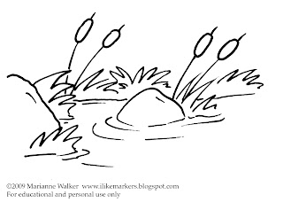
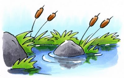
Here is a copy of the line drawing I am coloring today. You may print it for your own tutorial purposes. You can color with Copics over some inkjet printouts, so test before you print to know if your particular ink will bleed or not. Otherwise, you can print it on a laser printer or photocopy it and you'll have no problems coloring.

Water In A Pond
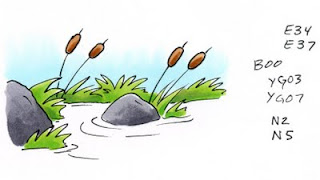
I'm starting today with anything above water already colored. That way we can focus on just the water. You'll see that my sky is a nice light B00 and my grass is a simple YG03 and YG07 combo. The rocks are a neutral gray and the cat-tails are a simple brown. This is a nice, easy scene to color - until you start coloring the water.

Let's take it in easy steps so you don't feel overwhelmed.

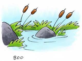
If we start by coloring the water the same color as the sky you can quickly see how flat and fake our scene looks. However, we must remember that the water will be the same tone as the sky - just slightly darker and grayer.

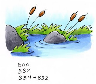
By adding a base tone of our sky color it will give the final picture hints of our underlying blue sky and pull the two elements together more. So go ahead, color your water with the same color as the sky (Other colors I like for blue skies include B0000 or B000, B32, BG10, BG0000)


Next, we need to darken the water and tone it down a bit.

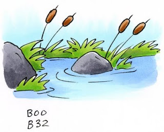
If I add a color that is in the same blending group as the sky then our water will be too vibrant. Remember, water is more gray than sky. In this case I will need to use a blue that is grayer by about 2 or 3 families, so I reach for something in the B30's. The lightest shade is B32, the last digit - 2 - tells me that it will be 2 shades darker than our original color which ends in 0.

I shadow the edges of the pond with the B32 and I leave the middle area still light, as this would have the most direct reflection of the sky. Already this is a big improvement over the flat blue we first had.

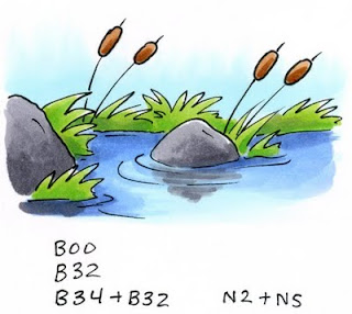
Time to add contrast. Remember, contrast makes things more interesting so we should always look for ways to improve our work. To give the water contrast and shadows I reach for a color that is 2 shades deeper than B32, which would be B34.

I darkened things near the shore, and the shadow side of each object near the water. I'm not adding too much, just enough to make it look interesting. Then I take the B32 and smoothly blend the dark blue into the middle color (You can leave yours kind of streaky as long as your streaks are in the same direction as the ripples). I also added a hint of shadow to the ripples to add variation as well.


Now we can add the reflections of objects. This is a matter of personal taste. You might like the water just as it is.

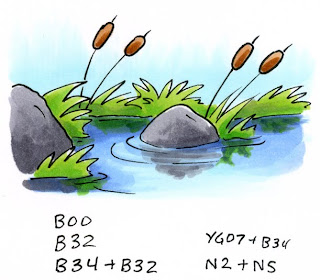
I start with the largest objects. In this case it's the rocks. I take the same two grays I used on the rocks and I am lightly scribbling in the direction of the ripples. Note how it's not smooth and perfect and you can still see blue under the gray. This is OK. This is what increases the illusion of water. You can see that where I have a ripple I left the darker blue alone. This also heightens the idea of water.

The rock closest to us is much bigger and closer, therefore it's reflection is much crisper and deeper. The ripples don't affect it as much when it's that close.

Now I can add the shadow of the grass. I use the darker of my two grass colors and lightly add the illusion of grass. to darken it up I added hints of the B34. This helps give the water a deeper, brighter blue-green feel, and it tones down the vibrant YG. Now our little pond looks almost done.

For the final step today I need to add white back in. To do this I took some opaque white and a very fine paintbrush (or toothpick) and I painted back in a few small highlights. I added some glints of light to the ripples in the water and I gave a dab of highlight to each of the objects in the picture as well. Now we can really feel how bright and crisp our day is with the sun shining on our serene little pond.

If you try coloring today's tutorial please send us a link of your example. I would love to see your colored picture! Have fun coloring.