 Computers and Markers working together
I wanted to share a recent illustration project with you so you can see part of my process. This was a poster I designed for the Oregon Asian Celebration which is held each year in February. This year I was out of town so I could not attend the event, but I still wanted to share what I made for it. For the last 5 years I have designed their posters and each year I use Copic in some aspect. (You can see last-year's poster design notes here).
This year I made my illustration more digitally than in years past, but I still want to show you how I started with Copics.
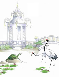
For this first picture you see, I drew the pagoda in the background, and scanned it in. I showed it to the client and they loved the image, then they told me what else they wanted to see in the picture.
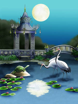
Their theme this year was "Reflections on 25 years" as it was their 25th anniversary of the event. They wanted the moon reflecting in the water along with a turtle on a rock, some cranes, and other symbolic images.
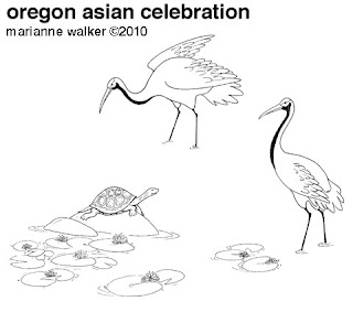
 So I drew the turtle and cranes as separate images and scanned them in. Using Photoshop I arranged them how I wanted them to look and made the pagoda gray instead of black, so the cranes and turtle would stand out more. I printed these onto color laser copier paper and colored them in very lightly.
This image looks great, but I knew the final picture was to be at night. By getting my basic shading in at this point I knew that I could always darken it on the computer. I also left the water and sky uncolored, as I was not sure how much shading or light I wanted to do, so I left it as areas to color on the computer.

Here is the final computer colored version. You can still see hints of my basic coloring. By using Photoshop I was able to darken the whole image, add in my water and background without worrying about making mistakes, and pull the whole thing together.
As you can see, I use both the markers and the computer when I need to. Neither one is better, as they are both tools and I use each one for it's strengths. I hope this gives you some ideas. Have a great weekend! I'll have updates on certifications tomorrow.

20 comments:
Beautiful! You are a master!!
Wow. Double wow. Triple WOW.
I agree! WOW, wow, wow! I bow to you ... oh Great Copic guru - You rock!!
WOW!! that is one awesome drawing. I love the final outcome.
Wowee- this is stunning! You make it look so easy, sigh...
All I can say is WOW...thanks for sharing this art with us...have a stampin' good day.
Stampin' HUGZ
Beverley
Your art is amazing! So beautiful :)
Very Pretty Marianne! TFS
What a lovely finished product - no wonder they ask you to do them. Absolutely fantastic!
♥hugs♥
Wow!!
You are a wonderful artist. What a thrill. I would think that there is a bit of stress involved with working through the entire process. Love the turtle. Thanks for sharing your incredible talent.
Holey Moley, what a gorgeous piece of art!! It's obvious why you are asked year after year to do their posters - they're awesome!
Absolutely beautiful!!!
Marianne, you are so amazing! I love the first picture I saw, everything. Then I saw the finished piece and it blows you away. It is absolutely gorgeous. Thank you so much for sharing this with us. I can't begin to invision how I could do that with photoshop.
Magnifique!
You are an inspiration, I will go play with photoshop tomorrow that for sure. I do not think I will acheive a result like you, but I like the fact, that you mixed art.
thank for sharing.
fany
Holy Moly!!!! This is stunning! YOU rock!
Very lovely Marianne!
Take care and STAY POSITIVE!
Beautiful! You are a master!!
data entry india
Very awesome! You are so skilled!
This is such a lovely poster and thanks for explaining how you used the unique aspects of each medium to complete your work. I adore your Asian Art and hope you post more!
This is absolutely stunning!!!
Post a Comment