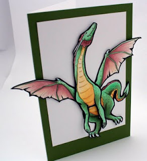
 I know I haven't posted a tutorial in a while, but I did make a simple card for a dear friend here at the warehouse who was having a birthday this week.
While I don't have a step-by-step tutorial for this project, I will point out a bit of strategic coloring that I did while creating this card. For those of you who have taken the Intermediate Certification, you'll know what I'm getting at, when I talk about Strategic Coloring.
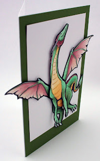
I drew this dragon as 4 pieces of cardstock, one part for the front, one for the hind end, and one each for the wings.The top layer is popped out with foam tape, then I used X-Press It Tape for adhering the rest of the dragon.
 Strategic Coloring- Shadows
You'll notice that I didn't bother to blend my colors very smoothly. However, I did add darker spots all over the green. This is to simulate irregular dragon skin. Also, it is hard to exactly determine a light source, except that there is light coming from above. This is my artistic license. The dragon is flying in midair, so there is a lot of ambient light. You can tell he's dimensional, but I'm not distracting you with too many shadows.
What I want to point out is the dragon's green coloration. The main, light green I used is YG41, this is my base tone. I colored ALL green areas with a base of this color, so that all areas, no matter how I darken them, would still feel cohesive. Then, to add simple shadows, I worked in YG63. YG63 has more gray in it than YG41, so it both darkened and toned down the shadows. This makes the shadows seem to have more depth.
On the hind legs and tail, I worked in G85, as G85 is even less intense than the YG's- less yellow and more blue makes the color recede more. Finally, to pull in the color of the green border paper, I added G99 to the darkest shadow areas. Because I physically popped the front of the dragon off the page, that also adds natural shadows to any portion below it.
Part of the strategic coloring in this case is the yellow underbelly. See how the yellow pulls your eye right to the dragon's head? And then, the dragon is looking up, off the page. The first version I drew, the head was pointing back towards his body. However, I changed it.
 Strategic Composition
Compositionally, having the head pointing back to the body would create more of a circle in the line of sight. Your eye would continue flowing around and around. However, the message I wanted to convey was freedom and flight. Therefore, having the head up, the wings spread out, and the dragon at a jaunty angle with wings and legs going off the edge of the white box creates more of a sense of freedom.
Also, I gave white space above the head. What this conveys to the viewer is a sense of possibilities- there is room for this dragon to continue flying, wherever his wings may take him.
The wings and tail help pull the viewer back into the dragon's belly, which then draws the eye back up the yellow belly, then to the head. From the head, the eye travels up, hits the dark green border, then flows back around the page back to the wings and tail, which continues the flow and makes the viewer look longer at the picture.
Physically having the dragon popping off the page also adds to the sense of breaking from the confines of the paper. I left his front arms unattached in any way- no extra dimensional tape or anything. This is because I want them to naturally flare out more, and to not lose the dynamic from that portion of the cast shadow.
Notice how simple this card is. The image is so strong and dominant, yet clean that I didn't need to add anything else to the card front. It works as it is. I liked this card so much that I had a hard time giving it to my friend, but since she loves dragons, I know that she loved getting this dragon card today as much as I enjoyed making it for her! May all your dreams take flight this week and I hope you get a little more insight as to how I choose colors and composition as well.
Other colors I used: E04 and YR30 for the wings. YR30, Y21, and E33 for the underbelly. Boo for white claws and horns. Assorted glitter pens to add sparkle to the shadows. To give you an idea of the size of this image, this is a full sheet of paper folded in half, so it is a very large card.

16 comments:
Wow, what a fabulous card!!! Love it!! tfs
Love it, Marianne! Thanks for sharing. :-)
Thank you Marianne for sharing the how and why you used in coloring the dragon...truly inspiring!
Jan
Thanks so much for explaining how & why you make the color decisions you do- that helps us Copic newbies so much! Great dragon, too!
Great tutorial!! Thanks Marianne!
Thank you for sharing that with us. It makes a lot of sence. It is a stunning very stricking.
First visit to your blog. learnt a lot. Stunning card and detailed explination. Will be back
Thank You
GinaA
Love it...wings are awesome! Thank you for sharing your talent!
This is just GORGEOUS!! So glad you shared it!
Thank you again for displaying your wonderful artistry.
Thank you Marianne for a great tutorial. The insights about how the eye moves around the card is soooooooo valuable, I'd love to see more of this type of tutorial. CoB
Thanks for your insights. It is so interesting to hear about your thought process relative to the choice of color choice and the role of the saturation and value.
Thank you so much for all the instructions it really helped me she what you had done. I'm hoping to take the intermediate in the near future. Your card is absolutely amazing.
Wow wheee! Gorgeous, Marianne! LOVE this, and I know she did too!
what a fabulous card. it is full of inspiration, at most I like its wings, it is very beautiful.
urban wear
Post a Comment