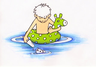
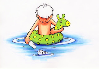
 I was sitting at my desk, thinking how much fun it would be to go wading in a stream, when I thought of this image. Coloring it can either be simple or complex. I am going to show you an advanced way of coloring it today. For this example, the light is coming basically from above.
  I started with the water. I started with B12, feathered out from the center. Then I pushed back towards the image with a lot of colorless blender. This is how I achieved the really soft, trailing edge that looks almost watercolored. Then, I streaked in some BG15 and B45.
The base color on his skin is E000, and the pool toy is colored with YG05. I added a hint of shadow on the pool toy with B12, the same color I used on the water. I did this to tie the shadow colors into the reflected color of the blue of the water.
 Next, I darken his skin tones and deepen the contrast on the shadows on the pool toy. Skin tones were layered E11 and E13. Notice his face is almost all in shadow, since his head is tilted down to look at the fish. His ears stick out and catch more ambient light, so they stay light.
I deepened the shadow on the pool toy with B45. I colored the spots with Y06. As the light is strong, I kept the coloring very simple. At the end I will add highlights back in as pure white to show the shiny, reflective inflatable toy.
Compare this third image to the last one. Look closely at the skin tones. I added B12 to the underside of his face, arms, and hair. Again, i used B12 since htat was the base blue I used on the water.
I added highlights with Y02 to the tops of his ears, tip of his nose, and top of the arms.
I added another layer of E13 to his face around the nose to darken it even more, but I left off coloring the nose, to keep it looking like it sticks out of the face.
I colored the popsicle with RV21 and RV06. I added a blue shadow to the popsicle with B12 as well. The fish is colored with C5 and BV00, with hints of RV21 and B12 reflections. I also added a faint highlight of Y02 to the fish's head.
When you look at this image, compared to the second one, it is easy to see how contrast helps make the boy look more dimensional. His face and arm on the toy, in particular, look much more rounded.
Here is the final, color-corrected version of the artwork. On the final image I finished coloring his hair with E11 and Y02. (I started with the B12 simply to show you where it was on the hair. Otherwise, you could add it after you color the hair as well.) Then, I added Copic Opaque White to create the final white highlights and reflections on the pool toy, and water. Also, I added white streaks into his hair with opaque white, rather than trying to leave those fine details white.
The line image was drawn with a 0.2mm Multiliner SP and printed on color laser copier paper to be colored. I hope this helped you, have a great week, and I will see you next week at CHA in Chicago!


13 comments:
Such a cute image! Love the colorless marker to make the water appear more "watercolor" like.
Great tutorial! Thanks Marianne!! Blue is one of my favorite colors (ok, all the colors are my favorite!).
Take care and STAY POSITIVE!
Love this, Marianne--thanks for sharing it!
This looks fantastic!!! Thanks for sharing and explaining details on how to do this!!! You rock!!!
Oh my this is just gorgeous! The step by step is sooo helpful thank you xx
I love to find one of your tutorials~ Thanks!! Adorable image!!
Amazing how the image comes alive step by step!! Thanks so much for the tutorial! Enjoy CHA!
Paper Higs,
Jan
WOW great tutorial, adorable image.
Really cute image. Going to have to give the technique a try!
Totally wonderful tutorial. Love how you did the water. Hope to see you at CHA this coming week. I did have the privilege of meeting you last year and I'm sure you do not remember but I was the one that loved your awesome guitar sketch.
Hugs, Patricia
Thanks Marianne for another great tutorial! Such a cute drawing, and your coloring brings it to life!
This is looking so great. The beautiful design. I am also a designer of Plastic business cards but i have never design so creative just like this one. Thanks for the sharing. I am so inspired.
Beautiful.. So lovely design. How much different is there in the Plastic card printing company designing and other gifts designing.?
Post a Comment