Simply download the image, color it using Copic Markers, and follow the rules listed on the Copic blog. I can't wait to see how you color this cute image!
Tuesday, September 25, 2012
Fall Coloring Contest
Looking for something fun to color? Want a chance to win some neat prizes? Head on over to the Copic Blog for a chance to enter our Fall coloring contest.
Simply download the image, color it using Copic Markers, and follow the rules listed on the Copic blog. I can't wait to see how you color this cute image!
Simply download the image, color it using Copic Markers, and follow the rules listed on the Copic blog. I can't wait to see how you color this cute image!
Wednesday, September 19, 2012
Limited Edition! It's Here!
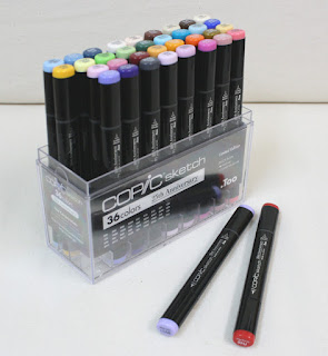 A couple days ago, a special delivery arrived on my desk. I can't tell you how many YEARS I've been waiting for this...
25th Anniversary Sketch Marker Set
But, what makes this set special is that it has a Super Brush nib on one end and the other nib is a Standard FINE!!
People have asked me for years, "When are you going to make a marker with a brush nib and a fine nib?" Now that marker is here. This nib is identical to the one found on a Copic Original marker.
I can use the firm, fine nib for small detail areas, and I don't have to go searching for another marker to be able to smoothly blend larger areas. The colors in this set are carefully chosen to include blending groups, but it includes colors that you can't find in Copic Original markers. I know some of you have sets of Sketch and a few Copic Originals for the fine nib...This set won't duplicate the Copic colors, but it does include some of the most popular Sketch colors, including some of the new 2012 colors.
Here I drew a quick sketch of a tree with my .5mm multiliner, then unwrapped the new marker set and gave them a try.
I think I'm in love!
The sleek black bodies were first introduced in a special anniversary set from the year 2000, and were chosen again to celebrate 25 years of Copic Markers. However, the set from 12 years ago didn't include fine nibs. The black body also helps you tell the difference between these markers and your current collection of Sketch markers.
We are so excited to have the new anniversary set! The first few stores that had pre-orders are just now receiving these in stock, so ask your local retailer if they have them in stock, or see if they can order them for you. You cannot buy individual colors...they are ONLY available as a set. I think you'll love these just as much as I do!
Thursday, September 13, 2012
Certification Update
 Wow! Another busy year of classes is winding down. I want to let you know that these are the FINAL classes for 2012. We will begin posting our 2013 classes in November. We will be having a class the two days before Winter CHA in Anaheim, so if you are trying to figure out your schedule for January, keep your eyes open for those dates. Meanwhile, here are the remaining locations for this Fall. Classes are filling fast, so if you want to register, check out our website for Standard classes:
Sept. 21st Vancouver, BC taught by Sherrie Siemens
Sept. 28th Sacramento, CA taught by Debbie Olson
Sept. 29th Warwick, RI taught by Cindy Lawrence
Oct. 5th Indianapolis, IN taught by Colleen Schaan- Almost Full!
Oct. 12th, Philadelphia, PA taught by Debbie Olson
Oct. 26th Portland OR, taught by Sherrie Siemens
Nov. 2nd Houston, TX taught by Colleen Schaan - Filling Fast!
Nov. 2nd Calgary, AB, Canada taught by Sherrie Siemens
Nov. 9th, Grand Rapids, MI taught by Debbie Olson
 Then, to accompany those standard classes, we have matching Intermediate classes. Check out our website for Intermediate classes:
Sept. 22st Vancouver, BC taught by Sherrie Siemens
Sept. 29th Sacramento, CA taught by Debbie Olson
Sept. 30th Warwick, RI taught by Cindy Lawrence
Oct. 6th Indianapolis, IN taught by Colleen Schaan
Oct. 13th, Philadelphia, PA taught by Debbie Olson Almost FULL!!
Oct. 27th Portland OR, taught by Sherrie Siemens
Nov. 3rd Houston, TX taught by Colleen Schaan - Filling Fast!
Nov. 3rd Calgary, AB, Canada taught by Sherrie Siemens
Nov. 10th, Grand Rapids, MI taught by Debbie Olson
We hope to see you at one of these classes. Look for our exciting lineup of 2013 classes in November.
Texture Techniques, Part 3, Fur
 Coloring Fur
Thank you all for the wonderful comments about my new book coming out next month! I think you will LOVE all the content included in that book. So far, I think it is my favorite from the series.
Meanwhile, I am getting ready to head out of town for a comic convention down in Los Angeles this weekend, but I realized that I forgot to post the rest of the cat tutorial. Sorry! Here is the third installment on coloring textures without using the colorless blender. You can click here for part 1 with the blank image, and part 2 with details about the sweater.
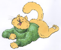
We will color the fur using three colors, just like the sweater. I want to have a solid base color, then add texture with a middle color and deepen the texture with a final shadow color. While I am using the Yellow family, you can try this with any color family. Please experiment!
I start the fur with a base of Y21, colored smoothly over all the cat. I colored the nose and tongue with R85 and the shadow inside the mouth with W7.
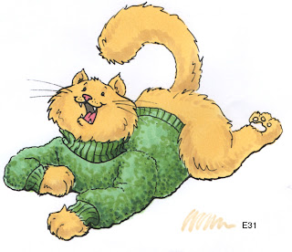 Next, I add the first layer of shadow. I am not coloring over the entire cat, only in the shadow areas. People will interpret that the whole cat has texture, as long as you give details in the shadows. I add a soft layer of E31, using only the tip of the brush.
Look at my little swatch example on this step. See how much white I leave? You want this much white visible on the areas where the E31 meets the Y21 base. In the darker shadow areas you can cover up more of the base yellow.
The E31 works as a very subtle shadow to the base color of Y21 because when you add gray to yellows, they quickly turn brown. Yellow in shadow loses intensity/saturation, in other words, they turn more gray. So, using brown for a shadow instead of a darker yellow works well.
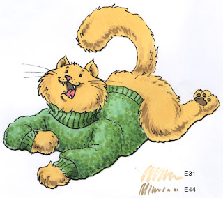 Now I add my final texturing color of E44. Again, I am only working in the shadows. Just like when I added the darker green on the sweater texture, I use only the smallest hints of this color, and I am applying it with the very tip of the brush. Don't forget to color the shadow on his mouth and chin.
E44 comes from a more neutral/gray brown family (E40's) than the E31. Again, I am choosing a color for my darker shadows that has more gray built into it. This is an example where you don't have to follow the color family rules, as long as you know why you are breaking them. Once you find color combos that you like, write them down! You may like these colors not just for a tabby cat, but also for coloring tawny hair or the center of a sunflower.
Here is the final cat. I finished the fur by darkening my shadows a little more carefully, layering hints of E31 and E44 as I felt they were needed. I added a hint of a ground shadow with BV31.
I hope you had fun coloring along. For those of you who are interested in comics, I will be in the Copic booth at Comikaze on Sat. & Sunday, in the LA Convention Center. I would love to see you there!
Friday, September 7, 2012
sneak peek...revealed
Have you figured out what my surprise is?
Here's a hint...
and if you can't find it from that hint, here's a double hint-hint in the coming soon section...just scroll down and you'll see it.
I can't wait!
I know you'll love it :)
Here's a hint...
and if you can't find it from that hint, here's a double hint-hint in the coming soon section...just scroll down and you'll see it.
I can't wait!
I know you'll love it :)
Thursday, September 6, 2012
sneak peek...
Wednesday, September 5, 2012
Texture Techniques, Part 2, Sweater
 Textured Sweater
I hope everyone had a good weekend. I wanted to share part 2 and 3 of the sweater cat post from last Friday. If you haven't downloaded it and colored it yet, please do, and practice along!
This next step is all about technique. Many of the techniques I use depend on how I am holding my marker.
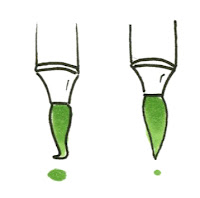
I started with the same base color of G12 that I worked with on Friday's examples. For coloring large areas like the base green, I work with the brush end of the marker, coloring using the side of the brush.
Next, I add details in the shadows, using my slightly darker green, YG17. For these details, I hold the marker straight up and down, using only the finest tip of the nib. When you push straight down, you will get dots of varying sizes (see diagram). Don't worry about damaging the nib, it will bounce right back to shape.
Use the very tip of the marker and scribble in the texture, leaving plenty of areas that are not blended. Go ahead and add some dots of color as well.
 As you can see from this close up, my scribbling is very irregular, but, it goes from darker and dense, to light and sparse. This is the technique you need to practice: Scribbling in shadows that appear to get lighter and darker, simply by how much ink you add.
Notice that on the lighter end, instead of scribbles I move more to individual dots. This color is layered over a lighter color on the cat's sweater, so those dots floating in open space won't look as strange.
On the original cat image, you will see that I give the suggestion of where to put the shadows through the dots that are already drawn in. For simplicity, the light is above the cat, so you are adding shadows on the underside of the image.
If you want softer color variation, work while the base color is wet and the two colors will soften together a bit more. If you want stronger contrast, work while the base color is dry. On the ribbed edges of the sweater, I did not scribble, rather, I colored in the direction of the ribbing.
Next, I add a darker layer of green scribbles/dots. NO BLENDING! Resist the urge to go back and blend the colors together.
Here I added G28 as my darker green. I use a lot less dark green, and I make sure that plenty of the lighter green shows through. Again, on the ribbing, color smoothly, in the direction of the ribbing grain. We are only adding the dotted sweater texture to the main area of the sweater.
Look closely at my pattern diagram in the corner. I am adding so little dark that I never really scribble, I simply dot it in, over the top of the middle green, again, getting lighter as you work into the highlights on the sweater.
At this point, you can make a decision- too much or too little texture? If you feel that the texture is too harsh, then you can add more texture to blend.
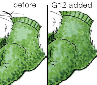
To soften edges without blending, take your lightest color, in this case G12, and heavily dot it over the entire sweater. Do NOT color in circles and blend, as this would destroy all your careful texture. All we want to do is soften edges. By dotting on the lightest color, it softens a little bit, without washing out the full texture.
Look closely at this final sweater sample. Compare the before and after. You need to make sure that the dots are really juicy for it to move colors around.
 This is also a time when you can add a subtle tone of another color. For instance, you are trying to match a particular green paper with your coloring. However, the sweater needs to be a hint more gray or yellow green. At this point, dot in some of whatever color it needs, be it a pale gray or a more yellow.
 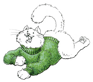 Here is the final sweater, colored with texture, instead of using the colorless blender to add texture. Later I'll show you a method for coloring the fur with texture as well.
Subscribe to:
Comments (Atom)


