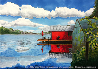
I've been working on building a new portfolio of Copic Art/Tracing Memories images, based on photos that I have taken over the last few years. This piece is an example that I made from a photo taken at our Copic design team retreat last Fall by Debbie Olson (her photos came out much nicer than mine!). The picture is only 5" x7", and took me about an hour or two to color. A beginner could spend 3 to 4 hrs. on this picture, depending on how complex you wanted to make it. Today, I'm just going to step you through the sky/clouds.
Coloring Clouds
 The sky in this photo is so dynamic, with the rich blues and beautifully fluffy clouds that this image quickly caught my eye for turning into an outline. But, coloring clouds can be tricky, so let me step you through my process.
I could have colored the sky with a few different methods, but I wanted to try going dark to light and see if I liked it.
I started with B23 for the upper, rich blue area. Then, under the top row of clouds, I put some of the B23 and blended in B41. I don't think I'd use this technique in the future, because the blend looks a little irregular, but, this is why we experiment.
I colored the B41 lighter and lighter as it got closer to the horizon (his photo makes it look grayer than it actually is). The outlines created on the computer did not have all the clouds defined, so this is where you get to decide where the clouds fit. The original photo got really detailed little clouds off in the distance, but I didn't have the patience to deal with those, so I skipped them.
 Now I started with my darkest color on the clouds, C3, to define my deepest shadows. I wanted my blends to look a little splotchy here, since clouds are puffy and irregular.
Get a general idea of where the shadows will be from the photo, but don't get hung up on being exact. Most people who see your finished work will never see the original photo, so they won't know if doesn't match perfectly. Notice I didn't carefully blend the dark, I loosely scribbled it in.
 Next, I dabbed in C1. Notice how it softened those hard edges of the C3, but not too much. Again, I didn't blend much, I just dabbed and spotted colors on.
 Something to remember when coloring a picture is that it will not look perfect at each step. Just because it doesn't look right now, doesn't mean that it won't look right a few more steps down the road. Don't give up! At worst, just start over and get a new sheet of paper.
 To finish the clouds, I came in with a C0 and dabbed in my lightest gray. Once again, this softened, washed, and blended colors together. If anything looks too dark or the edges still seem harsh, then you can come in with the colorless blender and pull the grays down a bit.
Be careful not to wash out the C3! If you remove too much of the gray, then you'll lose the nice contrast you see in the original photo. Luckily, you can always go back and add your shadows back in if they disappear too much.
Here is the final picture again, just for you to compare. Notice how the clouds reflected in the water are a little duller, and a little more gray. I added C1 to the water far away before I layered on the B41, then, went into B23 and B99 as the water gets closer to the viewer.
 I used BG72, B23, B41, C1 and C3, with hints of B99 on the glass from the greenhouse. I used YG06, Y08, G29, G85, and YG63 on the withered grapevines. I added pale hints of YG23 and YG11 to suggest plants inside the greenhouse.
The red boathouse is R24, R27, R39, R59. The roof is all from the Cool gray family, the brown is E35, with a gray layer. I didn't use black, anything dark is actually W7. The trees/buildings in the distance are YG63, G85, G29, and W3/W5, with a pale bit of B41 to make everything a little cooler (this helps it look farther away).
As I didn't take this photo, I cannot provide this image as a freebie, but, keep looking in the future for more info about Tracing Memories and where to get images. Also keep an eye out for details on future classes. Have a great week!


