Showing posts with label skin colors. Show all posts

Saturday, March 3, 2012

Popular Skin Colors

Blank Skin Color Chart
When we go to Comic shows, people are always interested in our most popular skin colors. Today I want to share the chart that we fill out and have at those shows. This is free for your own personal use and not to be sold or used for commercial gain.

For other color charts provided by Copic, please visit our website. And, don't forget to enter your favorite skin color combo on Thursday's post for a chance to win two rolls of double-sided tape.

Wednesday, May 27, 2009

New Spica Colors & Coloring Vampire Skin


Yeah! It's been a long process, but finally we have our new atyou Spica glitter pens in stock. If you love the bold, bright original colors then you'll love the new set of pastels and secondary colors. (Later this week you may even get a chance to win them...hint, hint..)

The colors and their Copic equivalents are:
Pitch Black - 100
Blossom - (RV22)
Garnet - R39
Lipstick - R29
Baby Blue- B21
Mint Green - G82
Buttermilk - Y21
Chocolate - (E58)
Sand - E33
Peach - E01
Lilac - BV00

These are available NOW at a store near you.

The atyou Spica pens are prefect for adding a subtle shimmer to any of your papercrafting projects. These pens are acid free, archival, and pigment based. They last twice as long as any other glittery pen and are not a gel pen. They're really hard to see in a picture, so you have to see them in person to understand how they work the best.

Coloring Vampire Skin
With the popularity of Vampires these days I realized that in my original Skin Color Posts I forgot Vampires.

The perfect pale, sallow, skin color with sparkle combination I found is

E000 + E70 + E01 + Clear Spica

(Other colors I used: B91, B93, B95, BV11, R35, R39, R89, C2, E31, E34, E37, E59, Y000)

Scribble over your main skin surface lightly with the Clear Spica. You don't need too much. Color the whole area in with your pale E000, this will evenly spread around the glitter, and they you can add your unhealthy shadows with the E70 and touch up the darkest skin areas with E01.

Skin colors are hard to scan or photograph, but on my monitor these colors look pretty accurate, though the E70 is more purple in real life (adding to the sleepless look). On paper they are a dead ringer for a vampire out in the sun where you can see their skin sparkle :) If you enlarge this picture and look really closely you might be able to see the flecks of light where the glass flakes from the spica pen is catching the light. I added a few hints of the new Peach Spica pen to the shadows just to deepen them up a bit.

Artwork is some I drew a while ago for another project, photocopied onto color laser copier paper.

Big Copic Prize Week
The winners for the Winnepeg Certification giveaway from Sherrie's blog will be announced tomorrow. Thank you to all who participated! That will be a fun class and the two lucky winners will have a neat opportunity to learn from Sherrie.

Look back tomorrow on Sharon's blog for another cool prize opportunity, and you can still enter to win a prize on Sally Lynn's blog, so keep looking for your chances to win all week.

Friday, December 12, 2008

Skin Colors Part 3 - Adding blush, part 1

Today I want to talk about adding blush to a colored image. I'm not the kind of person that likes applying make-up, so I find that adding a hint of rosy color to a face is a tricky thing to cover. Too much color? too little color? that's a matter of personal taste.

Also, thank you to everyone who sent cards to Kris. She had a fabulous birthday (we have the best cakes when it's someone's birthday down at Copic) and appreciated all the cards. If you would like to be entered in the blog drawing you can still sign up on Wed. post until midnight. However, you don't need to send Kris a card, rather, upload some artwork to the Copic Website gallery.

Simple Blush
I'm going to start with techniques today on a simplified face (I'll cover more detailed, realistic faces later). For this project you'll need some good pale skin colors (lighter colors are easier to practice over, I'll talk about other ethnicities later). I was about to draw a cute little face to color since I don't own many people stamps with faces big enough, and then I remembered I already had a stamp I could use for just this occasion (silly me, forget that I drew this in the first place). So today I'll be using little Anna Mae by OCL and talking about blush.

Before we get started, remember a few things
• For soft edges, work wet
• A lighter color will push a darker color out of the way if it is juicy enough

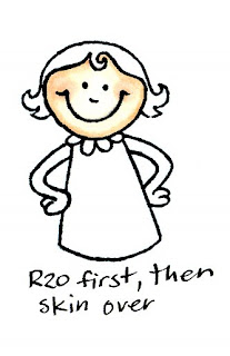
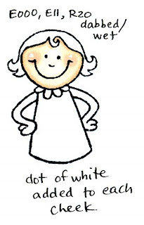
For my examples today I'm using E000 and E11. Each time I colored the face I started with E000 coloring in circles to get a smooth base color, then I added the shadows with E11, then came back with E000 and smoothly colored over the whole thing again to really blend in the shadows. I happen to be using R20, or Blush as my blush (go figure), but you'll want to try your own colors and find a blush that works for you.

Strokes vs. Dabs
There are two basic ways to apply color with a marker. You can either stroke it on or dab it on. The key difference is how much ink are you putting down. Color that is stroked on, or one quick overlay doesn't always soak through the paper, rather it is gently resting on the surface and overlays the base color, but you can still easily see the color underneath.

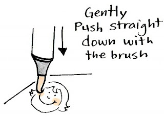
Dabbing, on the other hand, is applying so much ink that it pushes the other color out of the way. You can get this effect easiest with the brush on a Sketch or Ciao because they are so juicy (see diagram), but you can get the same effect with the firm points by coloring in the same spot so much that it soaks the paper and moves the other color out of the way (one upshot of using the brush for dabbing is that if you push straight down you can get a perfect circle each time, no scribbling in a circle and hoping it's the right shape).

Let's look at the difference.
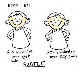
Brushed = Subtle
On my first example I have little Anna Mae with R20 brushed on wet skin. See how soft this is? You can barely see it, but it is subtle and the edges are very soft. The next example I brushed it on over dry skin. The edges are a little more crisp. Either way, I'm not soaking the color all the way into the page, rather, it's one quick stroke to leave a hint of pink over the skin.

If you are trying to tone down any object (if it's too dark and you want to add gray) then this is the technique that will give you the best results. You keep the color underneath, but you can still see the top color you are applying.

Dabbed = Stronger
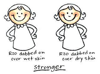
On this next pair, you see that I dabbed the blush on. Look at how much darker it is. The first example I dabbed it on while the skin was still wet. This gave me softer edges.

The second example I dabbed the blush color on while the skin was dry. Notice how much crisper the edges of the blush are. Either way, the color of the blush is stronger and you see much less of the skin tone through the blush. On darker skin this would really stand out.

I like to use a variation of this technique when I add subtle highlights into hair. If you have colore dsome dark brown hair, try taking a lighter yellow and streak in some juicy highlights. This is easy to do with the fine point on a Copic original marker, just color over the same streak about 3 or 4 times until the darker color moves out of the way. By using yellow it adds tone, whereas blender would just lighten it and not look as interesting.

What if I do the blush first?
This is fine to try on lighter skin, since you'll still be able to see the light blush underneath, but on darker skin tones you'll have to make the base blush darker. When you do the blush first it looks a lot like the example of the blush brushed on over wet skin. If you find a color combo that you like then write it down and remember the technique you used.

For something like blush, it's usually easier to do the dark color first then add the light color. that way you can judge better how much color you need to add. When you do the light first, it just gets overwhelmed and you loose it.


Making shiny cheeks
If you remember back to my posts on Opaque white, you'll know that I use white to add highlights back in. This is also a good way to show something is shiny. Magnolia Stamps suggest adding a dot of white to the middle of the cheeks on their characters. The reason they do this is because the contrast grabs your attention and pulls you into the cute cheeks. Second, it makes the cheeks look like they're shiny and sticking out more (like the extra light shining off your dimples). Here I've added a dot of white to Anna Mae's cheeks. I don't know if I like the look with this particular picture, but again, it's a matter of personal taste.

None of these methods I've shown today are right or wrong- they're just different. You may prefer the look of one method better than another. The trick is for YOU to try it for yourself and get the feel that works for you.

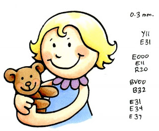
For my final art today I broke down and drew my own picture of little Anna Mae. I added blush both to her cheeks and her bear's cheeks using the dabbing method. See how much the color on the bear was pushed out of the way? Anna Mae looks so cute, it helps me forgive her for the sleep I've been missing as her last few teeth come in.

Wednesday, September 3, 2008

Shadows Part 4- Shadows on faces

Now that I've covered some basic shadows on round objects, let's see how we can apply those same principles to a common but challenging shape, the face. Check out my earlier posts for a good list of skin colors and ways to smoothly color skin. This is another beginner post on ways to draw shadows.

Shadows on Faces
Admit it, this can be tricky. A drawing of a face is easy. Eyes, eyebrows, nose, mouth, chin- all these make up a simple face, but all of these alter the shadows on a face taking a simple circle and making it challenging to color (I'm not going to get into hair yet).

Because the lighting is trickier, we're going to look at shadows coming from up and off from one side. In this picture I'm letting the lines tell me where my shadows are. I drew this face with the line of the nose on one side. This sharp line is perfect for telling me where the most contrast will be between my brightly lit nose and my shadowed cheek on the other side, so I'm going to have my sun shine opposite my nose line. The best way to see if you're shadowing correctly is to look at a photo of a face and see where the shadows and highlights are. Some faces are smoother or flatter, and some are more wrinkled, so this is just a general shadow guide.

For simple shadows let's look at where the sun hits your face first. Nose, cheeks, forehead, and chin catch the light, so those will be lightest. The side view helps us remember which parts stick out the most.

Now for shadows. See how your eyebrows shade your eyes? Then, under your eyes your face gradually smooths out to your cheeks. So you'll have a deep shadow above your eyes that fades down and around to your bright cheek. Your nose casts a shadow as well, since it sticks out from your face. The sides of your face curve back, so the far edge gets a shadow. Around your mouth, the top lip casts a small shadow, the bottom lip sticks out so it is a highlight, and from your bottom lip to your chin is a slight shadow.

This complex view of shadows on a face shows a progression of white-light-middle-dark-black better. Remember, when you use more colors and more contrast between colors your picture looks more interesting.

On the diagram I made the highlights yellow so they really stand out. The whole right side of the face is going to be slightly darker, so I didn't give him a highlight there, I let the midtone show the lightest areas, then added my deeper shadows from there. On the colored example I mixed the simple and complex, so I used 3 colors. First I colored with E50, then added simple shadows with E53, then darkened up the deepest shadows with E55. Looks pretty good.

On our final image today I chose this picture I drew last week for my father-in-law. He is giving a lecture on Sacagawea, the Native American woman who accompanied Lewis and Clark as they explored the American west (and spent a wet winter in Oregon). I also chose to use this picture because her hair doesn't cast shadows on her face (less to worry about).

I drew this picture based on photos of the woman who posed for the Sacagawea coin, so I knew when drawing the picture where the shadows were and where to put my highlights. See how the shine in her hair also clues me in - it is stronger on the side where the sun is shining.

Because she is Native-American, a good deep skin color sequence is E11, E13, E15, E18. This has a hint more red in it than the E20's, which is the sequence I prefer for African skin, but is not as olive as the E50's sequence, or as pink as the E00's. See how I followed the rules for complex face coloring- All highlights are E11, then E13 for my first layer of shadows. Deeper shadows get E15 and finally E18.

I colored this wet for smoothest blends. This means that I smoothly started with the light color, then while it was still wet I added my darker shadows. Where the two colors meet I go back with my lighter color to blend the shades together.

To color her buckskin dress I colored only the edges and shadows with YR31 and Y28, then used the colorless blender to push those colors out to the edges. Once it was dry I dotted on some more colorless blender to add texture to the cloth.

Before I go, I just want to say Thank you to all of those who came to visit me at my demos in Portland on Saturday. That was lots of fun! Just a reminder for those of you interested in the upcoming Certification Classes please e-mail me and I'll send you applications or add you to my mailing list.

Wednesday, July 2, 2008

Skin Colors- part 2

For those of you interested in the Milwaukee Certification class on July 15th or the Chicago certification class on July 16th, I still have a few spaces, so I'm opening them to the general public. I MUST have your completed applications by July 11th however. Please e-mail me for an application and info sheet. For those of you already scheduled for the Certification classes in July I will be sending out your supply list in the next couple days, so be looking for it.

Today we'll discuss ways of coloring once you've picked your favorite skin colors (see yesterday's post). These are only a few simple techniques, and by no means the only way to color. I drew this picture yesterday so I could show you what I mean. I photocopied it onto color laser copier paper, though Manga Illustration paper would be better for this (I just didn't have any loaded into my copier at the time).

2 color skin
This first picture is the most basic. I picked a middle/light skin color, E01 and a slightly darker shadow, E11. I left my highlights white, added the midtones with an even layer of E01. I let the E01 dry, then I layered in the E11. This gives the illusion of using 3 colors, but I'm only working with 2.

Shadows? I drew the picture with one side slightly darker than the other, giving a hint of where the shadows should be.

3 Color Skin
Compare this one to the first one. I started with E000 and completely colored any skin areas, then I added the exact same shadows as the first. She seems much darker skinned, simply because there are no white areas. When you are coloring, you may want to leave your brightest highlights white just so you get more dynamic coloring. The trick to even coloring on the E000 is to color in circles keeping all your edges wet. Then you get very smooth, rich color even though it is so pale.

Wet Coloring, 3 color skin
The first two examples have very crisp lines between each level of color. the simplest way to keep your edges smooth is by coloring each section individually. In this case, I did the face first. I colored it using the same colors as the second picture, however, while the base color was still wet on my paper I added my darker colors. This simply and softly blended all 3 colors together. To get my deepest shadows back I would have to let it dry, then add the E11 again.


Blended, 2 color skin
For this last example I used my two darker colors only. I colored evenly with the E01, then added shadows with the E11. Then, starting in the lightest spot on the face, with your colorless blender push all the tone out to the edges of the image. Do this by really juicing the light spot and gradually, evenly expand your blender spot until it goes almost to the edge of your picture (See last week's posts). Do not color all the way up to the line. There is a lot of blender on your paper and if you color up to the line then the color will push out beyond the image. The trick is to carefully follow the contours of the facial features. Then, if you want it even stronger colors, go back in and add another layer of E11.

Here is the finished, colored picture. I started with the wet colored picture, but I wanted even darker shadows so I added in some E04 and added a bit of pink to her cheeks with R20. I used the B41 blended out for my shadow areas, and as a base color for her eyes, and the small flower. I wanted her to be a dark blonde, so I chose YR31 and layered on Y28 (this is also a good combo if you want something to look like gold). For her sweater, I dabbed on colorless blender to add texture.


Tuesday, July 1, 2008

Skin Colors - part 1

Since we are going to Anime Expo this week I am going to be covering some topics that are really important not just to stampers, but for the manga artists. The most common question
I get asked all the time- What is the best skin color?

The easy answer: E00, Skin White
The hard answer: It depends on what you consider a skin color. If you haven't noticed, people all over the world have different skin colors. E00 is our most popular skin color in America, since this is a generic pale Caucasian skin. The Natural Blending family for E00 would be E0000 + E00 + E02

These examples I'm showing today are from a special color chart I made last year for Anime Expo. At comic shows like this skin tones are VERY important, so it helps to compare and see what feel you want for your artwork. Just a word of caution, these colors look different on your screen than they do in real life. It is nearly impossible to get accurate skin colors on the computer from marker drawings because the skin colors are so subtle.

The first color groups are in pairs, so you can see that a good skin image has a highlight and a shadow.

Rule of thumb: The trick is to pick a base color, usually ending in 0 or 1, like E00. For a subtle shadow, keep the letter and first digit the same, but go about 2 digits higher, like E02. There are lots of "skin" colors, but here are the most common:

The first image shows the sequence E0000 to E04- basic Caucasian skin. See how each combination is just a hair darker than the one before? The pale colors look a little yellow on my screen, but the darker combo, E02 and E04 looks more correct. IRL, I consider these a hair too pink for adult skin, but otherwise, not a bad, all-purpose match for skin colors.

The next group are the E11 thru E15. I personally love the E11 as a shadow (see the 3 color combos at the end of this post), but as you can see, it makes a great base color too. It's a little darker than most Caucasians, and it has a bit more deep red, but as you get into the darker combos it looks authentic for Native Americans.

This next group includes E21, another good, all-purpose skin color. E25 is the next in the group, which is a large color jump (I really want a E23 someday!) E50 thru E53 are a close match for adult, slightly olive-skinned people. Another sequence I didn't show is the E53 + E55, a good, darker Eastern skin color combo. The E93-E95 group is very pink, so I probably would use these as shadows to other colors, not as skin by itself. They would also make good blush colors that are more earthy than R20 or R30.

The last group includes the YR's. The pale YR000 is a great, very light base skin color, but once you get up to YR02 it starts to get orange real quick. R000 also is a great super pale skin color (with the pink tone it almost looks unhealthy, transparent skin colored). Ro2, Flesh, is way too pink to use as a base skin color, though as a shadow, it's not bad. R02 is really close to flesh- not skin, but the flesh underneath.

These aren't bad as a quick representation of basic skin color groups, however, many of these look a little flat. To really punch up the dynamic colors in skin it helps to add a 3rd level if marker. This last bunch of faces show how 3 colors make skin really "Pop"

Look at the first two faces closely. The first color combo is my current favorite. However, by adding an R20 to the second face instead of the E11 it gives it just a hint of healthy pink, instead of deeper earthy shadows.

Look at the E11 + E13 + E15 face and compare it to the E11 + E13 and the E13 + E15 face above. See how using 3 colors makes it more exciting than just 2?

E25 + E27 + E29 is a great, deep African skin combo. Compared to the E13/E15 it has much less red. The olive-skinned E50's are really a lot more dynamic when you make a 3 color sequence by skipping one of the shades (E53). Do you see how using darker shadows makes the light seem brighter? Working with your own colors see what combos you can create.


So a quick rundown of each color:
Light Skin colors (these tend to end in 0 or 1)
E0000 (almost clear)
E000
E01
E50 (good neutral skin color)
R000 (pinkish)
R00
R01
YR000 (orangish)
YR00

Slightly darker
E02
E11
E21
E51
R02
YR01

Darker skin shadows
E04
E13
E53

Dark African Skin
E25 base, E27 shadows

Dark Native American Skin
E13 + E15 + E17

Eastern Skin
E51 + E53 + E55

Pale Western Skin
E50 + E51

Light, Pinkish Baby skin
E0000 + E00
E000 + E01
E00 + E02 (note how these three combos get a hair darker each time)
R000 + R01

Cheek Blush
overlay R20 or R30

Tomorrow I'll show different ways of coloring faces, from smooth to crisp, faded to sharp. Have a great week!