
Thursday, June 4, 2015

Coloring a flower girl

Little Flower Girl
Last week I had the pleasure of coloring all afternoon at a demo. It's so relaxing to just sit and color. sigh. I wish life gave us all more opportunities to just sit and color. Can you imagine how much nicer everyone would be if they spent an hour each day coloring?

Anyways, while I was at the demo I colored this flower image you can download from the Copic website.  Many of the flower images I drew to match tutorials found in the Coloring Flowers with Copic book we sell.

This picture I drew for our website to match the 4th project in the book, so, in the book you learn how to color this style of flower, using palette blending for the dark colors. While coloring at the demo, I only took step-by-step photos of coloring the girl because the flowers are discussed in the book.

Even though this picture is simple, I tried to keep my shadows consistent on the little girl, with the sunlight hitting her face strongest. The flowers are more of a design element, so I just colored those in, without much worry over shadows, except a little bit on the leaves.

I started by coloring her dress with a base of R81, and added shading with R85. I knew that the hearts would be a darker purple, so I just colored right over the pattern and didn't stress about coloring around them. The darker purple is V06, with shadows of RV69. Notice how I left a lighter highlight on the back of the dress, along with the stronger highlight on the front. This makes the shading stand out more. Be careful not to blend out all your contrast, or your work will look too flat. High contrast makes art more interesting to look at.

I colored her skin with E00, E21 then added shadows with E13. I added light layers of  B00, R30, and a hint of R31 to change the tone. Her basket was colored with E31, E35, and R39.

Then I worked on coloring the flowers. The yellow flowers are colored with Y32, YR65, and R05. Centers are E35. The pink flowers are R81, R85, R39, and centers are RV69.

Leaves are YG11, and YG17 (notice how much contrast I use in my greens, I jump straight from YG11 to YG17. It makes them more vibrant). I darkened the deepest leaf shadows with G28.

I finished with a pale B00 sky background that I faded out to the white of the paper using the Colorless blender.

I had such a relaxing time coloring this picture. It took about 2.5 hrs to color, since it is a full sheet of paper and I was also helping customers during that time. Coloring all those little flowers kept my hands busy while my mind wandered. I ended up staying at the demo an extra hour or so because I was having so much fun coloring!

(I'm sure none of you have ever stayed up too late coloring because you were "in the zone".)

I'll be sure to post some more tutorials, even though I am super busy writing my next two books. Have a great weekend!


Wednesday, May 27, 2015

Coloring a knight in armor

Shiny Metal
A few weeks ago I was at a demo up in Winnipeg, Alberta. I had a chance to make a quick sketch of a knight and color it in the second day of their open house event. I don't remember exactly what colors I used, but I will try and guess as I show you a few step-by-step pictures.

I drew this guy with a 0.05mm multiliner onto Copic Alcohol Marker Pad paper. Then, I photocopied my outlines onto the new Art Paper Pack paper (Copic Sketchbook paper).

I began coloring his blue surcoat. I think I used B000, B32, B45, BV13, Y00, and maybe a couple others. Notice how I left the highlights on each wrinkle a clean, crisp white. This enhances the shadows and adds a nice contrast on a fabric that is supposed to appear pale.

Then I moved onto his reflective metal. Notice the strong contrast, the bright whites that I left, right next to the dark grays. I used a wide range of the cool gray markers, then added highlights of Y00, and extra shadows with B000.

I can't remember what colors I used on the back of the shield, but I gradually built up colors and contrast until I got the look I wanted.

Notice the light sketch suggesting a background. I didn't want hard lines to define the background or foreground, as I wanted to keep the knight the most important/highest contrast  object in the picture.

I kept working around his image, darkening the chain mail with the same cool grays I used on the shinier metal areas.

On his arm bands, I wanted a different feel. I honestly don't remember what material I was trying to achieve, just something kinda dusty so it didn't conflict with the other metal in his ensemble. The leather straps were closed with a range of E11, E13, E15, E18, and some grays.

Again, notice how I left strong contrast on the metal sword, but included faint highlights of pale yellow to enhance the white areas.

Here is a quick photo of the final image. I colored the cape with R24, R29, R59, Y00, and B39.

To simulate depth of field in the illustration, I kept my highest contrast on grass and shrubs in the foreground, with details and color range getting lost as it heads off into the distance. I finished up with highlights of Opaque White on many of the metal objects.

Overall, I liked this more when I was drawing and coloring it, but now that I look at it a month later, it's hard for me not to see the flaws. (We tend to be our own worst critics sometimes)

If you are working on a piece of art, don't get hung up on the flaws! Just try next time to do it better. I know what I want to change next time I draw a knight. However, the parts I really like are the colors on the surcoat and cape. I also like how I colored the helmet and steel boots.

Meanwhile, don't forget to come visit me at my free book signing events for my Coloring Flowers book!

Friday, May 29, 1-4pm, U of O Bookstore, Eugene OR
Saturday, June 13, 4-5pm, Main Street Stamping, Tigard OR

Saturday, May 23, 2015

Congrats to the book winners!!

I'm back from my recent trip and I've had a chance to randomly select the winners for a giveaway of my new book. Thank you so much to everyone who left a comment! It gave me lots of ideas for future topics, and confirmed some ideas that I already wanted to explore.

So, without further ado, the randomly selected winners are:

#4- Stampin Melissa

#26- Erin Ellis

#49- Ginny B

I know you will each love the book! Have a wonderful weekend everyone, and don't forget to color something fun!

Friday, May 15, 2015

Book Signing Events

For those of you in Oregon, I have a couple book-signing events coming up:

Friday, May 29th, from 1-4pm at the U of O Bookstore in Eugene, OR, main campus location. I'll be downstairs in the art department offering free Copic demos and book signings.

Saturday, June 13th, from 4-5pm Main St Stamping and Stationary in Tigard, OR.
The morning/afternoon of June 13th, I will also be teaching three classes straight from the flowers book. To register for those classes, please contact Main St. Stamping directly.

For other workshops and demos, please visit the Copic Website. 

Coloring Flowers with Copic Markers Book - Giveaway

It's here! It finally arrived!!

I've been waiting weeks and weeks for the main shipment of my new book, Coloring Flowers with Copic Markers.

I'm so excited because this book is not just a book, it's part of a whole series of awesome information. Who is this book written for?

• If you like flowers -flowers of all kinds- and you're a paper crafter, or an artist, or an illustrator, or just someone who likes to color, then this book is for you!

• If you're a beginner, this book is for you!

• If you're skilled and looking for tips to make your work look more professional, with depth and interesting coloration, then this book is for you!

• Hablamos Español? ¡Esta libro es para tí! Es todos en Español y English.
(and that right there is the extent of the Spanish I remember from High School, luckily I'm not the one who translated the books!)

For only $9.95, you can order a copy of the book by clicking here. Or, for $2 more, you can order an autographed copy.

Coloring Foundations Series
What's even better is that if you are a beginner and you ONLY care about flowers, then you don't need any other books. That's the great part of this new series. Each of these new books stands alone. So, the next book in the series that is going through final proofing now is Coloring Faces and Hair with Copic Markers. And after that, I'm finishing writing the Intro to Coloring with Copic Markers book, which is more generic. This week I'm also coloring the artwork for the 4th book, Coloring Cats and Dogs with Copic Markers, and next I'm drawing pictures for...

Do you get the picture? This series is going to be a lot of books that are all about exactly what YOU want to learn how to color! All in easy to follow along tutorials, with multiple color variations for each image.

Blank Art is in the back
In each book, there are blank outlines for each tutorial that you can photocopy to color along with the beautiful step-by-step photographs.

People ask me all the time what is my favorite paper to color on. I actually use our Copic Sketchbook paper, a super-smooth, medium weight paper that is very crisp and great for drawing illustrations. But, pulling a page out of your sketchbook isn't feasible. So, we are now selling the sketchbook paper as our new Art Pack- Paper for Markers. These packs of letter-sized paper are meant to run through a photocopier. In fact, this is the paper I use for just about any workshop I teach.  All those blank images in the back of the book will look great on this paper, because this is the paper I colored all the original artwork on for the books!

Note: If you are outside the US and Canada and are interested in purchasing the book or paper, please email us- orders@copicmarker.com  Wholesale inquiries are also welcome.

Download even more art
Now, you've bought the book, you got the special paper that I use, and you've colored some of the tutorials. You're pumped, you're excited, you are now an amazing Flower-coloring-machine!

But what else can you color? I've got you covered there as well.

Brand new to the Copic website, we are selling 8.5" x 11" downloadable line art to match the new books. For only $0.99 a download! And, the flowers incorporated in the illustrations are the same kinds of flowers taught in the book. I drew those pictures just for you, so you can have even more great things to color.

Right now there really aren't many images uploaded...yet.

Every couple weeks we will be uploading new artwork, and not just flowers. See the cool green bug on the paper pack? I posted a tutorial last Fall about that bug. Well, now you can download the outline and color in that exact bug! Maybe you really like that butterfly I colored earlier here on my blog, well that is uploaded to the website as well. Isn't that cool!?!? I am so happy I can finally share my favorite blog illustrations so you can also color along! And, anyone around the world can download these images, no problem.


Win a Free Autographed Book and Paper pack
Whew! That's a lot of information in one post, but I am so excited! In fact, I'm so excited, I want to give away some of these books and share the awesomeness with you.

• If you want to win your own, autographed version of the Flowers book and a pack of paper, please leave a comment on this blog post. Include your email so we can get in touch with you. Tell me what topics you would love to see written into future books or made into downloadable line art (besides Flowers, Faces & Hair, Cats & Dogs, since I'm already working on those).

Next Friday, when I am back in town, I will choose 3 lucky winners.

Easy as that. Good luck, and thanks in advance for letting me know what you want to see a book about!

Thursday, May 7, 2015

Dragons, Demos and workshops

I bet you're wondering where I've been off to, since it's been so long since I updated my blog. Well, I've been a lot of places and been busy doing a lot of things, writing books, drawing pictures, coloring with markers- you know, the usual.

This week I am in Winnipeg, Canada, doing demos with Artists Emporium.  Their open house theme this year is Medieval, so of course I'm drawing and coloring cool things. Last night at their open house I had the fun chance to color this image of a dragon and wizard. I think today I'll draw a castle of some sort, since I love castles.

This whimsical picture was colored with W1, W3, W5, W7
BG02, B05, B95, B29, B39, B00, B02
V22, V25, E31, E33, E35, E39
Y11, y02, Y28, Y35, Y38, YG11, YG13, YG17, YG06, G20, G24, G28, G07, Colorless blender, R22, R24, R29, RV69, and probably a few more I forgot to list!

It took about an hour to draw the picture, then it took about 4 hrs to color, since it is a full sheet of paper. I used our new Art Paper Pack paper for coloring my final illustration (same paper as the Copic Sketchbook), but I drew it on a piece of Alcohol marker pad.

So, where in the world will Copic be over the next few months? Lots of places! Did you know that you can find a list of all sorts of events and workshops on our website?

Events- click here
Workshops- Click here

For instance, I bet you didn't know that we now offer Fine Art intro to Copic workshops, and they will be coming to a city near you! Seattle fine art workshop is a few weeks away, May 30th, and more locations will be added this Summer. Fine Art workshops are only $99.

If you are looking for Papercrafting workshops, we have a great variety of those as well. Just look at our site for more great locations, one hopefully near you.

If you haven't had a chance to visit the Copic website recently, I think you should take a moment and see what's on there. We are constantly adding new products, running great contests, new tutorial manga from Chihiro and Alisa, and much, much more!

So, if you are in Winnipeg, I hope to see you tonight. If you are somewhere else, then I hope to see you sometime in the future. Meanwhile, enjoy the Copic website!

Tuesday, April 21, 2015

Plein Air Marker Sketch

A few weeks ago, our social media team asked me if I could work on a plein air sketch for them. For those of you not familiar with plain air, it is the chance to draw something out in nature, while you are sitting there in front of it.
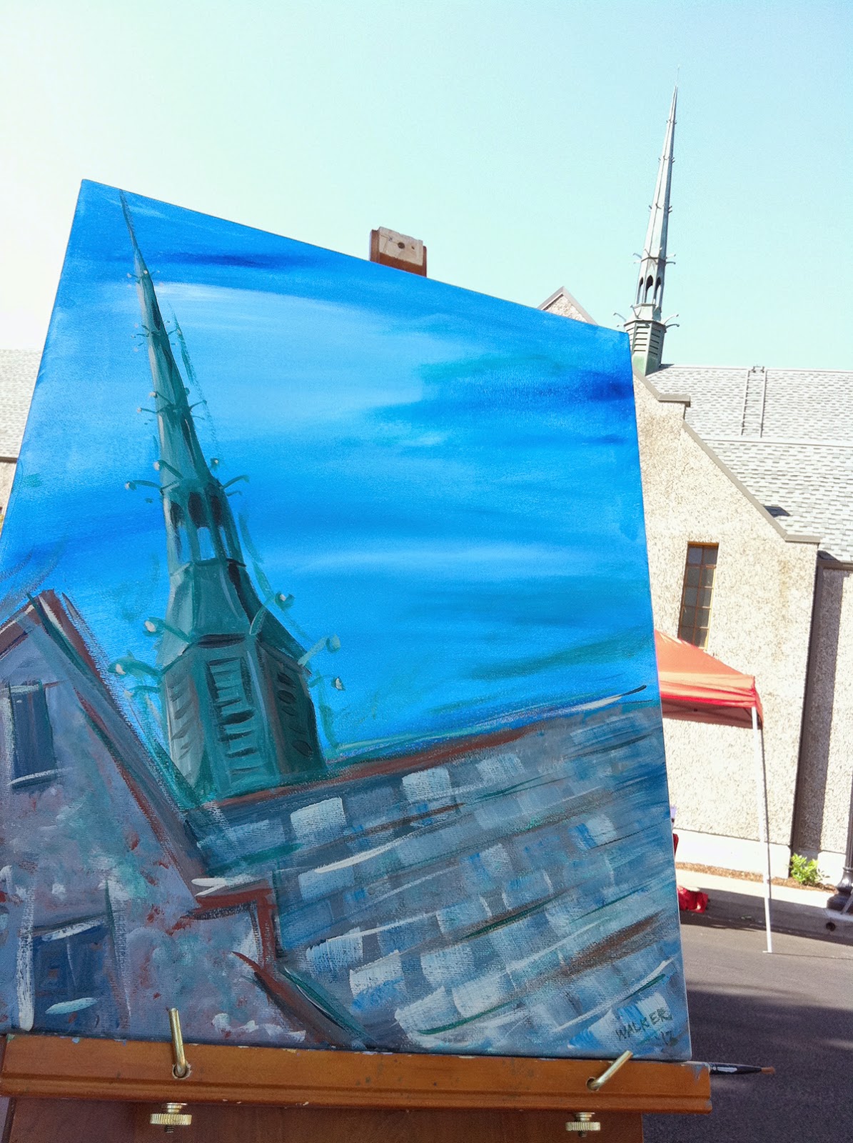

I've done a few plein air paintings over the years, it's a lot of fun. Here is a plein air painting from 2013 that I made of a church. You can see the resemblance to the church steeple, but it is a lot more expressive than some of my marker illustrations.

It's been a while since I worked on a plein air sketch in Copics. As you probably noticed on this blog, I have a lot of different styles that I draw in. Some are detailed, some are a bit more whimsical. The trick with plein air is to balance detail with  speed while capturing the essence of the thing you are drawing/painting.

So, part of my personal challenge was while I was traveling to nail down some time to work in plein air sketch of a place I was visiting.

One afternoon while I was in New Orleans I actually managed to get a few hours! I wandered around a few neighborhoods and finally saw this striking yellow building with a red car in front. My time was ticking, so I began my sketch.

I was working with a regular old pencil in my Copic Sketchbook. I was sure to keep a clean piece of scratch paper under my work at all times, so it didn't bleed through to the page underneath.

Now, usually, I would suggest to not color over pencil lines, because it can stain your nibs, but I was in a rush, and I was careful about scribbling any pencil residue off my lighter colored nibs.


As a side note, once you color over pencil lines, you cannot erase them.

 I worked with a base of Y21 and threw in YR14, YR18 and some other yellowy colors as I worked on the building itself. I block in large areas first, and work into more details, I'm not too fussed about accuracy of perspective, etc. I really just want to get the vibrancy of the color and the feel of the building.

The roof I made with W1, and W4. I used the chisel end of the W4 to suggest the shingles (there are a lot of strange angles going on in that roof!) I threw in hints of the cool grays as well. Then, I blocked in the windows with a rich, dark B97.


Next, I added a blue sky and a light gray suggestion of other buildings in the background. I added the window boxes with a nice selection of greens.
After I had a light suggestion of a sky and buildings, I added branches and leaves from the tree I was sitting under.

The red car was made with R24, R29, R59 and some grays. I also colored the windows with B95, and B97. I colored the truck in cool grays. I was careful to leave the shiny areas of the truck lighter. The cement was colored in a variety of warm grays and a few lighter cool grays. I also added C7 into the roof.

(By the way, don't tell my mom about this blog post. She'd get really upset about my lack of accurate perspective. She is picky about stuff like that).

I then just worked my way around the rest of the picture filling in details. The siding on the building next door was corrugated, so I colored in streaks, leaving a lot of color variation to suggest the texture.

The bricks on the other building were a lot of fun. I started with my lighter grout color as the base, Cool and warm grays, then added the darker brown/red bricks (E13, E15, E18, E31, E33, E35, E37)over the top.

Again, windows were colored with the B90's family of colors. I added opaque white afterwards to give the panes a shiny highlight.

I used the tip of the chisel nib to draw in the railing on the balcony. You don't want to go back and try to change the wall colors at this point, as it would cause the darker ink to smear, and unlike most of my drawings, I didn't use the multiliners at all.

Eventually my time ran out. It took me about 1.5 hrs to draw this 7" x 10" plein air sketch. Overall, I am pretty happy with how it came out. Does it match the building exactly? No, not really, but it captures the colors and essence, which was really the point. It was also a lot of fun to work on such a tight deadline, forcing me to work outside of my usual style.


Here is another pic of the finished piece. It was nice to get out in the fresh air, instead of being hunched over my desk at home or work, coloring away.

I hope you can also get out and try doing your own plein air sketch. Even if you don't think you're skilled, just get out there and try it! I think you'll be surprised. Just start small and work into the finer details.

Good luck in all your projects!
