My drawing process is as follows:
1. Rough Pencil Sketch.This was very loose, more to get an idea of how I wanted the markers placed on the page since I knew there would be leaves everywhere. I was working on color laser copier paper since it's thin enough that I can easily trace if needs be.
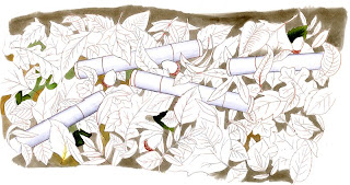
2. Sepia line work. I drew over the pencil with a Sepia 0.3 mm Color Multiliner SP. Because the drawing is so large I drew a section at a time and then erased the pencil with a kneaded gum eraser. This helped me keep the line feel consistent. After I had drawn all my main lines and erased the pencil I was able to go back and darken lines, add details to leaves, and generally touch up easier.
3. Photocopy. In the past I've tried to photocopy gray ink drawings with no luck. The color copier picks up some lines gray and some lines dark, so if I wanted all gray lines I would scan in a b & w drawing and make it gray. The copier didn't seem to mind sepia however, my original line work was distinctly reddish in tone. These lines are more neutral brown (which I'm OK with). By copying the work I can always have something to go back to if I make a mistake. I also enlarged this slightly when I copied it, since it's easier for me to color larger things and shrink them down (In comic illustration it is very common to draw oversized and shrink down to get more detail into your work).
 4. Color the background. This image is not hard to color- it's just a pile of leaves. What makes it complex is the number of leaves I have to work with. This artwork is about 10.5 in x 6.5 inches. To make it easier to focus on the top layer of leaves I colored my background first. With a W3 I colored anything that wasn't leaves or marker. Then I came back, colored just the gray of the markers (since the markers are a cool gray they stand out against the warm gray) and added a little bit of color tone to some spots of the background gray.
See how much the leaves pop out when I tone down the background? I'm not coloring the ends of the markers yet because I want those to contrast against the leaves, so I'll need to color the leaves first, then pick a good marker color. Markers C1, C2, C3, 0
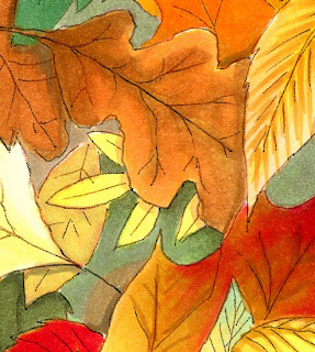
 5. Color the leaves. This was pretty fun. When coloring something large like this, since I am right-handed I usually start on the left and work my way across. This helps me see what I'm coloring and I'm not dragging my had across my work as much. I start light and go dark on each leaf. I tried to keep each leaf to 2 or 3 colors, since I had so many to complete. For the first pass I didn't worry about shadows as much, just the main leaf color.
Once my whole picture was colored I stood back, looked it over, then added my deeper shadows. Remember, shadows add contrast which makes artwork pop out more. Markers E07, E29, E31, E35, E53, E55, R29, YR02, YR04, YR21, YR23, Y00, Y13, Y17, G21, G85, G17.
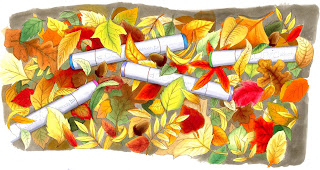
 6. Color the markers. Last I colored the markers with BG07, BV13, V04 and G14- all bright colors I hadn't used in any of the other leaves. As the final touch I added the words on the markers with a Gray 0.05 mm Multiliner.
7. Scan, resize, and alter for my header. I scan into photoshop, clean up the work then I bring that artwork into illustrator where I add my text and other elements. As you can see, the original artwork is a lot larger than my final header will be. I draw it this way so I have plenty of room to crop.
 In Photoshop, on artwork like this you can see how my scanner makes the coloring look grainy when in real life it is much smoother. To compensate for the grain I use either the Blur, Blur more, or Despeckle filter to smooth it out a bit. Each scanner is slightly different, and if you're scanning at below 300 dpi then you might not have this problem. Also notice how my pale grays get washed out on the markers so you don't see the smooth transition? To compensate you can color pale areas a little darker than you'll want them to finally end up (it bugs me when I color it darker, so usually I'll go in and manually re-touch my pale colors in photoshop to look correct, though this time I didn't).

13 comments:
Oh my gosh! At first, when I saw your 'uncolored' sample... I thought you had drawn a bunch of cigarettes thrown down in a pile of leaves. I just couldn't figure out why!?! LOL! NOW that I look at your new header... they look completely different and how they are suppose to look. :) I LOVE your new look! Thanks for the smile!
Your header is amazing! I love to see your coloring!
Ok now that is just plain awesome! I wish I could draw, I need a new header for my blog! bwaahahahha
Your illustrations never cease to amaze me, girly -- love the new header!!
Wow! The header is beautiful, and the information about the process is fantastic! I used to draw a lot -- before marriage and kids -- now that I have a great way to color drawings (Copics) I am itching to pick up a pencil again even though it's been years. Thanks for all your inspiration.
Beautiful new header Marianne! You are so gifted with illustration abilities....Love those fall leaves intermingled with one of my favorite things! (Smiles)
How pretty! I love the colors and it was interesting to see your artistic process. Thanks so much for sharing!
Ooooh... I love it!
Your header is gorgeous and completely captures the range of fall colours. Thanks!!
That is absolutely amazing - thank you so much for sharing this with us and providing us with the information on how you did it.
The new header is just perfect for your blog. :)
WOWWWWWWSERS!! I LOVE IT! SUPAH AWESOME COLORING!
just beautiful!
Post a Comment