Tuesday, September 30, 2008

Frequently asked questions

Here are some more questions and tips that I take for granted, but it may be news to some of you. Let me know if you have any Copic questions that you're dying to have answered. Have a great day!

Q. Without looking at the diagram printed on the marker barrel, how can I tell which end is the brush on a Sketch or Ciao marker?

A. The end with the brush has the darker gray band where the cap meets the barrel of the marker. On a Copic original marker, the darker gray end is the fine point.

Q. Can I draw my outlines with a black marker then color them in with marker?

A. No, it will bleed. The black marker is meant to blend with the colored markers, so it will feather, bleed into the colored area, and look bad if used for outlines. Use a black inking pen like a Copic Multiliner or other waterproof, pigment based pen without oil in it. If you really want to draw your outlines with a black Copic marker, then just photocopy your artwork and color in the photocopy.

When I started on this picture the fine line drawn by the 100 black Copic was about the same width as the 0.8 mm multiliner. After coloring with my yellow look at how it smudged and bled. Yuck!

Q. How long will a marker last before it needs to be refilled?

A. This depends on what surface you are coloring on. Softer, more absorbent papers will suck your marker dry sooner than dense, tightly woven papers. Copic Original markers also hold more ink to begin with than Sketch or Ciao, so they will last longer before they need to be refilled. Also, the more you layer a color in one spot, the denser the color gets in that area so it won’t cover as many sheets.

A Copic original marker on regular copier paper will evenly cover 5 letter sheets and streak for a 6th page.

A Sketch Marker will evenly cover 4 sheets and streak for another 3/4 sheet. I haven't tested it for a Ciao, but it should be about 3 sheets and streak for another 1/2 or so.

A Wide marker will evenly cover 4 sheets and streak for another 2 sheets.

If you think it's time to refill then go visit my directions for refilling.

Monday, September 29, 2008

Colored Multiliner SP's

Copic makes a number of drawing pens, in different styles and different colors. So far I've briefly mentioned the Multiliners and the F01 drawing pen. Today I'd like to talk more in-depth about another wonderful pen style, the Colored Multiliner SP's. If you're interested in the disposable colored multiliners, then check out this blurb from The Pen Addict a few weeks ago.

Multiliner SP pens come in 12 colors besides black. You can see a color chart if you go to the Copic website. What I like about these pens is that they are pigment, archival, acid-free, and won't bleed with my markers. Best of all, they are refillable and you can replace the tips.

Copic Multiliners are water-based, which is good because there are no oils to leave a residue that markers will pick-up and smear around. Water-based also means that you can't keep coloring in one spot without ruining the paper like you can with the markers. These pens are intended for drawing lines, not coloring (though the brush pen is perfect for fine, quick color swatches, just don't keep layering or it ruins your paper). Papercrafters love these pens for journaling and writing.

There are two sizes standard- 0.3 mm and the Brush Small. Look at the photo to compare the two widths of Wine Multiliner SP's . If you don't like those sizes then you can swap in any Multliner nib that's a size 0.2 mm or larger (the ink is too thick to flow through the smaller nib sizes). If you need a finer point then use one of the disposeable multiliners, they just don't come in as many colors.

So what are the differences between a regular Multiliner and a Multiliner SP?
Besides the SP being refillable, the tip is more sturdy on an SP. Also, the brushed Aluminum casing on the SP is a real pleasure to hold- it feels substantial in your hand yet allows for good control. The SP's are more expensive, but refills are cheaper than our disposeable pens. (One other minor difference is that on a disposable Multiliner the word has a space (multi liner) but on the SP's it is all run together (multiliner). Either way it means many lines).

As an illustrator, I tend to work mostly with black lines, however, working in colored lines gives a softness to my work. Look at the mermaid header- although this was drawn with one of our disposable multiliners, the gray line is much softer on the eye than if I had drawn it with black.

Usually I draw something in black also because I can photocopy it easier. Some color photocopiers can pick up the multiliners evenly, but I have the problem where the copier darkens some lines and lightens others, so my line work appears blotchy. To avoid this I draw my main lines in black then trace over my work on a light table and add fine details with the colored multiliner (this is how I did the mermaid- I have no un-colored nice line work of her because I traced from my rough, dark outlines).

Here is a drawing I would usually do in black, these are my husband's black dress shoes he left on the floor next to me. I decided to try drawing them in the first colored multiliner I grabbed, which happened to be an Olive 0.3 multiliner SP. Look at how the picture doesn't seem so dark and heavy because it is'nt drawn in black. I drew this on color laser copier paper, with rough outlines in pencil that I erased after I had inked.


How can I get line variation from one pen size?
If you look close, my picture has different line widths, though I drew it from just one pen size. I achieved the thick/thin line variation by pushing heavier or lighter. Even though the pen tip is very firm and has no flexibility without breaking, it is still possible to push less or more. The trick to this is have something softer under your paper other than just a firm table surface (not too soft!). Always keep a few sheets of scratch paper under your work, not because the pens will bleed through (they won't bleed), but because that added depth has a slight give to it so I can push harder without damaging my pen tip. Working in a sketchbook is a great way to get this line variation.

I apologize in advance, my posts will not be as regular for the next few weeks, since I am busy out and about traveling. Wednesday I will be in Charleston, SC teaching a certification class, then Friday, Sat, & Sunday I will be in Savannah, GA at the Savannah College of Art & Design. The Savannah event is open to the public- you can come and purchase directly from us, ask questions, and learn techniques from me all weekend. For more details click on my link to classes and events.

Next week I will be in Kansas City, MO teaching a couple certification classes. I still have a few spaces for those classes, but you need to call us directly to get in (866) 662-6742.

For those of you in Seattle, WA or Vancouver, BC who want to come to the classes in November, they are filling up fast, so get your applications back to me right away. I will NOT be opening the Vancouver class to the general public, but I will know in a couple weeks if I have space left in the Seattle class for people who are not designers, teachers, or otherwise affiliated with papercrafting stores.

I am looking at possibly doing a small certification class in Portland, OR in early December. If you are interested please e-mail me to get on that mailing list. Have a great week!

Thursday, September 25, 2008

Color Spotlight: YR's, Coloring Pumpkins, part 2

When coloring a pumpkin your basic color is orange. Copic makes a nice range of oranges, or YR's so let's talk about how to get the most from your YR markers and how you can increase your contrast by breaking away from the color families.

YR: Yellow-Red
There really aren't that many YR markers, especially when you compare them to a color family like the blues. YR is a secondary color on your color wheel and is made from yellow and red dyes mixed together to achieve orange.

If we start with the first YR's, the YR00 family, we have a lot of colors to choose from. YR000, YR00, YR01, YR02, YR04, YR07, and YR09. For basic coloring I suggest keeping a 2-3 digit difference and you know that your colors will blend well together. However, if you remember back to my posts about contrast, our eyes are drawn to images with higher contrast- they're more interesting. My first two pumpkins are colored with only 2 colors. I used the maximum color difference that would still blend well (5 digits apart!), but both pumpkins look a little bland. The first one isn't bad, but the second pumpkin is not exciting.

How do I make it more lively?
Add another layer of color. 3 colors look much better. 4 colors look even better than 3, and the blending looks more natural. When possible, use more colors to get a smooth blend and more contrast.

Why doesn't the sequence look right?
I've had people complain that YR02 and YR04 are NOT good blends for each other- there's too much of a difference when you see their swatches next to each other. I disagree (but that's just me). There is a HUGE difference between the YR02 and the YR04, but if you layer the two and blend them then you'll see that they really do work together. This is true for many colors in other sequences that don't seem to follow the rules - layer them with their next closest colors and they look better.

Shadows for YR
If you don't have enough YR's to make your picture stand out more, this is where you layer colors from other families. The first thing to try is shadowing with Gray. Since YR's are warm colors, we can add Warm gray W5 for a shadow. It doesn't look too bad.

YR's and Red
If you have YR09 and R08 you'll see they are almost the same color. If you download the Copic color wheel you will see that R00's and R10's are orangish and would actually work well with YR00's (Although YR04 could be considered a true vibrant orange, you don't get a true Red until the R20's, R29 in particular). Since Reds are so dark compared to YR's (in general) you can easily shadow YR's with Red. If you do, you are not adding any gray so your colors remain intense.

YR's and E's
What happens if you add Warm Gray to Red? You get brown, or Earth colors. So, if you want to add a shadow to something orange and you don't want the shadow to be too intese, try adding a middle brown. This is like adding Red and Warm gray at the same time. As you get into the YR10's and 20's you see the color change so that YR14 and YR24 could almost be considered E's. Why? Because as you add gray (by increasing the middle digit) you are creating earth colors. (Some E colors are more orange than others, so experiment to find ones you like). Beyond the YR30's the last 4 or 5 YR's don't follow the same graying rule, just so you know.


Highlights for YR's and Yellow
Yellow is much lighter than reds. While you can shadow with Reds, if you want to break away from the YR's for your highlights you need to move into the Yellows. Look at how much more rich my pumpkin is just by adding nice sunny highlights. Then, look at what color you want your shadows. Red is more intense, brown is more earthy and natural. The last two pumpkins have the most color range from light to dark and therefore are the most interesting, though it's your call as to which one is better. This is why on yesterday's post I could color my pumpkins with a yellow, YR's, and an E and I knew it would work.

The key is, when you find a combo you like WRITE IT DOWN! Add it to your swatch book and then you'll remember what worked well for you. Image: drawn with a 0.5 mm multiliner Paper: Color laser copier paper.

Note: Most of the blending on this page was marker to marker on paper. When I added really dark colors, I feathered them in until I got the smooth blends. If you try my same colors know that I blended them a LOT to get what you see on the screen.

Wednesday, September 24, 2008

Shadows Part 5- Vertical wrinkles / Coloring Pumpkins part 1

Last week summer ended for us and we got rain again, although Monday was the first official day of Autumn. What better way to start fall than by talking about pumpkins and how to shade them?

This continues on our study of shadows and how they fall on objects. So far we've covered:
Shadow types
basic shadows on round things
Shadows on groups
Shadows on faces

Vertical wrinkles, Shadows on pumpkins
This is not Coloring On Pumpkins, which I have been known to do with Copic markers, rather this is a two part post. Today I'm going to talk about the way shadows interact with the simple wrinkles of something like a pumpkin. Later I'm going to follow up with understanding the YR's and how to expand your color range.

Pumpkin shapes vary from smooth to deeply wrinkled, but their wrinkles run vertical so we'll color these today. Each ridge of a pumpkin catches the light slightly differently, so let's look in depth about how we show the wrinkles on the surface of what at first appears to be a simple shape like a pumpkin.

Smooth, Round Pumpkins
This is what the pumpkins in my garden look like right now- very smooth and just changing from green to orange. Much like coloring the round apple in the second shadow post, a smooth pumpkin is very straight forward to color, so we color with our base colors just the same as if it's a ball or a sphere.

I'm showing my highlight as yellow and my shadows as red in these diagrams so the colors stand out a bit more. It's fairly easy to see where my highlights and shadows will be. If I were coloring the ground brown in this diagram then my shadow would be the same family of brown, just a couple shades darker.

I want you to see my diagram for "Another way to look at it". This shows the general areas of light influence. In other words, if you slice the round thing the first slice is highlight, the second slice is midtone, and the last slice is shadow. Why should I look at it this way? When we get into more complicated shapes this helps us remember where the basic highlights/shadows for a round shape will be strongest. Then, we'll add shadows for wrinkles over the top of shadows for round things and see how each wrinkle gets different light based on where it is around the pumpkin.

Lumpy, Round
This is where we get into more complicated pumpkins. First we need to understand how light hits flat wrinkles, then adapt that to our round pumpkin.

Understanding light and wrinkles
We know that light hits strongest on the first spot it touches and gets darker from there. We've talked about how that works on basic round shapes, now let's talk about wrinkles, specifically wrinkles that go up and down (fabric is much more complex, so we won't cover that yet).

Each wrinkle is half of a circle, so the side closest to the light gets the highlight, the far side gets a shadow. When you run a bunch of these half-circles next to each other you'll see how the deepest part of each wrinkle is in shadow and it continues as a repeating pattern.

Round Wrinkles
Now, let's wrap those wrinkles around a circle. From the top this is easiest to picture. The side closest to the light still gets the strongest highlights, the far side of each wrinkle gets a shadow. You have to remember that the top of the pumpkin curves towards the stem, and sinks down a bit to reach the base of the stem, so the stem shadows will get tricky (luckily our final picture doesn't show the stem).

In looking at the side view remember "Another way to look at it"- in slices. The first slice gets the strongest highlights, with very light wrinkle shadows. The second slice shows the midtones, and the third slice shows shadows. Because each wrinkle blocks the light a little bit the shadows creep into the slice of midtone, and the midtones creep into the slice for highlights, but in general you can see where the lightest areas are in the first slice and on to the shadow slice.

Looking at the slices really helps our mind remember where the general color areas are, then we adjust from there based on wrinkles (I suggest reading over this a few times until it makes sense- it's hard to expalin in words but easier to see in the picture).

Final Artwork- two pumpkins
I have the benefit of drawing the art so I know what it looks like from above. If you are coloring someone else's picture then you have to guess. If the shadows are giving you a problem I would suggest drawing a simple diagram of the shape from above to see how the parts sit next to each other and where their shadows will fall. This gets you thinking of your shapes in three dimensions and away from looking at them flat all the time.


On my two pumpkins, the front pumpkin is bigger and closer to the light, so it's shadow will bump into the smaller pumpkin making it darker where it usually would have light. Also note that the leaves on the ground are in clusters of two. The back leaf falls in the shadow area from each pumpkin, so it will be darker (it will also get a bit of shadow from the leaf in front of it.

Later I'm going to talk more about why I'm picking the colors I am, but for now just follow along and trust me, even though I'm not totally following the rules for Natural Blending Groups. My final artwork looks nicely shadowed, with good contrast between highlights and shadows. Image: Drawn with a 0.7 mm Multiliner SP Paper: Color Laser Copier Paper

Monday, September 22, 2008

Reverse Coloring

Whenever I talk about smooth coloring, I mention turning your paper over to look at the backside which will show you how well you've been coloring. A well blended artwork will look just as smooth on the back as it does on the front. So why not show the back instead of the front?

I had art students who used to do this all the time because it looks so cool. It gives you blended, almost watercolor look by coloring the backside, StampinKub showed this technique earlier this year on his blog.

This works better on thinner or softer paper for soft lines. If you want crisp edges on the back then use paper that gives you crisp lines on the front. PTI Stamper's paper is very thick, so it won't work as well, neither will SU! paper because it's coated. Thin paper will take less ink to soak through. I'm going to show this on cardstock just because it is a bit more challenging, and I haven't tried it in a while.

For best results try this with images that aren't too detailed, or the lines are thinner. The stamp I'm using today has fairly thick lines, so I'm going to stamp, then stamp again so my ink isn't so dense. I'm coloring in the lighter version because even though I know my ink shouldn't bleed with my markers I don't need to risk it with this picture.

Thoroughly soak your colors. Work your marker in circles to evenly saturate the paper. Frequently flip the paper over to see if it's even. The nice thing about this technique is that no one will see if you went outside the lines.

I am leaving the eyes alone- those are so detailed that I'll add them on the back last. On the backside you can really see the areas that are colored darkly and which ones are light. The main body of the owl I had first colored E34, and see how that light color stands out more from this side than the dark color I added later.

Your coloring will leave white areas on the back where your stamped lines are if you don't color darkly over the lines (Like under his beak). We want to subtly define those lines without drawing anything.

This is where I can add a different look. On the front side, go back over each area with your colorless blender, pushing the colors out to the edge. The blender is pushing the dye from the markers not only to the edge but out the back as well so all my colors get darker. For crisper edges do this after the whole image has dried. For softer edges do it while it's still wet. Also, you will get best results if your blender pen is super juicy

You may like the look of the owl before I blended it, I think it looks cool either way, but hte choice is up to you. Last, add the little dots for eyes.

When would I use this technique?
This is a good way to salvage a picture that you think the coloring looks bad on. Sometimes the backside looks better, so don't throw it away just because it isn't perfect. Another thing you could use this for is on a symmetrical image I could stap back over the back and it would really give a loose, floating look to the artwork.

I like how this effect gives us soft edges with no defined lines. The shapes are simplified- almost as if a child painted it. I could see this owl on a card for a little kid.

I think that the next time I try this, I'll stick to thinner paper OR I'll use an image where the details don't matter as much (like a soft flower). As it is, it looks better with the leaves I added (G14 on the front side) and the little dot eyes (E27 from the backside). The idea behind this post though is to look at both sides of your artwork and don't discard it just because it's not perfect. If you are coloring a flower, what if you do the petals from the backside this way, then color the leaves in front the regulr way? Experiment!

Image: What a Hoot by Inque Boutique Ink: Memento Tuxedo Black Paper: Neenah Classic Crest Solar White Cardstock

Certification in October
Certification classes in Kansas City and Charleston SC are now both open to everyone. I have limited spaces available, so please let me know THIS WEEK if you would like to attend. I will be leaving next week for those classes and will have a harder time fitting you in. For simplicity, you can call our toll free number 866-662-6742 and Kris will get your registration over the phone.

Friday, September 19, 2008

Reflections on Water

Avast Ye! Today be the day fer talking Like a Pirate. So cozy up on the couch with yer favorite buccaneer, watch yer favorite pirate movie, and show that mangy pirate next to you that you can make a perfect reflection in water of their scurvy vessel.

This is tricky, so it's getting an advanced tag, and a reflection is sort of a shadow (it's like an anti-shadow). I'm confident that if you follow the steps it will make sense- it looks a lot trickier than it really is. The nice thing about water reflections is that you can do it for just about anything you want sitting next to a puddle/pond/lake/ocean. I strongly suggest doing this with something simple to begin with though.

A couple of basic rules about water reflections-( I'm generalizing):
1. Still water gives crisp reflections, moving water will be broken. The more your water is moving, the more the reflection will be broken, so it's a matter of taste as to how much accuracy your reflection has. Sometimes it's easier to have still water near the object and gradually make water far away more broken.

2. Reflections are the same size as the original object. Reflections are just a trick of light on a body of water, and from a distance the reflected object looks the same size. Strange but true.

3. Water is one or two shades darker than whatever it's reflecting. This is your clue that it's a reflection. Since the sky is usually blue, your reflection water usually has a slight bluish tint to it, which is where we get the idea that water should be blue. Water is not really blue, water is clear. We just draw it blue for simplicity sake.

Go look at a photo of a mountain reflecting into a still lake and you'll see how these rules apply in real life. All we're doing is stylizing from reality.

Reflected Pirate Ship
There are more rules about reflections on water, but this is enough to know for today. Now let's get onto our picture. I have to admit that I personally am a pirate and I stole this ship picture I'm using today. It's Captain Cook's ship the Endeavor that he sailed around discovering things. I drew it a few years ago, but last year I needed a good pirate ship, so I commandeered my old art and ran up the Jolly Roger. Now I have a good pirate vessel all fer me-self. (So this is an altered photocopy that I'm working with today)

To make this reflection it helps if you:
• Try this on thin paper
• Have a light table
• Have at least two copies of your artwork
• Have LOTS of markers in the full natural blending groups (or just a bunch of grays to tone everything down)
• optional - Have a Copic multiliner in a size that is slightly smaller than your picture's line width

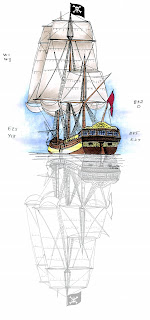
1. Color your main picture onto a thin sheet of paper with enough space underneath to show the whole reflection. Here is my beautiful pirate ship colored onto my favorite Color Laser Copier paper (I didn't quite leave enough space, I'll explain how I compensate later). If you are comfortable with the coloring quirks of Alcohol Marker papers or tracing paper then this is a good time to use those papers. If you want to know why I picked the colors for the vessel, go back to this earlier post where I show another old sailing vessel (Try to keep your colors simple the first few times you try this).

2. On a light table (or held up to a bright window) take a second copy of your artwork, flip it over, turn it around, and position it so it is the correct reflection. This is why you need thin paper (For those of you who LOVE your PTI Stamper's Select paper you're out of luck on getting it to be see-thru, sorry. Just practice on thin paper then look at your finished work on thin paper to see how to get the same effect on your heavier cardstock). Here is my photoshop simulation of what you should see.

2.5. If you're feeling brave, take your multiliner and trace a few of the key outlines from the reversed image (you can also do this last and add lines after you color). DON'T trace all the lines. You don't need to, and don't worry if your lines are a little crooked, it's a reflection. Read all of step 3 before you do this, so you can choose how much to show reflected. I'm going to do this step last, just so you see how I use it as an accent, not as a main element (too many drawn lines will distract from the main picture).

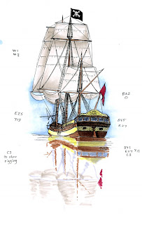
3. Color your reflection onto your main image with the same colors you colored the first picture with (we'll tone it down later) OR color it all with colors that are 1 or 2 digits higher on the last number (if your sails were mostly W1 before, color the reflection W2).

This is where artistic license comes in. Water is not always perfectly smooth, so don't feel that your reflection has to be perfect. Scribble the colors on to show wavy water, just scribble more horizontally, rather than up & down (the water distorts things horizontally). Don't worry about being perfect! This is your interpretation of reality and doesn't have to be exact.
My sheet of paper doesn't have quite enough room for the whole ship, so I'm going to distort the picture more as I get farther from the ship, to the point that about half way down the reflection we would loose the image entirely. See how the scribbles get gradually more vague to achieve this? Crisp near the horizon, faded as we work down. You can make your whole image crisp if you want, it's all a matter of choice.

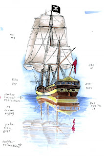
4. Come back in and add water and darken your reflection. I'm going to use a grayer blue to tone down the whole image, since we decided that water is kind of bluish. My sky was B32 faded with 0, so I'm going to use B32 as my base water color, no blender. Then to add darkness and gray, I'm going to jump to the next color group (B40's) and a few digits higher than the 2, so my final darker water color is B45.

I'm still coloring in horizontal streaks. It's OK to overlap your colored areas, since our reflection IS on water. Be careful not to go over yellow too much with the blue, or it turns greenish and looks wrong. Same with red, it turns kinda purple and looks odd.

For my final piece I went in and added a few key reflection lines with my multiliner. I kept these very loose, and only did the areas closer to the ship, getting less detailed as I got farther from the ship. I also darkened a few spots on my reflection that faded out too much when I added the blue water. Click on the picture to see the larger version with all my notes erased. If it makes you feel better, I've never done this before either, I knew the concept but this is the first time I've ever tried it. I'm fairly pleased with my results.

Challenge: Try making a reflection of something in water and post a link to it here. Have a happy Pirate Day ye scurvy scallawags!

Thursday, September 18, 2008

Coloring Gold

One thing that you can't leave out when talking about Pirates is their treasure. Piles, heaps, and troves of gold coins, priceless gems, jewelry, and all other things of value they picked up along the way. For all ye lubbers out there, today I be showin' ye how I color me gold coins. Remember, tomorrow is Talk Like A Pirate day, so brush up on yer pirate speak!

Coloring Gold
Copic makes a color, Y28 that is called Lionet Gold. At first I thought "Gold?? This isn't gold- it's kind of a muddy yellow/brown color" Then I realized that when layered with a brighter yellow, this is the perfect shade of gold-shadow. If you have a Y28 I strongly suggest you try layering it over a bunch of lighter yellows to find a nice shade of gold for yourself.

I wanted this to be a bright yellow gold, so I picked sunny Y13 as my base color. In real life this is probably way too bright, but it works for me. My image is fairly small, so rather than leave lots of highlights I know I'm going to come back with my opaque white to brighten up at the end.

Next I layer on my Y28. Pay close attention to shadows- these coins are small and close to the ground, so they get crisp but light shadows. Also, metal is reflective and leaves very crisp changes between light and dark, so my shadows on the back coin are crisp.

Last I add the flecks of white back in with my Opaque White and a fine paintbrush. Again, gold is very shiny so I can get away with lots of glints of light. You can really show how bright the gold is by covering up small specks of the top coin edge with white. I like to add light to the edge closest to the light, a point about a third of the way around, and a spot just inside the far edge of each coin (this shows a faint inner rim catching light). In hindsight, I think I still needed more white on these little coins.

How much light you add is a matter of taste, so don't feel like you have to do it just like I do. In real life the glints of light from a coin will follow your eye as you move your head, so experiment when you color. Look at a coin sitting on your table. Sometimes it helps if you squint at it so it is out of focus, then you can really see where the light is strongest without getting caught up in the coin's details (when coloring or drawing I squint often- it gives you a chance to examine an object as a whole and you don't get distracted by parts). It's also a good idea to hold your finished work at arm's length and look at it. Does it still need more light? More shadow? Ask a friend if you're not sure what it needs.

For my final piece today I drew the Pirate captain's cup, encrusted with garnets, and filled with his favorite vintage. The white glints really pick out the spots of reflective light. Image: Drawn with a 0.1 mm Copic Multiliner on color laser copier paper Extras: Opaque white .

Wednesday, September 17, 2008

Coloring Air Bubbles

Hopefully you've never had to be keelhauled, but if you've ever had to walk the plank then you know you'll be leaving a trail of air bubbles as you swim with the sharks. To go along with our Pirate theme this week, today's trick is an easy way to make perfect bubbles as you sink thorugh the depths of the ocean.

Making Bubbles
This is a fun, simple way to add little air bubbles to your artwork. This technique works best on paper that gives you very clean, crisp edges to your special effects. I particularly like the Copic Sketchbook paper for this, or my favorite scratch paper, color laser copier paper (a lot of you wonder where to get this paper- it can be found at any office supply store, about 24 to 28#, with a brightness of 108-117, depending on the brand. This is thin paper for stampers, but good for illustrators or beginners practicing). Keep clean scratch paper under your work, since this trick doesn't work if you try to do it over a smooth table-top, and dirty scratch paper will pick up colors into your bubble.

Start by making a row of little dots. Make some a little larger and some smaller. As you practice you'll find a size that is too small to work and too large to look right for your finished piece. Don't make any of these dots larger than the size of a pencil for now.

My bubbles are in water, so they're a nice blue green. You can make your bubbles whatever color you want (rainbow bubbles floating around a fairy, a little girl blowing bubbles, bubbles in your soda...).

Next, take your colorless blender and carefully add color to the middle of each dot, soaking almost to the edge, but not over. This will push the inner color out to the edge of the dot, leaving the middle lighter and looking more like a bubble. Not enough contrast? Let it dry completely and repeat. The more you add blender to the middle the stronger the contrast will be, but it won't be crisp if it's not dry each time. Remember, the blender is pushing color from the middle, out. this makes the edges darker than your original color, but also has a smooth blend to the middle of your dot.


Larger bubbles
The above steps are fine when you're working with little tiny bubbles, but for anything larger than a centimeter or so it can be annoying to push that much dye out of the middle.

For larger bubbles, just draw a little circle with your marker leaving the middle open. Let it dry, then push the color out to the edges, same as before. You'll have to do this a couple times to make the inner edge completely fade to white, but it looks good when it's done.

On this little example you can see what I start with, then the second circle shows one push out from the middle. The bottom circle I've pushed a couple times to make sure it is nice and smooth.

Lunch with Sharks
For my finished piece today someone just got sent to Davey Jone's locker, and now the sharks are circling for a snack. I made the water first, since this This is a rather large area of water to color, so I airbrushed my water with a BG15 and darkened it with G29. Usually I would mask off the sharks before I airbrush, but I was being lazy and I knew that they would be blue anyways, so I was just careful and colored them after I airbrushed (I'm not going to get into airbrush setup today, so for more details about airbrushing visit the Copic Library). Last, I added my air bubbles in the same way I described above. Image: Sharks I drew then photocopied onto color laser copier paper Extras: Copic Airbrush System.

Tuesday, September 16, 2008

Certification Classes 2008, 2009

The Charleston Copic certification class is now open to the public. I still have a couple spaces left, so if you can come play, Wed. October 1st, Charleston SC 9am to 4 pm. Call the office to sign up. Toll free: 866-662-6742

Kansas City will open up next Monday to the general public, so let us know if you can come October 9 or 10th, Kansas City MO. Space is limited, but we would love to see you!

This week I will be mailing out applications to anyone who is on my mailing list for the Vancouver BC or Seattle WA classes coming in early November.

Copic certification classes are open to any store owners, teachers, or designers in the papercrafting industry. I am always collecting names for mailing lists, so if you want to be notified of upcoming classes in your area, just send me a quick e-mail. These mailing lists also help me justify a class in your area, so if you know of people who would be interested then have them e-mail us as well. Let me know if you have access to a classroom in your area.

Possible locations for 2009:
Canada- Toronto, Calgary, Vancouver BC
East Coast- Westport CT, Rochester NY, Florida
Central- Denver CO, Salt Lake City UT, Phoenix AZ, Dallas TX
West- L.A. (CHA), Portland OR, San Francisco CA

What do you cover in a Copic Certification class?
Here is my basic outline. Remember, these classes are geared around papercrafters who will go out and be teaching or sharing these techniques to others. We don't have time to cover all of my little tips and techniques that I share with you here on the blog, just the most frequently asked questions that come up during classes. This is an opportunity to get hand's on Copic training that you can take and share with others.

Copic Certification Topics

I. Introduction
Why are alcohol inks special?
permanent on many surfaces • smooth colors • doesn’t cause paper to “pill”
Why are copic markers special?
Quality, durability, flexibility, lifetime guarantee
universal features (color system, low-odor)

1. Product Overview
Different Marker types &
why one is better /different than another,
what are they each used for • Copic, Sketch, Ciao, Wide
Multiliners • Airbrushing • Spica & Other accessories

2. Choosing papers & Inks
Different Papers, different coloration
basic cardstock • soft vs. hard papers • vellum • watercolor paper
Inks
qualities to look for in diff. inks (pigment vs. dye vs. solvent)
heat-setting • embossing • troubleshooting ink problems

3. Coloring
before you color- protect your surface
Basic Coloring Techniques
Smooth Colors • Large areas

Shading & Blending
marker + marker on paper • feathering • marker tip to marker tip • marker on palette

The Colorless Blender
lightening with the blender • fading to white • patterns

Copic Color Theory
picking color combos, what the numbers mean • color wheel, color chart
warm vs. cool • how shadows work • using the number system in your projects

4. Inks, Airbrushing, and Altering Everything
Airbrushing
Set-up & Parts • Masking tools & techniques

Inks & Special Effects
inks directly on surfaces • faux stone
Altered Items (everything but paper)
Plastic • metal • fabric • airbrushing accents (flowers, etc) • embellishments- ribbon, brads, etc.

5. Miscellaneous
- Refilling Marker Guide
Cleaning and marker Care- storage, etc.
Q & A

Monday, September 15, 2008

Coloring an old Treasure Map

For those of you who aren't familiar with new holidays, this Friday, Sept. 19th is International Talk Like A Pirate Day. I've been celebrating this day for many years, and I figured this would be a fun theme to color around this week. And the first thing any good pirate needs is a treasure map.

Coloring Old Paper
Old, weathered pirate maps usually are yellowed with age, grayed from the damp and mildew, faded from the harsh Caribbean sun, and generally ill-treated.

Yellowed paper
When coloring any shape I tend to start with the largest, light areas and layer from there. You can always add details, but in general work large to small, light to dark. In this case, the paper underlies any other colors on the page, so everything gets toned an old yellow. For my base color I used E41, a pale brown, then added the YR31 for the stronger yellowing at the edges and creases. this doesn't have to be perfect because it will all get faded later.

Map details
Next I add the colors on the map, since all the fading from the sun, mildew, and burns came after the map was drawn. I'm sticking to really pale colors from each family since we want the final hint of color, but nothing overwhelming. Again, it doesn't need to be perfect since we will be fading this whole sheet of paper still. The only color that is strong is the red, since the X is the most important element on the whole map.

Faded from the Sun
Now we can fade all the colors with our colorless blender. I'm carefully fading each color area distinctly, so I fade all the water first, pushing the colors towards the land. Then I fade the land, mountains, etc. Last I go back and unevenly leave blotches with the blender marker to add texture to the paper. All the colors I added in the last step wash into the faded yellow of the paper now, and they don't look so harsh.

Shadows
I picked a light source that allowed my red X to be on a lighter side of the paper, so the light is coming from the right. Because my paper is a warm color I'm adding shadows with my warm grays. I also know that my base colors end in 1, so for a gray to show up it needs to be higher than a value of 1, so I chose W3. The fold opposite my sun is shadowed and also the table surface the map is resting on. notice how I kept the shadows stronger at the edges to accent the other fading and weathering.

Final touch
For my final area I waned to simulate faded, burned edges, and what better to show burns than by adding actual charcoal? Notice I saved this for last, since charcoal would clog my marker tips if I used it sooner. A bonus of using something besides marker for the last detail is that I can use an eraser on charcoal areas I need to clean up, but the eraser won't erase my base marker colors underneath (you'll want to protect the charcoal once you're done). Now my map looks old, weathered, shadowed, and burned. Have a swashbuckling day! Image: Drawn with 0.3mm Multiliner Paper: Color Laser Copier Paper Other: Charcoal