 Here is another example of something that someone asked a while ago and I'm only now getting around to discussing it. Copic markers make it easy to color white things because of their extensive range of subtle colors. The brush nib on a Sketch or Ciao marker is the natural choice when coloring something light and airy like feathers. Today we'll combine both to make white feathers and birds with our markers.
 Coloring White things
To understand what colors are good for coloring white things, you should review this older post. Basically any light color will work, it just depends on the "feel" of your object.
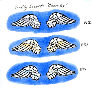
 If you look at this collection of wings, you will see how the tone of the wing changes slightly when you pick a neutral color (N2) versus the warm color (E31) or the cool tone (B41). Some birds turn kind of yellowish on their undersides, so you may consider tinting a warm tone with yellow to pick up these subtleties.
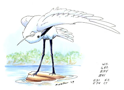
Colors around an object will also influence what tone it should be. On my final image today of an egret, the pure white bird is standing on a log in a pond. Since the water is reflective and blue, the white egret will pick up cool tones from the water. If he were standing on a sandy area he might pick up subtle tints from the sand. If he had nothing around him, then his shadows might be a true neutral gray.
Putting a background behind something white helps it stand out more against the white of the paper. These wings look very bright because I put a solid blue background behind them. If I left the sky white there would be much less contrast and the white wouldn't be so dynamic.
 Individual Feathers
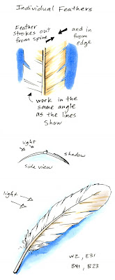
Once you've picked a white tone, let's start coloring by looking at a single feather, since wings are made up of lots of feathers. A bird's feather, or "vane", is made up of lots of tiny rows of little "barbs" that grow out from the shaft. These grow at an angle that points towards the tip. Near the base of the vane are the "downy barbs" . The downy barbs are soft and don't reflect back light. The other barbs however, interlock to form a smooth, shiny vane which does reflect back light.
The feather curves slightly down from the shaft on either side, so you will get one side of a feather in shadow. When you are coloring something white your goal is to accent the shadows without losing the overall whiteness of the object. I strongly suggest that you start with light colors (colors that end in 0, 1, or maybe 2). Go sparingly with darker colors, using them only to accent the deepest shadow areas.
 To accent the shadows it is best if you use the brush tip of your marker and work in strokes out from the spine of the feather, following the directions of the barbs. Work from the far edge in and from the spine out. This leaves a natural looking white in between the two colored edges, with color feathering in to the highlight area.
As a feather gets old or the barbs stop sticking together then you see the breaks in the edge. These will also catch the light at a slightly different angle and reflect it back. As you color, your strokes will accent these breaks and the subtle shadows they create.
 Coloring a Wing
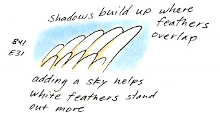
When you put the individual feathers together they overlap to form a solid wing. However, each feather has a slight curve and where two feathers overlap it creates a slight dip in the smooth surface.
Your goal is to accent the overlap and the shadows without losing the white. Again, work with light colors and practice lifting up at the end of your brush stroke. Make your strokes starting from the deepest shadow and feathering out to the light areas. Keep them consistent with the angle of the feathers.
 If you are using a Copic original marker you can simulate the "lift" at the end by lifting up as much as possible at the end of your stroke, then coming back with a colorless blender from the opposite direction. This is also useful if you got your colors too dark. Go back from the opposite direction with the blender and push the extra dye into the shadows. On thin paper you can remove excess color by keeping a napkin or paper-towel under your work and it will help soak up extra dye.
For my final image today I drew this egret preening his wing on a log. My scanner did not pick up the subtle colors as much as I would like (the soft blue sky goes half-way up the picture and you can actually see where I made blue-gray strokes between feathers). However, you get the idea of how I use the subtle blues and grays to accent the shadows of white on his underside and where his feathers meet.
On another note, the background plants were colored first with the W2, E31, and G82. Then I added the B41 of the sky over the whole area back there. This washed the colors together and faded them in a more natural way to show the atmosphere and to tone them down, as I talked about in an earlier post.
All images today were stamped or drawn onto Gina K Pure Luxury 120 lb cardstock. Stamped images were stamped with Memento ink and drawn images were made with a 0.1 mm Multiliner SP.


7 comments:
Wonderful Tutorial. Thanks
Thanks for putting up such an informative tutorial. I am so glad when you cover topics like this and coloring transparent things (like the bridal veil a while back), things that seem so intimidating.
GREAT DRAWING!! I love this bird! And so accurate, too! Great lesson today, again, Marianne!
hi love your blog and I refer it to people all the time who are new to copics. I notice that you have labels under your postings but that there is no where on the side bar to locate these labels ... it would be a really handy resourse if you had the label gadget up on the side bar so that when we wanted to come back to locate something like airbrushing that you did months ago it would be easy to locate it rather than going through months of posts.
The label gadget can be added by going to layout .. add gadget and then scroll down on the menu that pops up til you find the labels option.
I know it would benefit so many of us ... thanks for all you do on here!
Great tutorial. I love stamping birds and coloring them in. If I just had more time to do it! Thank you for another great tutorial.
Really cool! Thanks so much!
:-)
Hey!!
thanks a lot for this!
:D
Post a Comment