 Here is the second part of my advanced post on coloring light from a candle. This time I'm coloring the kitten and the jar of milk.
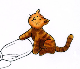
 Kitten
Coloring the kitten is pretty easy. I started with a base of YR31, added shadows with YR24, and added the stripes with E37. I also darkened the shadow areas with E37. Note that his face and the paw are the lightest parts since they are on the side closest to the candle. When I add a final background I may darken him up a bit (especially his tail) but for now I like his colors.
Bottle & Milk
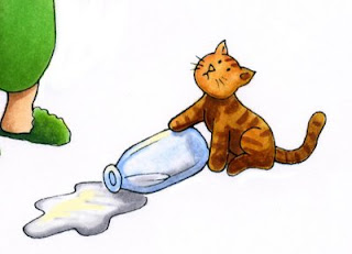
Coloring the bottle and milk are the tricky parts. The bottle and milk are colored with B32, colorless blender, C1, C3, and a hint of Y11. Once I add the background I will add some glints of light with my opaque white.
 First, I colored the bottle with B32. I colored only the edges and then I faded it out with the colorless blender (see these posts on coloring a glass of water, part 1, part 2). This makes the edges strong blue yet clear looking in the middle. At this point I would add a pale version of whatever my background color is to the inside of the bottle so you could see the floor through it. However, since I haven't chosen a background yet I will just hold off adding any color until later.
You can note that I am also trying to make the bottle darker than it would be in a bright light. I added hints of C3 to the base of the bottle and as a shadow under the kitten's paw so you can see the shape of the bottle better.
 The liquid inside is NOT transparent however, it is milk, so it needs to remain white. To keep it white and to make sure you know it is not the glass jar I shadowed the liquid with my cool grays. I did this both to the milk on the floor as well as the bottle. With a white background the milk looks a little dark, but remember, our background will be dark, so having the milk kind of dark is OK.
You can see that I added some pale yellow highlights to both the milk and the bottle. This is the candlelight reflecting, so it stays yellow, but it is not as strong a yellow as the highlights on his face and arm. Once again, after I add my background I will add some white in with my opaque white to really get the shiny things to look shinier.
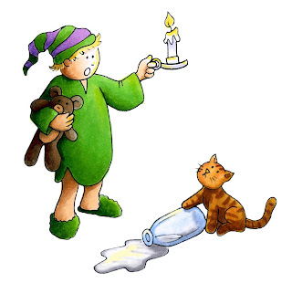
The final artwork now looks like this, where the boy and the cat are both lighted correctly and ready for a background.
 Background
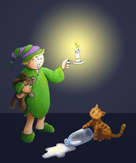
I keep mentioning how I am picturing the background. Here is a quick mock-up that I made in photoshop as a way of planning how my final background will look. I haven't made my background yet in real life, but I want you to get an idea of how it will change once I airbrush it. I will need to make masks and carefully plan my airbrushing. Using Photoshop is a cheater way of seeing how it will look without doing all the work (or making a mistake on something I just worked so hard on). Hopefully this week I will have a chance to show you how to actually make this background with the airbrush system.

5 comments:
As ever, an inspiring post. I just wanted to remind people who don't have PhotoShop that they can always photocopy their art so they can practice backgrounds, etc, without ruining their original!
Thank you again for guiding me through the wonderful world of Copic.
I really enjoy your post Maryanne
Thank You for sharing. You are so inspiring :)
It is so Pinnochio-like! Love this!
Marianne I love your blog and I especially love the knowledge you share with all of us.
I have an award for your blog called the Kreativ Award. Please go to my site to pick it up blstamper.blogspot.com
Your the best.
God Bless,
Jeanine
I have learned so much from you in such a short time! I commented on your blog on my last post.
Post a Comment