Tuesday, January 18, 2011
New Year Rabbits
New Year Rabbits
At first glance you may think "No way could I color that image! It's way too complex!" I beg to differ. You could color this image, you just have to work at it, piece by piece, rather than getting overwhelmed by the whole. Someone once said, the way to eat an elephant is one bite at a time. So, let's look at the rabbits, and tackle them, step by step.
When coloring a tricky image that you might mess up on, color the hardest part first. That way, if you really mess up, you won't have to go back and color the rest of the picture again. Remember, the only thing you're wasting is a piece of paper, so don't be afraid to experiment!
I started by drawing lightly with a pencil the main scene, then I traced the pencil work with Copic Multiliners using a TracePad light table. I photocopied the line work so I could color it many different ways. Here is one of my colored versions. I used about 30 different markers on this illustration, which I forgot to write down, but I will mention as many colors as I remember. Also, I did not take step-by-step scans as I went along, so I'm just going to explain how I colored each section. Click on the image to enlarge it.
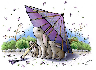
Here is my cute little rabbit family, waiting under the umbrella during a shower of blossoms.
There are a few details I want you to notice. On the rabbits, you can see that I used a Warm gray color range, however, I accented this with a hint of E31 in the shadows. The Copic warm grays are very brownish, and throwing in a hint of a very pale brown really brings out the brown tones even more.
Scribbling texture
I started by laying my W0 and W1 over all the brown areas, then scribbled in the darker tones. Scribbling gave me the slight furry texture, without having to worry about using a rag soaked in blender and messing up the background area. When I had finished adding darker colors, I went back and scribbled in with the light color. This subtly washed the tones together, making them softer and less harsh.
This scribbling is the same process I used on the bushes in the background, and also on the umbrella (discussed below). The ground was simply the same tones used in the rabbits dotted onto the pebbled path. The rocks were scribbled mostly with cool grays, then I dabbed on my blender to add texture.
To get the white tail and bellies on the rabbits to stand out more, I shaded them with Cool Grays. Notice how white the little bunny's tail looks, even though it is in the shadow and is colored gray. Then I threw in a hint of RV00 and RV21 to the ears.
Umbrella
The most tricky area on this image was actually NOT the bunnies, they are merely the focal point. The trickiest area is the shading on the umbrella. I can't tell you how many times I went over the umbrella to get the shadows correct.
When working on shadows, start light! I would carefully layer colors darker and darker to finally build up the tone I wanted. I had to be careful not to go too dark, as I didn't want to lose the color of the umbrella.
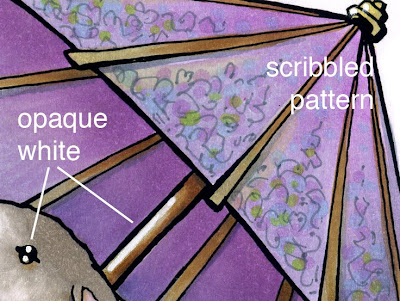
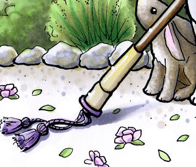
I used a wide range of V's, BV's and grays to build up the tone on the umbrella. Then, I used the same brown and gray families from the bunnies to color the wood on the umbrella. I used a gray multiliner to scribble a pattern onto the umbrella, then I dotted on pale blues, yellows, greens, and browns. From a distance, this looks like a complex pattern, but up close, you can see that it really is just scribbles and dots. The reason I used the gray multiliner was because it would remain crisp, no matter which colors I layered over the top.
Choices in shading
Notice the shadow on the ground. Where the shadow is close to objects- like the bunnies or the handle, I made it crisp and dark. However, I did not want the focus to go to my shadows, so I trailed them off, and faded them. This gives the illusion of bright sunlight (crisp dark shadows) but the viewer is not distracted by too much shadow. This was my own artistic choice, where I followed rules of shadows...up to a point. Then I chose to ignore them for the sake of my work.
Last, I picked out the highlights on the eyes and made the handle of the umbrella shiny with some Opaque white and a very fine paintbrush. My finished work is about 9" by 6 1/2" and took a couple hours to color.
Monday, January 17, 2011
Upcoming Certifications
Standard Certifications, North America
(Note: For International Attendees- We try to accommodate as many as possible, however, our training program is exclusively for North America and we need to save priority placement for US and Canadian attendees. As a courtesy, about once a month I will try to share upcoming European and Australian classes, however, Copic Certifications are currently not offered in any other territories).
Jan. 28 Los Angeles, CA (CHA) taught by Jennie Black Open to Public - only a couple spaces left!! Register now!
March 6 Sacramento, CA-taught by Jennie Black Open to stores & Designers- Filling Fast!
March 14 Edmonton, AB - taught by Sherrie Siemens Open to stores & Designers - Filling Fast!
March 19 St. Louis, MO - taught by Lori Craig Open to stores & Designers
Upcoming Certifications- Applications have not gone out:
April 10 Phoenix, AZ - Taught by Jennie Black
Intermediate Certifications
I must say, the people who have attended the Intermediate Certification classes so far have loved them. Sherrie and Debbie came to the Copic warehouse to have a test run of the new class and train the program organizers. The response was great! Nancy, our wonderful Certification coordinator thinks that everyone who can take the opportunity to attend an Intermediate class should jump at it, as she learned so much in one short day. You learn more than just coloring- from card layout to shadows and basic color theory. A must-have class for the cardmaker who wants to take their work to a whole new level.
ANYONE who has already attended a Standard Certification is eligible to apply to the Intermediate class.
Jan. 27 Los Angeles, CA (CHA) taught by Debbie Olson & Sherrie Siemens subject to approved application, a few spaces still available
April, 11, Phoenix, AZ taught by Debbie Olson & Colleen Schaan Applications are not available yet
If you need an application for either Intermediate or Standard certifications, you can download one here. Be sure to download the class information page as well as the application when you get to the application list on our website.
Monday, January 10, 2011
Copic New Products part 4
Before we get into the last, but certainly not least of the new Copic Products, I wanted to share the winners of my blog candy drawing from Friday's post- congrats! Please contact me if you do not get an e-mail from me... You will each be mailed a new 2011 Copic Swatchbook. Random.org chose the following three winners out of 397 comments.
Congratulations to:
#164
Trena in Naperville said...
Thank you for the opportunity for more goodies Marianne! Can't have too many.
Take care and STAY POSITIVE!
#280
Exquizeet said...
Oh Wow! Thanks for hosting this giveaway! I've heard great things about these markers but I've never actually tried them.
#330
Paula said...
Looks like lots of goodies will be revealed at CHA...your book seems like one that needs to be in every crafters/artist library. Thanks for putting it together and the chance to win the Copics.
My new swatchbook cover
In honor of the winners, I want to show you my new swatchbook cover. I colored the marker bodies with Neutral Grays, then I added the color strokes as listed.
Look close, because I think you'll see something exciting about the colors I used...
12 New Sketch Colors!!!
That's right! Copic now has 346 colors of Sketch Markers and Inks. If you stop by our booth at CHA you will be able to see the new set. These won't be shipping until March, so look for them this spring from your favorite Copic retailer. I have been working closely with Japan to add new colors that will expand the color offering, colors that people have been asking for- from new purples that aren't pink or bluish, to browns that could be brown or green depending on what you put them next to.
The new colors include:
V20 Wisteria
V25 Pale Blackberry
RV55 Hollyhock
RV63 Begonia
RV66 Raspberry
YR30 Macadamia nut
YG61 Pale Moss
BG53 Ice Mint
BG70 Ocean Mist
E23 Hazelnut
E81 Ivory
E87 Fig
So, thank you all for stopping by this weekend and leaving comments. Be sure to stop by the booth, or check out your local Copic retailer to find the new products as they are released over the next few months. Have a great week!
Sunday, January 9, 2011
Copic New Products part 3
Copic has a lot of new products coming out this year at the 2011 Winter CHA trade show! To win a free 2011 Copic Color Swatch Book, leave a comment on my post from Friday. Tomorrow morning I will draw three winners from my blog, as will each of our designers, so be sure that you've left a comment on each Copic designer's blog!
Other Copic Books
I am personally thrilled that so many of you are interested in a lighting book for beginners. If you are looking for a good coffee-table book filled with an assortment of sketchbook works by various artists (myself being one of the contributors) you can purchase the book Sketching With Copic by Ken O'Connell, president of Imagination International Inc. (Copic North America). You can purchase it through the website Blurb.
For those who are studying storyboarding, layout, and marker rendering we have brought in a great book from Europe- Visualizing Ideas. Inside you can find examples of fashion sketches, storyboards, automotive design, product design, and so much more! This is a great beginner book that i wish i'd had when I was studying storyboarding. Everything in this book was made with Copic markers, which I love, because it shows a great variety of end uses for the markers. We have a few copies at our warehouse, but you can also find these online from various places.
Many of you had questions about where you can purchase my Lighting book when it comes out...it will be available from your favorite Copic resellers. I will not be selling it direct from my site.
Meanwhile, here is one more new item to look forward to seeing at the CHA show...
2011 Copic Catalog
Unlike past years, the new 2011 Copic catalog is a showcase of artists and inspiration, as well as a place where you can find all your favorite Copic supplies. See gorgeous creations from a variety of artists, from paper crafting to pop-culture. The illustrations are GORGEOUS! Some are so lifelike, you'd swear they were photos...so later this year I'll post links to some of the artists included in the new catalog.
The new catalog will be available in the booth at CHA, and will also be available for download soon from the Copic website. You'll be able to find this new catalog in your local stores at the beginning of February!
We'll have one more new product announcement tomorrow -- and I think you'll really like this one!!
Saturday, January 8, 2011
Copic New Products part 2
Shadows & Shading: A beginner's guide to lighting placement,
book by Marianne Walker
This little project has been keeping me very busy this winter! This is much of the reason why I haven't been posting as much. I know that many of you read my blog and print it out. You are constantly asking "When will you make a book, so I don't have to print things out?!?"
I have been listening!
I took the fundamentals of coloring with shadows and have compiled them in this simple to use reference book. This book is for beginners, and applies to anyone who colors, from papercrafters to artists. You do not need to know how to draw to add shadows like a professional artist! This guide easily steps you through how to correctly add shadows and make your coloring look more dimensional. The wire-bound book comes with 4 clear printed guides to help you add shadows properly on your own work, without all the frustration and guess-work. This book will be available in March, though you can get a sneak peek at CHA.
If you want to attend a hands-on workshop that teaches these same concepts as they relate only to papercrafting, then register for the Intermediate Certification nearest you! Our team decided after the first Intermediate class in Chicago that people need to have access to more information about shadows and shading, as there is only so much time in the day to teach so many things besides shading.
This book does not teach how to draw, just where to add shadows and highlights when coloring. I am making it appropriate for both fine-art as well as papercrafters. As you can see from the simple sketch above, the shadows make all the difference. You can see and touch these objects- they look alive and dynamic. That is the power of contrast and shadows. I can't tell people enough- add more contrast into your work! This book is not Copic specific either, rather, it is for any coloring medium.
Why did I write this? Because I know many of you never had a chance to take art classes in school. Or, you took an art class, but didn't understand what the teacher was explaining. My goal is to help you feel comfortable with art techniques, even if you don't consider yourself an artist.
So, look for the finalized book in March, and see a prototype in our booth at CHA. Meanwhile, go leave a comment on yesterday's post to win a prize of a new swatchbook.
Friday, January 7, 2011
Copic New Products and Giveaway
The Winter Craft & Hobby Association (CHA) trade show is coming up and in preparation for CHA we just had a fabulous meeting with some of our Copic team members. Debbie and Sherrie are ready and excited to be teaching the Intermediate Certifications, and I'm busy finishing up some last-minute things for the show as well.
What better way to get excited about new products, than with a giveaway? Leave a comment on today's post, then Monday, January 10th, winners will be randomly selected. Winners will be mailed a NEW 2011 Copic Color Swatchbook to keep track of their Copic collections. The new swatchbook has been updated with a new cover, and with the new Ciao listings, so it's a must-have for collectors. THREE winners will be chosen from EACH of our designer's blogs, so after you check this blog, go visit the blogs of all the other designers. All comments are welcome, though the contest is only open to the US & Canada.
NOTE: Comments are now Closed on this post. Thank you for playing!
New Team Member
Wednesday, January 5, 2011
Intermediate Class? What's it about?
Have you ever spent hours working on a card project, just to step back, look at it, and hate it? You don't know why it doesn't work, you just know that it is missing something. This is what the Intermediate Certification is all about: Taking your hard work to the next level so that you can have fewer failures and recognize better what your project needs to make it POP!
• Who can attend Intermediate Certifications?
Anyone who has taken a standard certification. Not just store owners or people who would usually get first priority in a Standard Certification, but ANYONE is eligible as long as they have already completed Certification before they apply.
• Is the application hard?
Not really. The one tricky place is where we need to see an example of feather blending, but if you follow the directions in this post you should do just fine. Don't be afraid to apply simply because you need to work on feather blending! If all your other examples are great, then I may look over imperfect feather blends.
• How often will these classes be held?
There will probably only be one Intermediate class per quarter, so if a class comes up in your area SIGN UP! We won't have a second class in the same area if we don't get enough applications for the first class.
• What is discussed at the Intermediate Class?
The day starts with a discussion on light and shadows. Then we work into the color of shadows, color theory, and on to types of lighting. From there we move on to composition and layout- making your whole project look better together- and on to coloring hair, faces, etc. We finish the day with a coloring project that ties all the concepts into each other, and tie in self-critiques along the way.
• But I'm not an Artist, I don't think I'm good enough.
You don't have to be an artist to enjoy these classes. These concepts are taught specifically to papercrafters, not artists. If you love reading the tutorials on light and shadow here on my blog, you want more, but are still confused, then these classes give you the hands-on opportunity to learn and have someone explain it one on one. We want to help EVERYONE feel more artistic and creative, no matter what their background.
• Is the class worth it?
Yes! You get a full day of instruction that continues into the evening from one of our top-notch instructors. A 48 page manual that has a blank copy of every image colored throughout the book that you can go home and practice with, as well as lighting guides and a mini-portfolio. You get a lapel pin and a badge for your blog once you have completed the class. Best of all, you are learning concepts that will help you time and again, not just in papercrafting, but in any creative field.
So what are you waiting for? Download an application today and apply! You'll learn a lot more than you think, and the content is totally different than what is covered in a standard certification. If you still have questions, or think you're not good enough to attend then send me a note and we'll see what we can do to help you.
There are currently still spaces open for the L.A. class. Classes are limited in size so attendees get more time directly working with the instructor. Register early to make sure you can get in. Sherrie and Debbie are ready for an exciting L.A. class. We are expecting the Phoenix class in April with Colleen and Debbie to fill quickly once applications are sent out, so register early!
Click here for applications. Meanwhile, we've got an exciting blog hop coming up this weekend, with new releases for 2011, so stay tuned!