Monday, September 26, 2011

Last Certifications for 2011

Upcoming North American Standard Certification classes
I can't believe that 2011 is winding down! Here are the remaining locations for 2011 classes. These will be the last classes before Winter CHA. If you have hesitated to take a class, take one now, or you'll have to wait until Feb. of 2012.


Oct. 13th Knoxville, TN taught by Colleen Schaan Open to Public
Oct. 17th Sacramento, CA taught by Debbie Olson Open to Public
Oct. 28th Portland, OR taught by Colleen Schaan Open to Public

Nov. 5th Lansing, MI taught by Debbie Olson Open to Public
Nov. 4th Honolulu, Hawaii taught by Marianne Walker Open to Public*
Nov. 5th Honolulu, Hawaii taught by Marianne Walker Open to Public*
*Note: There is a non-refundable deposit for Hawaii Classes. Only a few spots left in those classes, so register now!
Nov. 11 Kansas City, KS taught by Lori Craig Open to Stores & Designers

Upcoming North American Intermediate Certification classes
Again, these are the last Intermediate Papercrafting classes in 2011. These classes are open to ANYONE who has taken the standard Certification class, and who wants to learn how to color and design more like an artist.


Oct. 16th Sacramento, CA taught by Debbie Olson now accepting applications
Oct. 22nd Langley, BC taught by Sherrie Siemens now accepting applications
Oct. 29th Portland, OR taught by Colleen Schaan now accepting applications

Nov. 4th Lansing, MI taught by Debbie Olson now accepting applications
Nov. 6th Honolulu, Hawaii taught by Marianne Walker now accepting applications

Dec. 1st, Atlanta, GA taught by Colleen Schaan applications have not gone out yet

To register for any of these classes or to download class info, please check our Certification page on the Copic Website. If you have any questions, please e-mail Nancy@copicmarker.com for details.

Upcoming Local Events

[events.jpg]Copic Demos and Workshops
For those of you who are local, there are a few events coming up that you can come and try out Copics with me.

Thursday, Sept 29th, 1-3pm Karen & Friends Scrapbooking, Springfield, OR
We will be coloring some cute Christmas images from Our Craft Lounge. Their Copic sets will be on-sale during the event as well, so stop by and come color with me all afternoon! Their store is conveniently located near Briggs Middle School in Springfield. I will also have copies of my Shadows and Shading book for sale, so come and pick one up and get it autographed!

Saturday, Oct. 1st, 24-Hour Comic Event, Noon -noon, DIVA Art Gallery, Eugene OR
Copic is sponsoring this event, and I will be volunteering for a little while on one of the days. Register now at DIVA and get more information about drawing your own 24pg. comic in 24 hours.

Saturday, October 8th, Copic Demo, 1-3pm Ben Franklin Crafts, Springfield, OR
I will be demoing Copic markers at Ben Franklin crafts from 1 to 3 pm.

Thursday, November 10th, U of O Tools of the Trade Show, 10-5pm, Eugene, OR
I'll be demoing Copics and drawing/coloring some great stuff, so come see me at the bookstore!

Friday, September 23, 2011

New Blog header again

Coloring Horses, part 3
Palomino
The back horse is a nice golden Palomino, (once again, thank you google for great references). The scanner makes him look slightly green, but trust me, on my paper he is a true golden with a white forehead and whitish/gray mane.

He was easy to color, as there really isn't much to see of him hiding back there. I used one of my favorite yellows, Y21, darkened with Y26. His mane is colored with the warm grays I used on the other horses, as well as a bit of C5 to make it appear more white. I darkened his muzzle with C5 as well.

I darkened the area where his neck goes into shadow with some hints of E27. At this point, I had a lot of layers of color near the base of his neck, and the colors were not absorbing into the paper as they should, so I had to go in with my colorless blender and lift out any colors that were over-saturated and mottled.

Dappled Gray Horse
While browsing through the google images, I saw some beautiful dappled gray horses. I figured the third horse would be fun to color as a dappled gray. However, most dappled horses are a cool, steel-gray rather than a warm gray, which is what I did my base tones in. Not a problem. As I mentioned before, if you layer enough color over the top, you can push base colors out of the way, so I happily went to town with my cool grays and totally ignored the base of warm grays except as a shadow reference.

Many times, I break up my cool gray sequence slightly, though you may not notice.
For this horse I used the cool gray sequence of C1, C3, BV23, and C7. Why BV23 you may ask? I have found that BV23 is about as intense as C5, but the added hint of BV gives a nice richness and punch to the flat, gray color, without being too noticeable.
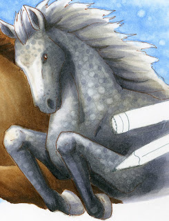
Dappled horses usually have white spots on a gray background. However, I added gray spots over white areas and white spots over gray areas. To make the white spots, I did it just the same as the spots in the sky. I let my base tones dry then I went back with the colorless blender and touched in the white spots. However, I did use the BV23 to add in gray spots as well. Overall,t he horse looks nicely dappled.

You can notice from this close up how the hints of remaining warm gray under the coat of cool grays really helps to liven up the work- the gray does not look flat, but it is still definitely a cool gray horse.

On his mane, you can see that I streaked warms and cools in, feathered in the direction of the hairs. I did not blend these colors in, I purposefully kept them streaky to enhance the feel of individual strands.

You can see a photo of me coloring the horse on instagram.

Overall I think I was able to capture the feel of these horses, running and jumping over something (my original sketch I had toyed with the idea of having them jump over a marker, but it wouldn't fit the header format). My next task was to tackle the pen and markers in the drawing.


Pencil, Multiliner, and Markers
The final step, once the horses were done, is to make the pencil and markers look like they were sitting on top of the picture. The only way to really accomplish this was through strong shadows.

I started with the pencil, as that was the easiest, and I was getting tired of working with neutral colors, that I was happy to throw some intense color into the image. The pencil was colored with the same Y21 I used on the golden horse, but this time, I accented it with YR04. The wooden area was colored with E11 & E13. I colored the graphite with N7, even though it looks like a deep black. Then I wrote in the pencil brand with my multiliner. (Recently I met the wonderful people at General Pencil Co, the last US-based pencil manufacturer. They use wood from trees logged right here in Oregon, so they are my new favorite pencil company!).

The multiliner is colored with N3, N7 and the cool grays I used on the horse. I colored it using the tutorial I posted a while ago about coloring metal. Sharp contrast is the key to making it look like metal. You can see how I enhanced the shininess by using Opaque White.
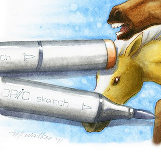
The markers on the other side of the image were colored with Neutral grays as well. I blended the colors more than I did on the shiny metal of the multiliner. Again, I used Opaque white to enhance the shine on the markers, as well as add the glints of light back into each horse's eyes.

The light brown marker cap was colored with E11, E13, and hints of E35.

I added shadows to all markers and pens with C3 and BV25. I was careful to make all the cast-shadows consistent, and crisp so it is easy to tell that they are suppose dot be resting on top of the picture of horses.

I hope you enjoyed this tutorial. The final artwork is approx. 8" x 4". The whole image took about 4 hrs. to sketch, ink and color, with breaks for scanning and actually getting work-work done. Writing the tutorials took about 3 1/2 hrs, so it is almost as difficult to teach how to do it as it is to actually color it in the first place.

I hope this inspired you to color, have a great weekend!

Thursday, September 22, 2011

Gray Base Tones, new header again

Running Horses, Part 2

Sky
For this image, I started with the sky. Usually I finish an image with the sky, but I knew what I wanted the sky to look like, and I hadn't decided on the horse breeds yet, so I began with the sky. If you want to see another tutorial on coloring sky, you can check out this older post on coloring clouds.

I used B32 and feathered out from the horse cluster. Then, I took a really juicy colorless blender and pushed the color back towards the horses. I specifically wanted the sky to feel more like an illustration than a realistic sky, so I pushed the colors around irregularly to give it a mottled look.

Once the colors were pushed, then I let the base dry. I took the colorless blender and added the spots in the sky. Then I went back and touched up with the B32 around the edges of the horses and added a few spots. I was not too worried about going over the edges of the other images, as I can always clean up the edges.

Gray Base Tones on Horses
While I was still deciding on the horse breeds, I added base grays. When you look at the final image, you can't tell that I used warm grays to plan my shadows.

All 3 horses were colored with W1, W3, and a hint of C1. This helps me get all my shadows correct before I start adding other colors. The middle horse I started toning brown with E31. The base tone of grays makes the E31 look like it has a lot more color variation than just one simple layer of light brown. At this point I knew it would be a brown horse, I just hadn't decided on breeds yet.

Notice that I have not done much blending with the base colors. Since I will be layering lots of other colors over the grays, it is more important to just have tones in place, rather than worrying that they all look perfectly smooth at this point.

Middle Horse
It finally came to a point where I had to decide on a breed for the middle brown horse. Once again, I ran a google search and looked up brown horses. I saw some beautiful Spanish Mustangs that I liked, so I decided to color him as a nice, rich brown that darkened into almost black accents. Since he was to be the focal horse, I put the most work into him so he would stand out more.

He is colored mainly with E31 and E35 to go with the base grays. I like the E30's sequence because it is a good, neutral brown family, without too much red or other tones in it. The more you layer browns over the base grays, the more the grays will be pushed out of the way, so be careful not to layer too much or you may lose the original shading. If this happens, just darken it more.

The areas that darken almost to black are colored with E47 and hints of W7. No black! W7 is as dark as you need to get. Even the darkest brown has a value of 7, so it is not black. In the final, you can see that it looks almost black, but still retains the feel of brown.

To soften the colors on his face, I went back over his head with the colorless blender. This added highlights back in, and allowed me to tone down the deepest areas a bit.

His foreleg that is in back, I added W3 to dull it down and make it less intense. This helps with the illusion of depth. I colored his teeth with W3 and his tongue with E04.

You can see that I went over the edges a little bit, on the knee of the front horse and under his chin, but that's what the colorless blender is for.

Tomorrow I will continue the tutorial, and finish up the other two horses and the markers around the edges. Have a great day!

Wednesday, September 21, 2011

New Blog Header

Running Horses
You may have noticed that I have a new Blog header. This morning I decided that my old header was just a little out of season. I also felt like drawing some horses. I ran a google search on horses to get ideas on perspective and angles for the three horses.

I drew them with a pencil first onto scratch paper, then I inked the image on a new sheet of paper using my light table...then I didn't have to erase. So, I sketched out the following illustration using a 0.05mm Gray Multiliner and a 0.05mm Sepia multiliner. Then I started coloring. Tomorrow I will post a tutorial with the steps I took in coloring the horses and markers.

Have a great day!

Thursday, September 15, 2011

Color Spotlight & Certification class updates

Spotlight BG10:
Over at the Copic Blog, I just posted a new Color Spotlight on BG10. Check it out! Meanwhile, here is a little more info about the picture I drew.

Eye movement: This is the art I created for the BG10 Color Spotlight. I drew it with a 0.05 mm Gray multiliner. I used a gray multiliner because the focus color was so light, I didn't want to increase the contrast too much.

As it is, the darkest color in the picture is the boy's BG78 shorts. This gives a nice focal point, then his pale skin pulls your attention down to the water, out to his hands, and up to his face, which looks back at the water.

Because the colors are for the most part pale, the image is fairly restful. I wanted to convey the feel of lazy summer days and a quiet river. I think that the overall color combination and lack of harsh lines helps convey that feeling. To see which colors I used and where they came from, check out the full color spotlight over on the Copic Blog.

Upcoming North American Standard Certification classes
Although it seems that Summer just ended, there isn't much time left to register for Fall classes. December and January will have fewer classes, so if you have been hesitating to take a class, don't wait too long, as there might not be another class in your area until later in 2012.

Sept 18th Ottawa, Canada taught by Sherrie Siemens Open to Public
Sept 22nd Orlando, FL taught by Jenn Balcer FULL
Sept. 30 Portland ME taught by Lori Craig Cancelled

Oct. 13th Knoxville, TN taught by Colleen Schaan Open to Stores & Designers
Oct. 17th Sacramento, CA taught by Debbie Olson Open to Stores & Designers
Oct. 28th Portland, OR taught by Colleen Schaan Open to Stores & Designers

Nov. 5th Lansing, MI taught by Debbie Olson Open to Stores & Designers
Nov. 4th Honolulu, Hawaii taught by Marianne Walker Open to Public*
Nov. 5th Honolulu, Hawaii taught by Marianne Walker Open to Public*
*Note: There is a non-refundable deposit for Hawaii Classes

Intermediate Certification
Intermediate Papercrafting Certification classes are popular! These classes are open to ANYONE who has taken the standard Certification class, and who wants to learn how to color and design more like an artist.

Sept 17th Ottawa, Canada taught by Sherrie Siemens now accepting applications
Sept 22nd Orlando, FL taught by Colleen Schaan now accepting applications

Oct. 16th Sacramento, CA taught by Debbie Olson now accepting applications
Oct. 22nd Langley, BC taught by Sherrie Siemens now accepting applications
Oct. 29th Portland, OR taught by Colleen Schaan now accepting applications

Nov. 4th Lansing, MI taught by Debbie Olson now accepting applications
Nov. 6th Honolulu, Hawaii taught by Marianne Walker now accepting applications

To register for any of these classes or to download class info, please check our Certification page on the Copic Website. If you have any questions, please e-mail Nancy@copicmarker.com for details.

Tuesday, September 13, 2011

Back to School Grays

Back to School
Recently, my children went back to school. While my husband and I are cheering, our son has been gray, since school is obviously not as much fun as hanging out with friends all Summer.

Grays might seem blah, but when you are working with a limited color palette, you can't underestimate the power of grays.

Working with grays
Copic makes 46 shades of gray. Each shade is used for a specific purpose...
Cool Grays are very blue-toned, and useful for shadows and metal.
Neutral Grays are neutral and good for generic gray things or for storyboarding.
Toner Grays are slightly warm, but not too warm.
Warm Grays are very warm and earth-toned, great for wooly or earthy things.

Working with limited colors
People frequently ask me, what are the best colors to start with when collecting Copics. I always answer that it depends what you are going to be coloring. If you color people, then go for skin tones and build from there. If you enjoy nature, then start with greens and browns. However, you may have only a few colors from each family and feel that your artwork has no depth until you get more colors.

This problem can be solved if you have a few grays. My first two markers I got after the 12 basic marker set I started with were two shades of gray. This instantly multiplied those 12 colors into twice as many options.

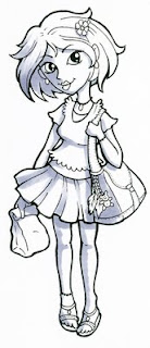
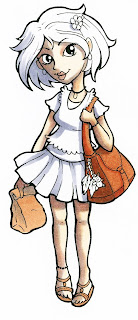
Here is a girl who is heading back to school. I started by laying down a C5 to mark my shadows. You may think this is too dark to start, but an interesting quality of Copic markers, is that any lighter color can push a darker color out of the way, so this C5 will lighten up as we layer colors over it.

I tried to keep all my shadows consistent, so you can easily tell that the light is coming from the upper right. (For more ideas on shadow placement, run a search on "shadows" on this blog using the search bar at the top.)

Usually when layering grays it is a good idea to match gray type to color family. However, I have limited colors, and I only have this one gray. That is OK. Shadows tend to cool down, as the sun is not hitting them directly. Skin would usually be a warm brown, but, it is OK to add a cool color in the shadow of skin, so I frequently add blue or purple into my skin shadows. Cool gray is cool, so that will be fine to use to accent the colors in the shadows.

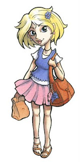
Now that I have planned out my shadows, I can layer my limited colors. Since I like drawing people, I have a good range of skin tones. I start by adding E000 over all skin areas, including the gray colored parts. then, over the gray shadows, I added E11 and E04. See how much lighter the gray is now?

I colored her bag and shoes with E15 and E19. I colored the paper sack with the E11 I used on her skin.

Last, I colored all the other areas of her with my limited colors.

I colored her hair with Y21, Skirt with R83, and her shirt with BV13. I lost some of the shadows when I colored the shirt with BV13, so I went back with my gray and darkened those areas again.

As you can see, using a gray helps cut back on the colors you need to own when starting out your collecting. In total, I used 1 gray, 5 browns, 1 yellow, 1 blue-violet, and 1 pink. The 1 gray meant that I did not need a darker shade of yellow, pink, or blue-violet. If I had colored her book bag purple, then I could have eliminated 2 browns as well.

She doesn't look too bad, in my opinion.

Enter our coloring contest!
For a blank image of this girl to download, and to see another way to color her, please visit our Copic blog. There you will also find information on how to enter this month's coloring contest via Facebook and copiccolor.com

Not a member of Copic Color yet? Now is the time to register and see what people are making with Copic markers. Registration is free and easy!