Friday, January 27, 2012

Certification Classes

North American Standard Papercrafting Certification classes
We have a lot of classes coming up in the next few months. All of our classes have been filling very quickly, so if you are interested in a class, and you get an e-mail for that location, register right away! Every time a class opens, we send out an e-mail. If you have not been getting the new class e-mails, please register with Nancy, nancy@copicmarker.com

Upcoming Locations:
Jan. 27th Anaheim CA, CHA Winter 2012 taught by Sherrie Siemens FULL

Feb. 3 San Diego, CA taught by Lori Craig Open to Public
Feb. 17th Richmond, VA taught by Debbie Olson FULL (Note: There are a few spaces that came open. If you need an application, e-mail Nancy)
Feb. 25 Miami, FL taught by Lori Craig Open to Public

March 2, Edmonton, Alberta, taught by Sherrie Siemens Open to Public
March 8, St. Louis taught by Lori Craig Open to Public
March 10, York, PA taught by Marianne Walker FULL
March 23, Phoenix, AZ taught by Lori Craig Open to Public

More locations are getting finalized. Here are a couple future classes that will be available soon. Applications have not gone out yet for:
April 13th, Toronto, ON taught by Sherrie Siemens
May 18th, Dallas, TX taught by Lori Craig

North American Intermediate Certification Classes
Take your coloring to a new level with these exciting Intermediate Certification classes. You can now take these classes back-to-back with the standard classes. To apply to any of these classes, please visit our website and you will find an overview of the program.

Jan 28 Anaheim, CA
Taught by Sherrie Siemens & Marianne Walker Open to Public

Feb. 18th Richmond, VA taught by Debbie Olson Open to Public

March 3, Edmonton, Alberta, taught by Sherrie Siemens Open to Public
March 9, St. Louis, MO taught by Debbie Olson Open to Public
March 10, Columbus, OH taught by Colleen Schaan Open to Public
March 24, Phoenix, AZ taught by Debbie Olson Open to Public

Thursday, January 26, 2012

Drawing In Italy

Ever wanted to learn to draw? Ever wanted to go to Italy?
Every two years, the President of Imagination International (Copic USA), Ken O'Connell takes a group of adults for two weeks to learn how to draw in the beautiful towns and countryside of Umbria.

Most of his students are absolute beginners, adults who have always wanted to learn to draw and who have always wanted to go to Italy. If this sounds like you, then this is your chance!

This year, Debbie Olson will be working with Ken to teach the drawing classes. You will be using Copic markers and supplies, traveling around the Italian countryside, learning to draw in a country famous for producing amazing artists. (art by Ken O'Connell)

I was one of Ken's students when I was in art school, and I feel honored to work for him. He is a fun and mesmerizing instructor. He inspires confidence in anyone who doesn't think that they can be an artist. You will be amazed at how good you are after drawing for a few hours with Ken. Each year at our annual Copic Design Team Meeting, our designers beg to have an afternoon drawing with Ken. Debbie is so amazingly talented and so helpful that I know if you decide to go, you will not regret it. You will come away from the trip with a book full of beautiful drawings, gorgeous photos, and a lifetime of memories! ...I only wish I could go this year... :(


COPIC markers in Italy 2012
Ken O'Connell will teach "Sketchbooks in Italy" for the 5th time in Italy September 2-16, 2102.
This year, Copic Design Team member, Debbie Olson, will assist Ken (President of Imagination international, Inc., importer of Copic Markers.)

The plan is to spend two weeks at a tiny art school in Umbria (1 1/2 hours North of Rome) each day traveling to a nearby hill town to sketch and returning to our base in LaRomita School Of Art (http://www.laromita.org).

We are taken care of by two Italian cooks as we stay in apartments remodeled from a 15th Century Monastery.

If this adventure is of interest to you please write to ken@copicmarker.com for more information.

Thursday, January 19, 2012

New Foam Tape

Today I get the chance to talk about another new item we are bringing in for CHA. I am so excited! For the last few years I have been using X-Press It High Tack double-sided tape, and I love it. Now, Imagination International is going to start distributing X-Press It Foam Tape.

What has me excited is that this tape is super strong, and comes in two economical sizes: 1/2" for larger things, and 1/4" for narrow objects.


The narrow tape is for popping up a strip of ribbon, or something else really long and narrow. I also love it for popping up detailed embellishments that really need tiny pieces of foam tape.

Here is a quick birthday card I made with the narrow foam tape. I wanted to hide the border on the lace with a strip of paper, but I didn't want to use a really wide piece of paper. The 1/4" foam tape was perfect for hiding the lace and glue used to hold down the lace.

If you are coming to CHA, be sure to visit our booth and see the new tape. If you are not going to make it to California, check with your local Copic supplier to purchase tape for yourself. Tape is now in stock and has started shipping!

Stamp: Our Craft Lounge, Vintage Roses, Memento, Kaisercraft Pearls, Assorted markers (i forgot to write down the colors, sorry!) X-Press It 1/4" Foam tape, X-Press It Double Sided High Tack tape. Wyla Lace, dyed with assorted Copic Various Inks, Cosmo Cricket paper.

Tuesday, January 10, 2012

New 12 colors artwork

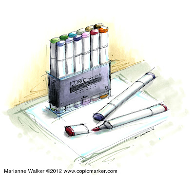
I promised last week when I posted the new 12 colors that I would show the artwork I drew for the new colors. I just finished coloring it, so I figured I would share, before I forget which colors I used.

Drawing the Marker Set
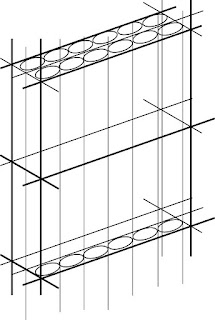
For this illustration, I was having a hard time getting the angles right on the marker set, so I created a guide in Adobe Illustrator to draw from. On something angular like a set of markers, this works well.

I don't like using rulers when I draw, since the computer does it better anyways, so rather than sketching this by hand and messing with a ruler or straight edge, I drew it all on the computer, scaled it to the size I needed, then used this as the base for my drawing.

I sketched it with my light table, using a o.o3mm multiliner onto nice paper. Then I scanned the drawing in and cleaned up the lines slightly. I printed it out onto thin, nice paper. I prefer coloring larger pictures on thin paper, as it uses less ink. This final artwork is about 7"x7"
I colored the final with T2, T4, T6, BG93, BG90, BG58, B000, B00, E81, E84, E89, E04, R56, V20, V22, V25, BV35, RV52, G43, G46, YR30, YR27.

For those of you who are starting to notice shadows, pay attention to the B00 and BG93 that I threw into the shadows. I did this to liven up the shadows and liven up the artwork. Note that I also added YR30 and B00 into the highlights. I added the rough sketchy lines in the background to liven those areas up as well. You probably don't notice much of this at first, but it helps to add variety to the whole. I did very little blending on this illustration, except for the purple/gray marker label, and even then I tried to keep it sketchy.

Again, new colors should be available in February, so get ready!

Sunday, January 8, 2012

Keeping Portfolios, Part 3

Thus far, I have talked about why you should keep a portfolio, how to be a good viewer, and things to consider when picking out a good portfolio. Today I want to discuss goals for choosing work to fill your portfolio. I think I will have one more post about portfolios, and then I think you'll be tired of hearing about my portfolios, and maybe you will be ready to start your own.

Purpose of YOUR portfolio
The first portfolio I ever made was in college. I was trying to get into some art classes, and I needed to show a variety of work that I had done. We were having a formal portfolio review, so I really needed to impress the professors to get into the classes I wanted. That portfolio was large. It contained a little graphic design, a little photography, a little illustration, and an assortment of other art I had done. The purpose of that portfolio was to be a showcase of both the best of my work, as well as the breadth of art subjects I could do. This was also a portfolio I could show new freelance clients, to see if they liked my skills and talent. This was (and is) a good portfolio from college.

Since that time, I have had the luxury of narrowing my portfolios. Since I mostly travel for Copic reasons, my current portfolios are all Copic related, and each has a specific purpose. My current goal is to share the variety of subjects that Copics can color.

When you start building a portfolio, you need to define the goal you are trying to achieve with that portfolio. Start by asking yourself a few questions to determine your Portfolio goals:

Which of these are most important to you:
• Variety?
• Keeping all my work in one place?

• Showing improvement over time?
• Organizing my styles by category?

• Showing only my best?

• Having something that I can share with friends for feedback?


Now, as you read some of the following organizational styles, you can choose the ones that fit your goals best. You may find that your organization changes over time, and that is Ok. Every now and then, evaluate your portfolio goals and make sure that your message is coming across.

Sort by kind
I usually carry 2 portfolios with me when I travel, 4 for Standard Certification, and 5 if I am teaching an Intermediate Certification. I take everywhere one book for Manga/comics, and one for General Illustrations (not manga). When I am teaching a Certification, I additionally bring one small one with papercrafting techniques, and one for color swatches.

When I teach an Intermediate class, I bring an additional book with all the original art from the Intermediate student manual. Here are the first pages from two of my portfolios, the ship is from my general illustration, the other title page is from my Intermediate book (later I will discuss labeling your work).

At a comic show or at Anime Expo, I show the Manga book first. Then, if people are really interested, I pull out the General Illustration book. When I visit a university or art store, they are interested in the variety of things you can use Copics for, from product design to fashion illustration, so my General Illustration portfolio comes out first. Then if they are interested, I pull out the Manga examples. At Standard Certifications, I refer to my two small portfolios throughout the class, and the two larger portfolios float around. Then I use the Intermediate portfolio for that class.

Different Content Categories
I could have one portfolio with a little of everything (like my portfolio from college), but then most viewers would only be interested in a small portion at a time, and miss the variety within that one subject. As it is, my General Illustration portfolio has a smattering of everything from architecture, fashion, product design, and freelance illustrations. This only has 48 pages or so, and is just enough to give a flavor of each topic.

Some people sort their work by people in one book, nature/trees in another. Some people sort by card projects in one, individual images in another.

If you don't have much material to put into a bunch of portfolios, it is Ok to have sections inside your book for different topics. Within my manga book, I tend to have characters in the front, fantasy in the middle, and objects in the back (this is not always the case, but I try to stick fairly close to this).

Best to worst
I used to think that most people who look at my books start at the front and work their way back. If I am one-on-one with them, then this is frequently the case. However, often my books end up left open to a random page and people start looking where the last person left off. If I organized best to worst, then as soon as the work starts getting bad people stop looking, Then, the next person to come along and thinks all my work isn't very good. Now, I keep mine mixed, good and bad together so one bad piece (that I keep because it shows a technique) doesn't stop people from looking.

If you are showing your book to only a few people, then by all means, put your best stuff first!! I still try to have my favorite images in the front of the book. In the very back of each of my books are images I am not done coloring. I found that some people like to see in-progress stuff, and it motivates me to finish it sooner rather than later. In the back of my Manga book you can find this image that has two versions of a picture that I never finished coloring. Maybe someday I will get around to it.


Newest to oldest (or Oldest to Newest)
If the purpose of your book is to show a progress- "look where I used to be, here I am now," then sort by age. Some people have comparison pages...one picture they colored two years ago next to the same picture colored this year. You'll find that your favorite colors change over time, your awareness of shading may have improved, or as your color collection changed, so did the colors you use. I try to keep some older work in my portfolios, but the majority of my stuff is from the last 5 years.

Keep this in mind, if you are looking at my portfolios. If you are a beginner, you are not seeing my beginner stuff, so you can't give yourself a fair comparison between my current work and your level of quality...or, then again, you could see mine and see that your work is just as good or better. Remember, a portfolio is a tool, not a reason to think any less of your own work or someone else's efforts. We are all at different places on our creative ladder, and need to help each other as much as possible.

Comparison
As an instructor, I have found that people love to see before and after, or step-by-step progressions. Frequently I will have one page with the black & white image, and a colored version next to it. If you don't have too many pieces in your portfolio, then this is also a good way to fill up space.

I almost always carry a spare B & W of each image in the portfolio with the colored copy. This allows people who are curious to see what the line work looks like. Sometimes I carry a few spares, so if I am doing a demo, I can simply pull out a blank image to color. If I end up coloring it good enough, then it replaces the old one. Or, I stick it in front of the old one, so if people ask, I can show them the progression, or different color variations of the same piece.

I hope this has given you some ideas of which art to choose. Now that you have your portfolio, you have a goal, you have your art, my next post will talk about good habits in maintaining a portfolio.
Friday, January 6, 2012

New Colors for 2012

358 Marker Colors
As many of you have noticed from our designers last week, we now have 12 new colors for 2012. This means that Copic Sketch markers and inks are now available in a whopping 358 colors!
I will be posting more information about these new colors, along with some illustrations later this week. Until then, you can drool over the luscious colors :). Below are some of the thoughts that went behind the development of these colors. G43 & G46: These complete the G40 sequence. These are great greens...not too bright, not too yellow, not too gray. A new must-have green sequence.

BG57: This goes with last year's new color, BG53. These are not as bright as the BG40's but more vibrant than BG70's family.

BG90: A new, beautiful pale, gray BG to go with the other BG90's colors

E84 & E89: These were developed as a nice, slightly greenish brown sequence to match last year's E87

BV34: Poor old BV31 has been alone for so long, but now it has a darker companion color. A lovely grayish BV color.

V22 & V28: This completes the V20 & V25 sequence. These were developed to be nice purples without hints of pink or blue, but are slightly grayish.

RV52: A bright, but pale pink to go with RV55 from last year.

R56: For too long R59 has been alone. This is one of my new favorite, must-have colors. I sequence this with E04-R56-R59. Try it and trust me :)

YR27: This is a wonderful orange, not as brown as the E90's sequence, and not as intense as YR18. It fills out the other beautiful YR20's colors.

These markers are available as pre-orders from many places, and will be shipping in February. Come to our booth at CHA and you can see them for yourself. Booth #2390
Have a great weekend!

Tuesday, January 3, 2012

Keeping Portfolios, Part 2

Last week I discussed the reason for keeping a portfolio and proper manners when looking through other people's portfolios, now let's get into the specifics of how to choose the portfolio that is right for you. Thank you for the wonderful feedback on last week's post! I am glad that I can share something valuable with everyone. Next week, I will go into how to fill your portfolios.

Picking a Portfolio
There are a couple features that I consider very important when it comes to choosing the right portfolio. Right now, next to my desk, I have at least 8 portfolios, each with a specific purpose. In my next post I will discuss the content of a portfolio, today we are just going to work on how to choose the right type of physical presentation for your work.

1. Size
What is the largest thing you will be showing in your portfolio? If it is a standard page size, then go for that size of portfolio. If all your projects are the size of a small card, then maybe you should consider a small portfolio. If you have one big project and a bunch of little ones, maybe you can scan or photograph the big one to fit in your portfolio.

You can get a large portfolio and display multiple images on the same page, but make sure that the portfolio has enough space for each object to have "breathing room" or else the pages will look cluttered. I have 3 different sizes of portfolios, each for very specific purposes. Small card projects go into the small portfolios, my regular illustrations go into letter-sized portfolios, and then I have a really big portfolio for my 11 x 17 artwork. I could fit all my card projects onto a couple pages in the large portfolio, but then it would be cluttered and confusing to the viewer (see point 3).

Make sure to get a portfolio with enough pages for your work, but not too many. If you have bulky things in your portfolio, then stick to fewer pages, and get multiple portfolios. If you are only adding flat sheets of paper, then lots of pages are fine. My biggest portfolio is for my Manga/comic art, and it has 36pages/72 views, but nothing in it is thicker than a sheet of paper. My other portfolios range from 24 to 48 pages/views.

2. Easy to add (and remove) projects
Pick a portfolio where it is easy to slide projects in and out. I use the Itoya Art Profolios. They have 12-48 pages, and open at the top of each page, so it is easy to slide work in and out. You can make your own portfolio using a 3-ring binder and page protectors. This will allow you more flexibility in number of pages, and if you have bulky projects in there, this might be the better route to go.

Don't glue projects into your portfolio!! Make sure anything you add can be easily removed. The purpose of a portfolio is to show progress. If you color something a second time, and you do it better, then show the better project. It is hard to do this if the first one has been permanently glued into a book with fixed pages. If it must be held in place, use a removable adhesive that won't stain or discolor your work.

3. Neutral Foundation
Up into the 1800's, art galleries used to cover every bit of available wall space with art. Way up to the ceiling, and down low. You could stare at a wall and see 30 pictures all clustered around. This was hard on the viewer, and any art that was not at eye-level could easily be missed. Then galleries started simplifying, putting only one or two images at eye level, allowing plenty of visual breathing room. Gallery walls are usually painted white, or another neutral color. This has been proven to more effectively show off the work.

In a similar manner, a portfolio should not be cluttered, and artwork should be on a neutral (white, black, or gray) background. Having two projects back to back without something between them can be cluttered and confusing, especially if they are of different sizes, or on different colors of paper. Most portfolios you purchase from an art store already come with neutral pages, but if you are creating your own, keep this in mind. Make sure the neutral base is thick enough to completely hide artwork on the reverse page.

Here is an actual page from one of my portfolios. This is the only page where I have multiple images on each page. Usually I only have one picture per page. The left side is not bad, the right side is untidy, cluttered, and disorganized. The torn edges are unprofessional, and the artwork isn't even attached to the page, so the art shifts around. It shows the viewer that I don't really care about this art. These are doodles that happened to come out well, but the cluttered presentation does not do them justice.

4. Durability
Make sure that your portfolio will stand the test of time. Archival, acid free, and durable. I show my work all the time, and some portfolios don't hold up as well as others.

My favorite brand are the Itoya Art Profolios. They have lots of different models for different needs. I used to get the nice ones with a clear pocket in the front, so I could have art on the cover, and it has a spot for art on the spine (bottom portfolio in the photo above). However, the edges didn't hold up after a few years, and the clear part of the cover gets scuffed and torn. Now I get the cloth-covered edges, as these wear better. For the average artist, the ones with a clear pocket are probably fine, and I miss the clear spine for labeling. But, with so many hands looking at my work, I am willing to sacrifice for the stronger edges.

You can always build a portfolio from a 3-ring binder and clear page protectors, just take into account the features I discussed today.

I hope this gives you some ideas for picking a portfolio. Later this week I will start showing new items for 2012, and next week I will finish the information on portfolios. Have a great week!