Wednesday, October 13, 2010

Just Rite Blog Hop

Christmas Bookmark
I realized while at the dentist this morning that I forgot to write the tutorial portion of this project for the Just Rite 12 weeks of Christmas Blog Hops #6!

Every Wednesday up until Thanksgiving some of your favorite designers will be joining some of the JustRite design team for a series of Christmas blog hops, showcasing JustRite’s entire Christmas Collection of stamps! This week, it’s most of the Copic design team and Certification instructors! So mark your calendars for Wednesdays at 9am Central for great Christmas gift, card & project ideas, starting at the JustRite Inspiration blog!

You may think that I have fallen off the face of the internet, and I do apologize, however, I have been polishing up the new Intermediate Certification manual (which is going to be jam packed with information) and getting ready for Chicago next week.

My project today was made with the new Christmas Ornament Set and Christmas Nested Frames & Occasions set from Just Rite.

I colored the image using G12, G17, Y13, Y17, YR09, R29, R59, C1, C2, C4, and 0. The background paper is from the Cosmo Cricket Everafter collection. I thought it paired perfectly with the pattern on the ornament. The pale gray paper is a textured paper I've had for years. The bling is from Prima, and the big ribbon is from Offray.

Thanks for stopping by today, and I'll be sure to type up the full tutorial tomorrow.

Please visit these designers’ blogs to see what fabulous Christmas projects they have for you on the hop today!

Sunday, September 26, 2010

Fall Leaves Header

You may have noticed a few days ago that I switched to a new header for the season. This image is from a picture I colored a few years ago. For the complete tutorial on how I colored the picture of markers, please visit this older post.

Meanwhile, come visit me in Savannah at the College of Art & Design. I'll be in the booth Friday and Saturday down at the SCAD River Club.

Tuesday, September 21, 2010

Rainy Tutorial

Dripped Water
Today I wanted to show you some simple methods to show, wet, drippy things. i know I've shown water drops in earlier posts, reflections on water, but I figured you can never have enough water tutorials, as water can be pretty tricky.

I started by choosing my light source and coloring the galoshes in shades of yellow. The scanner didn't pick it up, but I used Y06, Y38, and E35. The E35 helped tone down the shadows, otherwise they would have looked glowing orange instead of shaded yellow.


When we want something to look wet or shiny, the best way is to have very strong contrast between light and dark. In this case, we'll want the puddle of water to look wet, and we'll make the galoshes shiny, and add drops of water on both the umbrella and the galoshes. Since the image is so tiny, I'm going to worry about adding contrast back in later.


Next, I colored the water with B41. I want this to look dimensional, so I left strong white highlights on the edges that were closest to the light. I darkened the shadows with B45 and added a dark rim around the bottmo edge, especially on the shaded edges of the water. Already, the water is looking more wet and is catching the shadows from the boots and umbrella nicely. Now we can move on to coloring the umbrella.


I want the umbrella to be pink and purple. Notice that the way the light is shining, it is the inside of the umbrella that will be the brightest, not the outside. Also, keep in mind that the bottom of the umbrella outside will have darker shadow than the top of the umbrella, as there is less light bouncing around under the umbrella.

I colored the purple areas with B12, B17 and a hint of B79 to darken it up. Then, I colored the pink areas with RV00, RV02, RV04, and a hint of E04 to tone down the neon pink on the outside of the umbrella, yet keep the same feel of the base pink tone.

Now I am ready to add some drips of water. To do this, I start by grabbing my darker blue, B45 and adding spots on strategic places around the boots and umbrella. Don' go crazy- just add enough to make it look like it still has some drips left on the surface.

Last, with a tiny brush, take a jar of Opaque White and a really tiny brush and add a speck of white back into the center of each drop. Add a couple shiny highlights onto the edges of the galoshes that sick out closest to the light. To make the water appear shiny I added a couple simple parallel lines along the surface.

Now I have a pair of drippy wet boots and a wet umbrella. I hope you have a dry day today and have fun coloring!


Class Updates

It's officially Fall here in Oregon, which means that the rain has started. Maybe in April I will see the sun again. I apologize that I have not blogged in a while, I have been very busy writing the new Intermediate Manual, so all my tutorial efforts have been going into that book. To get you into the mood for rain, I'm sharing a quick tutorial on coloring a drippy umbrella and galoshes.

Before I get into that, here is an update on all Certification Classes coming up this Fall:

Sept. 25th Salt Lake City, UT taught by Jennie Black Open to the Public
Sept. 26th Calgary, Alberta taught by Sherrie Siemens Open to the Public

Oct. 2nd
Buena Park, CA taught by Jennie Black Open to the Public
Oct. 8th Jacksonville, FL taught by Colleen Schaan, Open to the Public
Oct. 15th Vancouver, WA taught by Jennie Black, Open to the Public
Oct. 21st Chicago, IL taught by Lori Craig, Open to the Public
Oct. 22nd Chicago Intermediate taught by Marianne, Sherrie, & Debbie Spaces still available

Nov. 6th
San Antonio, TX taught by Jenn Balcer Open to stores & designers
Nov. 8th Richmond, VA taught by Colleen Schaan Open to stores & designers
Nov. 14th Halifax, Nova Scotia taught by Sherrie Siemens Open to the Public
Nov. 16th Detroit, MI taught by Debbie Olson Open to stores & designers
Nov. 20th El Paso, TX taught by Jenn Balcer Open to stores & designers
Nov. 20th Denver, CO taught by Marianne Walker Open to stores & designers
Nov. 21st Tampa, FL taught by Colleen Schaan Open to stores & designers

If you need an application for either Intermediate or Standard Certifications, you can download one here.

Also, there are lots of classes coming up internationally as well:

Oct. 25th Brisbane QLD, taught by Kathy Jones (click here for Australia class info)
Oct 27th Wiesbaden, Germany taught by Diny Sprakel (for class information please e-mail Britta: b.rumpf-burblies@holtz-gmbh.de )
Nov. 8th Sydney, NSW , teacher TBA
Nov. 20th Melbourne, VIC Taught by Mandi Lee Klinger
Nov. 21 Elcot park Hotel, Nr Newbury, Berkshire, UK taught by Wendy Kadzidlo (click here for UK class details)

Whew! there are a LOT of classes this Fall! Now, onto the tutorial...

Monday, September 13, 2010

New classes coming up!

As the seasons change our Certification instructors are busy adding classes. Next week there will be a whole bunch of NEW applications going out, including:

Nov. 14th Halifax, Nova Scotia taught by Sherrie Siemens
Nov. 16th Detroit, MI taught by Debbie Olson
Nov. 20th Boulder, CO taught by Marianne Walker

You can check out the full list of currently available applications here. There are still a couple spots in the Intermediate class open as well, so get your applications in quickly.

Meanwhile, we have some great events coming up this Fall as well. Over the weekend I had the pleasure of doing a demo at the Eugene Teen Mayor's Art Show. Where else can you see me this Fall?

Sept. 30-Oct. 2 Savannah, GA Savannah College of Art & Design Art Materials Trade Show
Oct. 30 Eugene, OR Maude Kerns Art Center, Teen Manga Drawing workshop (to register please call 541-345-1571)541.345.1571541.345.1571 541.345.1571
Nov. 10 & 11th Eugene, OR University of Oregon Tools of the Trade Show, U of O Bookstore
Nov. 11th Eugene, OR Adult Marker rendering workshop, DIVA Art Center (to register please call 541-344-3482)

I'm looking forward to seeing everyone in the next few months!

Monday, August 30, 2010

Feather Blending, again


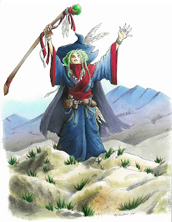
I had a great time at the Manga demo in Portland this weekend, and I had a chance to color this wizard picture I had drawn years ago. It's always fun to re-visit old images and color them with fresh eyes. I like this version a lot better than the version I colored oh so long ago.

Just to give you an idea of scale, these large manga pieces that I occasionally show are full-page sized, they are not small pictures, and are made for my example book. If you ever meet me at a show, bug me to let you look through my example books- it's fun to see bigger work sometimes, and see how I use techniques on a large scale.

You'll note in this picture how I show distance by making things in the back blueish. I know I've explained the blue-things-far-away before, but it never hurts to talk about how to make it look correct in a finished piece.

Feather Blending - Purple Mountain Majesties
I wanted to use this piece as an example of good feather blending. I've talked about feather blending a few times before (1, 2) but it never hurts to review.

Many of the Intermediate Applications I received I have had to turn down because they did not show proper feather blending. To me, this means I must not be explaining it well enough. This is a tricky concept, so it's getting an advanced label. What really makes it tricky is the amount of practice you need in order to find good color combos and time it takes to figure out the proper technique.

If you look at the mountains in the background, you'll see that they blend from blue, to purple, to warm gray. Blue and Warm Gray are opposites, in that Warm Gray is brownish toned and Blues and Blue violets are far away from them on the color wheel.
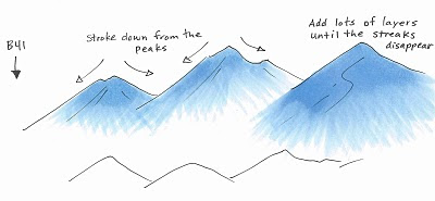
I started the mountains by coloring with B41. I stroke from the top of each peak, down to the base, flowing in the direction of the mountain. I am lifting up at the end of each stroke so that I have less ink at the base and more at the peak. As you can see from the third peak, I apply lots of very light layers to achieve the look I'm going for. I did criss-cross my strokes slightly for a proper feather, but I am consistent with the base feathered and the top of the peak dark.
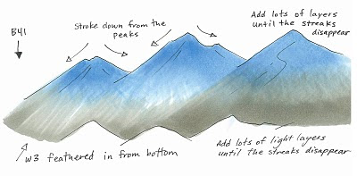
Next, I feathered in W3 from the bottom in exactly the same technique, this time, making the base dark and the feathering go back up into the mountain. I added lots of very light layers to achieve the proper blend. I think on the actual picture I used W2, not W3, but you get the idea.

You can see on the third peak how the layers blending more and more, and you notice the streaks less and less. Sometimes I'll come back with the blue and add another light layer after I added the second color, just to get it a little smoother.
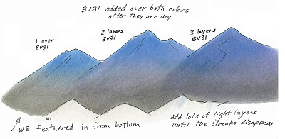

Last, you'll notice on my final mountains that it has the pretty purple fade. After I was done feathering the blue and the gray I added a faint layer of BV31. How much is a matter of personal taste.

You can see from these mountains that the more you layer the pale purple over the whole area, the more it shows through. The third mountain is colored as if it is in front, but it looks like it has more shadow than the others, so it could have been colored as if it were in back simply by adding more BV31. The purple is strongest in the middle because there is the least amount of dye on that spot on the page. This gives the purple a place to fill in, if that makes any sense.

On the final mountains in the main picture I added a faint streak of BV23/BV25 to darken the shadows on the left side of each peak. This makes it look a little less flat, but not so much that it detracts from the main image.

I used too many random colors to list, but I did use one other technique, which you might not have noticed. On the rocks in the foreground I dampened my nasty rag and blotted off some browns and grays that were already on there. This added the hint of texture you see on the front rocks.

I hope this has inspired you to practice the feather blending again. This is tricky, but when done right, it looks really good. Have a great week!

Friday, August 27, 2010

Events & Updates

Sunday from 2-5pm I'll be at Kinokuniya Beaverton, located inside of Uwajimaya's Japanese grocery store (10500 SW Beavertn Hillsdle Hwy, Beaverton, OR) .

I'll be doing Copic demos, coloring Manga, and generally having a great time, so stop in and say hi! Meanwhile, Nancy wanted me to remind people that there are lots of Certification classes coming up, so get your registrations in right away...

Intermediate Certification
Chicago, Oct. 22nd, Taught by Marianne Walker, Project by Sherrie Siemens and Debbie Olson
(the next session will be before Winter CHA, then regularly thereafter)

I am still reviewing Intermediate Applications, for the class in Chicago in October, so please submit them this weekend. Qualified attendees will be notified early next week.

It is important to read the application carefully and show your best coloring skills- I am picky about the coloring that I will accept into the class. I do not see the names on the coloring pages, only the coloring ability demonstrated, so give me your best representation if you want to be accepted.

If you need an application for either Intermediate or Standard certifications, you can download one here.

North American Standard Certifications this Fall
Please note that when you download an application to attend a certification class there is also an information file to download as well. This has the specific location, times, and other important details. Here are all the classes that are currently available to apply for:

Albuquerque, NM Aug. 29th Taught by Jennie Black Open to Public
Branson, MO Sept. 3, Taught by Lori Craig Open to Public
Pittsburgh, PA Sept. 6th, taught by Colleen Schaan Open to Public
Oakland, CA Sept 11th, taught by Jennie Black Open to Public
Minneapolis MN Sept 16 (before Scrapfest) Taught by Debbie Olson and Lori Craig Open to Public
Salt Lake City, UT Sept 25th Taught by Jennie Black Open to Public
Calgary, Canada, Sept 26th Taught by Sherrie Siemens Open to Stores & Designers
Buena Park CA, Oct. 2nd, Taught by Jennie Black Open to Stores & Designers
Jacksonville FL, Oct 8th taught by Colleen Schaan Open to Stores & Designers
Chicago, IL, Oct. 21 Taught by Lori Craig Open to Stores & Designers

Applications have not gone out yet for the following locations:

Richmond VA, Nov. 8 Taught by Colleen Schaan
Halifax Nova Scotia, Nov. 11th Taught by Sherrie Siemens