Monday, May 7, 2012

Copics and Acrylic Paint

Marker and Paint
I had a few questions come up this week, and I figured a quick blog post should answer those questions.

With the growing popularity of mixed media, people love using their markers on many different surfaces and with many different mediums. Invariably, people ask me about using their Copic Markers with Acrylic paint. I really don't recommend it, and let me show you why.

Here is the test sheet that I made. I am working on Canson Canvas Paper. I used Golden Paints, Gesso and Titanium White. I made marker swatches both under the paint and over dried paint.


First, I put R59 on the paper and let it dry for a while, to make sure it was not wet at all. I then applied a nice thick coat of Gesso and White paint. I brushed back and forth a couple times.

You can see that the red bled and was picked up and pulled around.

Then I let the paint dry all morning. I took the same marker and colored over the dry paint. The single layer of marker over the paint was fine. It did not mess up my tip, but the color also streaked on the surface of the paint.

Next, I took the red and colored over a spot of paint. I colored many layers in one spot, coloring back and forth. This re-activated the paint, and it got thick and gummy. The paint then clogged my marker nib.

Acrylic paint gets into the pores and now my nib will not allow the color to flow very well. This nib will need to be replaced before I use it on projects again, or else it will streak and possibly leave a bit of acrylic residue that will affect any other markers I use with it.

Now, Reds are the most intense dye, and I wanted to make sure that I was not just getting a result of the dye. So, I took a streak of black, let it dry, then put a single thick smudge of white paint over it. I did not brush back and forth at all. When I first applied the paint, it was pure white and pristine. After sitting for a few minutes, this is what soaked through.

The acrylic paint re-activated the dye and pulled it through the thick layers of paint.

So, if you are wanting to use Copics with Acrylic, be extra careful! Know that the dye will bleed through, and if you color directly onto dry paint you might clog your nibs. Be careful with multiliners over paint as well, as those nibs also run the risk of being clogged from the paint.

Good luck with your work!


Thursday, April 26, 2012

Color with me!

Have fun coloring!
Even if you can't come to an event with me this weekend, I want to share an image that you can color for yourself.

I drew this little image with a 0.3mm multiliner, then scanned it in. I colored the skin with E000, E51, E13, and BV00, cheeks are . I colored the hair with E31, E47 and 0. The purple areas are BV00 & BV04. I used Y21 and YR30 for the yellow background. Other colors: R85, C1, BV23, YG05, BG70, B93,

Here is your very own image to click and save to your computer. Print it out, and have fun coloring, even if you can't come visit me!


Wednesday, April 25, 2012

Coloring events this week

Tomorrow, April 26th, I will be demoing from 10 until 6pm downstairs at the U of O Bookstore, Main Campus Location for their "Proudly Oregon" event. Come see Ken O'Connell, as well as many other local artists, authors, and companies that are based in Oregon. Enter to win doorprizes, watch artists, and get autographed books. Don't Miss it!

Friday, April 27, Phoenix, OR, Scrappy Crafts. I will be doing demos from noon to 4pm, and then we will have a book signing party from 6 to 8pm. This should be a lot of fun for all the papercrafters down in the Medford area.

April 28, Medford, OR, Central Art Supply. I will be teaching a class from 10:30 to 12:30 for any artists interested in learning marker techniques and how to choose papers and inks. This is a great opportunity for any artists in Southern Oregon who have always wanted to give Copics a try.

I hope to see you at these events!

Papercrafting Certifications
Quick Certification update- We just opened a few new classes. Register now before they fill!

Standard:
June 22nd, Montreal, Quebec, Canada taught by Sherrie Siemens Open to public

 For a complete listing of standard classes, visit our list here.

Intermediate:
June 23rd, Montreal, Quebec, Canada taught by Sherrie Siemens Open to public


For a complete listing of intermediate classes, visit our list here.

Wednesday, April 18, 2012

Certification updates

North American Papercrafting Certifications
It has been a few weeks since I updated people about Certification classes. If you want to get e-mails about upcoming classes or get a copy of the Copic Newsletter e-mailed to you, please sign up for our mailing list here.

Meanwhile, here is a list of our upcoming Standard Papercrafting Certification Classes:

April 19th, Milwaukee, WI taught by Debbie Olson FULL

May, 6th
, Toronto, ON taught by Sherrie Siemens FULL
May 11th, Kalamazoo, MI taught by Marianne Walker Almost Full!!
May 18th, Dallas, TX taught by Lori Craig FULL
May 18th, Minneapolis, MN taught by Debbie Olson FULL
May 21st, Hanover, MD taught by Lori Craig FULL
May 25th, Regina, SK, Canada taught by Sherrie Siemens Open to public

June 5th, Portsmouth, NH taught by Marianne Walker & Cindy Lawrence Open to public
June 6th, Marlboro, Mass taught by Marianne Walker & Cindy Lawrence Open to public
June 15th, Las Vegas, NV taught by Colleen Schaan Open to public
June 15th, Casper, WY taught by Lori Craig Open to public

Upcoming: CHA Summer, Chicago, Il applications have not gone out yet

Intermediate Papercrafting Certifications
These classes are filling fast! Register now if you are interested in attending an Intermediate Certification Class. These classes are for anyone who wants to explore more of the art side of coloring. We discuss light, shadows, choosing color combinations beyond the basics, composition, and coloring tricky situations...along with so much more!!

April 20th, Milwaukee, WI taught by Debbie Olson FULL

May, 5th, Toronto, ON taught by Sherrie Siemens FULL
May, 19th, Dallas, TX taught by Colleen Schaan FULL
May, 19 Minneapolis, MN taught by Debbie Olson FULL
May 26th, Regina, SK, Canada taught by Sherrie Siemens Open to public

June 7th, Marlboro, Mass taught by Marianne Walker Almost Full!!
June 16th, Las Vegas, NV taught by Colleen Schaan Open to public

Upcoming: CHA Summer, Chicago, Il applications have not gone out yet

Tuesday, April 17, 2012

Savannah Sketches and upcoming events

I had the pleasure of spending last week doing class presentations at Savannah College of Art and Design. One day between classes, I had a little time to do some quick sketches around the beautiful city of Savannah. Here are a couple of those sketches.

I drew these in my Copic Sketchbook, with a 0.03mm multiliner, no pencil. Some of the finest lines did not show up when scanned, but these were really rough sketches/studies anyways.

I had been driving from one building to the next, when the porch on this house really jumped out at me, so I decided to draw it and fix the wood/brickwork in my mind.

As this is a rough study, for a finished piece, I would redraw everything, being more careful about my angles and lining things up properly. Instead, I wanted to get the big picture in my mind first.

A note about this second sketch. I was not drawing to make an exact recreation of each building. Rather, I was creating stylized images using elements that I saw and was inspired by.

These quick sketches were more studies of elements. So, in real life, the balcony did not have the ornate uprights, but another building nearby did. The planters were not really next to that doorway, but I had seen some by another building. Also, to be at the angle which my perspective suggests, would imply that I was actually viewing this from a second floor as well, when in reality, I was sitting on a park bench across a square from the doorway and balcony I liked.

I urge you, even if you don't consider yourself a great artist, sit down and sketch something that inspires you. It could just be a pencil or a piece of wood, it does not have to be as complex as these buildings.

Meanwhile, If you would like to come to some upcoming events, then you are in luck! In April I have a few fun things coming up that I would love to see you attend.

April 26, Eugene, OR, University of Oregon Bookstore, 10am to 5pm. I will be there with my books and portfolios, talking about Copic products and showing techniques. Come and see me!

April 27, Phoenix, OR, Scrappy Crafts. I will be doing demos from noon to 4pm, and then we will have a book signing party from 6 to 8pm.

April 28, Medford, OR, Central Art Supply. I will be teaching a class from 10:30 to 12:30 for any artists interested in learning marker techniques and how to choose papers and inks.

Thursday, April 5, 2012

Matching Coloring

I was making a stack of thank you cards, and I had a wonderful polka-dot green paper that I really wanted to use. However, I also wanted to use a cute teddy-bear image, and I wanted to keep the bear brown.

Today I wanted to step you through my coloring process to find the matching colors to make my project work.

Finding Colors that match
The first problem I had was that my patterned paper did not have an exact color match with any Copic colors on my hand-drawn chart. I found that it was very close to BG72, but it needed to be a hair brighter, not lighter, simply more vibrant. To accomplish this, I chose another color that was very close to the paper tone, G12. G12 is a brighter, light green. As a base to the BG72 it would help pull down the grayness, but still retain the greenish cast that I needed.
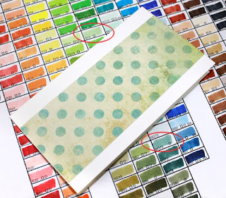
When you are having trouble finding an exact color match, try the closed color, and see what it needs to change it. If it is too dull, layer a more vibrant tone. If your color needs more yellow, don't reach for a bright yellow, try a base of a subtle, but close yellow. Many times it will take two or even three colors blended to make the right mix.

I was going to be printing the sentiment, so I chose that color a little differently. I pulled out a color chart that I had printed from the same printer. I matched the patterned paper to the closest color from my printout, then I chose that color as my text color.

Matching the Bear
I really wanted a brown bear, and have the turquoise as my accent color. I like to work with one dominant color and two accent colors.

My other challenge, was that I had to make a few of these cards, so I wanted to keep the color spectrum simple, and one that I could easily color a bunch of without taking too much time. I like challenging myself by working with a simple color palette, and an image like this bear does not need a whole lot of colors.


I wanted a fairly neutral brown, so I decided to work with the E30/E40's families. I started with a base of E30.

Then, I blended in E44. Those are the only two browns I used on the bear. After I had blended in the E44, I let the bear dry thoroughly, and I went back and darkened the deepest shadows with the E44. I added the cast shadows on his arms, on his legs, and from the flower. These needed to be crisp on the edges, and for crisp edges, let your base colors dry.

However, these colors were flat, and did not match my paper or chosen accent colors at all. So, my next step was to pull out the G12 I liked. I lightly brushed the G12 over the brown bear, starting in the shadows and feathering over the light areas. I did not blend. Here it may look kind of odd, but remember, this bear will be sitting on greenish paper.

In real life, if this teddy bear were actually sitting on the greenish patterned paper, then any light that hit the green paper would reflect back onto his fur, with a bit of a greenish tone to it. Lightly adding the G12 allows me to pull the bear into the background a bit more, and suggests reflected light from the paper.


Last, I colored the patches with a base of G12 and BG72 for the shadows. The flower is colored with E04 and the E44.

Not shown: I used a gold Spica glitter pen to add my darkest shadows on the brown fur areas, and a silver glitter pen along the edges of the turquoise

I added extra reflection on his nose and the flower with a dab of Copic Opaque White.

Here are the final, very simple cards. Look at how the green, while strange on the bear by itself, now pulls the bear into the paper nicely.
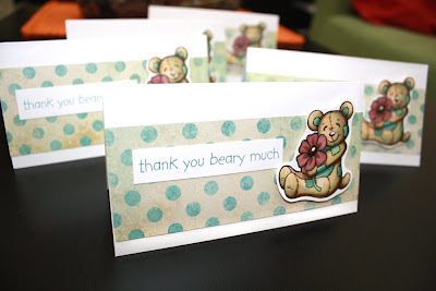


I think the cards are done. I may add a small accent under each sentiment, but at this point I am happy stopping. Now I get the fun of writing some thank yous!

Note that I only used 5 colors: E30, E44, E04, G12, and BG72. Accent with Opaque white, and two glitter pens. Now that is an easy image! Coloring didn't take very long, maybe 5 min. per image... which is what you want when making many cards. Paper is from Recollections Charming Paper Pad. I drew the bear with a 0.1mm Multiliner, then scanned it and printed it as needed. The bear is popped up with our X-press It Foam tape. I used Neenah Classic crest cardstock as a base, since it is slightly warmer than the Blending Card I usually color on for card projects.

Tuesday, March 27, 2012

Line Art Posters & Mermaid

Have you wanted larger images to color with your markers? We now sell large-format line art posters printed on high-quality paper, intended for coloring with Copic Markers.

Here is a sample of some of the artwork I colored from this new collection. It was fun to work on something so large. We have some posters that are 10" x 14" and some posters that are up to 22" x 32.5" Wow! That gives you a lot of space to create a beautiful work of art for your home or as a custom gift.

These are not paint by numbers, or fuzzy posters, simply high-quality line art posters by assorted artists. Each print is on paper that is intended for use with Copic markers.

I really had a lot of fun coloring these giant pictures. Copic markers make the images pop! I particularly liked how complex the wizard image was. I can't tell you how many colors it took to color, but when it was done, it was so worth it! If you are looking for something bigger to color, then I would strongly suggest that you pick up a few of these posters.


Coloring the Mermaid
Here is a close-up of an undersea poster that I am in the middle of coloring. It takes a long time to color each poster, but in the end it is really worth it!

I wanted to add lots of blue to her skin, as this mermaid is underwater, so I colored the skin with E000, YR01, E13, and E15, then added additional shadows to the skin with Boo, to give the hint of blue water. I colored the eyes and lips with BG13, E04, R14 and C3. Her hair is colored with a base of Y11, then I added E42 and E13/E15 for the deepest shadow areas, with a few dots of E04. Her tail is colored with E000 for highlights, then B00, BG13, B12, for the blue areas, with B34 in the shadows. The fringe/fin is colored with E000, RV02, Boo, and BG13. I threw B12 in the deepest shadows on the fringes and fin.

I hope you get a chance to order a few of these posters, and have fun tackling them.