 Contrast and Colored Inks
I don't usually use colored inks because I am a traditional pen & ink, black and white kind of person. Occasionally though, I draw something with colored lines, but I always have trouble coloring it after that. There are some different things to take into account when working with colored inks.
 There's something elegant about coloring a detailed picture with all one color. I used this image in earthy grays a few weeks ago as a sympathy card. It really works well because your eye is drawn to the detail and not the coloring job when you work within one color family (monochrome). To make the colors really flow together you have to plan ahead and pick your colors more carefully than when working with plain black ink.
 For Monochrome (single color) images:
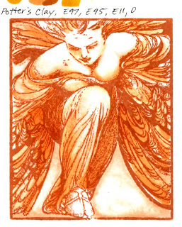
1. Know what the color equivalent of your ink is before you start coloring. On this first angel the closest color I found to match the ink is E99, but that is too dark, the next closest is E97, which is too light. So my ink color is basically E98, a non-existent Copic color.
2. Keep your ink line as the darkest color in the picture. You don't have to follow this one, but I find I get the best results when I do. This first angel I colored shadows with the E99 and it's a shade too dark. See how it runs over the ink lines and shows up bad? Keep all your marker colors lighter than your ink and you'll get better results.
3. Adjust your contrast from the ink color. Instead of black being "black", now my E98 is "black". I'm going to pick 3 colors of brown to shade down from there, plus white to make a full contrast picture. (note: the two Potter's Clay stamped pictures were side-by-side on my scanner and yet the ink colors look different and my sequence looks slightly off. Never trust a computer screen!)
 Ideally, the color sequence on the last digits of my markers for this ink would be white, 1 (light), 3 or 4 (middle), then 5 or 6 (dark), ink color of 8 or 9 (black). If the ink was equivalent to a number that ended in 5, then your sequence might be white, 0, 2, 3, with 5 as the "black", so you have a narrower contrast range because your ink is so pale.
4. Colors in a sequence might not be the best choice. For this picture, if E98 was my darkest color, then E97, E95 and E93 plus white would be my perfect sequence. Trouble is, in the E90's blending group, the pale E90's turn pink (when I use blender on the E95 it fades to pink. Pink does NOT go with this brown). So, I had to look to other color families for my lightest brown that would match.
My final marker sequence is E97, E95, and E11 for the Memento Ink Potter's Clay. See how well this works? The whole image looks nice and monochrome orange/sepia.
 Sometimes you won't find a matching Copic Color to your ink.
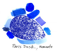
The biggest trouble is that Copics only come in 322 colors, and there might not be an exact match for your ink. Such is the case with the Memento Paris Dusk ink.
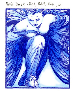
 See my tests? Nothing exact, I can't even find a family it would belong to like I did with the Potter's Clay ink. I tried layering a couple colors, still nothing. So, I just went with pale colors that seemed to work and fudged that sequence. I chose B21, B24, and B26. It's close enough for me, but not quite exact if I use any darker color than B26.
If I really wanted to get picky I could layer and mix colors until I found the exact match, then take an empty ink bottle, custom mix my inks and fill an empty marker with my exact color that matches whatever I'm working with. I don't care quite that much about having the exact match though.
 The final look of both these pieces is very simple, elegant, and yet it is visually appealing because it has the full range of values from light to dark.
Note on both these examples how much white space I leave. This goes back to the heavy contrast post from Tuesday. Because the stamp has so many dark, heavy areas I need to balance by leaving lots of white space so my overall feel is even between light and dark.
Some people prefer lighter colors overall- this would draw more attention to the angel's line work, whereas other people might go darker than I have because it would feel better for their purposes or matching embellishments. That is a choice that you have to make for yourself, but since I like balance then I chose my color range to be more balanced.
Tomorrow I'll discuss using different colors with colored inks. Have a great day!
Image: Believe by Crafty Secrets, Clear Art Stamps, Inks: Memento Potter's Clay and Paris Dusk Paper: Neenah Classic Crest

5 comments:
WOWSERS! Another enlightening post! Thanks, Marianne! And, surprisingly I 'GET IT', TOO! HA HA! Probably because you explain it so well!
Have a super day!
Light bulb moment! It never even occurred to me to match my markers to my stamping ink. Brilliant! Thanks Marianne!
Marianne, your explanations of Contrast is very good. I wish I could say like your first comment that "I get it" but I don't yet! I will probably have to read and reread to really get it. I do better by watching and doing. Thank you so much for such good information.
"Sometimes you won't find a matching Copic Color to your ink" thank you so much for putting that in writing for me. LOL. I keep looking for a paticular color I want for shading and it's just not there but your ideas are so helpful to me.
Thanks for telling us so much! QP
Post a Comment