 Sorry I haven't posted in a few days, I've been on the road again and will be back to my regular posting more next week. Meanwhile, here's a simple concept that is opposite of how I usually color.
 Usually when I color I go from light and add dark, then add light and blend the two together. What if I cut out the first step, and go straight from dark to light?
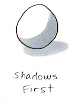
This is a great technique for people who aren't that great at blending, but want a softer blend with only a little effort, and who don't have many colors. I start by adding gray first where my shadows will be. I'm coloring very crisp and clean today to show you what it looks like without blending. You don't have to color with smooth blends all the time, crisp can look good as well. On this first circle I start with C3 and plan where my basic shadows are.
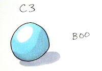
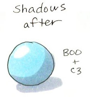
 Next, I add blue over the top while the gray is still wet. I'm not blending, I'm just coloring evenly over the top of the gray. See how the gray naturally softens into the blue? It's subtle, but if you compare it to the next example, where I added the gray over the blue while the blue was still wet it didn't look as smooth. When you look at them next to each other it really stands out.
 So why does this work? Lighter colors gently push darker colors out of the way, even without a lot of blending. This is true of any light color. If I went over it again with a light color it would blend it more and more. This is why the colorless blender works- It pushes and mixes a color with clear to get it to lighten up a color. When you use a light color like pale blue it leaves the pale blue behind yet you still feel the gray since I didn't completely blend it.

 Why Shadows first?
If you have a hard time remembering where to put your shadows while coloring, just add them all at the beginning. If you use a pale Neutral gray (N1, N2, or N3) then it will go with any other color and you can layer your other colors over the top and you know it will blend well. This makes it easier to keep your shadows consistent, especially on complicated images.
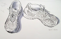
 Here is my final example. I colored it with just two colors- showing that you can achieve what looks like more complicated coloring, even though you're using only two colors. Note on the inside the light blue blends into the gray- here is where I added extra blue to really get the light gray to blend in. These shoes are photocopies from mt sketchbook, printed on color laser copier paper. Colors: C3 and B00.

8 comments:
Oh how cool Marianne!!! I used my new Airbrush system today!! :) Check out my blog to see the results!
Very helpful post today! Playing with my markers I had noticed that the lighter colors do push the darker colors away just as you said. However - silly me - I was still adding my shadows last. Now I know to switch it up. It's amazing what these markers can do!
I know I am late on this, but here it is, my take on the wax resist bit:
http://www.twopeasinabucket.com/pg.asp?set=recent&gallery=1&cmd=display&layout_id=1404398
I colored the stars, then went over with wax, then did the airbrush and then scraped off the top layer (with my fingernail!!!)
Very easy but fun project.
wow your tutorials are the best...
I know I would not have purchased copice without your help..
Just got mine yesterday.
connie paxman
WOW, your drawing is amazing, but coloring it in makes it even better!
Amazing! Thanks for sharing your tips and tutorials. They really help.
:-)
if someone made this shoe sketch into a rubber stamp, I would buy it!
Post a Comment