Monday, November 21, 2016
Live drawing on Facebook!
Today, on the Copic Facebook page we will be sponsoring a live drawing session of 4 resident Copic artists in San Francisco airport. Join us at 2:30, pacific time. See you then!
Thursday, November 10, 2016
Eugene Comic Con and more!
 This Fall I've been on the road a lot. That's why I'm happy to say that we have a couple local events going on this week! If you're in down in the Los Angeles area, we have a great opportunity there as well.
Eucon- Eugene Comic Con, in Eugene OR from Nov. 11-13th is a great chance to pick up any markers you need for your projects. We are hosting the Imagination Room, a room with over 5,000 sq. ft. of inspiration. Guest artists from around the country, ongoing live workshops, coloring tables to try our products, and demo artists to ask about techniques. You won't want to miss it! Due to our amazing range of artists, I'm only teaching one class, Friday afternoon.
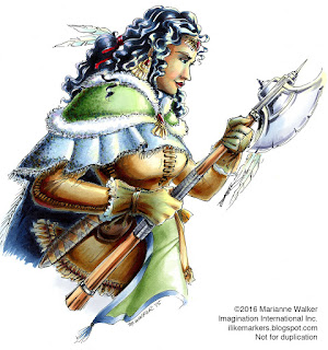
Here's a barbarian woman I drew last year while at Eucon. It's a lot of fun to draw whatever random things come to my mind, and this was definitely random. Who knows what I'll think of tomorrow at the con?
Tools of the Trade, Nov. 16-17th in Eugene OR at the U of O Bookstore, on campus. This is another great opportunity to add to your marker collection, as they have an awesome sale price. The event is totally free, and there are many artists and dealers there to share their neat new art supplies.
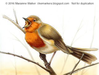 Come see me color another side of my art. Last year I was able to draw and color some beautiful birds for my portfolio. Here's one I made at that event.
Moving further south, if you're near Burbank...
Nov. 18-20th CTN Expo. This is an amazing animation conference full of the most talented animators and illustrators in the industry. I won't be showing my work, I'll be busy managing the booth, but this is a great chance for you to see how pros use Copic markers. For more info on this event, click here.
As the year winds down, I hope to see you at one of these events. Happy Fall!
Thursday, October 13, 2016
Tracing Memories App now available
 Free App for Converting Photographs
For those of you who like coloring, but want to color your own picture, you're in luck! We just released the first version of our new Tracing Memories App on the iTunes store (for iPhones and iPads).
(I know the next question will be when is it available on Android, and don't worry, it will come. This is only the first version of everything, so we aren't ignoring you, we just had to start somewhere.)
Meanwhile, check it out and let your friends know. It's free, and super-easy to use. You just take a photo on your device, click a few buttons, and presto, you have an outline!
 The app allows you to control line thickness and level of detail, with just a swipe of your fingers. The super easy interface helps you make the look you want, then you can easily send to a friend, or print it yourself.
I'm heading off this weekend to teach at the Oregon Art Education conference, and we'll be using this app to make images in my workshop.
I can't wait to get back and start experimenting with the new app, making great things to color (so much faster than using Photoshop!)
If you download it, please let us know what you think. Our developers have been working hard on the functionality and programming to help you have a seamless experience. We want you to be able to get to coloring faster.
Tuesday, September 13, 2016
Re-coloring old art
A few days ago I showed you how I re-drew an old piece from my portfolio and colored it from scratch. This time I want to show you a piece I drew and colored back in 2005, then decided to update the colors.
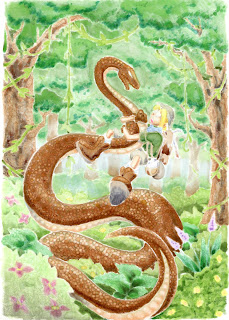
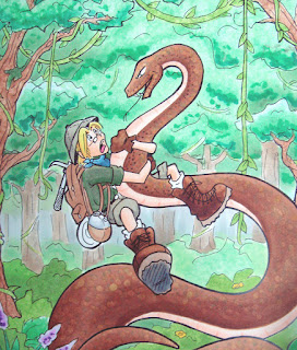 Here is an old, kinda washed out photo of the original. The colors were pretty soft, the trees were washed out, and the whole thing was a bit flat (the photo also makes it look worse, but it was pretty bad). I had been experimenting with the markers at the time, learning how to use them better, so this was not a fabulous coloring sample, but I did like the drawing itself.
I realized when I was flipping through my portfolio that I had actually never finished coloring the image, but it looked "good enough" so I'd ignored it all these years.
Well, I pulled it out. This was a line drawing that I had photocopied onto color laser copier paper. I had colored it and stuck it away. Now, 11 years later, I pulled it out to tighten up a lot of things.
One of the most amazing traits of Copic markers is that on uncoated paper you have an infinite working time. Meaning, just because I colored something 11 years ago doesn't mean that it's done. I can pull it out and re-work the colors at any time. Once the ink is wetted with another marker again, I can mix and blend.
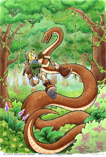 So, I throughly worked over this piece. Biggest priority was fixing the lack of contrast in the trees. Years ago I had dabbed on hand-sanitizer to affect the texture in the trees. Trouble is, hand sanitizer really fades out colors. It looks cool, but I learned through trial and error over the years since 2005 that I should have started darker on the base color first. I also crated more depth on the bushes and shrubs. Now you can clearly see which trees are in front, which bushes are in the foreground, and how dimensional the fern-things are.
Next, I made him look less flat. Again, deepening the shadows on my character makes him pop and look much more dynamic. (by the way, Tad is his name, as in "A Tad Bit of an Adventure", the comic series I was working up at the time). I added better skin tones, shadows on the snake, and generally punched up the contrast on the character.
Last, I spent a lot of time on the snake. In the first sample, you can see I had a few, irregular scales dotted in with a variety of colors. This time, I increased the contrast in the shadows and more clearly defined the scales on the belly with the colorless blender. Once all the contrast was done, then I went, scale-by-scale with the colorless blender and added more regularity to the scales.
 To create dots, I simply touch the tip of the colorless blender to a colored area and it pushes the color out the backside of the paper. To show you what I mean, here is a scan of the backside of this picture. Because this is on such thin paper, you can clearly see the contrast and effects of the blender on a colored area.
What is really amazing is that except for the shadows, the brown ink on the snake is the same ink I put down 11 years ago. So, all the ink pushed out the back of the paper came from a marker more than a decade ago, and I was still able to move it around. Love that about my Copic Markers!
Have a great week, and I hope to see you at some upcoming event!
 Here is an old, kinda washed out photo of the original. The colors were pretty soft, the trees were washed out, and the whole thing was a bit flat (the photo also makes it look worse, but it was pretty bad). I had been experimenting with the markers at the time, learning how to use them better, so this was not a fabulous coloring sample, but I did like the drawing itself.
I realized when I was flipping through my portfolio that I had actually never finished coloring the image, but it looked "good enough" so I'd ignored it all these years.
Well, I pulled it out. This was a line drawing that I had photocopied onto color laser copier paper. I had colored it and stuck it away. Now, 11 years later, I pulled it out to tighten up a lot of things.
One of the most amazing traits of Copic markers is that on uncoated paper you have an infinite working time. Meaning, just because I colored something 11 years ago doesn't mean that it's done. I can pull it out and re-work the colors at any time. Once the ink is wetted with another marker again, I can mix and blend.
 So, I throughly worked over this piece. Biggest priority was fixing the lack of contrast in the trees. Years ago I had dabbed on hand-sanitizer to affect the texture in the trees. Trouble is, hand sanitizer really fades out colors. It looks cool, but I learned through trial and error over the years since 2005 that I should have started darker on the base color first. I also crated more depth on the bushes and shrubs. Now you can clearly see which trees are in front, which bushes are in the foreground, and how dimensional the fern-things are.
Next, I made him look less flat. Again, deepening the shadows on my character makes him pop and look much more dynamic. (by the way, Tad is his name, as in "A Tad Bit of an Adventure", the comic series I was working up at the time). I added better skin tones, shadows on the snake, and generally punched up the contrast on the character.
Last, I spent a lot of time on the snake. In the first sample, you can see I had a few, irregular scales dotted in with a variety of colors. This time, I increased the contrast in the shadows and more clearly defined the scales on the belly with the colorless blender. Once all the contrast was done, then I went, scale-by-scale with the colorless blender and added more regularity to the scales.
 To create dots, I simply touch the tip of the colorless blender to a colored area and it pushes the color out the backside of the paper. To show you what I mean, here is a scan of the backside of this picture. Because this is on such thin paper, you can clearly see the contrast and effects of the blender on a colored area.
What is really amazing is that except for the shadows, the brown ink on the snake is the same ink I put down 11 years ago. So, all the ink pushed out the back of the paper came from a marker more than a decade ago, and I was still able to move it around. Love that about my Copic Markers!
Have a great week, and I hope to see you at some upcoming event!
Thursday, September 8, 2016
Fall Classes and Events
 I have a list of upcoming events, and I think you'll be excited. This year we've been branching out in what we teach and offer. So, classes over the next few months are really covering a wide gamut of topics. Look for classes on Fine Art as well as for Papercrafting (Click on our classes page to see all classes offered)
Papercrafting classes - 2016
Whimsical Faces & Hair $99
Vintage Values & Monotones $99
Sept. 9th Charolette NC
Sept. 23rd Las Vegas, NV
Sept. 23rd, Sacramento, CA
Oct. 14th, Boston MA
Oct. 14th Hanover, MD
Oct. 14th Portland, OR
Dress for Success, Clothing & Accessories
Sept. 10th Charolette NC
Sept. 24th Las Vegas, NV
Sept. 24th, Sacramento, CA
Oct. 15th, Boston MA
Oct. 15th Hanover, MD
Oct. 15th Portland, OR
Note if you want to take all 3 workshops in a location, we offer a package discount HERE.
New! Fine Art Workshops 2016
Fine Arts 101 class-
This is a basic overview of using Copic markers, from blending to paper choices. No experience necessary! Lots of great content, offered in a couple locations coming up soon. Only $99, classes run from 9am to 1pm
Sept. 10th Phoenix AZ, Taught by Jennifer Dove
Nov. 4th Dallas, TX, Taught by Ryan Weber

Fine Arts: ThINKing Outside the Box
Use a limited color palette to make amazing mini masterpieces. No experience necessary! $99, 2 to 6pm.
Sept. 10th, Phoenix AZ, taught by Jennifer Dove
Fine Arts: Portraits with Copics
This is a mid-level class that goes in-depth on how to acheive more realistic portraits with Copic markers. Learn how to achieve good skin tones, and more $99, class runs from 2 to 6pm
Nov. 4th Dallas, TX
Papercrafting Classes- 2017
Standard Certification
Jan. 18th 2017 Phoenix AZ
Coloring Flowers with Copics
Jan. 18th, 2017 Phoenix AZ
Intermediate Certification
Jan 19th, 2017 Phoenix AZ

New! Hand Lettering with Copic $120
Jan. 20th 2017 Phoenix, AZ
New! Copic Coloring Animals $99
Jan. 21st 2017 Phoenix, AZ
Coloring Landscapes with Copics $99
Jan 21st 2017 Phoenix, AZ
Conventions
We have booths at many events this Fall. If you are nearby any of these upcoming locations then stop by and check us out!
Sept 9-11th, Rose City Comic Con, Portland OR - Comic convention
Oct. 8th, Main St. Stamping, Portland, OR - I'll be teaching Copic coloring workshops
Nov. 4-5th, Pinners Convention, Salt Lake City UT - Hand lettering, coloring, adhesives, home decor paint, and more
Nov. 11-13th, Eucon, Eugene, OR - Comic Convention, we're hosting live art demos and ongoing workshops
Nov. 16th - 17th, Tools of the Trade, Eugene OR - I'll be doing free, live coloring demos
Nov. 18-20th, CTNX, Burbank, CA - Professional artist gathering, we'll have workshops and demos
Labels:
certification,
color and Ink workshop,
events
Updating Old Work
 This year has been pretty busy. I know I haven't been around for a while, but never fear, I am still here. Recently I was at Salt Lake Comic Con and I was flipping through my old portfolio. It is sadly in need of updating as a lot of the artwork I'd made was about 10 years old.
Some of the artwork I look at and cringe...I'm so much better at drawing than I was 10 years ago! (A big reason to keep a portfolio is to remind yourself how much you've improved over time).
Other artwork I looked at and decided it just needed coloring touched up, since I colored many of the pictures during conventions, with limited supplies, or while I was talking to others. And, my coloring has improved a lot in the last 10 years.
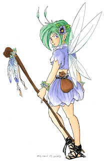 Redrawing & coloring old artwork
This first piece is one I originally drew about 12 years ago. Apparently when I was at a demo I only used 14 colors the first time. I've always liked this spunky fairy, so in flipping through my portfolio this weekend I figured now was the time to update her.
First, I traced her outline onto a clean sheet of our sketchbook paper using a brown multiliner 0.3mm. I have also changed my style of drawing a bit over the years, so I cleaned up my line work a little. Sometimes, just redrawing something you made previously makes all the difference in changing something from good to great.
I colored this version with way more than 14 colors! B00, BG000, YG11, Y000, E000, BV11 are the main colors used throughout, then I enhanced each area.
The wings are colored with B00, BG000, YG11, Y000, and a glitter pen (you can't see it but it sparkles). I used the colorless blender to lighten up the transparent areas that show the shirt and arm through.
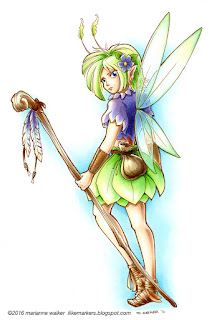 The purple areas are colored with BV11, B66, and BV17, with highlights of B00 and Y000 (Heck, I used highlights of Y000 and B00 throughout all areas of the picture). Green things are colored with YG11, YG13, G02, YG17, Y000 and B00.
I used a few different earth tone families. E40's for the sack and base coat on the staff. The skin is colored with E0000, E11, BV11, E13, E15, B00, Y000. The shoes and wrist cuffs are in the E30's family, with the B00 and Y000 thrown in for good measure.
I'm excited! This came out so much cleaner, crisper, than the one I made 12 years ago. Now, at least one page in my portfolio is updated (only like 30 more images that bug me to go!). Doing this exercise really helped me see just how much I have improved in that time, so I strongly encourage you to also go through and re-color something you made a long time ago.
Ok, I'll share another updated artwork soon!
Friday, June 24, 2016
Giveaways and events
 Summer is here and a lot is going on. I'll get through some announcements, then we'll move on to more fun stuff. If you want to see the live video from the last post on coloring some beautiful goldfish and koi, you can find it Here.
Win a free class in 2017
First, if you didn't know, there is a great blog-hop contest going on right now for the Copic Paper Crafting team. Start playing along on Debbie Olson's blog, then work your way through the questions and email the answers for your chance to win a free class from us in 2017. Hurry! You only have until tomorrow to register!
Upcoming Shows & Events
This Summer Copic can be found at some great comic conventions, so look for us at:
July 1-4th, Anime Expo, Los Angeles, I'll be teaching coloring workshops along with a host of other talented artists, so come see us!
9th - Main Street Stamping, Tigard, OR This class is perfect for adults getting into basic coloring with Copic products. Contact the store for registration details and to find out about future classes.
July 21-24, Comic Con, San Diego Stop by our booth to pick up your favorite art tools
August 4-7 Gen-Con in Indianapolis, IN There will be ongoing classes in creature design, coloring, and map-making for gamers.
Sept. 1-3 Salt Lake Comic Con, SLC, UT stop by our booth for tips on using your favorite art supplies.
Local Kids events
Summertime is my chance to teach a number of local classes to preschoolers, kids, and teens. Check out my list of awesome art workshops:
June
29th Preschool Storytime at Eugene Library Free for your little ones! 10:15 am and 11am
July
8th Preschool Storytime at Sheldon Library, Eugene Free for your little ones! 10:00 am
14th Fern Ridge Library, Veneta, OR 1:30pm Teen Art workshop
15th Preschool Storytime at Bethel Library, Eugene Free for your little ones! 10:00 am
20th Teen Classes at Eugene Library Alcohol Ink painting and coloring with Copic Markers
21st Teen Classes at Bethel Library, Eugene Alcohol Ink painting and coloring with Copic Markers
22nd Teen Classes at Sheldon Library, Eugene Alcohol Ink painting and coloring with Copic Markers
28th Kid's class at Springfield Library, Springfield OR 1-2:30pm Design shoes with Copic Markers
Wow! That's a lot of great events for people to attend this Summer! I hope to see you at one of these awesome places.
Tuesday, May 31, 2016
Alcohol Ink Painting live video
 This Thursday afternoon, join me for an awesome live video where I'll show you coloring techniques, then we'll talk about how to "paint" with Copic inks. The theme is fish (because for some reason I wanted to color goldfish and koi).
 To RSVP to the video, click here, or join us live on Periscope. Thursday, June 2nd, 3-3:40 pm PST
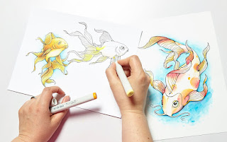 If you want to color along, you can even download the images I'll be working on:
Koi (we will color this one with inks) If you want to follow along, print this onto a glossy paper or photo paper.
Goldfish (I'll be showing some basic coloring techniques on this image) This image can be printed on your favorite marker paper (I'll be working on the Art Paper Pack, but you could print it on Blending Card as well).
I hope to see you at the live feed! If you don't make the live feed, we will be posting a video after the event as well, so stay tuned.
Friday, May 13, 2016
Thoughts from my hotel room...
I'm on the road this week, it's the middle of the night, but I had this thought that I wanted to share...
Last night, a store owner at the event I'm at made my favorite comment of the day:
"How do you manage to get those 13yr old girls coming into my store, dragging their parents, to buy them art supplies?!?"
He's not the first store to tell me that, and that makes me so happy! That 13 is a kid who sees value in creating, and has convinced their parent that making art is a core part of who they are.
Making things defines us and gives us a deep satisfaction. How do you feel when you say the words "I made that!"
I made that art, that cake, that flower arrangement, that goal, that dream, that life ambition...we celebrate and cheer, we pat each other on the back. And we learned long ago that once that was made, we move on to the next thing to make, always striving to make more.
For some people, "I made that" is much harder. I made that bed, I made that step without the use of crutches, I made it out in public for the first time in months. Celebrate!!! You might feel that those are minor things, but not to the person in those shoes.
You know what makes me sad? Giving up before trying. Deciding not to make anything because you feel that it isn't going to be amazing. Doing nothing because someone you've never met in person on the Internet can make it faster, better, prettier, or cooler than you ever could. Thinking that your best friend can make a better cake, so why should you bother, it won't be as good.
I don't know the skill of the 13yr old girl the store owner mentioned. I know my skill as a 13yr old and I see 13yr olds in my classes all the time that are way more skilled than I was at that age.
I do remember that at 13 I didn't really care what I couldn't do, I was focused on making what I could do, making what I wanted, pushing myself to make and make and make. I'd scrounge up my paper route money and bike down to the craft store for twine, beads, paints, cake stuff...whatever creative things I was experimenting with at the time.
I didn't know my future self. I didn't know I'd be typing something like this in a hotel room thousands of miles from my hometown, helping teach art techniques to store owners...not because I'm the most amazing artist ever, (I'm not). I'm here because I was the 13 year old who also felt that constantly making stuff was the coolest thing I could be doing (besides reading books) and I never told myself that I wasn't any good.
I guess my long winded conclusion is really this: Don't get hung up on Pinterest, Instagram, Facebook, or blogs, telling yourself you'll never be that good, so why bother trying? Everyone had to start somewhere. Be that awesome 13 year old in an art store! Celebrate everything you make!
Make what YOU want, and be proud of every bit of it....then start again, and make more.
Friday, May 6, 2016
Color along with me!
 That was so much fun! This morning, we colored some awesome butterflies on our live video feed on Periscope and Google. For those of you on YouTube, you can watch the video here.
We colored the butterfly image from the Intro to Coloring with Copic Markers book, then we moved on to coloring a page from the additional Line Art Pack. You can download the individual sheet here for only $0.99!
I really encourage you to watch the video, even if you don't have the book or line art yet.
We had such a good turnout that we're going to try and host one of these live coloring sessions again in a few weeks. This will also give us a chance to work out some kinks and make it better. So, stay tuned for our next live coloring session. If you have a time of day that you prefer watching, please leave a comment and we'll try to see what we can do better next time. Have a colorful weekend!
Monday, May 2, 2016
Live video on Friday!
 Intro to Coloring With Copic Markers
Check it out! This Friday I will be hosting a live video on either Google Hangouts (click the link to send yourself an invite and info). Or, via Periscope (Periscope is an app that allows you to watch live video feeds).
I'll be showing you some tidbits from the Intro To Coloring with Copic Markers book that I wrote. If you don't have a copy yet, I strongly suggest that you pick one up so you can follow along as I color. I will be starting with the first project in the book, the big, beautiful butterfly. From there, who knows what I'll color? Whatever I color, it should be fun and hopefully you'll learn a few tricks and tips. So be sure to join us, 9am Pacific Standard Time. (Can't watch it live? Don't worry, it will be shared on YouTube).
We will be trying to host regular videos, so stay tuned for more chances to watch and interact with us live. It's the next bet thing to having us come to your town, hover over your shoulder, and teach you how to color.
Monday, April 4, 2016
Upcoming workshops
 Does it feel like Spring yet? My flowers are in bloom, my yard needs mowing, but springtime also means my travels begin. So, if you would like to come to one of my workshops, then take a look at where I'll be, and maybe it will be close:
Papercraft Classes & book signings
Wed. April 20, Afternoon, Heartfelt Hobby and Crafts, Sandy UT Marker coloring workshop. Contact the store for more information.
Wed. April 20, 6-8pm, Treasured Memories, West Valley City UT Alcohol Ink painting workshop. Contact the store for more information.
Sat. July 9th at Main Street Stamping in Tigard, OR. I know it's a long way off, but those classes are already nearly full, so contact the store to sign up soon!
Anime Conventions
Copic will be offering some great workshops at Denver Comic Con, June 16-19th.
Or, join me in LA at Anime Expo over the 4th of July weekend for awesome workshops.
For Kids
I teach a lot of local art classes throughout the year, but especially in the summer. Join me for a variety of ages, from preschool story time, up through teen classes. Here are some to look out for:
Sat. April 30th, 9am-3pm Girl's Rule event, Eugene OR. For girls age 9-14. I will be offering steampunk/fashion coloring workshops. Visit their website for more details.
Then, this summer I will be offering classes at Eugene Library, Springfield Library, and Fern Ridge Library. Most of those classes will be in July, so check each website for exact dates and times.
I can't wait to see you there!
Meanwhile, here is a drawing I made a month ago while at a demo. I didn't take step-by-step pictures of the process, and I don't remember what colors I used, but you can see that I used the airbrush to create the soft focus and lighting effects that you see in the background. I drew the outlines with a cool gray 0.1mm multiliner.
From pencil to final coloring took about 5 hrs. This was based on a photo given to me by my dear friend Maaike in the Netherlands.
Wednesday, March 23, 2016
Blog Winner and Gift Tag
Happy Wednesday! I am thrilled to announce the lucky winner from my blog giveaway- Dani Chapman!
Dani Chapman said...
 Quick Spring Card Project
And, since you are looking around my blog today, I figured I'd share a quick gift tag/card I made from the March Hero Arts Monthly Kit. If you haven't ordered one of these awesome kits yet, don't worry, there are still a few in-stock. Just pop over to Hero Arts to pick it up. It has been a lot of fun to work with them in adapting my Coloring Flowers with Copic Markers book into stamps and projects!
I think this book will be a must for anyone who uses Copics! I love coloring books but this one will be perfect for me so I can get better and more confident using my Copics!
Congrats Dani and I hope that this book will give you some useful tips for any of your future projects with Copics. If you would also like to pick up a copy of this book, you can find Intro to Coloring with Copic Markers here.
 Quick Spring Card Project
And, since you are looking around my blog today, I figured I'd share a quick gift tag/card I made from the March Hero Arts Monthly Kit. If you haven't ordered one of these awesome kits yet, don't worry, there are still a few in-stock. Just pop over to Hero Arts to pick it up. It has been a lot of fun to work with them in adapting my Coloring Flowers with Copic Markers book into stamps and projects!
This little gift tag is made with the cluster of flowers from the Marianne's flowers add on set, stamped with Memento New Sprout colored ink. I colored it using only 6 Sketch markers: G20, Y00, Y21, BG000, R81, and colorless blender. I used the techniques shown in the second project of the Coloring Flowers with Copic book, except instead of having 3 shades of a color, I used only 2, and on the leaves, my lighter green was actually colorless blender, and my darker green was simply allowing the G20 to dry before adding a second layer to get the color just a tiny bit darker.
I'm thrilled with the final color scheme, and how it matched the card base from the kit perfectly. I chose a clean, simple white ribbon bow and was trying to figure out how to make it just a little bolder. After digging for a bit, I found a perfect little pop of yellow bling in my "drawer-o-stuff" to add to the bow. I held the bow and bling in place with a dab of the X-press it Gel Glue.
Have fun coloring!
Saturday, March 19, 2016
Intro to Coloring giveaway
New book for the Coloring Foundation Series!
I was cleaning off my desk and I noticed that I missed a blog post about one of my new books, Intro to Coloring With Copic Markers.
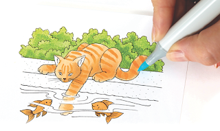 This new Coloring Foundations book is a must have for anyone who wants the scoop on how to use Copic markers! I wrote this book with clear, step-by-step tutorials to guide you through everything from smooth coloring to basic blends. From creating patterns, to properly adding highlights and shadows in a still-life. Images are clean and easy to follow along with, incorporating a good balance of simple to complex techniques.
All the books in the Coloring Foundations series are full color and include text in both English and Spanish. Tutorial images and blank color charts are in the back of each book, ready to be photocopied onto good marker paper.
You can purchase a copy of Intro to Coloring With Copic Markers from the Copic website, or
you can also choose to get an autographed copy of Intro to Coloring with Copic Markers.
Better yet, why don't you leave a comment here on my bog for a chance to win your very own autographed copy?! I'll draw a winner on Wednesday next week. (Limited to residents of US and Canada only, sorry!)
I had a lot of fun writing this book, and I tried to fill it with as many useful things as I could. I hope you find it helpful in your creative process. Good luck winning a copy!
I was cleaning off my desk and I noticed that I missed a blog post about one of my new books, Intro to Coloring With Copic Markers.
 This new Coloring Foundations book is a must have for anyone who wants the scoop on how to use Copic markers! I wrote this book with clear, step-by-step tutorials to guide you through everything from smooth coloring to basic blends. From creating patterns, to properly adding highlights and shadows in a still-life. Images are clean and easy to follow along with, incorporating a good balance of simple to complex techniques.
All the books in the Coloring Foundations series are full color and include text in both English and Spanish. Tutorial images and blank color charts are in the back of each book, ready to be photocopied onto good marker paper.
You can purchase a copy of Intro to Coloring With Copic Markers from the Copic website, or
you can also choose to get an autographed copy of Intro to Coloring with Copic Markers.
Better yet, why don't you leave a comment here on my bog for a chance to win your very own autographed copy?! I'll draw a winner on Wednesday next week. (Limited to residents of US and Canada only, sorry!)
I had a lot of fun writing this book, and I tried to fill it with as many useful things as I could. I hope you find it helpful in your creative process. Good luck winning a copy!

Monday, March 14, 2016
Coloring Ducklings
 Add contrast!
You may have noticed that I posted a new blog header recently. Here are a few step-by-step photos of my coloring process for the cute row of ducklings that I used on my header. I made this picture a few weeks ago, while demoing for the University of Oregon Ducks bookstore. (I figured this picture was appropriate for the U of O.)
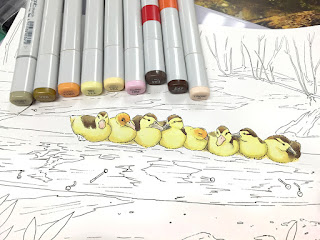 Once again, I need to give credit to my dear friend Maaike in the Netherlands for the beautiful reference photo. The whole process, from line-drawing to final coloring took about 6 hrs.
As with most of my illustrations, I started with a pencil sketch based loosely on the original photograph. Then I traced the pencil drawings with a 0.1mm black inking pen. I copied the outline onto my favorite marker paper.
I started coloring the little ducklings, as they were the focal point of the whole image. Y11, Y21,YR000, R81, YG91, Y28, YR14, E44, E47.
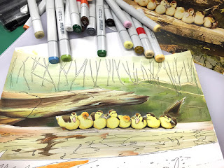 If you look close, you can see a corner of the reference photo peeking out. The log that the ducks are on sits in a murky, swamp with lots of interesting colors floating on the water. It took a lot of markers to suggest the water tones. At this point I was pushing at least 30 colors, so I stopped keeping track of all of them.
I like to put a lot of subtle base colors into things like the logs, then I add my dark colors to build up the variations. Compare the back log, which I've already darkened, to the log in the foreground. It is easy to see the yellows, pinks, oranges, and green in the light log. Then, when I add dark tones, it feels less flat. Also notice the pale blue I added on the underside of the log to suggest a watery reflection.
Contrast makes things jump. So, to make sure the ducklings are bright yellow and dynamic, I tried to keep the water behind them nice and dark. I added dark green dark blue, dark purple, dark browns, and all sorts of colors into the water so it looked murky but alive.
The grasses in the background are not as important, so I didn't emphasize those as much and I kept my stronger contrast in the foreground. However, I threw in a little airbrushing to darken it up back there.
My demo time was quickly ending, and I knew it would be a while before I could come back to finishing this piece, so I wanted to get it done before I left. A big risk with any complicated piece of art is overworking it. Knowing when to stop is important! Having a time limit has kept me from overworking many good pieces.
Here is the finished piece, including final touches of white added back in with the Copic Opaque White with a built-in brush. Scanning in artwork and color-correcting makes a world of difference (the lighting at the demo did not bring out the richness of the colors).
I hope you enjoyed the limited tutorial. It's hard to remember to take process photos when I'm also helping customers. May your week be just ducky!
Monday, March 7, 2016
Hero Arts Blog Hop
 You know what I like to do? I like to draw and color! I also like to make neat things for my family and friends. So, I partnered up with Hero Arts to work on their March Hero Kits. Then all my online friends can also share the fun of coloring the things I enjoy drawing. These kits are packed with all the supplies you need to make a bunch of beautiful cards to share with the people you love. You add the color, and the kit comes with the rest:
The kit contains: 12 coloring cards on XPressIt paper, coordinating stamps and dies, an Intense Black ink cube (alcohol marker-friendly), extra XPressIt paper, assorted notecards, and a package of gems.
There are 3 optional add-on items -
DC184 Ribbon Messages Stamp & Cut: https://heroarts.com/shop-sidebar/dc184-ribbon-messages-stamp-cut/
CL964 Marianne's Flowers: https://heroarts.com/shop-sidebar/cl964-mariannes-flowers/
PS755 Coloring Foundation Book - Flowers: https://heroarts.com/shop-sidebar/ps755-coloring-f…ion-book-flowers/
You can see more at the Hero Arts blog post: https://heroarts.com/my-monthly-hero-is-here-5/
Notice that you can order my Coloring Flowers with Copic book? As an added value I autographed all the books that Hero Arts is selling (I almost got a blister on my drawing finger from signing so many books!). This is a great chance to pick up the coloring flowers how-to book for any of your friends that also love working with Copic Markers.
Flowers are popping up in my yard, and they are popping up on blogs as well. Join our talented designers for this awesome coloring flowers blog hop and see all the neat projects made with the March Monthly Hero Kit:
The kit is available for a limited time only - once it's gone, it's gone, so order soon.
Here are some of the fun cards I made using the stamps, dies, stamp pad, flowers coloring cards, notecards & gems. All you need to add are the markers and your own creativity!
Here are some of the fun cards I made using the stamps, dies, stamp pad, flowers coloring cards, notecards & gems. All you need to add are the markers and your own creativity!
Hero Arts card project
Basic color blends
I am so excited to be sharing these fun, exclusive Hero Arts kits! These little pictures, stamp set, and book were so much fun to draw and color. Each of the provided 1/4 page panels are printed on high-quality X-Press It Blending Card, meaning your artwork will pop when colored with Copic Markers!
For this project, I chose the 1/4 pg panel "Beauty is a light in the heart" These flowers are sort of like poppies, but not really. However, I decided I wanted to work with a vibrant, red-orange color scheme, similar to what you might find on poppies.
Whenever I color flowers, I tend to color the greenery first, and this project was no exception. I started with a smooth base of YG11, then gradually went in and darkened each leaf with YG13 and YG17.
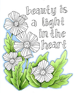
I tried to pay close attention to the veins on the leaves, the shadows between leaves, and the dark areas where the flowers stand out from the leaves. I left the main view of each leaf lighter, as I knew that later on I would be adding more tones over the top.
I finished the leaves with dark accents of G28. Then I added a blue outline to the image with B32. I know I've said this many times on my blog, but contrast is key! Because I have a range of tones from the really light YG11 all the way to the very dark G28, I have a great range of contrast and the leaves are much more dynamic.
The pale blue border pulls everything together. Usually I would add the blue last, but I went outside the lines a little, and the pale blue covers/pushes those mistakes out of the way, so that you don't really notice them as much.
 Next I worked on the flowers. I started by coloring the centers with Y02. Then, I colored the petals with YR12. I also added a faint ring around the yellow portion in the center with the YR12 and blended that out, just to give a little dimension.
I colored each flower with YR12, then I darkened it with R05 and added extra contrast with hints of R29. I was careful to darken under each folded petal so those looked more interesting and dimensional.
I think the red really helps the orange pop off the page more, though I worked with a very orange red (R05) so that it was not changing the tone too much. Also keeping the centers a pure, vibrant yellow as much as possible makes the petals look really sharp.
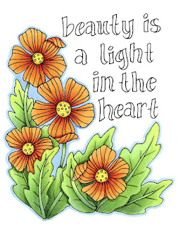
I finished up coloring all the flowers, then I came back with B32 and continued the border around each bloom. I also wanted to add more color depth to the green leaves, so I took the same B32 and added a faint overlay to the shadow areas of the leaves. You can see it in the stems on each leaf. Cool colors, like blue, help make these areas softer and feel more like they are in shadows.
The tips of the leaves I warmed up with a faint layer of Y02. You can barely see it, but it makes those leaves feel more like they are catching the sun. I know it's subtle, but it does help to make the overall piece look more dynamic.
Last, I colored the text with YG11, YG13, and G28. I added a faint blue shadow to each letter on the left side using the B32. This just gives it a hint more dimension.
And, though it doesn't show up on the scanner, I took a peach Spica glitter pen and colored over all the flower petals. Now, in certain light, each flower shimmers. I love how easy this project was and how beautiful it came out. My goal in drawing these cards for you ,was to help you have beautiful results easily, so let me know how it goes with your own project.
I hope each of you has as much fun coloring these as I have had! Now, I encourage you to go visit the rest of our fabulous team members to check out the other awesome creations for this monthly Hero Kit by Hero Arts Blog hop.
I am so excited to be sharing these fun, exclusive Hero Arts kits! These little pictures, stamp set, and book were so much fun to draw and color. Each of the provided 1/4 page panels are printed on high-quality X-Press It Blending Card, meaning your artwork will pop when colored with Copic Markers!
For this project, I chose the 1/4 pg panel "Beauty is a light in the heart" These flowers are sort of like poppies, but not really. However, I decided I wanted to work with a vibrant, red-orange color scheme, similar to what you might find on poppies.
Whenever I color flowers, I tend to color the greenery first, and this project was no exception. I started with a smooth base of YG11, then gradually went in and darkened each leaf with YG13 and YG17.

I tried to pay close attention to the veins on the leaves, the shadows between leaves, and the dark areas where the flowers stand out from the leaves. I left the main view of each leaf lighter, as I knew that later on I would be adding more tones over the top.
I finished the leaves with dark accents of G28. Then I added a blue outline to the image with B32. I know I've said this many times on my blog, but contrast is key! Because I have a range of tones from the really light YG11 all the way to the very dark G28, I have a great range of contrast and the leaves are much more dynamic.
The pale blue border pulls everything together. Usually I would add the blue last, but I went outside the lines a little, and the pale blue covers/pushes those mistakes out of the way, so that you don't really notice them as much.
 Next I worked on the flowers. I started by coloring the centers with Y02. Then, I colored the petals with YR12. I also added a faint ring around the yellow portion in the center with the YR12 and blended that out, just to give a little dimension.
I colored each flower with YR12, then I darkened it with R05 and added extra contrast with hints of R29. I was careful to darken under each folded petal so those looked more interesting and dimensional.
I think the red really helps the orange pop off the page more, though I worked with a very orange red (R05) so that it was not changing the tone too much. Also keeping the centers a pure, vibrant yellow as much as possible makes the petals look really sharp.

I finished up coloring all the flowers, then I came back with B32 and continued the border around each bloom. I also wanted to add more color depth to the green leaves, so I took the same B32 and added a faint overlay to the shadow areas of the leaves. You can see it in the stems on each leaf. Cool colors, like blue, help make these areas softer and feel more like they are in shadows.
The tips of the leaves I warmed up with a faint layer of Y02. You can barely see it, but it makes those leaves feel more like they are catching the sun. I know it's subtle, but it does help to make the overall piece look more dynamic.
Last, I colored the text with YG11, YG13, and G28. I added a faint blue shadow to each letter on the left side using the B32. This just gives it a hint more dimension.
And, though it doesn't show up on the scanner, I took a peach Spica glitter pen and colored over all the flower petals. Now, in certain light, each flower shimmers. I love how easy this project was and how beautiful it came out. My goal in drawing these cards for you ,was to help you have beautiful results easily, so let me know how it goes with your own project.
I hope each of you has as much fun coloring these as I have had! Now, I encourage you to go visit the rest of our fabulous team members to check out the other awesome creations for this monthly Hero Kit by Hero Arts Blog hop.
Friday, March 4, 2016
Hero Arts Sneak Peek
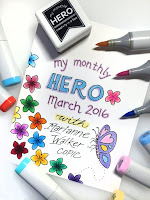 March is here and I'm so excited! Why am I so excited? Because I have been working with Hero Arts to design a fabulous March My Monthly Hero Kit.This kit was based on my Coloring Flowers with Copic Markers book, and now you can have a pile of flowers to color in, using the techniques you learn from the book!
Jump over to The Hero Arts Blog and leave a comment for a chance to win a couple of prize packs! We will have two prizes during the hop: a kit ($29.99 value), and also a prize package from Marianne consisting of a 3 pack of Sketch markers, a Flowers Line art pack, and 3 Kirarina 2win scented markers. Over $40 retail value!
 Prizes will be announced on Monday, when the full kits are announced. Order your kits on Monday, March 7th. Be sure to check back then, as you can also follow along with our inspiring designer blog hop.
Then, once you see the great things you can make from these fun stamps and kits, order your kit quickly! Because the kit is available for a limited time only - once it's gone, it's gone.
Wednesday, February 10, 2016
So much neat stuff!
Wow! I've been so busy working on all sorts of projects. My drawing fingers are sore, and my creativity is high.
 I just wanted to share some recent things I made, and give you a sneak peek at some upcoming cool stuff.
Oregon Asian Celebration
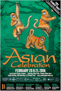
Each year I have the pleasure of drawing the poster for the Oregon Asian Celebration. This is the year of the Monkey, and what better monkey to use than the beautiful Chinese Golden Snub-nosed monkey? I love their blue faces offset by rich golden fur.
The poster is a playful combination of hand-drawn and Copic colored monkeys on a digital background. To get the committee excited about the idea, I found many reference photos online and composed my own drawing of one of these beautiful monkeys, cold and alone on a branch.
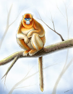 I didn't write down all the colors I used, but I worked heavily with the E40's family, Y21, YR12, YR14, and YR27. The blue is combination of B29, B41, and B63.
Then, I used some very light grays to suggest the branches in the distance, just like I did on this blog post of a bird, from a few months ago.
My sketch paid off. The committee agreed to let me draw these beautiful monkeys, they just wanted them to look a bit more lively than this poor soul, sitting alone on the cold, barren winter branch.
Demo
If you want to join us, we will have a booth at the convention, as well as activities going on all day in the youth art room. You can find more details at their website
Oregon Asian Celebration. The convention is Feb. 20 & 21st, held in Eugene Oregon.

For those of you scattered around the world, here is a downloadable outline based on the poster that you can print and color.
Other Events
I have a few other great things coming up in the near future. Feb. 25th 10-3pm I will be holding free demos at Proudly Oregon, at the U of O Bookstore on campus in Eugene.
April 2nd I will host some beginner coloring classes at Main Street Stamping in Tigard, OR. You can contact the store for more info.
Sneak Peek
OK, that's a lot for now. In the next few weeks I'm going to
show a neat project I'm working on with Hero Arts. Stay tuned!
 I just wanted to share some recent things I made, and give you a sneak peek at some upcoming cool stuff.
Oregon Asian Celebration
Each year I have the pleasure of drawing the poster for the Oregon Asian Celebration. This is the year of the Monkey, and what better monkey to use than the beautiful Chinese Golden Snub-nosed monkey? I love their blue faces offset by rich golden fur.
The poster is a playful combination of hand-drawn and Copic colored monkeys on a digital background. To get the committee excited about the idea, I found many reference photos online and composed my own drawing of one of these beautiful monkeys, cold and alone on a branch.
 I didn't write down all the colors I used, but I worked heavily with the E40's family, Y21, YR12, YR14, and YR27. The blue is combination of B29, B41, and B63.
Then, I used some very light grays to suggest the branches in the distance, just like I did on this blog post of a bird, from a few months ago.
My sketch paid off. The committee agreed to let me draw these beautiful monkeys, they just wanted them to look a bit more lively than this poor soul, sitting alone on the cold, barren winter branch.
Demo
If you want to join us, we will have a booth at the convention, as well as activities going on all day in the youth art room. You can find more details at their website
Oregon Asian Celebration. The convention is Feb. 20 & 21st, held in Eugene Oregon.

For those of you scattered around the world, here is a downloadable outline based on the poster that you can print and color.
Other Events
I have a few other great things coming up in the near future. Feb. 25th 10-3pm I will be holding free demos at Proudly Oregon, at the U of O Bookstore on campus in Eugene.
April 2nd I will host some beginner coloring classes at Main Street Stamping in Tigard, OR. You can contact the store for more info.
Sneak Peek
OK, that's a lot for now. In the next few weeks I'm going to
show a neat project I'm working on with Hero Arts. Stay tuned!
Subscribe to:
Comments (Atom)


