Today I'm teaching a free workshop on drawing Manga to teens at our local Library from 2 to 4. It's been a while since I last taught a Manga workshop, probably this summer was the last time. I used to teach up to 5 different workshops a week in drawing everything from Manga to Comic accessories, 6-10 yr. old drawing classes, storyboarding, and even Photoshop. I really miss teaching everyday, I guess my blog is the best outlet for the craving to teach.
Meanwhile, in honor of the Manga class here is the first part of a discussion on line thickness and "hatching" or "cross-hatching".
Changing your lines from thick to thin
Copic makes a whole pile of inking pens that work beautifully for basic line illustrations. Between the disposable Multiliner and the refillable Multiliner SP there are 14 unique pen tips:
0.03 , 0.05 , 0.1 , 0.2 , 0.25 , 0.3 , 0.35 , 0.5 , 0.7 , 0.8 , 1.0 , Brush Small*, Brush Medium
*note: the BS tip is slightly different between the two pen styles
Then there are the F01 and F02* disposable fountain pens
*F02 is a new style coming out in 2009.
As you can see, among the Copic products there are bound to be a few good inking pens for your illustration work. I strongly suggest that you either get a full set or pick 3 to 4 pens in a good range of sizes so you can have the most flexibility in illustrating (papercrafters should also keep a good range to touch-up their lines and for journaling).
Why would you need more than one pen size?
If you had asked me 15 years ago I would have said "you don't". 15 years ago my high-quality inking pen choice was a black, fine ball-point pen that came in a 2-pack at the local K-mart for $1.50. That was big money, and I was forever riding my bike down to pick up a few more inking pens since they would run out so quickly (I drew a LOT). Today I tell you otherwise, since I have learned the reason after many years of practice.
My second year in college I was introduced to Copic. From then on, I never went anywhere without a set of the disposable multiliners. I can't tell you how many BM and BS pens I went through since they put so much ink on a page, however, my other pen sizes seemed to last much longer. I did a lot of hand-drawn animation and I had to keep all my line sizes consistent so I usually would stick to a standard 1.0 or 0.8mm since those looked good on our old animation equipment.
The more I got into drawing comics though, the more I needed varying line widths to make my artwork interesting. Thick and thin lines accomplish a many things, but the basics are:
1. Varying line widths give the illusion of dimension. A simple circle becomes a ball by making one side of the line thicker.
2. Varied line widths give the illusion of weight. An object becomes grounded or heavier when you have a thicker line on the bottom
3. Thick and thin lines give the illusion of lighting. When you see thick, heavy lines you can feel the shadow and where the light is hitting something.
4. Line variation is dynamic and attracts the eye. If you write a word with a regular pen it is not nearly as interesting as if you write the same word with a calligraphy pen. The eye is attracted to a line that changes widths.
When you are working in inking pen you really have only black and white to share the ideas of weight, dimension and light. How do you share the feeling of "gray" or in-between black and white without using color or a gray pen?
In illustration there are many techniques these days, from digital screen-tones and pixels or with traditional stippling or hatching/cross hatching. Stippling can make you go mad though, since it really takes a long time. A much easier and still very much traditional technique would be Hatching.
What is Hatching/Cross Hatching?
You don't see this technique as much as you used to since technology and styles have changed the way people draw, but hatching is a way of drawing lots of lines close together to show volume or shading.
If you think of old illustrations (like my drawing here of the Mad Hatter based on the original Alice In Wonderland book illustrations), you'll know exactly what I mean. Many old illustrations were made in this way because it is easy for a printer to reproduce. From a woodcut or an engraving you can ink this in black and print it out, with people feeling the full range of tone without switching printing inks.
Cross hatching is when you draw more thin lines in the opposite direction to darken up an area. Depending on how fine your pen is and your technique, you can deepen your cross hatching from very light to almost black. The trick comes in learning to keep a steady hand and making your lines consistent and even. Illustrators a few hundred years ago had a lot more patience than I have, since their work was beautiful, detailed, and meticulously drawn.
When used in conjunction with thick and thin outline syou can really show the full range of grays using simple black lines. This is the same concept computer illustrations are based on. Remember the days when the screen was 9 inches and black & white? To show grays you would add more pixels closer to each other and fewer pixels as you got lighter. There were some amazing illustrations made with those clunky pixels. Hatching and cross hatching allow much more freedom than the old pixel techniques, with finesse and skill playing a key role in how much the eye is fooled into thinking the object is gray.
I'll leave you today with a simple cube on which I've added cross hatching. Click on it to enlarge it and just ponder the power of tiny little lines. Notice areas where I had to shift my hand or the paper and it caused a break in my smooth pattern. I really appreciate the skill and effort good hatching takes and how exquisite old illustrations are. I'll talk more about hatching techniques later. Have a grat day!
Tuesday, December 30, 2008
Saturday, December 27, 2008
Glossy cardstock part 3, blending
I hope everyone has had a chance to recover from a long and busy Christmas week. My life gets so frantic it's hard to sit down and mellow with my markers. However, here is the continuation of my discussion on glossy cardstock.
Not all glossy papers are created equal
What I am showing you is a glossy paper that doesn't work very well, in my opinion. Some will work better, and some will work more like vellum with your markers. Some glossy papers you might prefer coloring on and some you might never want to look at again.
Don't avoid it until you've tried it.
Blending on Glossy paper
Here are my blending experiments on glossy. You'll have to dig through my archives for June/July '08 to see the comparison techniques on absorbent cardstock.
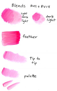
As you can see, starting with the light color, adding dark, then going back with your light marker doesn't really work on this paper. You still see the edges on the dark colored blob. Likewise, starting with dark and adding light doesn't work.
Feather blending looks a little better, but it's still pretty streaky. Also, you quickly run the risk of adding too much ink and creating blobby edges with ink buildup. Not very pretty.
Tip-to-tip blending and palette blending look much better. This is also good for the tiny areas you color in, so maybe this is going to be your best bet for smooth blending when working on glossy papers. Keep practicing to tell how much darker ink you have on your light marker tip until you get the look you are craving.
Colorless Blender on Glossy
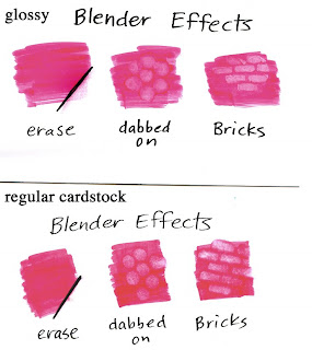
The colorless blender does not work the same on glossy paper as it does on regular cardstock. Look at my comparison here between glossy and regular paper. I strongly suggest that you compare the two for yourself side-by-side to see the subtlties, since my scanner makes the glossy look better than it does in real life.
First of all, it won't erase. The ink has no-where to suck into, so it doesn't go anywhere. It also leaves a residue in the fibers which, because they are coated they won't go away.
Special effects look different. Look at the blobbing and the bricks. You can see how the color pushes out of the way on the regular paper, but on the glossy it just gets lighter. It doesn't stand out quite as much, but the edges are crsiper than they are on regular paper. You might like one better than another.
Personally, losing the ability to erase makes glossy paper unappealing to me. This is a basic blender technique that is way too useful, so I'm not a big fan of glossy (I make a LOT of mistakes and I rely on my blender to make those mistakes go away).
The blender is a good tool for removing heavy ink buildups even if it won't erase completely on glossy, but it also discolors the area around it slightly and can cause even more little ridges like the ones you were trying to remove in the first place. Use it carefully as a removing tool but be careful since a little goes a long way. Also remember to clean the tip really well after using it with glossy paper.
Try other colorless blender techniques on your own- Nasty Rag techniques will still give you good results. If you are dabbing blender on, test to see how juicy to add your blender, since it will spread more on glossy.
Dirty Blender tip
Glossy paper makes the tip of your blender dirty very quickly because the ink doesn't soak into the paper, it just gets on your blender tip. Keep a piece of absorbent paper as scratch paper to clean off the tip frequently (you can't clean it off on glossy- the glossy won't soak the color off). Don't put your blender away dirty! the next time you come to use it the color will have diffused throughout the pen and might not be clear anymore.
Test each and all of your papers before you decide whether it's a winner or not. This is not to say that one is better than another, rather, each will feel different and you will like the way one works better than another. The way I test a paper that is absorbent is posted here. This doesn't work on glossy papers. Glossy you'll want to test a little differently, since you won't have feathering problems.
To test glossy paper
1. Evenly color a blob (see glossy paper part 2). Does it seem to streak more than other glossy papers? If you can tell a difference then maybe this will be a deciding factor.
2. How well does it blend? Make swatches like I did above to try it out. Test each blending method before you make a decision.
3. How does the colorless blender work on it? Again, try making swatches just like I did to see if you like the way it works.
4. Always test your markers and inks on a new paper. This is accomplished in the same way as you would on regular cardstock, since it's the line bleeding that we're worried about, not the paper fibers spreading the ink.
Whatever paper you choose to work with, the key is practice. The more you practice techniques on that paper, the more it will look good to you. Don't give up. If someone else shows you great results on the same papers and inks that you're using ask them how they got that look.
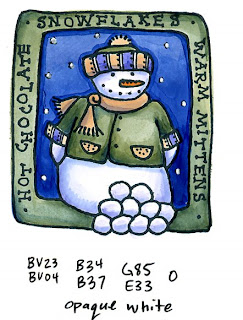
For my final example today I've colored this adorable little snowman stamp by Lockhart Stamp Co. I used Memento Tuxedo black ink on glossy cardstock. I used a lot of palette blending for the tiny details, and used the colorless blender to remove excess ink buildup. For the stars (or snowflakes) in the sky I waited until I was totally done and added opaque white. I don't like how crisp the edges are and how unforgiving this paper is, but with practice you still can get beautiful results on glossy.
Labels:
beginner,
paper,
smooth coloring,
techniques,
tips
Monday, December 22, 2008
Glossy Cardstock, part 2 - Smooth Coloring
As I suspected, some of you had more questions about what kind of glossy cardstock I was using, and yours doesn't seem to work and you can't blend, etc. Don't worry! I'll explain. Just remember, glossy paper is NOT as easy to use as regular cardstock, so you won't get the same results you do with regular cardstock.
Glossy Papers
First of all, I am using a regular glossy paper that we print on at work. We have 3 weights that we use, and for simplicity I'll say thin, thick, and coated cardstock. It doesn't matter which type I'm using, it's the fact that it's glossy. No, it's not Alcohol Marker Paper, like the Copic paper or the Bienfang Graphics 360; rather it is glossy paper, sort of like what magazines are printed on but just a little thicker.
Glossy photo papers should work, though some have a thin coating that the markers "eat" through. If you start coloring and it seems like a layer of something is peeling off or getting mucked up, then you probably shouldn't use that paper. Test a small area before coloring a larger piece.
Before I get into blends, I want to make sure that we have smooth coloring down first, so today we'll talk about getting smooth colors on glossy paper. Glossy paper is very unforgiving. If you make a mistake and go outside the line you can't fix your mistakes with the colorless blender. Sorry, doesn't work. You get one shot to color correctly and that's it. At least on vellum you can erase your mistakes. As someone commented, their paper seemed to dry too fast. Yes, the glossy paper dries very quickly and doesn't give you time to blend smoothly or erase, rather it just adds another layer of color and looks bad.
Smooth Coloring on Glossy paper
The best advice I can give you to get smooth coloring is to don't lift up your marker from the paper and color fairly quickly. Any time you lift up the marker you will get streaks. Color in small circles, color back and forth, whichever way works best for you, just don't lift up the tip of your marker.
When I lift up on each stroke do you see how streaky the colored area gets? Even in that short motion the paper had a chance to dry and the marker streaks. Don't worry about soaking through the paper, glossy doesn't work that way.
I do like the effect you get from dabbing color on, it has a nice mottled feel.
As for layering, it is really easy to color a second or third time and get your base color darker. Notice I'm not getting any blends. With glossy paper you will have a much easier time getting crisp shading lines, not smooth blends (more on blends later).
No matter how you look at it though, glossy paper is NOT the same as regular cardstock. I was getting best results from the brush end of a Sketch/Ciao for these examples. With the broad end of a Copic it's a little harder to avoid streaks. The fine point is great for smooth, tiny little details however. I do like how crisp and clean my Memento ink stamps onto coated or glossy cardstock- it's very rich, deep, and clean, even on the tiny details like the example in my last post.
Stampin' Up Paper
SU! Whisper White cardstock is a hybrid paper. It is a coated paper intended for water-based coloring media (markers) so it doesn't pill up when colored on with SU! markers. When using Copics on SU! paper you will get better results if you treat it like a glossy cardstock, NOT a regular cardstock. This is why I have said before that you shouldn't use SU! paper with your Copics. If you color in the ways I have been teaching for regular cardstock then it just won't work very well. Some people use it for coloring with Copics and they get great results. Now that I've explained why it doesn't work as well or how to get it to work better maybe you can get it to work better in your projects (let me know how it goes).
For my final artwork today, I am working on thin, regular glossy cardstock (I don't rememebr what brand or the exact weight). I used Memento Tuxedo Black ink and let it dry well. Image is from GCS Artstamps, Daisies.
Saturday, December 20, 2008
Glossy Cardstock, part 1
So far in this blog I have mostly worked on absorbent cardstock. Why? Because in my opinion it has the most options and gives you the most flexibility in coloring. Is absorbent cardstock the BEST? No. Each paper type has its own weaknesses and each colors vary differently.
Today I want to start talking about another kind of cardstock and all the fun things you can do with it. This is not to say that it's better or worse than other cardstocks, rather there are diferent ways of using it and you will ge t very different results than you would on other papers.
Glossy Cardstock Intro
Before we get into techniques, here are some things to keep in mind about Glossy paper (this is not vellum! I already talked about working on vellum and it's different).
1. Glossy paper is coated so ink has nowhere to go. You can't pile up layers of color and expect them to smoothly blend like on other paper types.
2. Glossy is coated so colors don't soak through. No checking how well you've done on the backside, sorry.
3. It picks up less ink to color evenly. See the example. Less ink means lighter colors, less ink also means your marker lasts longer without needing to be refilled.
4. Test your outline ink well. You might not be able to use a Multiliner to fix lines, or your stamping inks might need to dry longer. Heat set it, let it wait for a while before coloring, try lots of different papers as well. Some papers will work better than others.
5. The colorless blender will not work the same on glossy as it will on other papers. Any blending will be very different.
6. Less is more when it comes to coloring. Ink will pool up and blob or streak very differently than on other paper.
7. Glossy paper is fun to do ink effects on.
Ponder these first few points for a while, then I'll talk about how to get good results on glossy. For my comparison today I used the stamp Dr. Pea-Nut from Our Craft Lounge. I colored him first on glossy paper, the second time I colored him on some regular absorbent paper. Notice how very different each color looks between the two images and how layering the same color shows up so much more on the glossy than it does on the other paper. Stamped with Memento Tuxedo black ink (let it dry well on glossy).
Thursday, December 18, 2008
Copic Certification, Winter 2009
Time for updates on upcoming Certification classes! I have a couple venues in the next few months that I will begin sending out applications for in early January, so keep your calendars open and add yourself to the mailing lists. Each class runs from about 9 am to 4pm and cost will be around $120 per session (you get more goodies in 2009)
January
CHA Classes, Two sessions, January 23 & 24. There are still a few spots open to stores, teachers, and members of design teams. Contact Kris at orders@copicmarker.com for more info or call us here at the warehouse 866-662-6742 (US) or 541-684-0013 (outside US). Note: These are NOT classes that you will find listed on the official CHA education program.
For the following classes, please get on the mailing list by using the application here on my blog sidebar.
February
New Orleans, LA (18, 19, or 20, exact date TBA)
Pensacola, FL 23rd. Gathering at Flourishes to follow
March
Westport CT, (19th or 20th, exact date TBA)
Rochester, NY (22nd or 23rd, exact date TBA)
Toronto, Ont. 24
Sally Lynn Certification Classes
Get on my mailing lists for these classes using the registration on the side as well.
February
Long Branch, NJ Feb 22nd
March
Topsfield, MA March 1
Camp Hill, PA March 15
April
Chino CA (L.A. area), April 26th
Wednesday, December 17, 2008
Using colored pencils to lighten areas
A couple weeks ago I mentioned in a post that most people pick Copic colors that are too dark to start. Instead of investing in a whole new pile of Copics (which will probably happen anyways since the markers are so addictive) here is a way to get more from what you already have.
Adding Light with Colored Pencils
For today's technique we are working opposite of a technique I shared back in August for using colored pencils with Copic markers. For that post I was working with light marker colors and adding dark colored pencil, for today's technique we're going to be using dark marker and light colored pencil.
Colored pencil is a wax that leaves an opaque residue behind when you are working with it. Colored pencils look better on a paper that has a slight tooth to it, since this helps pull the color off the paper, so today I'm working on a rough textured paper (sorry, I don't know what brand).
Remember: Always use the pencil LAST. Otherwise the wax clogs your marker tip.
If you have a dark colored area you can overlay a lighter colored pencil and cover up the darker color, to some extent (it's hard to get back to pure white, rather, you can get close with a white pencil). This is handy when you are in a small area and you colored it too dark, but pulling the extra color out with your colorless blender would leave a bigger mess than you had in the first place. Just add a dab of light pencil and you're good to go.
One nice thing about colored pencil is that you can overlay lighter colors that normally you would have a hard time blending back into a dark area with marker. If you look at my example you can see that I added a few different tones of pencil over my dark red and each came out feeling a little different.
For my final example today, I'm working with the stamp set Poppy Patch by Flourishes. Notice in the first example you can only get so much color variation from a YG67 and a R59. Both colors are dark and they make the poppy seem flat. I like that even on this textured paper the marker looks smooth and clean, but having dark colors is a bummer.
If you add a bit of light colored pencil you can quickly and easily bring back some of the highlights and make the image not so blah and dark. It changes the tone of the poppy to more of an orange, rather than a deep red. The texture on the paper also adds to the feel of the artwork. It reminds people that these were colored by hand and not generated on a computer.
Monday, December 15, 2008
Coloring Icicles
It snowed! Around here it only happens a few times a winter, so it's still a big deal. In honor of our snow I figured now is a good time to look at how to color icicles. This is an advanced post because I know most of you will never think of coloring your icicles this detailed.
Two ways of looking at Icicles
I'm splitting icicles into two directions because they're colored a little different depending on where you stand. You could be looking out through them (you're inside a house looking out through them at the light) or looking into them (you're outside and looking at them with the light behind you).
Either way, you don't just see a row of white- you see a distorted reflection of light and color.
Here are my two examples. I drew these with a 0.1 mm Multiliner onto color laser copier paper. I colored the backgrounds first so we can get an idea of what colors the icicles will be reflecting.
For the picture looking at the side of the house, you can see that I showed where the light was coming from by drawing the shadows of the overhang and of the icicles. The computer really made these color jump out- in real life they are much more subtle (I think I like the heavier contrast).
Look at how strange the icicles look when they are left white. They need something. Ditto for the next one.
In this picture I'm showing the icicles from the other angle- as if you are inside the house or behind the icicles looking out at the snowy yard. The scene is much brighter, but the icicles still look strange with no color or contrast to them.
So how do I add light and color to something that is clear and colorless? I asked myself this question, then I went and ran an internet search on icicles. I looked at lots of photos to figure out the shading distinction between the two directions of light. I'm not saying that my directions are perfect, but I have tried to simplify the coloring as much as possible. With practice this will be much easier and look better, but this is my first time really slowing down and looking at how to draw icicles as well.
Understanding Icicles
1.Ice is clear. There may be bubbles in your ice, but these will show up as white, so they're easy to draw.
2. Ice is shiny. This means it reflects back light. Things that are shiny have high-contrast.
3. Ice has mass that light passes through. This means that it changes the color, ever so slightly, of what is around it.
4. Icicles are cylindrical. Any object on the other side will be distorted into long skinny shapes.
Now that we've looked at the nature of Icicles, let's simplify the coloring into diagrams. Here are my two different icicles. I put a sun in the picture so you can get a clear idea of how light passes through the icicle.
First of all, notice that when we are looking into an icicle, or standing outside the house, the color is in the middle of the ice. It is white on the edges, and it has the strongest contrast on the edge where the sun or light source is strongest (where I put "dark"). If you are looking at sky on the other side, then the colored area will be a darker shade of blue. If you are looking at an object, then the colored area will be a muted shade of that object. You'll have the richest color contrast right on that edge where the light and color meet.
Now let's look at the other icicle. Here is where you're inside, or behind the icicle looking out. The colors are reversed. You'll have white in the middle, surrounded by color, though you'll have a white highlight on the side with the sun. Again, look at the strong contrast between the colored area and the sun-side. Again, the colors from your surrounding objects will be squished and muted into the icicle.
So let's apply this to our artwork. Here I've taken my background colors and picked out a couple basic colors- BG93 for trees/house, B32 and BG10 for the sky. I'm going to lightly, carefully color the middle of each icicle on the house and color the edges of each icicle looking away from the house.
Notice on the top example that the icicles on the outside have more blue- you see more sky at the corner of the house. The other icicles show more of the gray blue-green.
On the bottom example you see how I put more blue at the top for the sky, then I used more of the green-gray on the side closest to that tree (it's picking up the color all the way over there).
Then I used my blender on each picture. Ont he top example I was careful to bled from the outside in, on the bottom example I blended from the inside out. See how very different the two icicles look. I'm not worrying as much about keeping the whites whitest, since my final step is yet to come.
Icicles are not completely straight, rather, they are a little lumpy as the water drips down. to heighten this effect, when you are coloring them, color in little uneven strokes. When I used the blender to go back over the icicles I added lumps, or spots where I held the blender pen in one place longer than others. If you look at the final close-up of the large icicles, you'll see where I used the Opaque White and also increased this effect.
Last, to finish up my artwork I need to add contrast back in and make those whites their whitest. Here is where I carefully painted in Opaque white. Notice how I added dots on the side of each icicle? this is to simulate how light catches and reflects back from lumps on the icicle and looks even brighter, or it looks like glistening drops of water. It also helps break up my black lines, since real life doesn't have black lines around it. I also added a few stripes to the window to make it look more shiny. I hope this inspires you to look at icicles in a little different way, have a great day!
Saturday, December 13, 2008
Copic Gallery and Blog Candy Winner
I hope everyone is having a great weekend. In my last post I breifly mentioned the Copic Gallery. For those of you who haven't visited the Copic Marker website, this is a feature you should check out.
Every few months we get a new featured artist. It's Debbie Olson for a little while longer, then it will be someone new and exciting who uses Copic markers in a different way. The fun thing about the Copic gallery is that there is a wide variety of people who use Copic markers. It's pretty neat to see the variety of things produced out there- from comics to cards, to sketchbook art or professional designers.
You can also submit your own artwork to the gallery. Submit what you think is your best project and follow the directions you see on the gallery page. It's that easy. We like to rotate new and old stuff, so if you think that you have made something that really shows off how you use Copic markers in a fun way, please upload it! (in the fine art section are two pieces by me, can you guess which ones?)
As promised, here's the winner for my blog candy. There were 109 comments, so thank you very much to everyone who played along. Kris had a great birthday and really enjoyed the cards. The winner was chosen by Random.org, a simple way to get random numbers generated.
True Random Number Service
Random Integer Generator
Here are your random numbers:
39
Timestamp: 2008-12-13 08:05:44 UTC
Which means the winner is Janet. Janet is a fun papercrafter who likes her music loud, her stamps cute, and is giving away her own blog candy, so check her out!
OK, I'm heading back to bed. It's supposed to snow this weekend, but hopefully it won't do that until after my cardmaking class this afternoon (there's still room if you can come, class goes from 1 to 3- it's a fundraiser for the art gallery my husband and I volunteer for- DIVA). Snow will be a nice change from the rain we've had the last few days. We get about 3 snowstorms a winter here, and when we do everything closes down over that inch or two of white. Have a great day!
Friday, December 12, 2008
Skin Colors Part 3 - Adding blush, part 1
Today I want to talk about adding blush to a colored image. I'm not the kind of person that likes applying make-up, so I find that adding a hint of rosy color to a face is a tricky thing to cover. Too much color? too little color? that's a matter of personal taste.
Also, thank you to everyone who sent cards to Kris. She had a fabulous birthday (we have the best cakes when it's someone's birthday down at Copic) and appreciated all the cards. If you would like to be entered in the blog drawing you can still sign up on Wed. post until midnight. However, you don't need to send Kris a card, rather, upload some artwork to the Copic Website gallery.
Simple Blush
I'm going to start with techniques today on a simplified face (I'll cover more detailed, realistic faces later). For this project you'll need some good pale skin colors (lighter colors are easier to practice over, I'll talk about other ethnicities later). I was about to draw a cute little face to color since I don't own many people stamps with faces big enough, and then I remembered I already had a stamp I could use for just this occasion (silly me, forget that I drew this in the first place). So today I'll be using little Anna Mae by OCL and talking about blush.
Before we get started, remember a few things
• For soft edges, work wet
• A lighter color will push a darker color out of the way if it is juicy enough
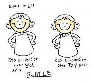
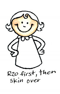
For my examples today I'm using E000 and E11. Each time I colored the face I started with E000 coloring in circles to get a smooth base color, then I added the shadows with E11, then came back with E000 and smoothly colored over the whole thing again to really blend in the shadows. I happen to be using R20, or Blush as my blush (go figure), but you'll want to try your own colors and find a blush that works for you.
Strokes vs. Dabs
There are two basic ways to apply color with a marker. You can either stroke it on or dab it on. The key difference is how much ink are you putting down. Color that is stroked on, or one quick overlay doesn't always soak through the paper, rather it is gently resting on the surface and overlays the base color, but you can still easily see the color underneath.
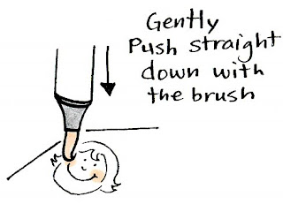
Dabbing, on the other hand, is applying so much ink that it pushes the other color out of the way. You can get this effect easiest with the brush on a Sketch or Ciao because they are so juicy (see diagram), but you can get the same effect with the firm points by coloring in the same spot so much that it soaks the paper and moves the other color out of the way (one upshot of using the brush for dabbing is that if you push straight down you can get a perfect circle each time, no scribbling in a circle and hoping it's the right shape).
Let's look at the difference.
Brushed = Subtle
On my first example I have little Anna Mae with R20 brushed on wet skin. See how soft this is? You can barely see it, but it is subtle and the edges are very soft. The next example I brushed it on over dry skin. The edges are a little more crisp. Either way, I'm not soaking the color all the way into the page, rather, it's one quick stroke to leave a hint of pink over the skin.
If you are trying to tone down any object (if it's too dark and you want to add gray) then this is the technique that will give you the best results. You keep the color underneath, but you can still see the top color you are applying.
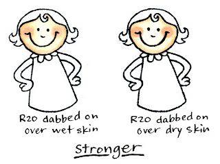
Dabbed = Stronger
On this next pair, you see that I dabbed the blush on. Look at how much darker it is. The first example I dabbed it on while the skin was still wet. This gave me softer edges.
The second example I dabbed the blush color on while the skin was dry. Notice how much crisper the edges of the blush are. Either way, the color of the blush is stronger and you see much less of the skin tone through the blush. On darker skin this would really stand out.
I like to use a variation of this technique when I add subtle highlights into hair. If you have colore dsome dark brown hair, try taking a lighter yellow and streak in some juicy highlights. This is easy to do with the fine point on a Copic original marker, just color over the same streak about 3 or 4 times until the darker color moves out of the way. By using yellow it adds tone, whereas blender would just lighten it and not look as interesting.
What if I do the blush first?
This is fine to try on lighter skin, since you'll still be able to see the light blush underneath, but on darker skin tones you'll have to make the base blush darker. When you do the blush first it looks a lot like the example of the blush brushed on over wet skin. If you find a color combo that you like then write it down and remember the technique you used.
For something like blush, it's usually easier to do the dark color first then add the light color. that way you can judge better how much color you need to add. When you do the light first, it just gets overwhelmed and you loose it.
Making shiny cheeks
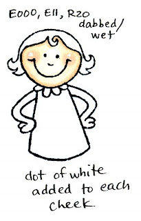
If you remember back to my posts on Opaque white, you'll know that I use white to add highlights back in. This is also a good way to show something is shiny. Magnolia Stamps suggest adding a dot of white to the middle of the cheeks on their characters. The reason they do this is because the contrast grabs your attention and pulls you into the cute cheeks. Second, it makes the cheeks look like they're shiny and sticking out more (like the extra light shining off your dimples). Here I've added a dot of white to Anna Mae's cheeks. I don't know if I like the look with this particular picture, but again, it's a matter of personal taste.
None of these methods I've shown today are right or wrong- they're just different. You may prefer the look of one method better than another. The trick is for YOU to try it for yourself and get the feel that works for you.
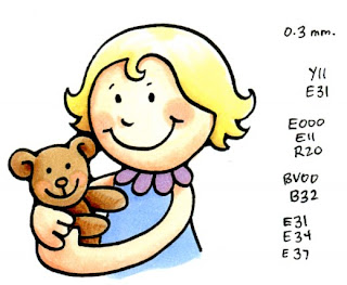
For my final art today I broke down and drew my own picture of little Anna Mae. I added blush both to her cheeks and her bear's cheeks using the dabbing method. See how much the color on the bear was pushed out of the way? Anna Mae looks so cute, it helps me forgive her for the sleep I've been missing as her last few teeth come in.
Wednesday, December 10, 2008
Washed-out Effect & Blog Candy
Happy Birthday to Kris
As I was thinking about what to post today, I realized that tomorrow is the birthday of Kris, our front desk manager extraordinaire. So I have a little favor to ask you...
Kris handles all the applications for the Certification classes, answers phones, and keeps me in line. She also LOVES all the cute cards people submit, either digitally or physically in the mail.
All I'm asking you to do is take one photo of a birthday card you've made- it could be made for a kid, a guy, or even your grandmother- and e-mail it to Kris this week. If you don't make cards, then send her a photo of some artwork. You could have posted it on your blog a month or a year ago, it doesn't matter, just send a quick e-mail to Kris. This will be my surprise to her: an in-box full of cute birthday greetings from across the country. Title the message: Happy Birthday to You
her e-mail is orders@copicmarker.com
Once you've sent her an e-mail, come back here and leave a comment. I'll enter you in a quick prize drawing for a handful of Ciao markers.
It's that simple. On Saturday at 12 am I'll chose a winner and post it here. Thanks in advance for helping me make Kris's birthday a fun one. I know she'll be smiling all week long :)
Edit: I came into work this morning and had a big smile waiting from Kris. She was VERY surprised and VERY grateful for the cards! She is really looking forward to seeing more cards and artwork, so THANK YOU!!!
Washed Out with Colorless Blender
Here is the artwork I made for Kris' birthday card. I'm not saying Kris is really old, but she is older than me, so that makes her old in my book (I used to be the youngest one around here at the Copic office, but it's been a few years since I could still make that claim).
This is an easy technique. It doesn't matter too much what paper you use, as long as it's cardstock. Start by loosely coloring with a few colors. You don't have to stay in the lines or anything, you're just getting some color down on the page.
Then, I took a blender marker and dipped it into a big bottle of colorless blender solution and dripped it onto the colored areas. Simple, fun, washed-out coloring.
The scanner didn't pick up all the subtle drop-looking blobs, but in real life it looks pretty cool. I love how the color on his hands and the ribbon really washed out of the lines. Before I glue this down I'm going to add more cute grunge and dirt to the edges to really make it look like this card is ready for the happy grave it has waiting. I know Kris will love her card!
Local Classes
On another note, I'm teaching a cardmaking class this Saturday the 13th from 12:30 to 2:30 or so at DIVA (Downtown Initiative for the Visual Arts) here in Eugene. Please register by 5pm tonight if you can come. All supplies are included, and this is a fundraiser for DIVA. I'll be bringing paper, altered art supplies, and all the Copics we can play with (even an air compressor!). To register, visit their website at www.divanow.org
Certification, CHA
There is still space, though these classes are filling up quickly. Contact Kris right away to get added to either the Jan. 23 or 24th class.
Thanks again for all your cards. You'll really make Kris happy and you'll let her know that we appreciate all she does for us down here at Copic. Good luck winning the prize!
Tuesday, December 9, 2008
Coloring Pine or Palm Trees
I'm Back! What a great trip. It was fun to see the palm trees all decked out in Christmas lights and it was nice to be able to wear flip-flops again, if only for a few days. Whenever I go to S. California I love to draw palm trees, probably because we don't have any up here, it's too cold.
Coloring Pine branches or Palm fronds
In honor of the season, here's a quick tutorial on coloring palm fronds or pine branches. The steps are the same for either, it's just the climate that is different. The trick to coloring either type of branch is remembering your lighting. Pictures with more contrast are more interesting, so try to get light, middle, and dark into your picture.
1. Start with the background sky
If your background will be light blue then start with that FIRST. IF it's going to be a darker background, still color it first, but be more careful that you don't miss spots. The nice thing about a blue sky is that blue is one of the colors in green, and our trees are green.
Evenly color any area that might peek through the branches. On these pictures that I drew with a 0.1 mm multiliner, note that I went pretty deep into the drawn areas with my light blue. This assures me that once I layer in my greens there will be no spots of sky that I missed. If I accidentally colored over a bulb or ornament then I can use my blender and touch it up later.
2. Add your lightest green to the largest area.
In this case, I'm using G14, a nice, bright green. It may seem too bright, but trust me, it will get toned down.
Instead of coloring in circles, color in little flicking motions out from the middle of each branch/frond towards the tips (see the mini diagram in the photo). Don't worry about soaking through the paper, since our blends are different for something like this. Color the middle of the branch as well. Keep all your strokes consistent, but they don't have to be even on the ends. For something like this you can use the brush end of the Sketch/Ciao marker, or the fine end on a Copic Original.
At this point we haven't worried about a light source, since these are both base colors, but I've drawn arrows to show our light for the next step.
3. Add middle green
In this case I'm using G17. Add it stronger on the side of each branch that is farther from the light, but also add a few strokes on the sunny side. Where the two branches meet, go heavier with the dark green.
Pine branches will be denser and darker than palm fronds, so it's OK to use more of the middle green on these. Just remember to leave some areas of the light green for more contrast, particularly on the tips of each branch. Since they don't shed their needles, the tip of each pine branch is lighter green where new growth is taking place, so keep these lighter.
4. Add dark green
Just like on the last step, go darkest in the shadows, in little flicking motions that follow the growth on the branches. Use even less of the darkest, leaving areas of lighter green showing through.
On the palm tree, I used none of the dark green on the sunny side, since palm trees get more sun than pine. On the pine tree, note how I darkened the whole lower branch, leaving only the tip in light. I also am going to add a few hints of C8 to really darken up the pine's shadows. Now you can feel a difference between the two tree types, even though we used mostly the same colors.
How do I know if I've used enough light and dark?
I like to hold a picture a few feet from my face and squint at it. If you can still see good contrast between parts/branches, then you have enough contrast. If it all seems to blur together and you can't tell what's important, then try adding deeper shadows or leaving more highlights next time. Do this a few times while coloring, it really helps you get an idea for the overall picture and you can see better where your shadows and highlights are messed up.
5. Final Touches
This is where you finish coloring the pine branch with it's ornament and string of lights. Keep the highlight on the bulb consistent with your light source, and add shadows where the branches overlap the top of the ornament. I'm not adding any glow to the little string of lights (it's daytime they're not turned on), but if I were to add some glow, I would have needed to plan that in earlier and left the branches immediately around each bulb a little lighter.
The final, final touch is to add light back into the picture by touching in some Opaque white (go check out this link for another example of pine trees colored in). This makes the ornaments shiny, shows crisp definition on the pine needles, and adds some sunlight onto the palm tree. Remember, a little white goes a long way, so go easy on the white. One nice thing about Opaque white, is that if you do use too much, you can gently wash it away with a wet brush and it won't mess up your artwork underneath.
Here is my finished artwork, with all my notes erased and the Opaque white added. Look at how the picture seems to pop out of the page with all those layers of contrast. I hope this helps you make some fun images this holiday season. Again, thank you to all the fabulous people I met with on my trip this weekend.
Subscribe to:
Posts (Atom)