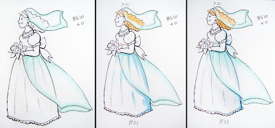
 Every now and then I get a question that I think everyone would benefit from the answer. Here's one I got recently. Just so everyone knows, I was NOT planning on posting anything else about the Colorless blender today, I really was going to move on to talking about the differences between markers, but this question just fit in too perfectly with this week's earlier posts.
Q. I have several of the sketch copic markers but I need one that will show white on white cardstock or a color that will look white or 2 colors that will make a wedding dress or image like that look white. Can you help me??? I just don't know which one to buy. Any help I would so love to have that you could give me thanks so much and thanks for such great markers !!!! I love them
A. "White? just don't color it. Your paper is already white" (This was the first response our Operations Manager had)
MEN ... jeepers ... he just doesn't get it :)
I didn't have a wedding dress stamp, so I drew an example to show you what I mean. First, you need to figure out the feel of the card. What papers are you going to accent with? what do you want it to feel like?
 1. What tone of white?
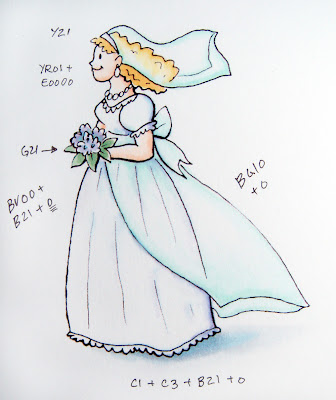
Cool, crisp, clean white tends to have a hint of blue, hence adding blueing to a load of white laundry. It makes it look cleaner. So use a super-pale blue or blue violet. bright-B000, muted-BV20, or B40. I'm using a B21 on the final picture since a B000 is a little bright.
Natural white, like a white wool is actually warmer. If I were working with an antique palette, I'd choose a really pale E40 or W0/W1
Sunny bright things would have a trace of yellow. Y000
Cool, neutral blue could use a pale gray. C0/C1 or N0/N1
Watery looking things would get a hint of green, so BG10, BG000
Rosy, blushy glow, R000 or RV000
Or, basically any color that ends in a 0 can be used to achieve some kind of pale tone, so test yours to see what colors work for you and with your other accents. IMO, Blue or blue gray with a hint of violet will still be your best choice for a clean white dress.
2. How do I color it?
Ah, now this is the part that makes it look white. Don't color in the whole picture with whatever pale color you chose, since it will not be white anymore. Color only the shadows and edges. Pick a spot for your sun to be shining (I'll explain this better someday), and add your shadows heavier opposite that spot. For these examples, I am having the sun shining from the front, so she'll be slightly more shadowed on the back.
Color only the edges and use the blender to fade to white. It's that easy (it's sounds easy, right?) The complicated part gets an advanced tag-
 Transparent-
Same thing, color only the edges and fade to white. The tricky part is showing things that are under the transparent layer. Her dress and hair are partially covered by a veil. What do we do now?
In this picture the lines suggest what to do:
1. Color the transparent layer with a faint edge of the tone you want. Fade this into white with the colorless blender. I chose BG10 because it has a different feel than the under layer so you can keep the parts distinct in the tutorial. Normally I would choose a blue that would match the dress better.
2. Things under the transparent layer appear one or two shades LIGHTER than they would otherwise. So, whatever color you color the hair or dress, make it even lighter under the veil or train.
3. Don't color all the way to the edge on the under layer- leave some white between it and the over-layer. This really adds to the transparent look. See how I didn't draw the line all the way to the edge? This gives you a visual clue about how see-through it is. I am only going to color where the line is.
4. The transparent layer under the transparent layer will also be colored a shade lighter. Huh? Read it again, slower and it will make sense. Where you see the back of the veil make it lighter than the front edge.

5. The last thing is to add your ground shadows. Areas under the dress are completely shadowed, but she is walking across a white background, so choose a shadow color that ends in 1 or 2. The shadow under her flowing train will be one shade lighter than under her dress because more light is getting through. fade these out with the blender to show how diaphanous the edges are.
Bonus: For some extra bling color edges with the clear Spica Glitter pen. It doesn't show up on camera, but that just adds the final subtle, glimmery touch.
I know it's tricky, but it looks cool when it's done. Again, I chose very different feeling transparent colors so you could get a better idea of how the dress looks underneath. Keep in mind that these colors are super-hard to pick up either from my camera or from the scanner, so don't trust the screen colors entirely, they are just to give you an idea. Sadly, a lot of the subtle colors are washed out. Paper: Neenah Classic Crest Ink: Photocopy


18 comments:
Thank you, thank you for this info!!!! I was wondering about this!
This is the best tutorial ever. I am addicted to your blog now. Beautiful example!. Thank you for this, I am reaching my copic markers more and more... the bad part (for my wallet) I want another set now.
I have just recently discovered copics and am so glad I found your blog. Thanks for all the wonderful info!
Wow Marianne! Fabulous tutorial; so many great details! Can't wait to meet you in Chicago!
here's a question for ya: when are YOU coming out with a line of stamps? because, wow! your drawings are blowing me away!
Thanks for the tips! Especially which colors for shadowing different whites. I never knew exactly how to decide that.
Thanks for the info! Now go relax :) Oh...tell thoses men they need glasses!! HELLO!! LOL
that is a great image you should design stamps
Very cool!!!! Thank you so much! I have a wedding card to make and this is immensely helpful!
Wow! This was something that I was curious about! I saw a clip on youtube that explained this - but not very well. You just answered questions I didn't even know I had! Thank you sooo much!
Thank you so very much for this blog, I am learning so much & loving my copics even more.
Man, I need to take your class!!! Do you have openings in Milwaukee?
I am still thinkin' that someone needs to have her own stamp-line (hint-hint) !! Let me know when you need some investors!
Great tutorial! THANKS FOR THE INFO AGAIN! Nicole
Way cool! You are amazing with your tutorials. It's almost like sitting there with you but not quite!
You are amazing! What a fantastic tutorial. I am interested in your teaser regarding picking a place for the sun and shading your image based on that. :) Although I only have 1 Copic (which I'm pretty sure is a crime), this could apply to any kind of coloring (i.e. Copics, watercolors, pencils, etc.). I have such a tough time with this! Thanks for all of your tutorials...I think you're da bomb! :)
This was a very helpful tutorial. I remember drawing a picture a few years ago where a girl had sheer sleeves, but I was using Prismacolor pens which can't fade out like Copics too with the blender, and I had no idea what to do. It was very frustrating and I ended up trying (and failing) to make the effect with just a black pen. This will be very useful in the future! Thank you! ^_^v
Hello..I am trying to learn to color and love your tutorials but was wondering if there any classes for beginners, even if on DVD? Thank you.
Kathy
Eggdcr8tr@satx.rr.com
Thank you this is really helpful I always wanted to colour things white with a hint of colour, I've seen it on cards so many times and it looks fab. So thanks. xx
Post a Comment