Showing posts with label beginner. Show all posts

Tuesday, September 13, 2016

Re-coloring old art

A few days ago I showed you how I re-drew an old piece from my portfolio and colored it from scratch. This time I want to show you a piece I drew and colored back in 2005, then decided to update the colors.

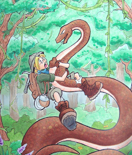
Here is an old, kinda washed out photo of the original. The colors were pretty soft, the trees were washed out, and the whole thing was a bit flat (the photo also makes it look worse, but it was pretty bad). I had been experimenting with the markers at the time, learning how to use them better, so this was not a fabulous coloring sample, but I did like the drawing itself.

I realized when I was flipping through my portfolio that I had actually never finished coloring the image, but it looked "good enough" so I'd ignored it all these years.

Well, I pulled it out. This was a line drawing that I had photocopied onto color laser copier paper. I had colored it and stuck it away. Now, 11 years later, I pulled it out to tighten up a lot of things.

One of the most amazing traits of Copic markers is that on uncoated paper you have an infinite working time. Meaning, just because I colored something 11 years ago doesn't mean that it's done. I can pull it out and re-work the colors at any time. Once the ink is wetted with another marker again, I can mix and blend.
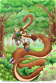
So, I throughly worked over this piece. Biggest priority was fixing the lack of contrast in the trees. Years ago I had dabbed on hand-sanitizer to affect the texture in the trees. Trouble is, hand sanitizer really fades out colors. It looks cool, but I learned through trial and error over the years since 2005 that I should have started darker on the base color first. I also crated more depth on the bushes and shrubs. Now you can clearly see which trees are in front, which bushes are in the foreground, and how dimensional the fern-things are.

Next, I made him look less flat. Again, deepening the shadows on my character makes him pop and look much more dynamic. (by the way, Tad is his name, as in "A Tad Bit of an Adventure", the comic series I was working up at the time). I added better skin tones, shadows on the snake, and generally punched up the contrast on the character.

Last, I spent a lot of time on the snake. In the first sample, you can see I had a few, irregular scales dotted in with a variety of colors. This time, I increased the contrast in the shadows and more clearly defined the scales on the belly with the colorless blender. Once all the contrast was done, then I went, scale-by-scale with the colorless blender and added more regularity to the scales.
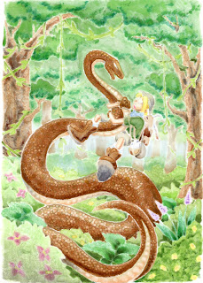
To create dots, I simply touch the tip of the colorless blender to a colored area and it pushes the color out the backside of the paper. To show you what I mean, here is a scan of the backside of this picture. Because this is on such thin paper, you can clearly see the contrast and effects of the blender on a colored area.

What is really amazing is that except for the shadows, the brown ink on the snake is the same ink I put down 11 years ago. So, all the ink pushed out the back of the paper came from a marker more than a decade ago, and I was still able to move it around. Love that about my Copic Markers!

Have a great week, and I hope to see you at some upcoming event!


Wednesday, March 23, 2016

Blog Winner and Gift Tag

Happy Wednesday! I am thrilled to announce the lucky winner from my blog giveaway- Dani Chapman!


Dani Chapman said...
I think this book will be a must for anyone who uses Copics! I love coloring books but this one will be perfect for me so I can get better and more confident using my Copics!
Congrats Dani and I hope that this book will give you some useful tips for any of your future projects with Copics. If you would also like to pick up a copy of this book, you can find Intro to Coloring with Copic Markers here.

Quick Spring Card Project
And, since you are looking around my blog today, I figured I'd share a quick gift tag/card I made from the March Hero Arts Monthly Kit. If you haven't ordered one of these awesome kits yet, don't worry, there are still a few in-stock. Just pop over to Hero Arts to pick it up.  It has been a lot of fun to work with them in adapting my Coloring Flowers with Copic Markers book into stamps and projects!
This little gift tag is made with the cluster of flowers from the Marianne's flowers add on set, stamped with Memento New Sprout colored ink. I colored it using only 6 Sketch markers: G20, Y00, Y21, BG000, R81, and colorless blender. I used the techniques shown in the second project of the Coloring Flowers with Copic book, except instead of having 3 shades of a color, I used only 2, and on the leaves, my lighter green was actually colorless blender, and my darker green was simply allowing the G20 to dry before adding a second layer to get the color just a tiny bit darker. 
I'm thrilled with the final color scheme, and how it matched the card base from the kit perfectly. I chose a clean, simple white ribbon bow and was trying to figure out how to make it just a little bolder. After digging for a bit, I found a perfect little pop of yellow bling in my "drawer-o-stuff" to add to the bow. I held the bow and bling in place with a dab of the X-press it Gel Glue
Have fun coloring!

Monday, March 7, 2016

Hero Arts card project

Basic color blends
I am so excited to be sharing these fun, exclusive Hero Arts kits! These little pictures, stamp set, and book were so much fun to draw and color. Each of the provided 1/4 page panels are printed on high-quality X-Press It Blending Card, meaning your artwork will pop when colored with Copic Markers!

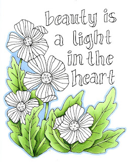
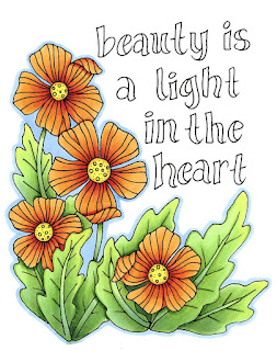
For this project, I chose the 1/4 pg panel "Beauty is a light in the heart" These flowers are sort of like poppies, but not really. However, I decided I wanted to work with a vibrant, red-orange color scheme, similar to what you might find on poppies.

Whenever I color flowers, I tend to color the greenery first, and this project was no exception. I started with a smooth base of YG11, then gradually went in and darkened each leaf with YG13 and YG17.


I tried to pay close attention to the veins on the leaves, the shadows between leaves, and the dark areas where the flowers stand out from the leaves. I left the main view of each leaf lighter, as I knew that later on I would be adding more tones over the top.

I finished the leaves with dark accents of G28. Then I added a blue outline to the image with B32. I know I've said this many times on my blog, but contrast is key! Because I have a range of tones from the really light YG11 all the way to the very dark G28, I have a great range of contrast and the leaves are much more dynamic.

The pale blue border pulls everything together. Usually I would add the blue last, but I went outside the lines a little, and the pale blue covers/pushes those mistakes out of the way, so that you don't really notice them as much.

Next I worked on the flowers. I started by coloring the centers with Y02. Then, I colored the petals with YR12. I also added a faint ring around the yellow portion in the center with the YR12 and blended that out, just to give a little dimension.

I colored each flower with YR12, then I darkened it with R05 and added extra contrast with hints of R29. I was careful to darken under each folded petal so those looked more interesting and dimensional.

I think the red really helps the orange pop off the page more, though I worked with a very orange red (R05) so that it was not changing the tone too much. Also keeping the centers a pure, vibrant yellow as much as possible makes the petals look really sharp.


I finished up coloring all the flowers, then I came back with B32 and continued the border around each bloom. I also wanted to add more color depth to the green leaves, so I took the same B32 and added a faint overlay to the shadow areas of the leaves. You can see it in the stems on each leaf. Cool colors, like blue, help make these areas softer and feel more like they are in shadows.

The tips of the leaves I warmed up with a faint layer of Y02. You can barely see it, but it makes those leaves feel more like they are catching the sun. I know it's subtle, but it does help to make the overall piece look more dynamic.

Last, I colored the text with YG11, YG13, and G28. I added a faint blue shadow to each letter on the left side using the B32. This just gives it a hint more dimension.

And, though it doesn't show up on the scanner, I took a peach Spica glitter pen and colored over all the flower petals. Now, in certain light, each flower shimmers. I love how easy this project was and how beautiful it came out. My goal in drawing these cards for you ,was to help you have beautiful results easily, so let me know how it goes with your own project.

I hope each of you has as much fun coloring these as I have had! Now, I encourage you to go visit the rest of our fabulous team members to check out the other awesome creations for this monthly Hero Kit by Hero Arts Blog hop.


Friday, December 11, 2015

Coloring a stylized poinsettia

Crisp layered colors
As I promised a few days ago, here is the colored step-by-step tutorial that I worked up for the free poinsettia download. I hope you enjoy coloring it your own way!

I printed my image on a piece of our Art pack paper. I always make laser prints or photocopies. (I know some of you ask about ink-jet printers, but sadly I don't have much experience with those, as I always work with toner).

I started with a light, even base coat of my lightest colors. I used R21 for the red and YG11 for the green leaves. I colored in circles, evenly soaking the paper so that my base color was nice and smooth. Then, I let this dry completely before I added my darker colors. This helps keep the color edges crisp.

Next I colored the green leaves. I wanted to work in a graphic style, not a realistic style. This is what I had in mind when I drew this whimsical, stylized poinsettia illustration.

 I used YG13 and YG17 to create the gradient on each leaf. I left the outer edge on each leaf light. I first feathered on YG13, then feathered a layer of YG17. The, I carefully blended the YG17 with a layer of YG13 and faded that out into the leaves with YG11.

If the base coat of ink isn't totally dry, then this technique doesn't work very well because the darker colors will bleed out and not be crisp enough. For darkest green areas, I added G28.

Same for the red. The base coat needs to be totally dry. Then, the red petals are much smaller and reds tend to bleed more, so I used a slightly different color order. I layered my dark R29 on each petal, then went back and blended out with R24 and R21. The center of each flower has a layer of R89.

This also prevents a build-up of too many layers of dark red. (On some papers that buildup turns into a sticky residue where the paper can't absorb any more.)

You can see the difference between the left flower, which has been blended, and the right flower which only has R29 and no blending yet.

I colored the flowerpot with Y00, Y13, Y21, and Y28. I layered and blended each of those colors. Then, I wanted to add some extra punches of contrast to the leaves and blossoms.

On the leaves, I added some very light streaks of R22 over the dark green area. I also added some light highlights of Y13 to the edges of the leaves. (See the close-up). It's hard to see that those are red streaks, unless you look really close.

Then, in the dark red I wanted to add hints of contrast as well, so I added tiny streaks of BG09. I know it seems strange, but the dark blue-green helps the reds pop-out more. Why did I use BG09? I really don't know. That was the marker my eye saw first in my stack of markers and I said to myself "Well, that color will work". Really, I could have used any dark blue or green or even purple to add pops of shadow color.

I finished the whole picture by adding a soft blue background. I used B00 and feathered it out towards the white of the paper. Usually I would come back with the colorless blender and blend it to make it fade, but the finished edges were so soft it worked fine without the need to blend. I colored right over all the black flourishes.

Then, I took the YG13 and colored in the flourishes. Since blue is found in green, there wasn't a problem of having a light blue base to the green areas. I added tiny bits of contrast to the larger flourishes with little dots of G28.

I hope you enjoyed this different, stylized look to my coloring. Now I have a pretty Christmas poinsettia to use for gifts.

Have a great weekend!

Wednesday, December 9, 2015

Free Poinsettia Line Art download

I can't believe it's December already! This year has really flown by. Anyways, this week I am working on a fun tutorial and I figured that I would share the line-art with you ahead of time, so you can experiment on your own, before you see how I color it.

This is my early Christmas gift to you. You are welcome to click and download and share this line art coloring page. I encourage you to color it, then display your finished creation around your house.

May you find some peaceful time during this hectic season to just sit down and color. Have a great week!

Thursday, September 17, 2015

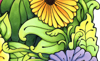
Coloring leaves with extra depth


Working with a limited color range
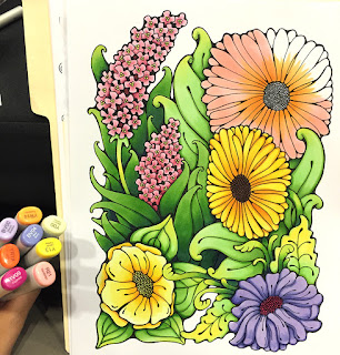
This weekend I was at an event and I had a chance to color one of the flowers coloring pages I drew this Summer. It really is a relaxing way to pass time, working on a larger project for a few hours.

I drew this image for our Coloring Flowers Line Art Pack. The images in our image packs are printed on the nice Art Paper we use in the Copic Sketchbooks.

Anyways, I was coloring on a folder on my lap, and I had only a limited color set with me. Even with few colors, I was still able to have a lot of fun coloring with depth. I wanted to share the power of having only a few greens and how you can add extra depth to your coloring.

As you can see, these kinda large, goofy flowers have a lot of different foliage in them. But with a limited range of greens, how could I create more color variety?

I had only YG11, YG13, YG17, and G28 for my green families. So, I had to pull out my Y13 to add some additional brightness to the leaves up front.

Base color changes everything
The color you choose as a base makes a huge difference when you are working with layers of light colors. Evenly soak your base color by coloring in circles, using the side of the brush nib on your Sketch or Ciao marker.

If you look at the flower on the bottom left, it had a base of YG11, with yellow added on top. The flower on the right I colored in reverse, with the base of Y13, and the YG11 was added to the top. I shadowed each leaf with YG13 and hints of YG17.

I wanted to make a layered look, with the viewer being able to easily pick out the leaves in front, then the other leaves fading into the background a bit more. However, I still wanted the viewer to feel that the leaves were from different varieties of plants, even though I had limited colors.

Here is the rest of the leaf area, colored with only Y13, YG11, YG13, YG17, and darkest areas colored with G28.

Extra details
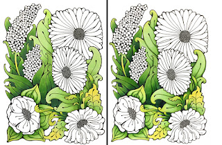
If you look closely at the side-by-side comparison, you'll notice some subtle finishing touches that add extra depth and interest to the image. the image on the right has extra layers of color around the edges and veins on the leaves. Basically, on each leaf, I took the color that is one step darker than the base color of that area and accented edges, veins, shadows, etc.

Here is a close up from the finished picture to show you what I mean. Look at how the extra green edges on the yellow leaves really accent them and make them more striking. (For the final area, I did end up needing to make my dark green area darker, but without another green, I ended up adding some faint hints of deep B39 into the shadows. )

I spent way too much time fussing over the leaves, probably 2-3 hrs on the leaves alone...except that I was at an event and constantly being interrupted to answer people's questions, so maybe it only took an hour or so of continuous time.

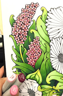
Then I moved on to coloring the rest of the flowers in the picture. Remember, I had only a few colors, so the pink flowers were colored with R81, R85, and RV69. The centers were colored with Y13.

The two yellow flowers were colored with Y00, Y13, and YR14 and YR18 for the deep shadows (I used more YR14 and 18 on the darker yellow-orange flower).

The purple flower was colored with BV00 and BV04. The center is colored with RV09.

The top, coral-colored flower was colored with a base blend of YR14 and R21. If you look at the bottom image, you can see how the YR14 was flicked out from the center, about half way across the petals. The tips were left white. If they hadn't been left white then the R21 overlay would have been lost in the base orange.

R21 was brought in from the tips and colored back into the darker YR14. To darken the shadows and edges of the petals on the coral flower, I used more layers of YR14 as well as YR18 and hints of RV69.

Overall, I love how different this came out than most of my other work. It was a lot of fun! Now, it will promptly find a happy place in my portfolio.


Thursday, September 3, 2015

Watercolor look


This morning I was working on a piece of art for a poster, and I was experimenting with the sky. I thought you might enjoy seeing a bit of the process.

Different papers give different looks
I wanted to get a very wet, watercolor look with my markers, so I decided to color a printout on inexpensive copier paper. (you can also color much faster on this paper as it uses so little ink). When you work with many layers of subtle colors on thin, soft paper it is much easier to move around.

I used C0, C1, C3, B41, BV000 and BV23 on the sky, along with colorless blender. (I lightly drew the cloud shapes in pencil so the lines ween't very dark). I added final highlights with Y00, then I used a LOT of blender. I used the chisel nib, as it was a great way to push and mush subtle colors together on large areas.

On thin paper, you need to be extra careful, as the color will want to keep spreading long after you are done, so around the edges of an area, you might find yourself going back with many light, careful layers of blender.

To show you how much blender I used, here is the backside of the paper. See how soft and washed together the colors are? That is due to the colorless blender.

The backside has a very different look, once you remove the dark black lines. (I really like it!!) However, for this project, I need a black and white version as well as the colored version, so I needed to run with the outlines.

For the rest of the ship, I streaked in colors like W1, E42, C1, C3, BV23, E44, E57 and E29. I used accent colors of R32 and R59. For the water I used B00, B34, B41, G24, BV23, BV000, and Y00.

Here is the final version, with all the yellow highlights and extra color added into the shadows. I think my client will really like this for the poster they need.

If you get a chance, experiment with soft, watery coloring and using colorless blender on a thin paper to see if you like the results. If you want your own antique sailing vessel to download and color, you can download one from our website here.

Monday, August 3, 2015

Coloring a stylized butterfly

A few months ago I had a chance to draw this really awesome butterfly. Drawing things like this is very meditative for me- I'm sure many of you can relate. It took many hours to draw, and I drew it with a 0.03mm multiliner on the Copic Art Paper (sketchbook paper).  If you would also like to color this exact butterfly, it is now available for download here on the Copic website, along with a few other doodles in a similar style. Check out our whole range of illustrations for download, since they're only $0.99 each.

Anyways, I was at a demo recently and I had a chance to color the butterfly. Although there are many many details, when you color it, you can choose to ignore most of those details, and have them just become part of the patterning.

I printed the butterfly on the Copic Art Paper  so it wouldn't bleed when I colored it in.

The technique I used for this entire image is feathering colors. I started with a light V12, feathered up, then I took a B66 and feathered down into the V12, and I went back and blended with the V12.

Then I feathered the B66 up, feathered a B04 down, then blended with the B04. I feathered the B04 up into B02, and that up into B00.

I repeated the process up along the top edge of the wings. Then, I went into each of the inner segments and repeated the same color scheme.

Once I'd finished those sections, I colored the main background of each wing with a feathered gradient from Y11 into YR65, and finally into R37.


Although the finished piece is a full sheet of paper, it was surprisingly quick and easy to color (I think it took about an hour, and I was demoing for customers as well). I love how vibrant the colors appear! the finished piece looks a lot more complicated than it really was.

The store that I was demoing at liked it so much, they asked if they could keep my colored piece. I was happy to share it with them, since it was so easy to color.


If you are looking for something a little different to work on, I encourage you to check out our full collection of downloadable coloring sheets and make your own fun artwork.

Have a relaxing week coloring!

Thursday, June 4, 2015

Coloring a flower girl

Little Flower Girl
Last week I had the pleasure of coloring all afternoon at a demo. It's so relaxing to just sit and color. sigh. I wish life gave us all more opportunities to just sit and color. Can you imagine how much nicer everyone would be if they spent an hour each day coloring?

Anyways, while I was at the demo I colored this flower image you can download from the Copic website.  Many of the flower images I drew to match tutorials found in the Coloring Flowers with Copic book we sell.

This picture I drew for our website to match the 4th project in the book, so, in the book you learn how to color this style of flower, using palette blending for the dark colors. While coloring at the demo, I only took step-by-step photos of coloring the girl because the flowers are discussed in the book.

Even though this picture is simple, I tried to keep my shadows consistent on the little girl, with the sunlight hitting her face strongest. The flowers are more of a design element, so I just colored those in, without much worry over shadows, except a little bit on the leaves.

I started by coloring her dress with a base of R81, and added shading with R85. I knew that the hearts would be a darker purple, so I just colored right over the pattern and didn't stress about coloring around them. The darker purple is V06, with shadows of RV69. Notice how I left a lighter highlight on the back of the dress, along with the stronger highlight on the front. This makes the shading stand out more. Be careful not to blend out all your contrast, or your work will look too flat. High contrast makes art more interesting to look at.

I colored her skin with E00, E21 then added shadows with E13. I added light layers of  B00, R30, and a hint of R31 to change the tone. Her basket was colored with E31, E35, and R39.

Then I worked on coloring the flowers. The yellow flowers are colored with Y32, YR65, and R05. Centers are E35. The pink flowers are R81, R85, R39, and centers are RV69.

Leaves are YG11, and YG17 (notice how much contrast I use in my greens, I jump straight from YG11 to YG17. It makes them more vibrant). I darkened the deepest leaf shadows with G28.

I finished with a pale B00 sky background that I faded out to the white of the paper using the Colorless blender.

I had such a relaxing time coloring this picture. It took about 2.5 hrs to color, since it is a full sheet of paper and I was also helping customers during that time. Coloring all those little flowers kept my hands busy while my mind wandered. I ended up staying at the demo an extra hour or so because I was having so much fun coloring!

(I'm sure none of you have ever stayed up too late coloring because you were "in the zone".)

I'll be sure to post some more tutorials, even though I am super busy writing my next two books. Have a great weekend!


Friday, October 3, 2014

Cute Witch part 2

Today, as promised, I'm sharing a few of my in-progress coloring steps for the cute witch free image I shared yesterday.

I actually started by grabbing a random color from my bowl of markers and it happened to be orange, so I ran with it. Usually I begin by coloring the most difficult part of an image first, but in this case, the pumpkin is the focal point of the whole picture, so it was fun coloring that first.

The pumpkin is colored with a base of YR14, a shadow of YR68, and deepest shadow of E39. Why did I shade it with brown? Well, when you darken orange and make it less warm (as happens in shadows,) then orange quickly turns brownish. Always go back and blend with the lighter of the colors. So, blend E49 with YR68 and blend YR68 with the YR14.

Next I colored the broom handle with E34 and E39. I colored her hair and the straw on the broom with a base of Y11. I layered on some E31 and darkened it with streaks of E34. I colored her hat band and stripes with G14 and BV13. Then, I shadowed her legs with a single streak of BV13. I also added a hint of the BV11 in the shadows on her hair and broom.

 Why purple shadows? Because it looks OK, and then I don't need another shade of green on the leggings.

I colored her dress and hat in blends of BV11, BV13, and BV17. I like the cute purple witch outfits, as the black/gray dresses and hats just get so dark. I wanted this to be a cute, innocent little witch chowing on her stash of candy.


I wanted her boots to be a slightly darker purple, so I omitted the BV13, and left a very light highlight of BV11 with the darker BV17. If you want them to look shiny, then leave your highlights white (or add white back in with a faint touch of Copic Opaque White).


Next I added E00 on her skin. I  also grabbed a handful of random, bright colors and colored all the candies.  B34, R27, Y08, YR68, G14, I think are all that I used. Don't forget the candies inside the tub! I added shadows with the BV13 in many instances.


I finished up the illustration by adding shadows on her skin with E21 and BV11. I colored the buckles with Y08. I shadowed the ground around her  with deepest shadows of B34, then BV11, and blended those out with a soft layer of BG000.

I hope you have as much fun coloring this cute little witch as I did! Coloring always seems to make me feel better (candy is pretty yummy too) so if you've had a rough day, I encourage you to just sit down and color. Or, if someone is stressing you out, get them to sit down and color as well...that should help them relax as well.

If you are in the Portland, OR area, I hope to see you at my coloring workshops at  Main Street Stamping and Stationary tomorrow. Have  a great weekend!


Tuesday, August 26, 2014

Focal points


Coloring Backgrounds to create Focal Points
When you are presented with a complex image, where the details run together, it can be intimidating for the viewer if you color it all the same as well. Before you color, it helps if you identify focal points, or which parts of the image will be most important (if everything is important then nothing is important).

Here is a freebie image you can download as a simple color along to understand the concept. The bugs are nice but really appear to get lost in the mass of surrounding flowers.

Right away, I know that I want the bugs and a couple of the biggest flowers to stand out. So, I start by coloring the dark background and building out from there. (for simplicity, the tutorial will show flowers that are all the same color, but the same theory applies for multicolored flowers)


First, I isolate the focal points by coloring everything else in dull, grayish purple tones. One of the great qualities of Copic markers is that any lighter color can push a darker color out of the way. This means that even if I do tone my whole image grayish, when the time comes to add colors back into it, they won't be totally obscured.

Instantly it becomes easier to focus on the parts of the image that I want important. This trick works on just about any kind of image. (If you aren't confident enough to go as dark as I have gone here, then try the same thing with a very light gray instead.)


Next, I colored the top flowers in a pure, bright pink, RV02. I added Y11 to the centers of ALL flowers. This helps it make look like the whole cluster is made of the same flowers. You can still see the yellow through the purple background, but it's not overwhelming.

If you want the flower centers to stand out more on the flowers in the distance, simply go over them a few times and it will push the darker colors out of the way. This is a matter of personal preference.

You can leave the image like this, but I like to add even more depth. Right now I have basically two layers, the bright top layer, and the grayed out under layer.


For my final you can see I have 4 layers:

1. Bright Top layer (RV02)
2. Grayed under layer (V93)
3. Slightly darker grayed under layer (V04)
4. Darkest background layer (V17)

This was much easier to visualize than if I had tried to simply start on one flower and color each flower individually to start. The finished picture looks more complicated than it really is, and it is much easier now to identify the bugs as being the most important. A word of caution: Don't color the final bugs in dull, grayed colors or else they will get lost. Choose vibrant colors that stand out so they remain your focal points.

Multi-color variation
As I mentioned above, this can also be done with flowers of different colors. Here is the same illustration, this time with pale yellow and pink flowers.

Same as before, I colored the flowers in the background entirely with the grayish purple, then I went back in and colored over some of the flowers with a pale yellow. I left the other flowers alone. Then, I colored the hints of the farthest background with my darker purple to make it look even more dimensional.

I hope this helps you speed up your coloring and simplify the layering process. Enjoy the free image download!