Saturday, December 31, 2011

Certification Updates

Nancy told me that I needed to update the classes before I left for the long weekend, so here is a quick update. To apply to any of these classes, please visit our website and you will find an overview of the program. More classes open each week, so stay tuned for classes in your area.


North American Standard Certification
We now have our classes for the first few months of 2012. To apply to any of these classes, please visit our website and you will find an overview of the program.

Jan. 13th Memphis, TN Taught by Lori Craig CANCELED
Jan. 27th Anaheim CA, CHA Winter 2012 taught by Sherrie Siemens Open to Public

Feb. 3 San Diego, CA taught by Lori Craig Open to Public
Feb. 17th Richmond, VA taught by Debbie Olson Open to Public
Feb. 25 Miami, FL taught by Lori Craig Open to Public

March 3, Edmonton, Alberta, taught by Sherrie Siemens Open to Public
March 10, York, PA taught by Marianne Walker applications going out soon

North American Intermediate Certification Classes
Register now for these great classes. Remember, you can now apply for back-to back classes!

Jan 28 Anaheim, CA
Taught by Sherrie Siemens Open to Public
Feb. 18th Richmond, VA taught by Debbie Olson Open to Public
March 4, Edmonton, Alberta, taught by Sherrie Siemens Open to Public

Friday, December 30, 2011

Keeping Portfolios, Part 1

Happy New Year!
Portfolios
If you have ever met me at a demo or class, you may have had the opportunity to see one of my portfolios. I never travel without them, so if you see me out at an event, just ask to see them. I am always happy to share these, as I appreciate the chance to get feedback or to see what catches people's eye first. As 2012 is getting started, now is the time to work on New Year's Resolutions, and maybe one of those resolutions should be to work on your own portfolio.

This new year, I urge you to start a physical portfolio (not a digital one), especially if you have never kept one before. In the Intermediate class, you are given a small portfolio to begin with. Now, in the standard class you are also given one. We wouldn't include these if we didn't think they were so important! If you would like to pick one up similar to the ones we use, you can find them at any art store, or you can easily make your own.

(Next week I will talk more about picking a portfolio and what to put in it).


The purpose of a portfolio
Any artist or crafter should keep a portfolio of their best work. This is a tool for improvement, and should not be considered a "bragging book". A good portfolio allows you, and your viewer, a chance to see your best work and give each piece individual, critical examination. By keeping work in one, central place, it is easier to compare and improve quality from piece to piece.
In my opinion, if you are an instructor, you NEED to have a portfolio and be willing to share it with your students.

As nice as photographs and blog posts are, nothing compares to being able to see an original work. The computer can be very deceptive, as it interprets colors differently than our eyes and shows work at whatever scale it wants to. Sometimes, you really need to see how big something is in real life, and not shrunk down on a computer screen. Looking at a portfolio is important for both the viewer as well as the creator.

Here are some of my personal thoughts on how to be a good portfolio viewer.

Etiquette in viewing portfolios
Give praise but don't gush. When people look through my portfolios, yes, I like to hear "Oh my goodness! That is amazing!" but I would rather hear "Oh my goodness! That is amazing. How did you do that technique?" I want a chance to teach through my artwork.

I never want to hear "You are sooo good. I could never be like you." It is nice to compliment, but don't embarass them by going over the top. Give sincere compliments and remember that with practice you could make work like theirs, or vice-versa.

A portfolio is not a tool for you to compare your work to another person. This is a self-assessment and feedback tool. Don't look at someone else's portfolio and feel bad about your own work. We are all at different places in our work at different times. A portfolio is of a person's best work, so when you look at it, try not to compare your problem areas with their strengths. Use other people's portfolios as inspiration and learning tools, ask constructive questions (mixed in with healthy praise).

Take notes. If you see something you really like, be it the way they shaded an image or colored hair, ask about their technique and practice it.

One time I really wanted to work on making round gemstones look luminous. So, I drew an image with lots of round gemstones. Then, I looked through an artbook by James Christensen to color the gemstones. He is an oil painter, and does a fascinating job rendering luminous stones. There are a couple pieces in my portfolio that are inspired by James Christensen. I could not have improved my technique as quickly without studying his work. This is a good use of another person's portfolio (in this case, an artbook).

Ask before you photograph. Never photograph someone else's portfolio without their permission, and never publicly display those photos without their permission and without giving them credit. Come back to the notes or photos, then try to incorporate those techniques into your own work. There is a saying in art "Copying is the greatest form of flattery." It is OK to copy techniques and colors you like, but whenever possible, attribute credit where it is due. Sometimes for legal reasons you cannot display photos of their work, as those pieces might be published or the rights might belong to someone else. In that case, you could face a potential lawsuit, so always get permission! Be considerate with your flashes, as original works may be light sensitive.

Ask before you touch. If you try to photograph an image and it is behind a piece of plastic, many times the glare will prevent you from getting a decent photo. Or, sometimes, you want to see a technique really close up, or you want to see the back of the paper to see how the ink soaked through. Always ASK before you touch the original. Flipping through plastic pages is one thing, touching the original is another.

In libraries, you are expected to wear linen gloves when touching original works. This is because each time you touch an original, your oily hands are transferring grease onto a project. Copic markers do not like oil and grease, so if a person tries to color that art again, it may not react the same. If you must touch an original, touch the edges, and avoid important features.

Try not to hover. If it is your own portfolio, you may really want to hear feedback. It is OK to hover and explain your work, but it is also OK to not feel obliged to stand there while they look through it. Be courteous to the viewer and consider if you are being over-protective and hovering. Sometimes that makes them uncomfortable, so try to be aware of their comfort level as well.

Next week I will have Part 2 about portfolios, meanwhile, have a wonderful and safe New Year!

Tuesday, December 20, 2011

Color Spotlight, B66

Head on over to the Copic Blog for the color spotlight on B66. Here is the new image I drew for the spotlight post to go along with the tutorial I posted yesterday. Yesterday's bird was the male swallow, today's illustration is of the female- hence the lighter colored breast feathers. More details can be found on the Copic Blog.

Monday, December 19, 2011

Coloring a Swallow

I finally got the time to write up the tutorial for the picture I colored last week. Tomorrow, you can see the color spotlight I made this tutorial for. I'm please with this picture because it only took 10 colors to make it look so neat.

Barn Swallow
I drew this barn swallow after being inspired by seeing a beautiful Victorian cut-out of one last week. I draw my pictures with pretty simple lines, because I like to rely on the markes for giving depth, however, I like my line work to stand alone sometimes, so added a lot of little lines that I knew would get covered up by coloring. I drew it with a 0.03 mm Multiliner SP, then photocopied it a couple times before I colored it. For coloring reference, I found this amazing website by photographer Rick Cameron.

I started with a simple base of grays to define my shadows. I don't have strong shadows in this illustration, because I wanted the top of the bird well lit, but I also wanted to showcase the vibrant belly plumage. I started with C3 and BV23. BV23 is my favorite alternate for C5...it is more purple and adds a little more richness to my cool grays.


Next, I feathered in a light base blue of B91 and B63. I layered B66 over that, (B66 is the color spotlight color that I'll feature tomorrow). I deepened the blue with the BV23 and C7. I did not blend much, rather, I kept my strokes in the direction the feathers grow so it looks more like natural color variation.

I darkened around the eye with C7, and darkened the wings with BV23 and C7. Again, I did not blend, instead I simply layered and feathered colors together . The top of the head is the only area where I blended the colors, as that is a very smooth area of feathers.


Next, I added my YR's. In looking at the photos of barn swallows, I noted that their chests are pale orange to brighter orange, depending on gender. I wanted a base that was not too vibrant, so I went with YR31. Then, I blended in YR12 and YR18. The YR18 was a perfect match for the photos I found online.

At this point, I held my image at arm's length and squinted...was it dark enough in the shadows? Did it look right overall? This is the point of self-critiquing that we discuss in the Intermediate Certification classes. This is also the point when I would clean up any spots where I went outside the lines (look at the gray tail feathers and how I fixed the mistake).

Last I needed to add a background of some sort. Usually I would just add a simple blue fade to suggest sky, but I didn't want to overwhelm someone with that much blue, so I decided to go more stylistic on my sky.

I made a mask from one of my photocopies of the bird and attached it firmly with some weak double-sided tape. Using the chisel end of the B63 I added a faint blue around the bird, getting darker closer to the bird. Then, I added larger speckles with the brush end of the B63 and a G12 marker. By airbrushing very lightly from a brush end, you can get larger speckles than if you airbrush directly with the chisel. After I was content, I added a final touch of Opaque white to the eye and beak.

Here is the final swallow. As I mentioned earlier, be sure to check out the color spotlight later this week on the Copic blog for other color combination suggestions for B66.

Thursday, December 15, 2011

Certification 2012 Updates

I have a lot little details to update today, so we shall see how much I can get through. Then, hopefully, I can get a tutorial posted tomorrow. Meanwhile, here are all of the upcoming certification classes around the world.

New Certification Information for 2012!
1. Standard and Intermediate Classes Back to Back
This Fall we have changed our policy regarding attending the Standard and Intermediate classes back-to-back. Many users have had our markers for many years now and have been happily coloring. However, there may be tidbits that you do not know about the Copic system, which is why we need to have a standard level before getting into the nitty-gritty of Intermediate. We still require you to have attended the Standard Certification before the Intermediate, but now you can take them back to back (Note: We do not recommend it, as we cover a lot of information in those classes).

2. Changes to the Standard Certification
In January 2008 I taught the first Copic Certification. The standard certifications taught up to this point have not varied much from that first class. Only the literature has improved, the content has been the same. With 2012 we are re-vamping the program. The same concepts will be covered, but the timing and supplies will be different.

In 2008 there were few papecrafters who knew about Copic Markers and how to effectively use them. Today, the average attendee in our Standard Certification has a lot more information available before they attend our class, more now than ever before (thanks in large part to all of you who already have been certified and have been spreading the word. Thank you!). If you attend the Certification this year, we will be switching to a portfolio format, similar to the format we use in Intermediate. There will be more coloring and a different assortment of products in your product pouch. We strongly suggest that you indulge this year and re-take the certification, especially if you want to brush up on your coloring skills.

North American Standard Certification
We now have our classes for the first few months of 2012. To apply to any of these classes, please visit our website and you will find an overview of the program.

Jan. 13th Memphis, TN Taught by Lori Craig Open to Public
Jan. 27th Anaheim CA, CHA Winter 2012 taught by Sherrie Siemens Open to Public
Feb. 3 San Diego, CA taught by Lori Craig Open to Public
Feb. 17th Richmond, VA taught by Debbie Olson Open to Public

North American Intermediate Certification Classes
Register now for these great classes. Remember, you can now apply for back-to back classes!

Jan 28 Anaheim, CA
Taught by Sherrie Siemens Open to Public
Feb. 18th Richmond, VA taught by Debbie Olson Open to Public


For all North American Residents, you can register for classes directly from our website.


World-wide
Certification Classes
In many countries outside of North America, there are opportunities to take Copic Certification classes. As new regions establish their programs, I will try to announce their classes as I hear about them.

Germany
Feb. 2nd, Wiesbaden, Germany taught by Diny Sprakel, in English
Please apply for this class by contacting Britta b.rumpf-burblies@holtz-gmbh.de
If you are European, check out the Copic blog for Europe.

Australia
New classes for 2012 have not been announced yet. If you are interested in keeping up with some fabulous tutorials, contests, and finding out what events are going on in Australia, please visit the Australian Copic blog.

Have a great weekend!

Tuesday, November 29, 2011

Atlanta Intermediate, Thursday!!

This is your last chance to register for the Atlanta Intermediate Class on Thursday. We only have a limited number of seats available, so if you are interested in attending, please register ASAP. If you walk in, there are no guarantees that we will have supplies.

To register, and for more details, check the Copic Class registration link here. Contact Nancy, nancy@copicmarker.com for more details.

Remember to come visit us on Friday, Dec. 2nd, from 10-11am, as we will be having a book signing at Altered Angel in Alpharetta, GA. We'll see you there!

Tuesday, November 22, 2011

Happy Thanksgiving!

Turkey Fun
I want to take this chance to tell everyone what I am thankful for. There are so many blessings I have: Good Health, Family, Friends, a fun job, and the chance to live in a wonderful country. And, I have so many wonderful online friends that I never get a chance to thank, for their inspiration and support.

Today, as a thank you to all my online friends, here is a free image that I drew just for you! I have been drawing variations of this pilgrim/turkey since elementary school, and I thought you might also like a chance to color him. Just click on the image and save it. (Not for commercial reproduction without permission).

Coloring the turkey
I looked at turkey photos to get the coloration right on my turkey. This image has a lot of browns, and honestly, I used so many browns that I may have missed some in the tutorial.

First, I started with the hardest parts. In this case, the gun was trickiest. I colored the metal parts of the gun with C1, C3, N5. Notice the strong contrast between darks/lights. This helps with the illusion of reflective metal.

I used E31/E44 for the main body of wood, and E27/29 for the shadows.

The yellow was colored with Y06 and Y21. His hat was colored with N3/N5/N7. His leather boots were colored with E13, E37 and E29. Notice the crisp cast shadows under the cuffs, as this helps make the boots look more dimensional. By changing the base tone of brown, you can see that the boots take on a different tone than the gun, even though the darker colors are pretty similar.


Next I colored his head. Turkeys have a red/blue fading bald head. Really pretty, and kindof tricky to do with Copics. The B32 is feather blended into the R22/R14. I added some C3 to his head to tone it down as well. I dotted on colorless blender and R59 to make it look lumpy. I could have darkened under the hat brim a bit more, but his head is so tiny that I didn't want to lose too much color, so I left it fairly bright.

Finally, I colored his body with a bunch of browns and N7 and W9 to darken the deepest shadows. Real turkeys have beautiful, patterned feathers, heavy in blacks/dark browns, so I wanted to keep that feeling of dark, dark feathers.

His tail is colored first with E44, then I added E31 to the small feathers, darkened those with E27 and W7. The Bigger feathers are darkened with YR14, E27/29, and the tips are colored with C3.

Once his body was done, I went through and touched up colors, deepened shadows on the whole image, and then added a hint of blue sky with BG70, BG000, and B41.

The scans all came out a little different in tone from each other but I didn't bother color-correcting them, and he seems to look better in real life. Oh well. He was fun to draw, fun to color, and I hope you enjoy coloring him as well.

Upcoming Events
Atlanta Intermediate Certification, Dec. 1
If you haven't registered yet, we still have a couple spaces left in the Atlanta Intermediate class next week. Colleen Schaan and I will be teaching that class.

On Dec. 2nd, from 10-11am, we will be having a book signing at Altered Angel in Alpharetta, GA.

This is a free event. We will also have markers and images from Our Craft Lounge for people to color and come down and say Hi! Don't miss it! Colleen and I are going to have a lot of fun, so please join us either at the class, or at the book signing.

I hope you all have a fabulous weekend, and those of you here in the States, enjoy your Thanksgiving!

Monday, November 14, 2011

Update and Chair

Class Update
We are busy getting our schedules outlined for 2012, but we still have one last class coming up in the next few weeks, and there is one change I would like to bring to your attention.

Dec. 1, Atlanta Intermediate Class has been filling so quickly that we decided that I will also be going, so that class is now being taught by Marianne Walker and Colleen Schaan.

So, if you were thinking of attending, or would like to give yourself an early Christmas present, then please register right away! We only have a few spaces left, and we anticipate those filling quickly. Colleen and I are looking forward to a really fun class. We had a blast teaching together in Portland, and Atlanta should be just as much fun!

To register, and for more details, check the Copic Class registration link here. Contact Nancy, nancy@copicmarker.com for more details.

Meanwhile, for those of you preparing for 2012, there will be both a Standard and Intermediate Certification class in Anaheim, just before CHA. Details will be going out in the next couple weeks, so be prepared for those dates as well.

Chair
Here is one of the other images I drew while demoing at the U of O last week. Since I drew these while demoing, I do not have line work or in-progress step outs, nor do I remember what colors I used, sorry! I drew it with a 0.03mm multiliner onto scratch paper.

Frequently when I am demoing, I look through my example book and find old images that need to be updated. I realized I did not have a good range of furniture illustrations, and interior designers love using Copic markers, so I dreamed up this simple floral chair.

I really like how this chair came out (maybe not as much as the outhouse from the last post, but it is still nice). Notice the texturing on the fabric. This was made by taking my blender pen and dabbing it, straight down with the brush nib, after I had finished coloring the basic green layer. For those of you who are studying shadows, you'll notice that there are two light sources, hence the two faint shadows under each chair leg.

I hope this inspires you a little bit, have a great week!

Friday, November 11, 2011

Back in town

Whew! I am finally back in town. What a wonderful group of students I had in my 3 certifications in Hawaii. Those classes were a lot of fun, and I can't wait to go back and see all your smiling faces.

Yesterday I had the nice opportunity to demo at the University of Oregon's, 30th annual Tools of the Trade show. I look forward to this each year, as I always have a chance to draw and color something new each time. I showed you the piece I colored and drew last year, so I couldn't conclude the event without showing you one of the pieces I drew and colored yesterday. I hope you enjoy!

Outhouse
I drew this picture with a 0.03mm multiliner onto nice paper.

The base brown for the wood is E33 with YG91 and Warm Grays 3, 5, & 7. I added hints of E37 and E47 just to flesh out the color range.

The foliage is colored with G21, YG41, G24, G28, YG63, YG67, YG45, and BG99 and Warm Grays (for the darkest shadow areas).

The sky is airbrushed B41. The roof is cool grays blended with 0 and a tiny hint of BV23 and Y00.

Shadows on outhouse
For those of you who have been studying shadows on my blog, you can note that the outhouse is basically a cube. The light is coming from the left, and casting a shadow to the right. The foliage closest to the base of the outhouse on the shadow side is the darkest, and the shadows get really deep with the BG99. On areas where the vines creep in front of the shadows, you can see that I used YG41 as my base, but for shadow areas, I used G21/24 for the lightest area on those leaves. Also notice, under the tin roof, I added the deepest shadows right under the ridgeline.

I hope this gives you a little inspiration for the weekend. Have fun coloring!

Monday, October 24, 2011

Portland this weekend!

Color Spotlight and Events
Happy Monday! I'm in a whimsical mood today, but I have a bunch of things to get done, as I have a very busy week coming up.

For those of you who do not regularly check out the Copic blog, you should, as last week I posted a color spotlight for YG17.

I drew this little blue butterfly for the color spotlight. I started with a rough drawing in pencil, then colored over it, trying to keep it loose and relaxed. If you look close, you can see that I dripped colorless blender on the edges to break up the image. You can read more at the Copic Blog.

[events.jpg]Copic Demos and Classes
Meanwhile, I have a quick event update for things I am doing this Fall:

Friday we will be having a Standard Papercrafting Certification in Portland, OR taught by the beautiful Jenn Balcer. If you would like to come, we still have a few spaces left.

Then, on Saturday, the spunky Colleen Schaan and I will be hosting an Intermediate Certification in Portland, OR. I don't teach this class very often, and Colleen and I always have fun when we team teach, so if you have been waiting to take this class, wait no more! If you ask us real nice, I bet we'll even sign books for you :)

November 4 & 5th, I will be teaching Standard Certifications in Honolulu, Hawaii. The class on the 4th is pretty full, but we still have a few spaces on the 5th. The Intermediate class is on the 6th, and I only have a couple spots left, so register now. We may have a Free event in Hawaii on the 4th, in the evening, so keep this open on your calendars if you are in the area (I will know later this week, so stay tuned).

To register for any Certification Class, please visit our website. For questions about certification classes, please contact Nancy at nancy@copicmarker.com

November 10th, I am back in Eugene, OR demoing at the Tools of the Trade show at the U of O Bookstore. This event runs from 10 to 6pm. Here is a picture of what I drew and colored last year at this event. Stop by, and who knows what I'll be drawing or coloring this year! The Bookstore always has great specials and wonderful demos from a variety of artists during this event.

November 30th I will be hosting a Copic demo at Karen & Friends Scrapbooking store in Springfield OR from 4 to 6 pm.

Whew! What a busy fall! I hope to meet you at one of these many fabulous events.

Thursday, October 13, 2011

Certifications 2011

Upcoming North American Standard Certification classes
I can't believe that 2011 is winding down! Here are the remaining locations for 2011 classes. These will be the last classes before Winter CHA. If you have hesitated to take a class, take one now, or you'll have to wait until Feb. of 2012. We also have a new way of applying for classes online that is much simpler than the old process, so what are you waiting for? Register today!


Oct. 17th Sacramento, CA taught by Debbie Olson Open to Public
Oct. 28th Portland, OR taught by Colleen Schaan Open to Public

Nov. 5th Lansing, MI taught by Debbie Olson Open to Public- filling fast!
Nov. 4th Honolulu, Hawaii taught by Marianne Walker Open to Public*
Nov. 5th Honolulu, Hawaii taught by Marianne Walker Open to Public*
*Note: There is a non-refundable deposit for Hawaii Classes. Only a few spots left in those classes, so register now!
Nov. 11 Kansas City, KS taught by Lori Craig Open to Public

Upcoming North American Intermediate Certification classes
Again, these are the last Intermediate Papercrafting classes in 2011. These classes are open to ANYONE who has taken the standard Certification class, and who wants to learn how to color and design more like an artist.


Oct. 16th Sacramento, CA taught by Debbie Olson now accepting applications
Oct. 22nd Langley, BC taught by Sherrie Siemens now accepting applications
Oct. 29th Portland, OR taught by Colleen Schaan now accepting applications

Nov. 4th Lansing, MI taught by Debbie Olson now accepting applications
Nov. 6th Honolulu, Hawaii taught by Marianne Walker now accepting applications

Dec. 1st, Atlanta, GA taught by Colleen Schaan now accepting applications- filling fast!!

To register for any of these classes or to download class info, please check our Certification page on the Copic Website. If you have any questions, please e-mail Nancy@copicmarker.com for details.

Monday, October 10, 2011

Just Keep Swimming


Swimming For Katie Bloghop & GIVEAWAY!
From October 10-12 some of the best stampers are joining together to support and encourage our friend and fellow stamper, Katie Renz, who is currently battling inoperable gastric cancer. Katie is also dear facebook-game friend of mine, and I want all of you to know her struggles, as she really needs friends and support now more than ever before.

If you're not familiar with her, Katie’s cancer story started just before Christmas last year. This young, beautiful, healthy, vibrant mother of 3 with her infectious smile was suddenly diagnosed with an inoperable cancer, virtually overnight. A few tummy aches and then stage 4 gastric cancer. Her first post about it is here. The idea of “Swimming for Katie” came from her recent post here.

The card I made is using a digi image I drew for Katie. I have always loved the elegance of mermaids and I felt the sea stars symbolize the enduring light of stars, whose brilliance is shining upon us from the distant past, guiding the way for travelers over the eons.

I colored the mermaid with E00, E11, E15, BV00, RV21, B12, BG10, B32, B34, Y02, YR02, BG13, R29, and a clear glitter pen. The paper is from Recollections, and I popped her tail up with dimensional tape.

The card that I made today is going to be given to another dear family friend who is also suffering from a terminal illness, which began over 12 years ago, and who, sadly, is not doing well. Again, my heart goes out to anyone who has to endure the pain and sorrow of debilitating illness.

I designed this digi stamp specially for Katie. 100% of the profits go to Katie's fund to help her and her young family. Her husband Kevin and her three young children need our help and support.

In addition to the Keep Swimming Mermaid, Becky Oehlers and True =D Doodle Designs both also donated digis that are for sale (you can purchase Becky's octopus as a clear stamp as well). Direct donations are also being accepted. Information central is HERE. This is a permanent page that will stay active at i {heart} papers with current information and the full 3 day blog hop listing, as well as the donation button.

Here is a full list of contributing designers for today's portion of the Blog Hop:

AJ Otto
Beate
Carolyn Mustopa
Dawn Burnworth
Deb Felts
Gretchen Belknap
Heather Jensen
Jen del Muro
Julie Ranae
Kate - i {heart} papers
Kendra Wietstock
Lisa Johnson
Loretta Lock
Lori Tecler
Lynn Mercurio
Marianne Walker
Michele Gross
Stacy aka Twinshappy
Tracy Schultz
Debbie Olson
Cindy Lawrence
Cindy Haffner
Julie Koerber
Christine Okken
Tammy Hershberger
Danielle Kennedy
Barbara Anders
Makiko Jones
Ashley N Newell
Shannan Teubner
Taylor Usry
Jen Tapler
Jenn Balcer
Jenny Chesnick
Jess Larsen
Jessica Knutsen
Jimmi Mayo
Joan Bardee
Joan Ervin
Julia Aston
Julie Day
Julie Ebersole

Now for the giveaway: Please leave a special note on this post for someone living in the US or Canada that you know is going through hard times. On Friday, Oct. 14th, I will randomly choose a winner. If you are chosen, then I will contact you for an address for that person, so I can send them a special Copic prize pack to help them feel your love and prayers.

Thank you again for supporting Katie and her family!

Wednesday, October 5, 2011

Awesome video!

This morning I was forwarded this amazing video link of Copics being used in a Volkswagen ad. Enjoy!


In case you're wondering why they didn't use blue Copics to color the images, remember, the outlines are drawn in black Copic, not multiliner, so they had to color in the areas with water-based markers.

Then, if you wan to see the making of video, here you go:

Tuesday, October 4, 2011

New All-Marker Carry Case

Holds 380 Sketch Markers!
For a long time, we have wished that we had a good way to carry ALL of our markers. I have a hard time when I travel, trying to get them to all fit in cases that are not too bulky, but also wouldn't break.

Finally, Copic developed a perfect solution. This soft-sided carry case is sturdy, with reinforced sides, yet holds the markers compactly. We filled one of these cases and started turning it upside down, shaking it, tossing it around, and it held all the markers in place nicely!

In fact, the Copic carry case can hold up to 380 Sketch markers...that means your entire collection, plus room for a few of your favorite inks or other pens. The markers sit in removable mesh cups that allow you to hold Sketch, Ciao, Copics, Inks or Wide markers with ease. So, if you like to take ALL your markers with you, then this is going to be your best, compact solution.

I can't tell you how excited I was, yet, I didn't like the idea of having my markers unorganized in little cups, so I thought of another solution.

If you already have your markers in the plastic marker cases, and you only have a couple hundred markers, not the full collection, you can just pull out the carry pouches and it will easily hold your existing plastic cases.

I like this because my markers live on my desk in plastic cases but if I want to take some somewhere, then I don't have to un-organize them and put them in the cups if I don't want to. If you use 36 pc. plastic cases (like I did for this photo), you can hold 288 markers. Not bad! Otherwise, it holds 3 of the 72pc. cases, with spare room on the sides for other tools.

So, what do you think about the new Copic Carrying Case? Would you like to *win* one? Copic Marker is proud to partner with Splitcoaststampers the entire month of October for their annual Hope You Can Cling To campaign for breast cancer awareness.

Splitcoast is hosting daily challenges through the entire month of October, and asking members of the paper crafting community to create cards in support of cancer patients and their families and mail them to national partner MD Anderson Cancer Center in Houston, TX. Copic Marker is pleased to offer FOUR of these great new Copic Coloring Cases as prizes for four lucky participants in the Hope You Can Cling To campaign. It's a campaign of the sweetest type - you have the opportunity to color, spread a little hope with your handcrafted cards and be eligible to win!

You can find general information for the Hope You Can Cling To campaign, including information on how to play and a handy tracking sheet to keep track of your entries, here. You can find a master list of the challenges presented thus far right here. It's updated daily for new inspiration, and there are a variety of themes, so participation easy. And, just in case you aren't familiar with Splitcoast, it's a free papercrafting community where thousands of card ideas and tutorials are shared in the galleries and their resource archives. It's a fun place to be. You can find the details here. You can sign up for your free account and start sharing here.

I HOPE you'll find a few opportunities to color and participate with me this month. We'll announce our *FOUR* Copic Coloring Case winners the second week of November! Good luck!

Just a note: If you are not a cardmaker, there will be other opportunities to win one of these cases in October, so keep checking here, the Copic Blog, and the Copic Facebook Page.

Monday, September 26, 2011

Last Certifications for 2011

Upcoming North American Standard Certification classes
I can't believe that 2011 is winding down! Here are the remaining locations for 2011 classes. These will be the last classes before Winter CHA. If you have hesitated to take a class, take one now, or you'll have to wait until Feb. of 2012.


Oct. 13th Knoxville, TN taught by Colleen Schaan Open to Public
Oct. 17th Sacramento, CA taught by Debbie Olson Open to Public
Oct. 28th Portland, OR taught by Colleen Schaan Open to Public

Nov. 5th Lansing, MI taught by Debbie Olson Open to Public
Nov. 4th Honolulu, Hawaii taught by Marianne Walker Open to Public*
Nov. 5th Honolulu, Hawaii taught by Marianne Walker Open to Public*
*Note: There is a non-refundable deposit for Hawaii Classes. Only a few spots left in those classes, so register now!
Nov. 11 Kansas City, KS taught by Lori Craig Open to Stores & Designers

Upcoming North American Intermediate Certification classes
Again, these are the last Intermediate Papercrafting classes in 2011. These classes are open to ANYONE who has taken the standard Certification class, and who wants to learn how to color and design more like an artist.


Oct. 16th Sacramento, CA taught by Debbie Olson now accepting applications
Oct. 22nd Langley, BC taught by Sherrie Siemens now accepting applications
Oct. 29th Portland, OR taught by Colleen Schaan now accepting applications

Nov. 4th Lansing, MI taught by Debbie Olson now accepting applications
Nov. 6th Honolulu, Hawaii taught by Marianne Walker now accepting applications

Dec. 1st, Atlanta, GA taught by Colleen Schaan applications have not gone out yet

To register for any of these classes or to download class info, please check our Certification page on the Copic Website. If you have any questions, please e-mail Nancy@copicmarker.com for details.

Upcoming Local Events

[events.jpg]Copic Demos and Workshops
For those of you who are local, there are a few events coming up that you can come and try out Copics with me.

Thursday, Sept 29th, 1-3pm Karen & Friends Scrapbooking, Springfield, OR
We will be coloring some cute Christmas images from Our Craft Lounge. Their Copic sets will be on-sale during the event as well, so stop by and come color with me all afternoon! Their store is conveniently located near Briggs Middle School in Springfield. I will also have copies of my Shadows and Shading book for sale, so come and pick one up and get it autographed!

Saturday, Oct. 1st, 24-Hour Comic Event, Noon -noon, DIVA Art Gallery, Eugene OR
Copic is sponsoring this event, and I will be volunteering for a little while on one of the days. Register now at DIVA and get more information about drawing your own 24pg. comic in 24 hours.

Saturday, October 8th, Copic Demo, 1-3pm Ben Franklin Crafts, Springfield, OR
I will be demoing Copic markers at Ben Franklin crafts from 1 to 3 pm.

Thursday, November 10th, U of O Tools of the Trade Show, 10-5pm, Eugene, OR
I'll be demoing Copics and drawing/coloring some great stuff, so come see me at the bookstore!

Friday, September 23, 2011

New Blog header again

Coloring Horses, part 3
Palomino
The back horse is a nice golden Palomino, (once again, thank you google for great references). The scanner makes him look slightly green, but trust me, on my paper he is a true golden with a white forehead and whitish/gray mane.

He was easy to color, as there really isn't much to see of him hiding back there. I used one of my favorite yellows, Y21, darkened with Y26. His mane is colored with the warm grays I used on the other horses, as well as a bit of C5 to make it appear more white. I darkened his muzzle with C5 as well.

I darkened the area where his neck goes into shadow with some hints of E27. At this point, I had a lot of layers of color near the base of his neck, and the colors were not absorbing into the paper as they should, so I had to go in with my colorless blender and lift out any colors that were over-saturated and mottled.

Dappled Gray Horse
While browsing through the google images, I saw some beautiful dappled gray horses. I figured the third horse would be fun to color as a dappled gray. However, most dappled horses are a cool, steel-gray rather than a warm gray, which is what I did my base tones in. Not a problem. As I mentioned before, if you layer enough color over the top, you can push base colors out of the way, so I happily went to town with my cool grays and totally ignored the base of warm grays except as a shadow reference.

Many times, I break up my cool gray sequence slightly, though you may not notice.
For this horse I used the cool gray sequence of C1, C3, BV23, and C7. Why BV23 you may ask? I have found that BV23 is about as intense as C5, but the added hint of BV gives a nice richness and punch to the flat, gray color, without being too noticeable.

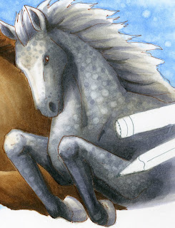
Dappled horses usually have white spots on a gray background. However, I added gray spots over white areas and white spots over gray areas. To make the white spots, I did it just the same as the spots in the sky. I let my base tones dry then I went back with the colorless blender and touched in the white spots. However, I did use the BV23 to add in gray spots as well. Overall,t he horse looks nicely dappled.

You can notice from this close up how the hints of remaining warm gray under the coat of cool grays really helps to liven up the work- the gray does not look flat, but it is still definitely a cool gray horse.

On his mane, you can see that I streaked warms and cools in, feathered in the direction of the hairs. I did not blend these colors in, I purposefully kept them streaky to enhance the feel of individual strands.

You can see a photo of me coloring the horse on instagram.

Overall I think I was able to capture the feel of these horses, running and jumping over something (my original sketch I had toyed with the idea of having them jump over a marker, but it wouldn't fit the header format). My next task was to tackle the pen and markers in the drawing.


Pencil, Multiliner, and Markers
The final step, once the horses were done, is to make the pencil and markers look like they were sitting on top of the picture. The only way to really accomplish this was through strong shadows.

I started with the pencil, as that was the easiest, and I was getting tired of working with neutral colors, that I was happy to throw some intense color into the image. The pencil was colored with the same Y21 I used on the golden horse, but this time, I accented it with YR04. The wooden area was colored with E11 & E13. I colored the graphite with N7, even though it looks like a deep black. Then I wrote in the pencil brand with my multiliner. (Recently I met the wonderful people at General Pencil Co, the last US-based pencil manufacturer. They use wood from trees logged right here in Oregon, so they are my new favorite pencil company!).

The multiliner is colored with N3, N7 and the cool grays I used on the horse. I colored it using the tutorial I posted a while ago about coloring metal. Sharp contrast is the key to making it look like metal. You can see how I enhanced the shininess by using Opaque White.

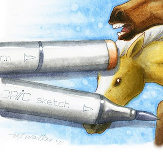
The markers on the other side of the image were colored with Neutral grays as well. I blended the colors more than I did on the shiny metal of the multiliner. Again, I used Opaque white to enhance the shine on the markers, as well as add the glints of light back into each horse's eyes.

The light brown marker cap was colored with E11, E13, and hints of E35.

I added shadows to all markers and pens with C3 and BV25. I was careful to make all the cast-shadows consistent, and crisp so it is easy to tell that they are suppose dot be resting on top of the picture of horses.

I hope you enjoyed this tutorial. The final artwork is approx. 8" x 4". The whole image took about 4 hrs. to sketch, ink and color, with breaks for scanning and actually getting work-work done. Writing the tutorials took about 3 1/2 hrs, so it is almost as difficult to teach how to do it as it is to actually color it in the first place.

I hope this inspired you to color, have a great weekend!

Thursday, September 22, 2011

Gray Base Tones, new header again

Running Horses, Part 2

Sky
For this image, I started with the sky. Usually I finish an image with the sky, but I knew what I wanted the sky to look like, and I hadn't decided on the horse breeds yet, so I began with the sky. If you want to see another tutorial on coloring sky, you can check out this older post on coloring clouds.

I used B32 and feathered out from the horse cluster. Then, I took a really juicy colorless blender and pushed the color back towards the horses. I specifically wanted the sky to feel more like an illustration than a realistic sky, so I pushed the colors around irregularly to give it a mottled look.

Once the colors were pushed, then I let the base dry. I took the colorless blender and added the spots in the sky. Then I went back and touched up with the B32 around the edges of the horses and added a few spots. I was not too worried about going over the edges of the other images, as I can always clean up the edges.

Gray Base Tones on Horses
While I was still deciding on the horse breeds, I added base grays. When you look at the final image, you can't tell that I used warm grays to plan my shadows.

All 3 horses were colored with W1, W3, and a hint of C1. This helps me get all my shadows correct before I start adding other colors. The middle horse I started toning brown with E31. The base tone of grays makes the E31 look like it has a lot more color variation than just one simple layer of light brown. At this point I knew it would be a brown horse, I just hadn't decided on breeds yet.

Notice that I have not done much blending with the base colors. Since I will be layering lots of other colors over the grays, it is more important to just have tones in place, rather than worrying that they all look perfectly smooth at this point.

Middle Horse
It finally came to a point where I had to decide on a breed for the middle brown horse. Once again, I ran a google search and looked up brown horses. I saw some beautiful Spanish Mustangs that I liked, so I decided to color him as a nice, rich brown that darkened into almost black accents. Since he was to be the focal horse, I put the most work into him so he would stand out more.

He is colored mainly with E31 and E35 to go with the base grays. I like the E30's sequence because it is a good, neutral brown family, without too much red or other tones in it. The more you layer browns over the base grays, the more the grays will be pushed out of the way, so be careful not to layer too much or you may lose the original shading. If this happens, just darken it more.

The areas that darken almost to black are colored with E47 and hints of W7. No black! W7 is as dark as you need to get. Even the darkest brown has a value of 7, so it is not black. In the final, you can see that it looks almost black, but still retains the feel of brown.

To soften the colors on his face, I went back over his head with the colorless blender. This added highlights back in, and allowed me to tone down the deepest areas a bit.

His foreleg that is in back, I added W3 to dull it down and make it less intense. This helps with the illusion of depth. I colored his teeth with W3 and his tongue with E04.

You can see that I went over the edges a little bit, on the knee of the front horse and under his chin, but that's what the colorless blender is for.

Tomorrow I will continue the tutorial, and finish up the other two horses and the markers around the edges. Have a great day!

Wednesday, September 21, 2011

New Blog Header

Running Horses
You may have noticed that I have a new Blog header. This morning I decided that my old header was just a little out of season. I also felt like drawing some horses. I ran a google search on horses to get ideas on perspective and angles for the three horses.

I drew them with a pencil first onto scratch paper, then I inked the image on a new sheet of paper using my light table...then I didn't have to erase. So, I sketched out the following illustration using a 0.05mm Gray Multiliner and a 0.05mm Sepia multiliner. Then I started coloring. Tomorrow I will post a tutorial with the steps I took in coloring the horses and markers.

Have a great day!